For WooCommerce store owners, the checkout process can make or break a sale. Even with great products and high traffic, friction at checkout often leads to abandoned carts and lost revenue.
Checkout friction includes anything that slows down, confuses, or frustrates shoppers, like long forms, unclear buttons, limited payment options, or concerns about security. Cart abandonment happens when customers leave without completing their purchase.
Focusing on WooCommerce checkout optimization is key to turning website visitors into buyers.
A streamlined checkout not only improves the shopping experience but also drives measurable business results. By simplifying forms, offering flexible payment methods, and displaying clear trust signals, store owners can reduce cart abandonment and boost conversions.
In this guide, we’ll explore actionable strategies for WooCommerce conversion optimization and share proven eCommerce checkout best practices you can implement today.
The High Cost of Abandoned Checkouts
Cart abandonment is a silent revenue killer for WooCommerce stores. On average, eCommerce abandonment rates hover around 69-75%, meaning nearly three out of four shoppers leave without completing a purchase.
Each abandoned cart represents lost revenue, wasted marketing spend, and missed opportunities for customer engagement.
Complicated forms, mandatory account creation, limited payment options, unexpected fees, and slow page load times can all drive shoppers away. Even small annoyances like unclear progress indicators or poorly organized fields can add up to significant losses over time.
For example, a WooCommerce store selling high-ticket electronics might observe that checkout abandonment is highest on mobile devices.
By simplifying the layout, reducing required fields, and enabling guest checkout, the store can reduce cart abandonment, directly boosting monthly revenue.
Another store might optimize payment methods, adding recognizable payment methods like Apple Pay and PayPal alongside credit cards, and see an increase in completed sales.
These examples highlight the importance of WooCommerce conversion optimization. Each improvement in the checkout experience, whether related to the layout, payment flexibility, or trust signals, can have a measurable impact on your bottom line.
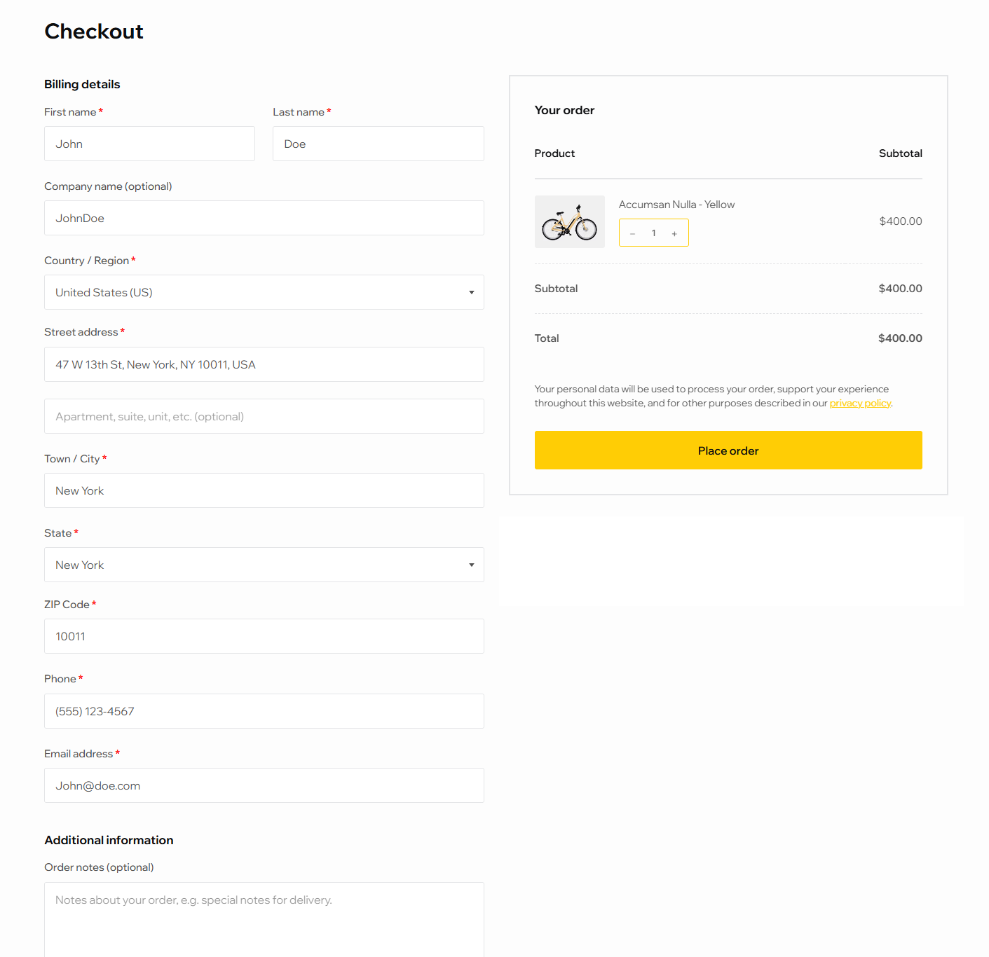
Simplify the Checkout Layout
The layout of your WooCommerce checkout plays a critical role in driving conversions.
A cluttered or confusing checkout creates cognitive overload, slowing decision-making and increasing the likelihood of cart abandonment. By simplifying the layout, you can guide customers through the purchase process quickly and intuitively.
A clean, minimalist design is the foundation of a frictionless checkout. Focus on displaying only essential information such as shipping details, billing info, and payment options while removing distractions like unnecessary promotions or multiple sidebars.
A strong example of this approach is Graham & Brown, which redesigned its checkout after identifying friction points such as forced account selection, multi-page reloads, and poor form validation.
By replacing the process with a streamlined, single-page checkout and simplified layout, the brand removed unnecessary barriers and distractions. The result was an 11.6% increase in mobile conversion, a 10.2% increase in desktop conversion, and a return on investment in just 1.8 weeks.
Logical field order is another key principle. Customers expect to enter shipping information before payment details, and billing fields should follow a predictable pattern.
WooCommerce supports flexible field arrangements, allowing you to streamline the flow. Highlight primary calls-to-action like the “Place Order” button using bold colors and ample spacing, ensuring it’s immediately visible.
Multi-step checkouts can also benefit from progress indicators, which reassure users about the remaining steps and reduce anxiety about the process length.
Remember: every second saved, and every field clarified, brings shoppers closer to completing their purchase, translating directly into measurable revenue growth.
The Power of Guest Checkout
Requiring shoppers to create an account before purchasing is one of the biggest barriers to completing a sale.
Many users simply want to buy quickly and may abandon their cart if they’re forced to register. Offering a guest checkout option can significantly reduce friction, improve WooCommerce checkout UX, and help reduce cart abandonment.
Guest checkout is particularly effective for first-time buyers or stores with a high volume of low-ticket purchases. It removes unnecessary steps while still allowing you to collect essential information for order fulfillment.
Once the purchase is complete, you can invite users to create an account for faster future checkouts or loyalty perks, turning a single transaction into a long-term relationship.
Enabling guest checkout in WooCommerce is simple. Simply navigate to WooCommerce → Settings → Accounts & Privacy, then check the option for “Allow customers to place orders without an account“. This small adjustment can yield measurable results.
A well-known example often cited in UX research comes from Expedia, which discovered that mandatory account creation was costing the company an estimated $300 million in lost bookings. After introducing a guest checkout option, conversions increased significantly by allowing customers to complete purchases without interruption.
By lowering barriers and prioritizing user convenience, guest checkout is a straightforward strategy for driving more completed sales.
Essential Payment Methods That Improve Conversions
Payment options are a critical factor in WooCommerce conversion optimization.
Shoppers expect flexibility, and offering limited methods can lead to abandoned carts. Providing multiple, trusted payment options increases trust, convenience, and ultimately, completed orders.
Essential payment methods include major credit and debit cards like Visa, MasterCard, and American Express, which remain standard for most online purchases.
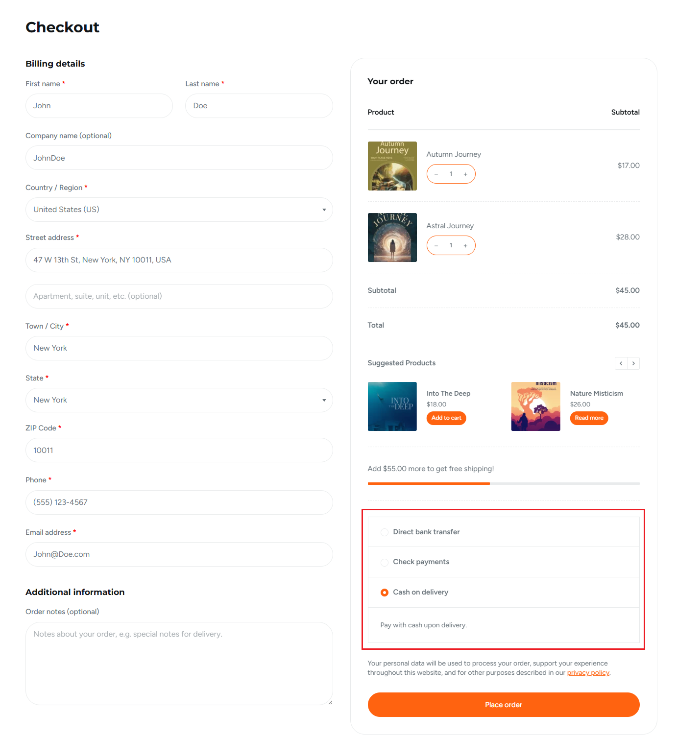
Digital wallets such as Apple Pay and Google Pay are increasingly popular, especially for mobile shoppers, as they enable one-click checkout. PayPal and Stripe integrations are also highly effective, combining familiarity with secure payment processing.
For stores targeting specific regions, offering localized gateways can further reduce friction and build customer confidence.
Consider your product pricing as well. High-ticket items may benefit from installment options or financing solutions, while lower-cost products should prioritize fast, frictionless payments.
An example of payment method optimization comes from ASOS, which expanded its global payment options to include local and alternative methods (such as Klarna) and regional wallets to better serve international customers.
By aligning payment methods with local shopper preferences, ASOS reported measurable improvements in checkout completion and international conversion rates.
Trust Signals and Reassurance at Checkout
Trust is a critical factor in WooCommerce checkout UX. Shoppers hesitate to complete purchases when they feel uncertain about security, payment safety, or return policies.
Displaying clear trust signals at checkout can reassure customers, reduce anxiety, and increase conversion rates. SSL certificates are the foundation of trust.
A visible padlock in the browser or an “HTTPS Secure” badge shows shoppers that their payment information is encrypted. Recognized payment logos, such as Visa, MasterCard, PayPal, and Stripe, signal that transactions are handled by reputable providers.
For added confidence, consider displaying money-back guarantees, clear return and refund policies, or even short testimonials and star ratings near the checkout area. Small details like showing trust badges next to the primary “Place Order” button make a big difference.
Research from the Baymard Institute found that 19% of users abandoned a checkout in the past three months because they didn’t trust the site with their credit card information.
Their large-scale usability testing shows that shoppers judge security largely by visual cues (such as trust seals, padlock icons, and visually reinforced credit card sections) even when all fields are technically equally secure. The study highlights that clear, visible reassurance at the payment step can significantly reduce abandonment driven by security concerns.
Performance and Speed Optimization
Website speed directly impacts WooCommerce conversion optimization.
Slow checkout pages increase friction, cause frustration, and lead to abandoned carts. Studies show that even a one-second delay can reduce conversions by up to 7%, making performance a crucial factor in WooCommerce checkout UX.
To improve speed, start with lightweight checkout plugins and optimized hosting. Avoid unnecessary scripts or large media files during the checkout process, as these can significantly slow page load times. Implement caching solutions and content delivery networks to deliver pages faster to users regardless of location.
Monitoring checkout load times is equally important. Aim for pages that load in under three seconds, particularly on mobile devices, where most shoppers abandon slow processes.
UX Patterns That Boost Checkout Completion
Implementing smart UX patterns in your WooCommerce checkout, like optimized forms, progress indicators, and transparent pricing, reduces friction and significantly improves conversion rates.
Smart Form Field Design
Optimizing form fields is a key WooCommerce checkout UX strategy.
The goal is to collect only essential information like email, shipping address, and payment details while minimizing friction. Every additional field increases cognitive load and the risk of abandonment.
Use inline validation to give instant feedback when customers enter information incorrectly, preventing errors before submission.
Placeholder text and tooltips provide helpful guidance, reducing confusion and streamlining the process. Autofill and smart defaults, such as pre-selecting the customer’s country or suggesting previously entered addresses, speed up checkout and enhance convenience.
Progress Indicators and Next Steps
Progress indicators are a simple yet powerful WooCommerce checkout UX pattern that reassures customers about how many steps remain in the checkout process.
Multi-step checkouts can feel overwhelming without visual cues, and uncertainty often leads to cart abandonment. Highlighting the current step visually, through a progress bar or numbered stages, gives immediate feedback and encourages completion.
Additionally, clear “Next” or “Continue” buttons with a bold, accessible design guide users seamlessly through each stage. By combining step-by-step guidance with intuitive navigation, you create a smoother, more confident checkout experience, enhancing WooCommerce conversion optimization.
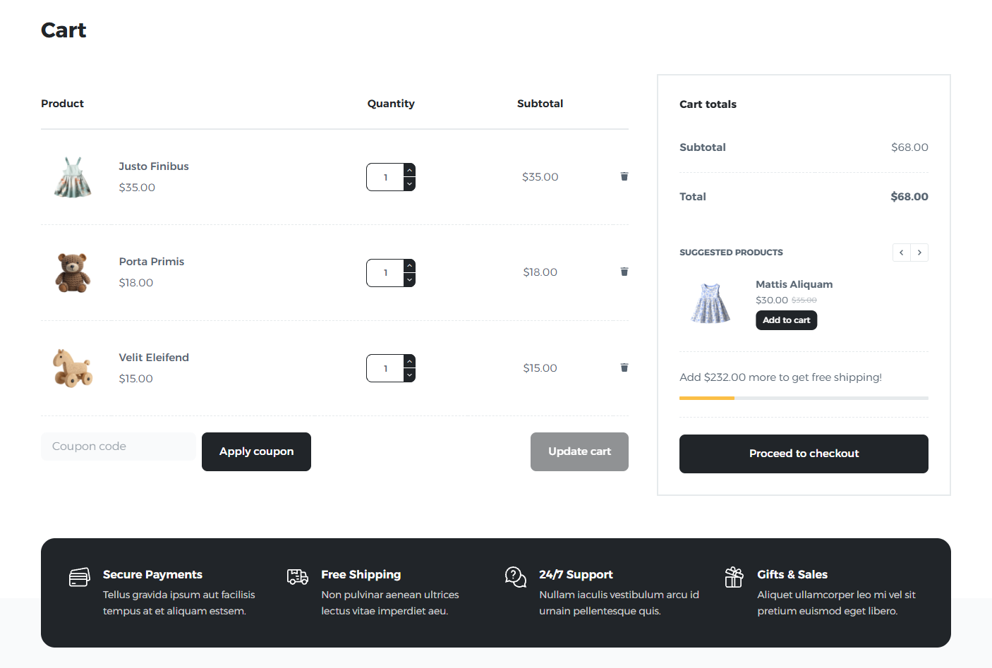
Transparent Pricing and Fees
Unexpected costs are a major reason shoppers abandon their carts, making transparent pricing a critical WooCommerce conversion optimization strategy.
Display shipping, taxes, and any additional fees upfront, so customers know the total cost before reaching the final step. Hiding charges until the last page can create “sticker shock” and reduce trust.
Clear breakdowns of costs, such as itemized product prices, shipping options, and tax calculations, help shoppers feel informed and in control.
Highlight free shipping thresholds or discounts where applicable to incentivize completion. By prioritizing transparency, you enhance WooCommerce checkout UX and foster trust, encouraging shoppers to complete their purchases confidently.
Accessible UX
Creating an accessible checkout is essential for improving WooCommerce checkout UX and maximizing conversions.
A checkout that works well for all users, including those with visual impairments or disabilities, reduces friction and prevents abandonment.
Key accessibility practices include optimizing keyboard navigation, ensuring all form fields and buttons are reachable without a mouse, and providing clear focus indicators.
Consistent spacing, legible fonts, and high-contrast colors improve readability and reduce visual strain. Mobile optimization is equally important: responsive layouts, touch-friendly buttons, and fast-loading pages make checkout seamless on smartphones and tablets.
Conclusion
Optimizing your WooCommerce checkout is an easy and powerful way to reduce friction, improve WooCommerce conversion optimization, and drive more completed sales.
From layout simplification and guest checkout to flexible payment methods, trust signals, performance improvements, and thoughtful UX patterns, each adjustment contributes to a smoother, more confident shopping experience.
By implementing these eCommerce checkout best practices, store owners can meaningfully improve WooCommerce checkout UX, increase conversions, and grow revenue.