To make your WordPress site accessible, your theme and content need to support each other. First, you’ll need to choose an accessible WordPress theme, then create accessible content.
An accessible WordPress theme provides a strong foundation for content—like well-structured text, captions for videos, and alt text for images—that supports all users.
To help you with theme accessibility, in this article, we’ll look into four things you should and four things you shouldn’t do before picking a theme for your WordPress site.
In this guide, we’ll explore essential dos and don’ts for selecting an accessible WordPress theme. From testing for keyboard navigation to checking color contrast and mobile compatibility, these tips will help you find a theme that supports accessibility standards and enhances your site’s user experience for everyone.
Key Takeaways
- Test for full keyboard accessibility including “Skip to Content” links and tab focus visibility.
- Choose themes with flexible options for colors, typography, spacing, and layout.
- Review default designs or starter sites to gauge built-in accessibility quality.
- Look for clean, semantic HTML and WAI-ARIA support in the theme’s code.
- Don’t rely only on the “accessibility-ready” label—run your own manual and tool-based tests.
Table of Contents
Four Essential Tips for Choosing an Accessible WordPress Theme
1. Do Start with Checking the Theme for Keyboard Accessibility
As keyboard accessibility is fairly easy to check, it’s a good idea to test it before anything else. If a theme doesn’t pass the test, it’s better not to use it.
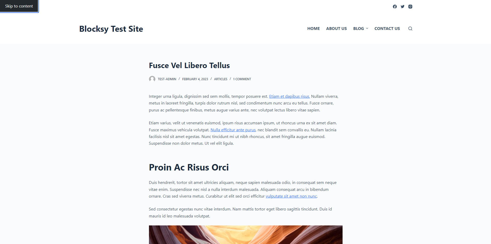
Imagine a visitor with limited mobility navigating your site via keyboard. As they press the Tab key, they should be able to see a “Skip to Content” link to bypass menus, underlined links for clear visibility, and easy access to all form fields, such as search bars or contact forms. This setup allows them to navigate smoothly without getting stuck on inaccessible elements.
After installing and activating a theme, hit the Tab key, and check whether:
- a ‘Skip-to-content’ link appears at the top of the page
- the links in the main content area are underlined
- all the links are visible as you’re tabbing through them
- you can access every menu item and form field (e.g. search bar, contact form) just by using your keyboard
- the most common keyboard navigation keys work without issues
If a theme provides starter sites or demos, test the default install (with no starter site enabled) for keyboard accessibility, as this is how you can check if the theme has been built with accessibility in mind.
2. Do Understand the Color, Menu, Typography, and Spacing Options the Theme Provides
One of the most important aspects of WordPress theme accessibility is whether the theme provides you with all the necessary tools to create an accessible website.
In other words, you’ll need to understand the customization options built into the theme. While the WordPress Core adds some default options to the Customizer, most of the settings depend on the theme — and there can be huge differences between one theme and another.
Accessibility isn’t just about functionality—it’s also about readability and visual clarity. A theme with customization options for color, typography, and spacing helps you build an accessible, visually appealing site for users of all abilities.
For a food blog, choosing a high-contrast color scheme makes recipe text and ingredient lists easier to read for visually impaired users. The ability to adjust typography and spacing also allows readers to comfortably view content without straining, making your site more enjoyable and accessible.
While the options are located in the Customizer (under the Appearance > Customize menu), some themes provide a separate Theme Options panel, too, to help admin users find the most important settings (which also improves cognitive accessibility).
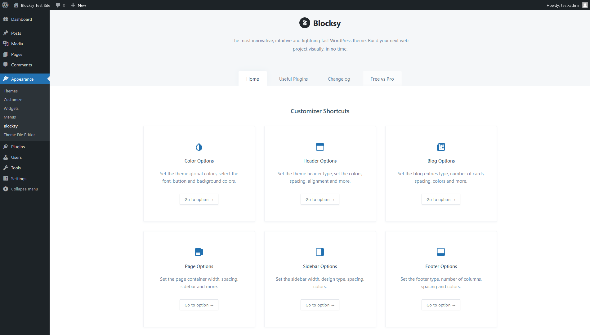
To assess a theme’s options for accessibility, check:
- what layout options you get for different post types (blog posts, pages, the search page, etc.)
- if you can adjust the colors, typography, spacing, buttons, menu, etc.
- if the options are structured logically and described in straightforward language
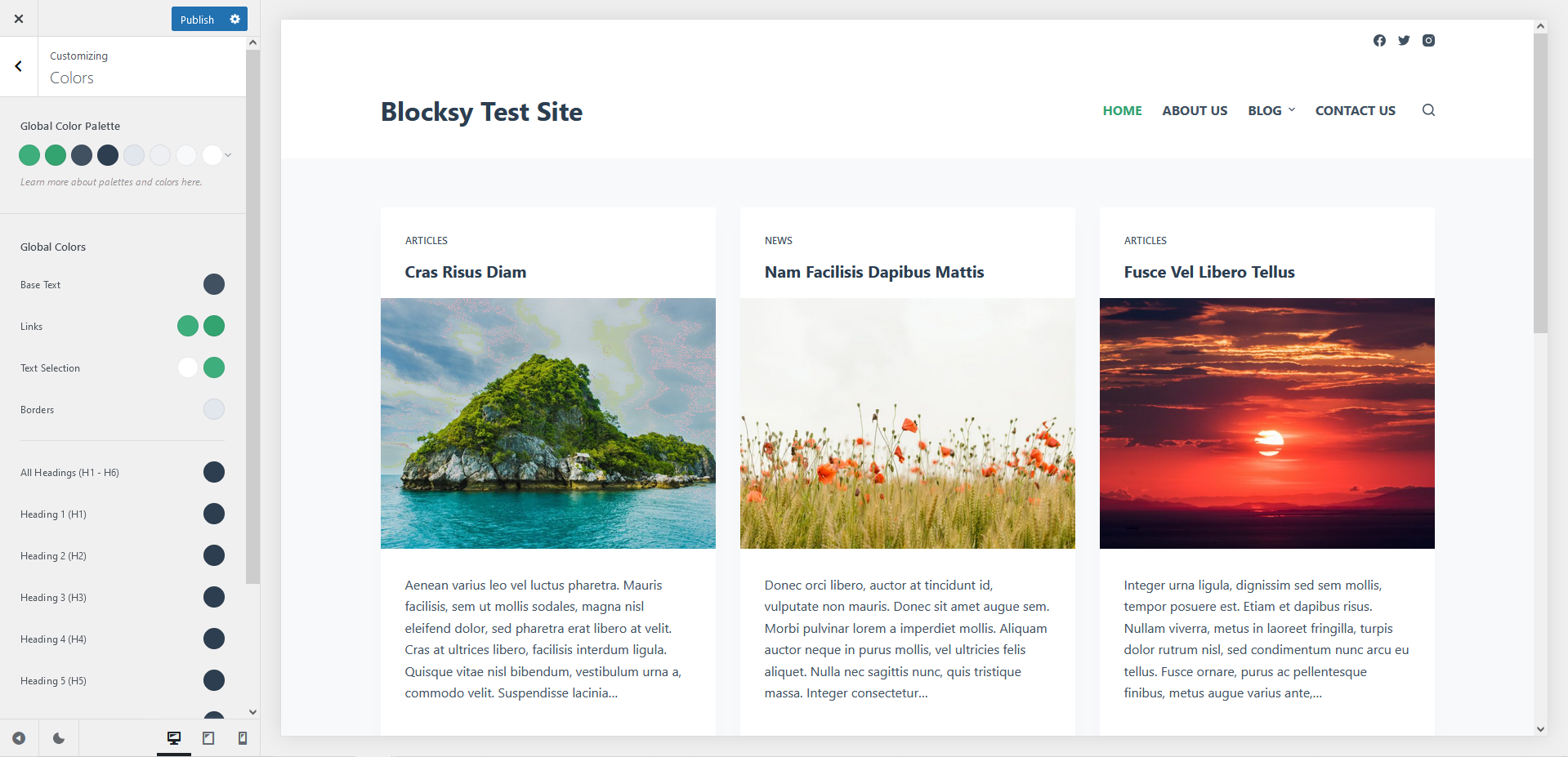
For example, here are our Blocksy theme’s color options that help you implement a fully accessible color palette:
Note: As navigation is an especially challenging part of web accessibility, you’ll need to test the theme’s menu options with extra care if you want to add a more complex menu to your WordPress site.
3. Do Test the Default Theme Design or Pre-Built Starter Sites
The default design or starter sites tell a lot about how the theme author approaches accessibility.
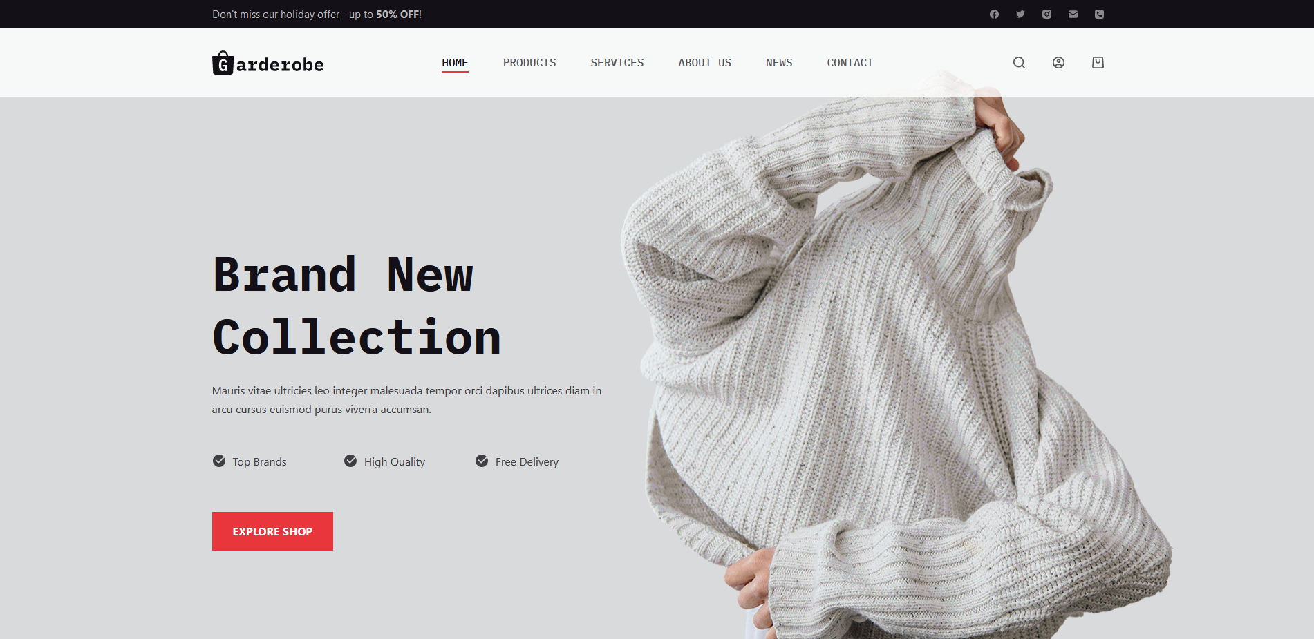
The demos are sometimes available online on the theme author’s website so that you can check them out without installing the theme.
Pre-built starter sites or demo content can show you how a theme handles accessibility out of the box. A theme with good default design choices often makes it simpler to create accessible pages.
If you’re setting up a portfolio website, use a theme’s demo site as a starting point, then tweak it for accessibility by increasing color contrast and choosing readable fonts. This approach helps you ensure that your site is accessible from the start while still reflecting your style and branding.
As a rule of thumb, avoid treating starter sites as finished designs.
Instead, think of them as starter designs you can still tweak later using the theme’s customization options — for example, you can increase the color contrast or change the font type to a more readable one.
4. Do Check if the Theme Uses Clean and Semantic Code
Theme accessibility is not simply about design — the underlying code base also needs to be accessible.
Code accessibility means that the code:
- uses semantic HTML tags where they are available
- uses the WAI-ARIA syntax where semantic HTML tags are not available
- is optimized for performance
- follows the WordPress Coding Standards
Accessible code allows screen readers and other assistive technologies to interpret content accurately. Look for themes with clean, semantic code that follows accessibility standards like WAI-ARIA.
If you’re building an eCommerce site, clean code with semantic tags like
<header>,<nav>, and<footer>helps screen readers accurately interpret sections of your site, allowing visually impaired users to locate product categories, checkout forms, and customer service links quickly and efficiently.
If you know how to read code, you can use your browser’s developer tools to inspect the page. For example, here’s our Blocksy theme’s semantic and accessible markup for the search form:

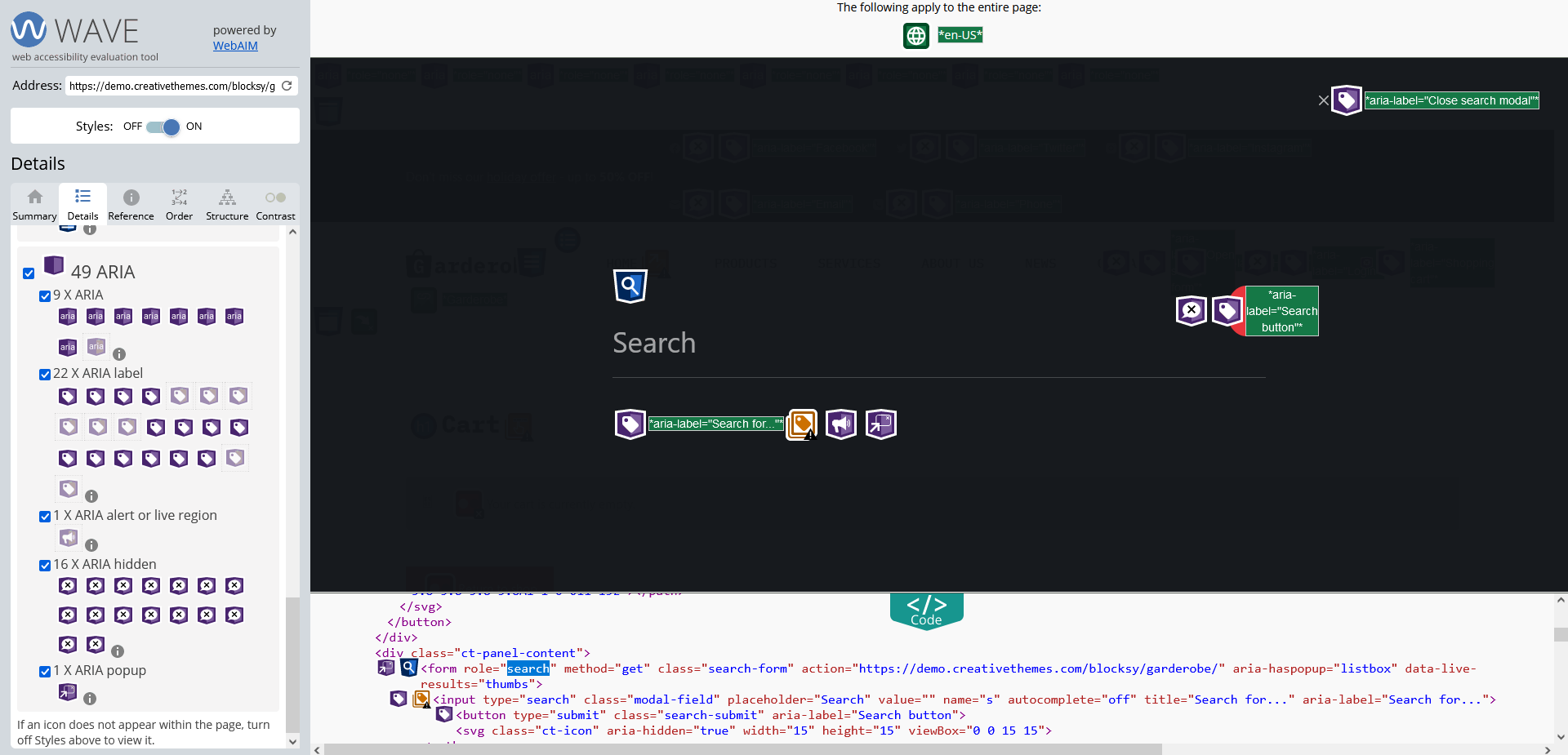
Alternatively, you can use an accessibility testing tool, such as WAVE, to visualize the code:
If you don’t want to look at code at all, you can turn on the screen reader or text-to-speech tool of your operating system or web browser, such as VoiceOver on MacOS; Narrator on Windows; or the Read Aloud feature of the Edge browser, to check how easy or hard it is to access the content with assistive technology.
Four Common Accessibility Mistakes to Avoid When Selecting a Theme
1. Don’t Rely on the Accessibility-Ready Label of the WordPress Theme Repository
While the official theme repository at WordPress.org does have an ‘accessibility-ready’ filter, it doesn’t mean that a theme meets the WCAG guidelines at Level AA.
As the WordPress Accessibility Handbook puts it, the accessibility-ready label only acknowledges that a theme meets the minimum requirements set by the WordPress theme review team:

While adhering to the minimum standards can be a good starting point, it’s better to use a more holistic approach when choosing an accessible WordPress theme.
The “accessibility-ready” label in the WordPress theme repository signals that a theme meets minimum accessibility requirements but doesn’t guarantee full accessibility.
A theme with this label may pass basic checks, but still lack color contrast options or mobile-friendly navigation. If you’re creating a travel blog and want users to easily browse posts on any device, a full test beyond the label is essential to ensure accessibility across all site elements.
2. Don’t Ignore Mobile and Tablet Users
Your WordPress site needs to be accessible on mobile and tablet devices, too. The best way to ensure this is by choosing a theme that comes with customization options that let you adjust the mobile design.
The biggest mobile accessibility issue tends to be the navigation, as there’s not enough space on the screen to show everything. To improve mobile accessibility, you’ll need a theme that allows you to create a separate mobile menu and fine-tune its design.
Accessible design should extend to all screen sizes, including mobile and tablet devices. A theme with mobile-friendly menu options and customizable layout settings will help ensure accessibility for all users.
For a small business site, a theme that offers a mobile-specific menu allows you to simplify navigation on smaller screens. This means visitors can easily find your contact information, business hours, or services on their phones without unnecessary scrolling.
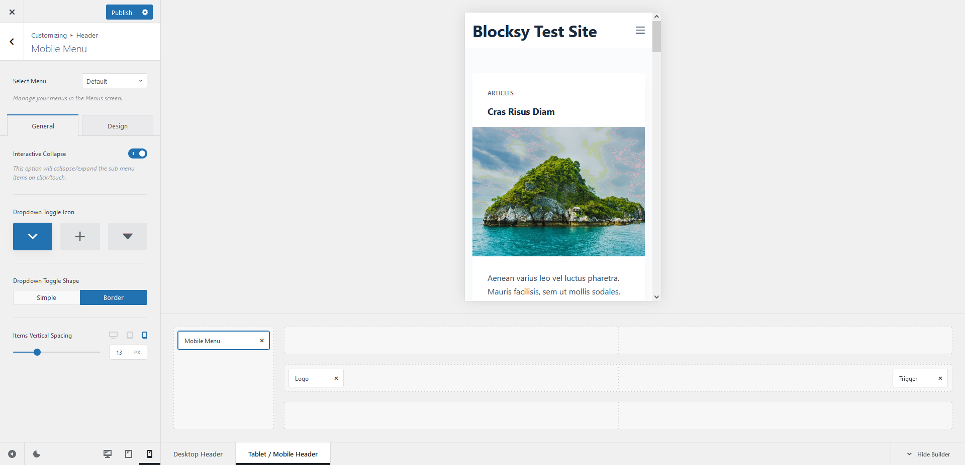
For example, Blocksy’s mobile menu options let you change the dropdown toggle icon, adjust the spacing between the menu items, and more:
3. Don’t Trust Any Single Accessibility Testing Tool or Method
To evaluate the accessibility of a WordPress theme, always use more than one method or tool to get a multi-angle overview of its strengths and weaknesses.
For example, you can:
- do manual testing (with a keyboard, screen readers, styles disabled, etc.)
- use online accessibility testing tools such as WAVE or Lighthouse
- test for mobile and desktop performance with a tool such as Lighthouse or PageSpeed Insights
- ask people with different types of disabilities to test your theme — they still might find accessibility issues that you have overlooked
Testing your theme’s accessibility with multiple tools gives you a well-rounded understanding of its strengths and weaknesses. While tools like WAVE or Lighthouse offer great insights, combining these with manual testing and user feedback is key to catching potential issues.
For a nonprofit organization’s site, run an automated test with WAVE, then use a screen reader to simulate the experience of visually impaired visitors. This dual approach can reveal issues that automated tools alone might miss, ensuring that all users can access your donation forms and other essential information.
4. Don’t Choose a Theme You Don’t Like Just for Accessibility
While making your WordPress site accessible is an important endeavor, don’t choose a theme you don’t like just because it scores well on accessibility tests. If it has a design that won’t engage your audience, it’s better to go with another theme.
While accessibility is important, the theme should also fit your brand’s style and appeal to your target audience. Look for a balance between aesthetics and usability.
For a design agency website, opt for a theme that combines accessibility with visual appeal. While accessibility features help ensure inclusivity, the overall look and feel should still represent your creative vision to engage potential clients effectively.
To optimize user experience, you’ll need to find the balance between aesthetics and the different aspects of usability, including accessibility.
Theme authors can help you with that by giving you access to multiple good-looking starter sites and providing you with well-thought-out customization options that let you tweak the design.
FAQ
What Does “Accessibility-Ready” Mean in the WordPress Theme Repository?
The “accessibility-ready” label means a theme meets the minimum accessibility standards set by the WordPress theme review team. However, it does not guarantee full compliance with WCAG Level AA guidelines, so further testing is still necessary.
How Can I Test if a WordPress Theme Is Keyboard Accessible?
Install and activate the theme, then press the Tab key. You should see a “Skip to Content” link, visibly outlined links, and be able to navigate through menus and form fields using only the keyboard. If any of these fail, the theme likely has accessibility issues.
Can a Theme Be Both Accessible and Visually Appealing
Yes. A good theme balances accessibility with design flexibility. Look for themes that offer multiple starter templates, customizable layouts, and typography controls. You don’t have to compromise on aesthetics to meet accessibility needs. Only 3.7% of the top one million websites globally are fully accessible, highlighting how rare complete compliance remains—even among major sites.
Summary
In this article, we looked into WordPress theme accessibility in detail.
Here’s a recap of the four dos and four don’ts of how to choose an accessible WordPress theme:
| Do | Don’t |
|---|---|
| … start with checking the theme for keyboard accessibility. | … rely on the accessibility-ready label of the WordPress Theme Repository. |
| … understand the color, menu, typography, and spacing options the theme provides. | … ignore mobile and tablet users. |
| … test the default theme design or pre-built starter sites. | … trust any single accessibility testing tool or method. |
| … check if the theme uses clean and semantic code. | … choose a theme you don’t like just for accessibility. |
Finally, don’t forget that even if you have an accessible WordPress theme, you still need to create accessible content and regularly test the live site, as issues can always arise as you’re adding new content and functionality.
Blocksy is a fully accessible free WordPress theme — take a look at the features, check out the starter sites, or download it from WordPress.org and give it a test drive.
Editor’s note: This article was the third part of our WordPress Accessibility series — it covered how to choose an accessible WordPress theme. Check out the previous parts, too, on website accessibility in general (Part 1) and WordPress accessibility in detail (Part 2).

