Product pages are the beating heart of eCommerce stores. They’re the pages that either convert site visitors into paying customers or send them packing.
A well-designed product page doesn’t just showcase a product, it’s a carefully crafted sales pitch, an experience, and a decision-making guide all packed into one.
But here’s the thing: there isn’t a one-size-fits-all solution.
Every brand has a unique audience and each product has its own set of unique selling points. What works for one product might not necessarily work for another.
In this article, we’ll share some of the best product page examples from real eCommerce stores. We’ll break down their various strategies to craft standout pages and explore what makes them successful. We’ll also talk about the different features they use to stand out and explain how you can implement the same on your store using Blocksy.
Table of Contents
#1: Bellroy – Interactive Product Images and Swatches
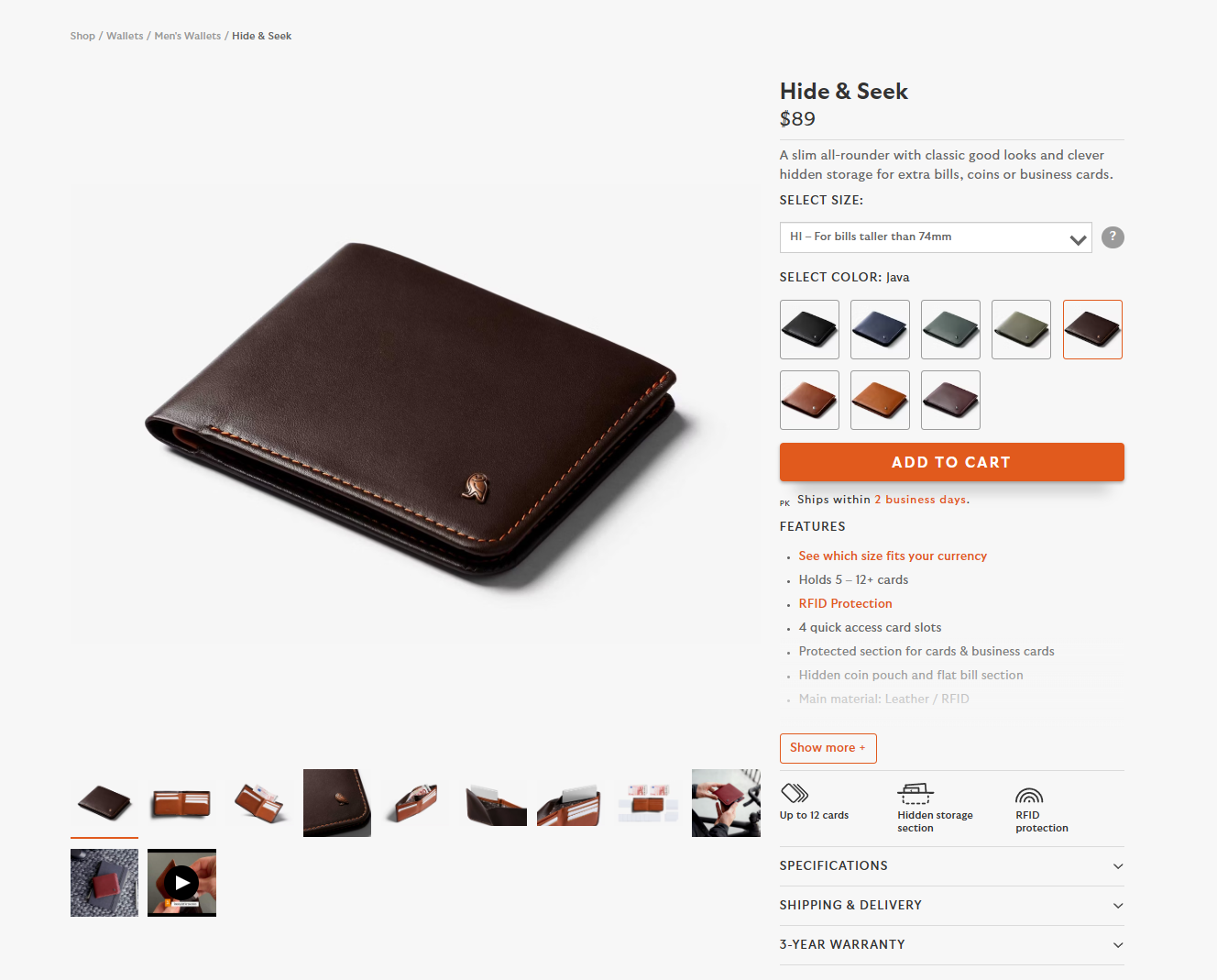
Bellroy uses variation swatches on their product page to present their wallets. They’ve used images swatches to give prospective customers the option to choose the color they like best. To do this, they’ve added photos of the wallet in all the colors it’s available in as image swatches.
41% of shoppers say they hesitate to buy online due to uncertainty about product appearance. Bellroy’s visual approach eliminates this hesitation.
This way, customers can quickly see the different colors the wallet is available in and make an informed purchase decision. In addition to this, when a customer clicks on a specific color, the main product image dynamically updates to show a larger photo of the wallet in the customer’s selected color.
Displaying image swatches on the product page gives users a clear idea of what they can expect.
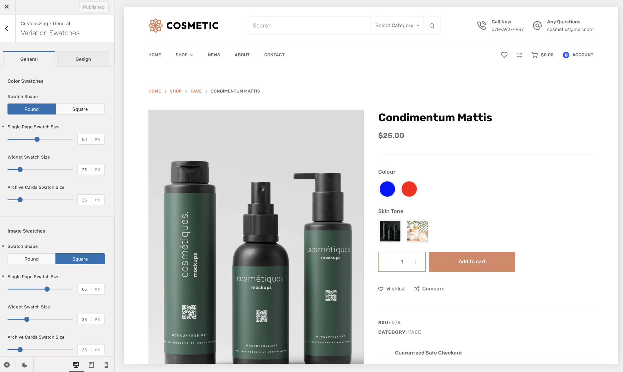
If you want something like this for your eCommerce store, you can use the Variation Swatches module which is part of Blocksy Pro’s Shop Extra extension. The module lets you upload the desired image for each attribute term and effectively display product variations on your product pages.
#2: Kit + Ace – Size Guides for Fewer Returns
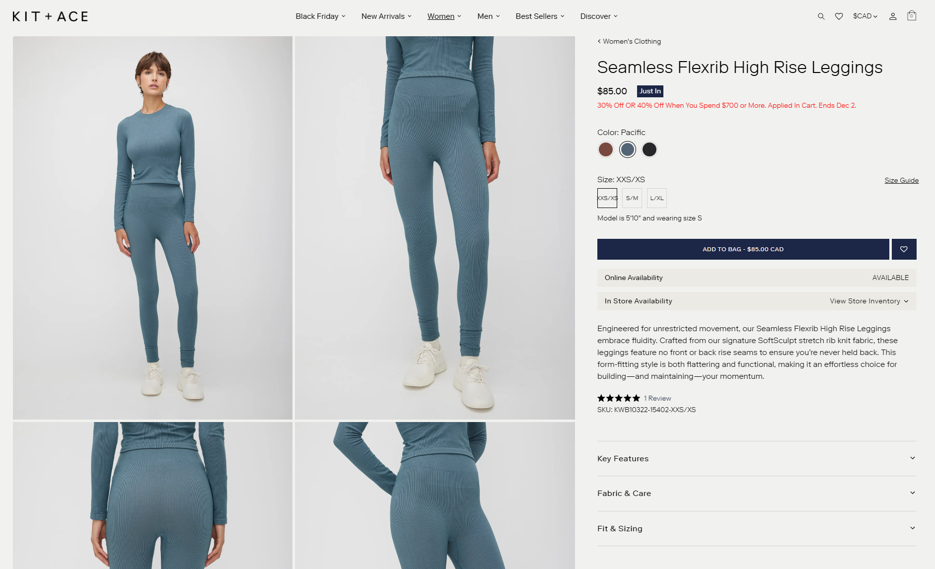
Kit + Ace is an apparel store that uses size guides to help customers pick the correct size for them. They’ve provided a clear Size Guide link on their product page that opens the size guide table for the product the customer is viewing in a pop-up.
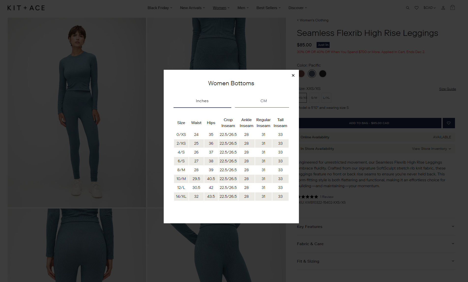
Size guides are a game-changer. They cut down on returns, save you cash, and give customers the confidence to buy, which means higher conversions and more sales.
Providing detailed product information, such as size guides, addresses customer concerns, as 53% of U.S. online shoppers abandon purchases if they can’t find quick answers to their questions.
Kit + Ace makes sure their size guides are front and center on the product pages so customers don’t miss them.
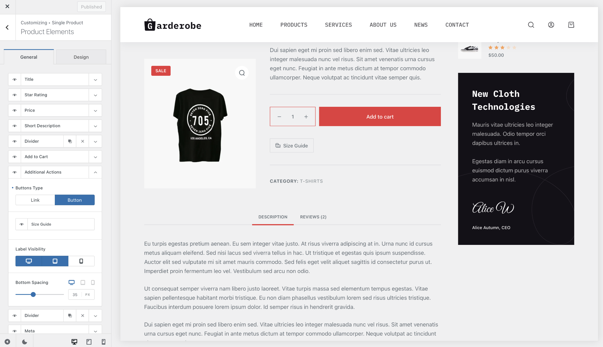
If you sell products that require size guides – like clothing, shoes, or accessories – you can easily implement them using the Size Guide feature from Blocksy Pro’s Shop Extra extension. It lets you set display conditions for the style guides you create.
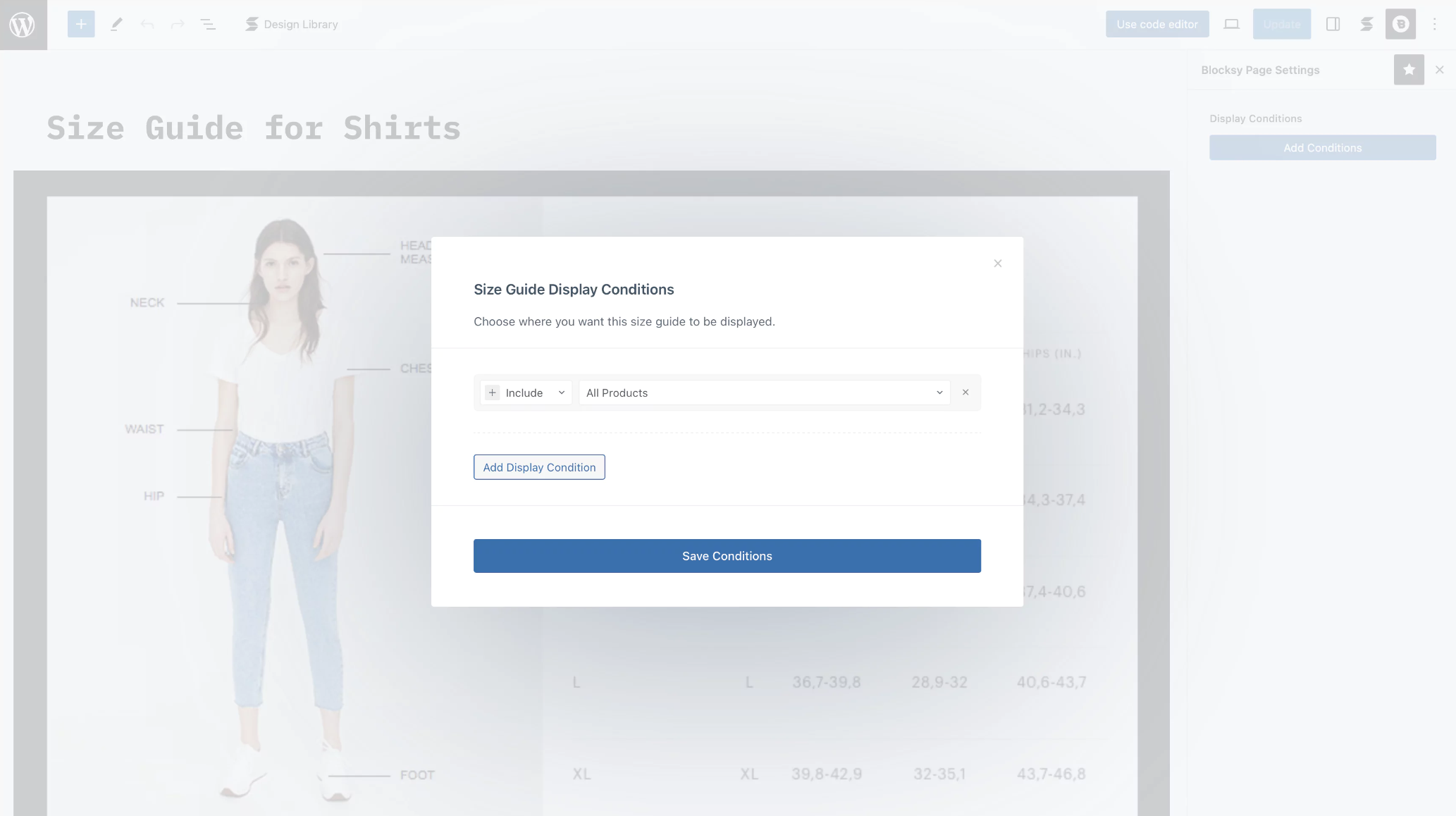
This means that you can choose to show the Size Guide for Tops when customers are viewing tops, blouses, t-shirts, shirts, etc… and Size Guide for Bottoms when customers are viewing trousers, pants, sweatpants, etc…
#3: Luxy Hair – Custom Tabs for FAQs and Shipping Info
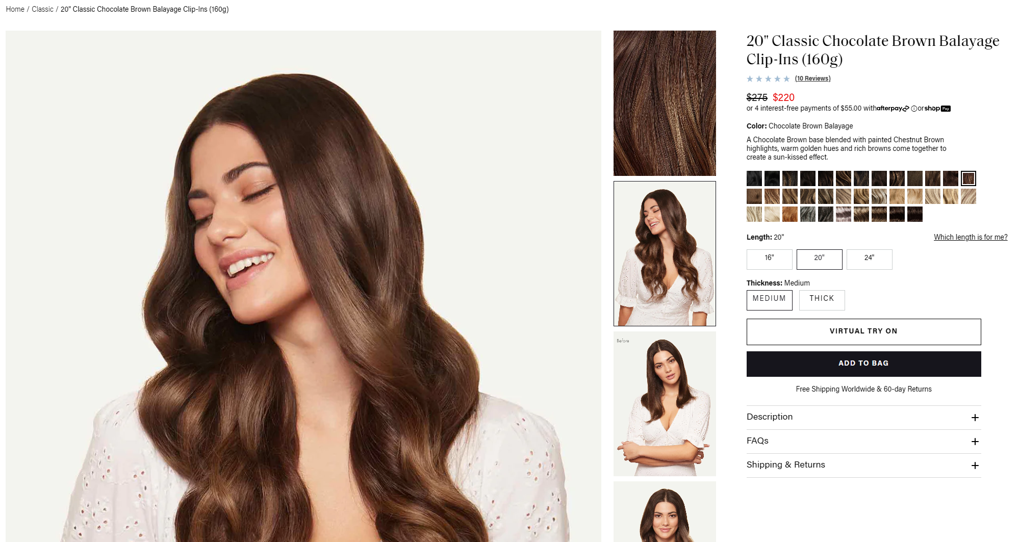
Luxy Hair is an eCommerce store that sells hair extensions and haircare products. They have custom tabs on their product pages to make it easier for customers to learn more about the products (from the FAQs tab) and shipping and returns policies (from the Shipping & Returns tab).
Custom tabs like FAQs and Shipping & Returns enhance the customer experience by providing quick access to important information. They also reduce the volume of repetitive customer support inquiries, improving efficiency and allowing your team to focus on more complex issues.
Organizing information into easily navigable sections enhances user experience, reducing the likelihood of customers leaving due to frustration.
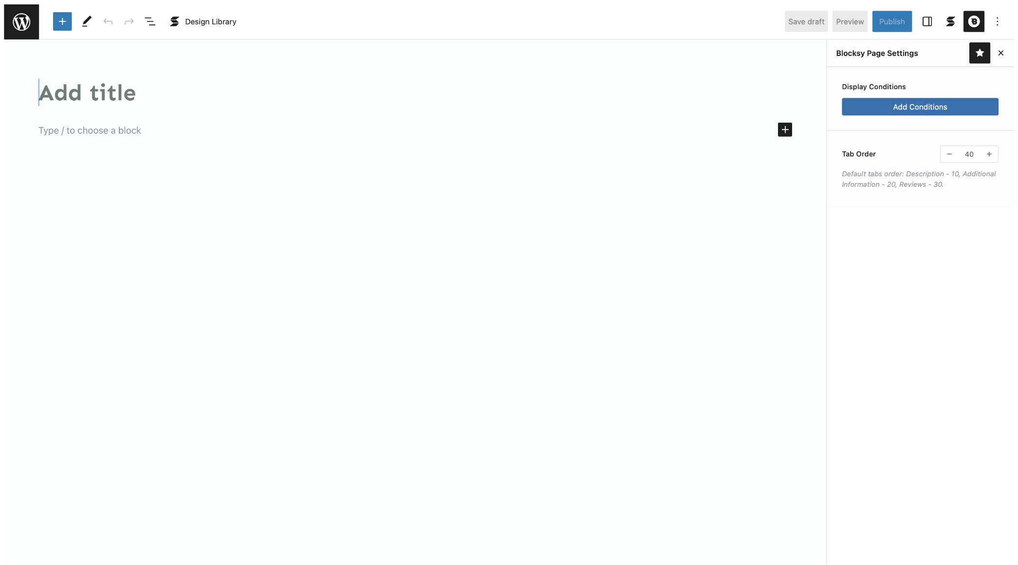
Out of the box, WooCommerce shows three tabs on product pages – Description, Additional Information, and Reviews. If you want to create custom tabs, you can use Blocksy’s Custom Tabs module. You can create as many custom tabs as you’d like, set display conditions for each one, and choose the tab order.
Here are some ideas for custom tabs you could create depending on the types of products you sell:
- Care instructions
- Sizing guide along with instructions on how to measure
- Shipping & Returns
- FAQs
- Warranty information
#4: Cider – Advanced Customer Reviews with Photos
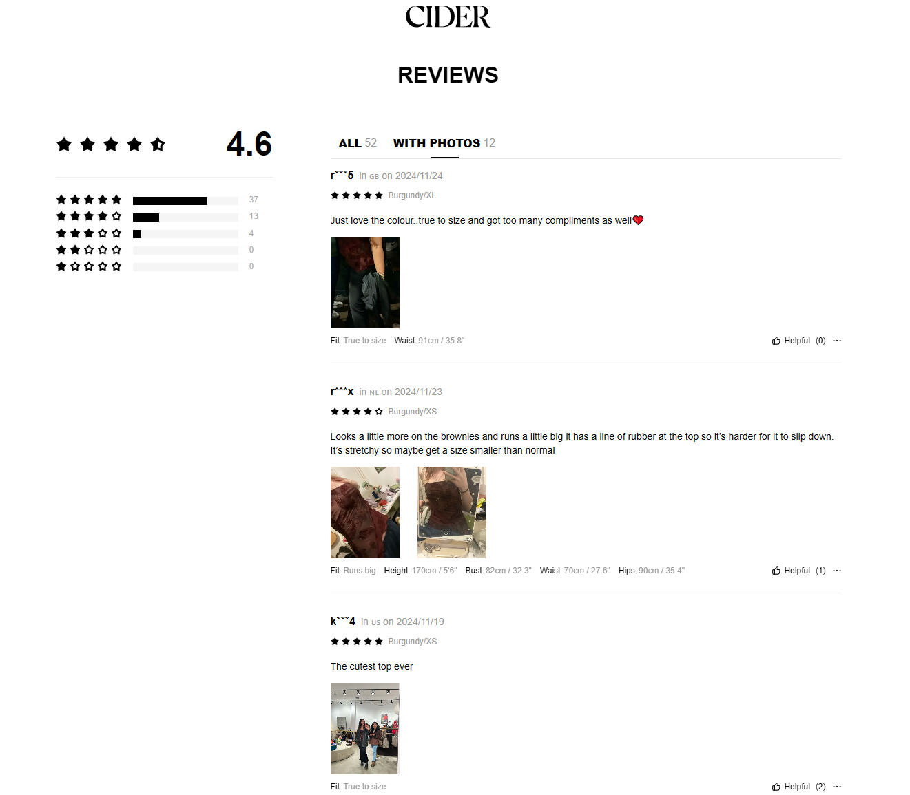
Cider is a fast-fashion store that sells a wide range of apparel products. They use an advanced product reviews system that lets customers upload product reviews with photos and details about the fit, their body measurements, and the size they ordered.
Displaying user-generated content, such as customer photos, can increase conversions by 28%, as shoppers find real-life images more trustworthy.
This helps other customers see what the product looks like on real people and make informed purchase decisions. Customers can also upvote an advanced product review if it is helpful to them.
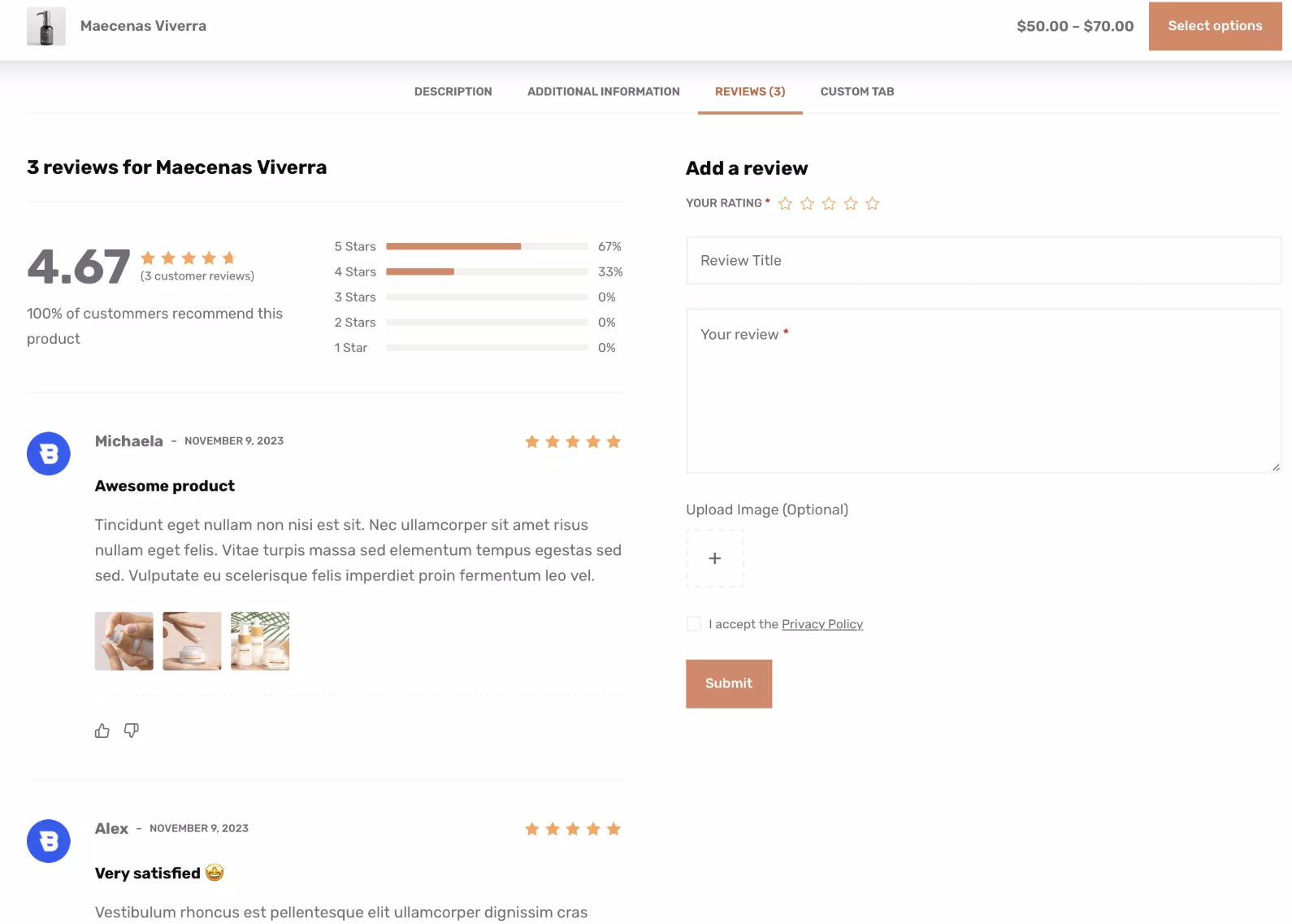
Blocksy Pro comes with an Advanced Product Reviews module that lets customers add photos to their reviews. It also lets you set up a voting system and provides an aggregate score with a breakdown similar to how Cider does it.
#5: Pottery Barn – Social Sharing for Word-of-Mouth Marketing
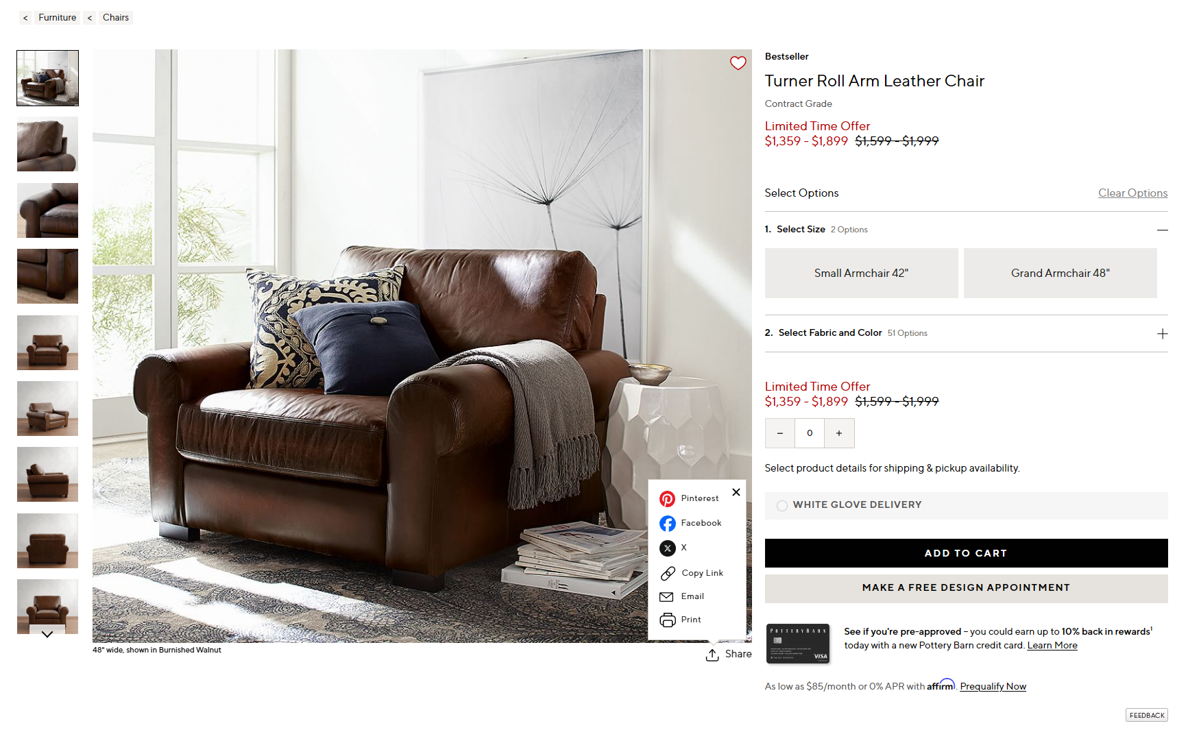
Pottery Barn offers a wide range of stylish and functional home furniture and decor. Their product pages feature a handy Share box that lets customers share their favorite items via social media or email, copy the link, and print the page.
This feature helps increase product visibility, driving traffic from social platforms and encouraging word-of-mouth marketing.
By making it easy for customers to share products with their friends and family, Pottery Barn effectively expands their reach and builds brand awareness.
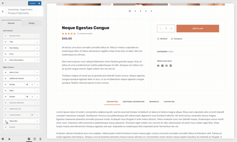
Blocksy Pro comes with a neat Product Share Box feature that lets you add a similar Share box to your product pages. You can customize it and select the sharing networks you want to include. You can choose from 13 options including Facebook, X (Twitter), Pinterest, LinkedIn, and email.
#6: Bose – Wishlist Feature for Repeat Visits
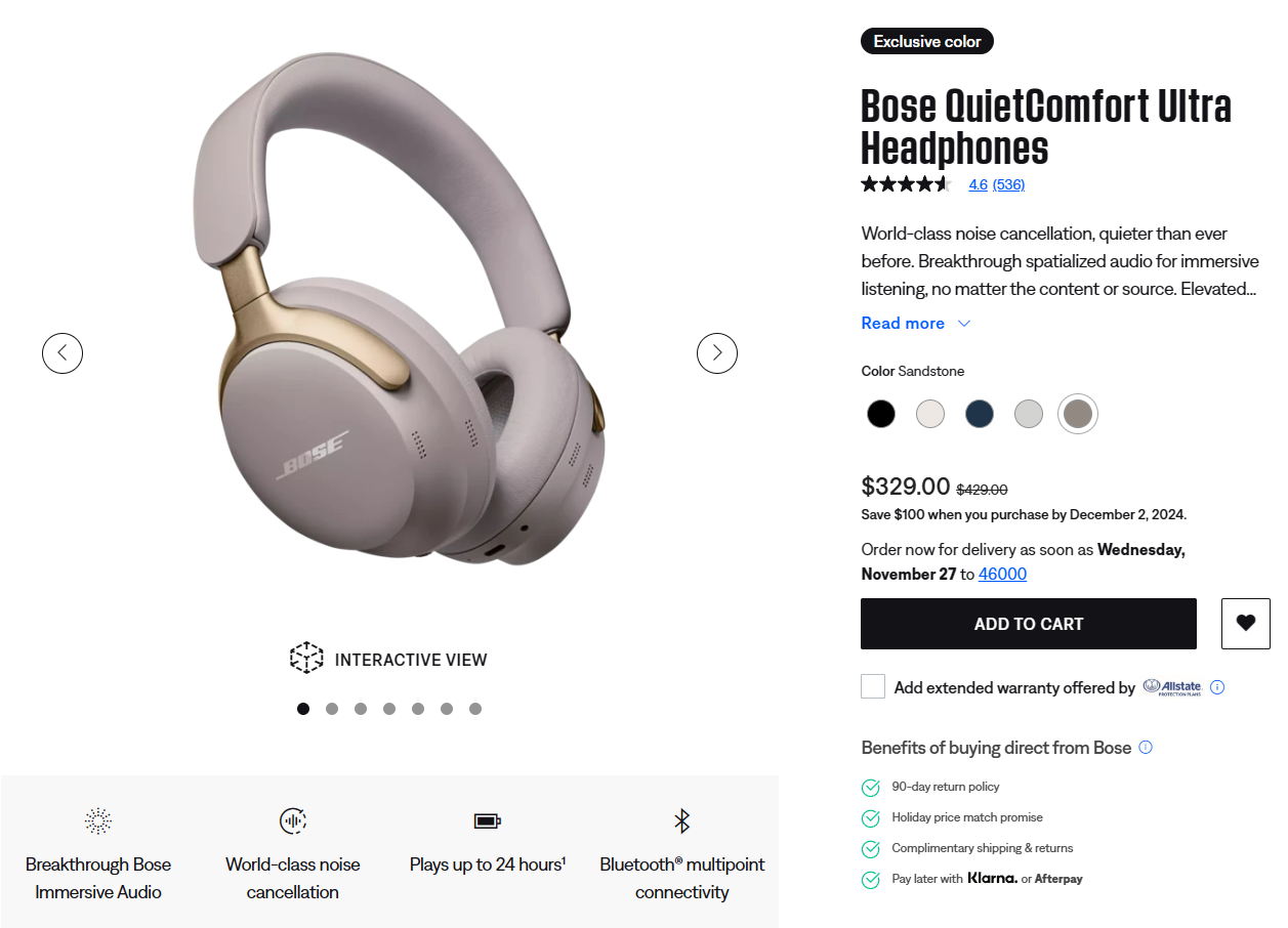
Bose is known for its high-quality audio products, and their headphone product pages offer a convenient wishlist feature. This lets customers save their favorite headphones for future purchases. Customers can easily return later when they’re ready to buy.
The wishlist feature helps increase customer retention by encouraging users to return to the store and complete their purchase.
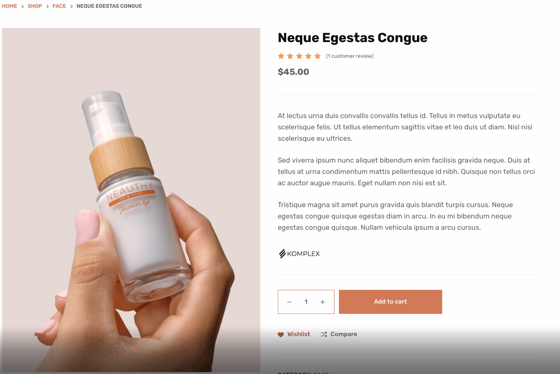
If you want to use the wishlist feature to turn potential interest into future sales opportunities, you can use Blocksy Pro’s Wishlist module to enable an “Add to Wishlist” button on single product pages.
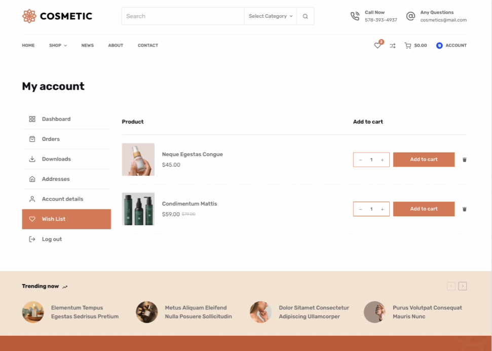
When customers are ready to make a purchase, they can head over to their My account page to see their Wishlist and add the product to their cart.
#7: Lululemon – Low-Stock Alerts to Create Urgency
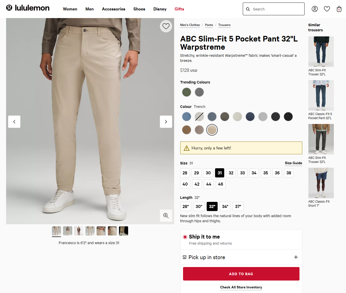
Lululemon is a popular activewear brand known for its premium products. In the product page screenshot above, you’ll see a “Hurry, only a few left!” alert to create a sense of urgency around limited stock.
This tactic leverages the psychological principle of scarcity, encouraging customers to make a purchase quickly before the product sells out. By highlighting low stock levels, Lululemon taps into FOMO (fear of missing out), which can lead to faster conversions and higher sales.
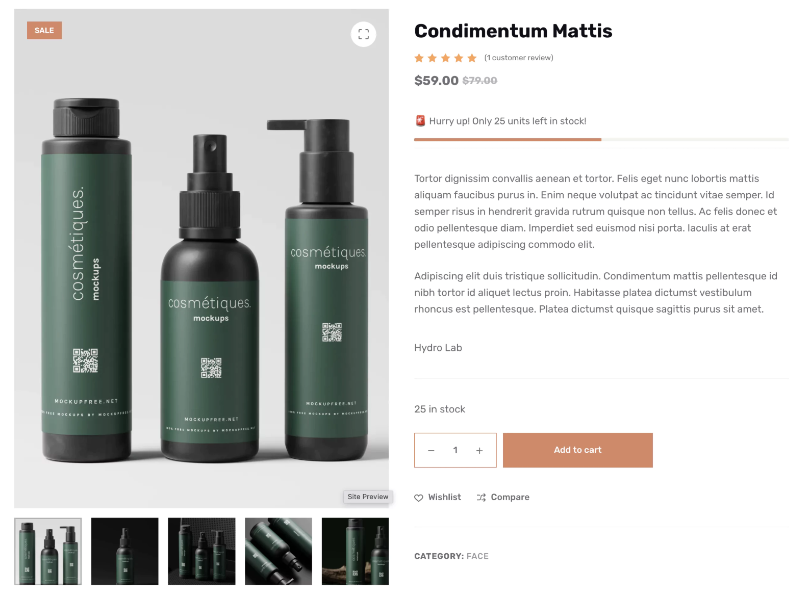
Blocksy Pro comes with a Stock Scarcity module that lets you set a minimum product stock level. When product stock falls below that number, a low-stock alert with a custom message will appear on the product page similar to how Lululemon does it.
#8: TOMS – Grid-Style Product Gallery for Better Browsing
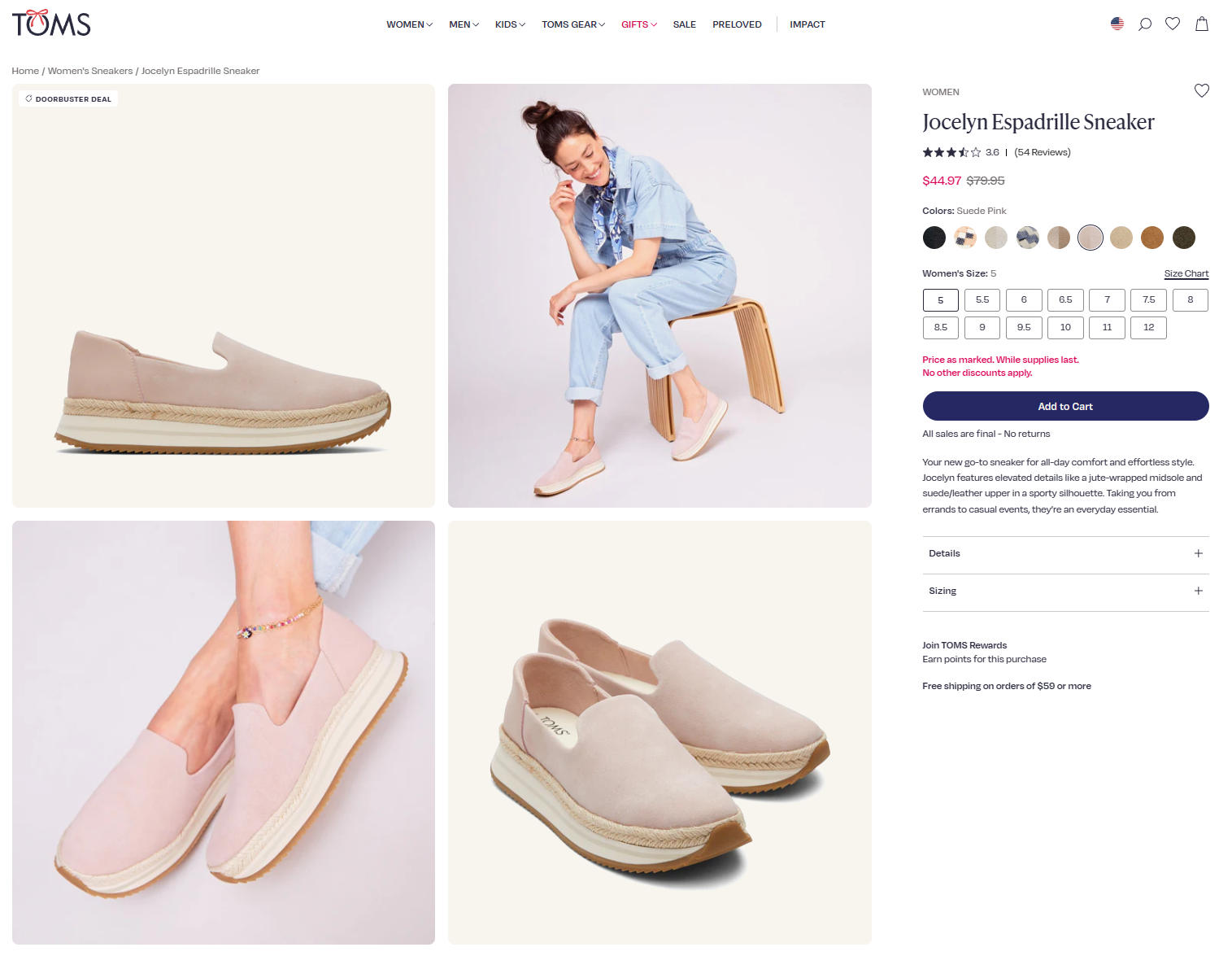
TOMS product pages feature a clean, organized grid layout for displaying product images. This grid-style product gallery lets customers see multiple product angles and colors at a glance. This is a simple and effective way to enhance the overall shopping experience.
High-quality images are crucial, as 67% of customers consider them more important than product descriptions.
By optimizing the visual display of their products, TOMS keeps customers engaged and encourages them to make a purchase.
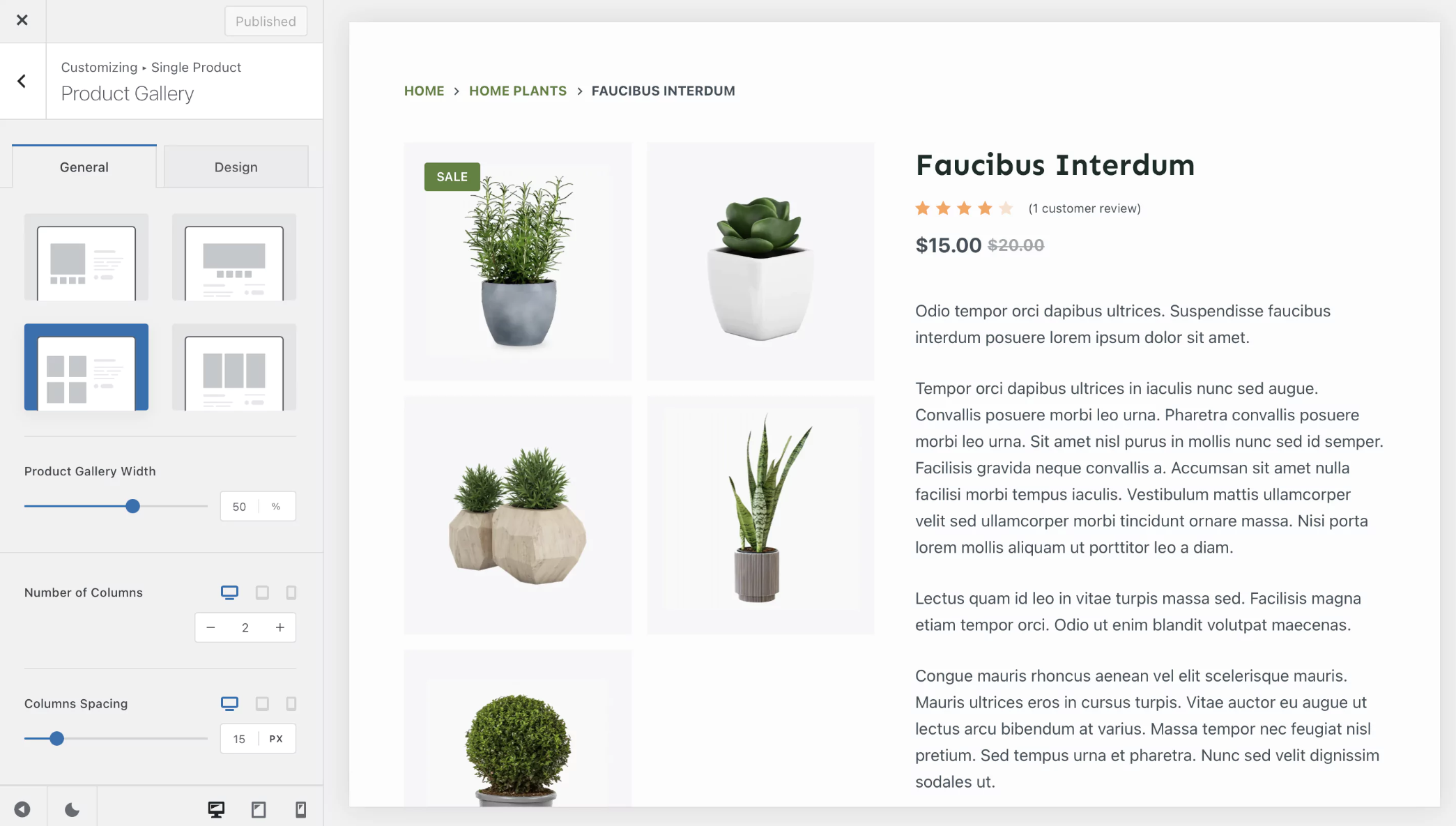
The Pro version of Blocksy lets you choose between three additional product gallery layouts. You can choose how many columns to display in the product gallery grid.
#9: Old Navy – Limited-Time Offers with Countdown Timers
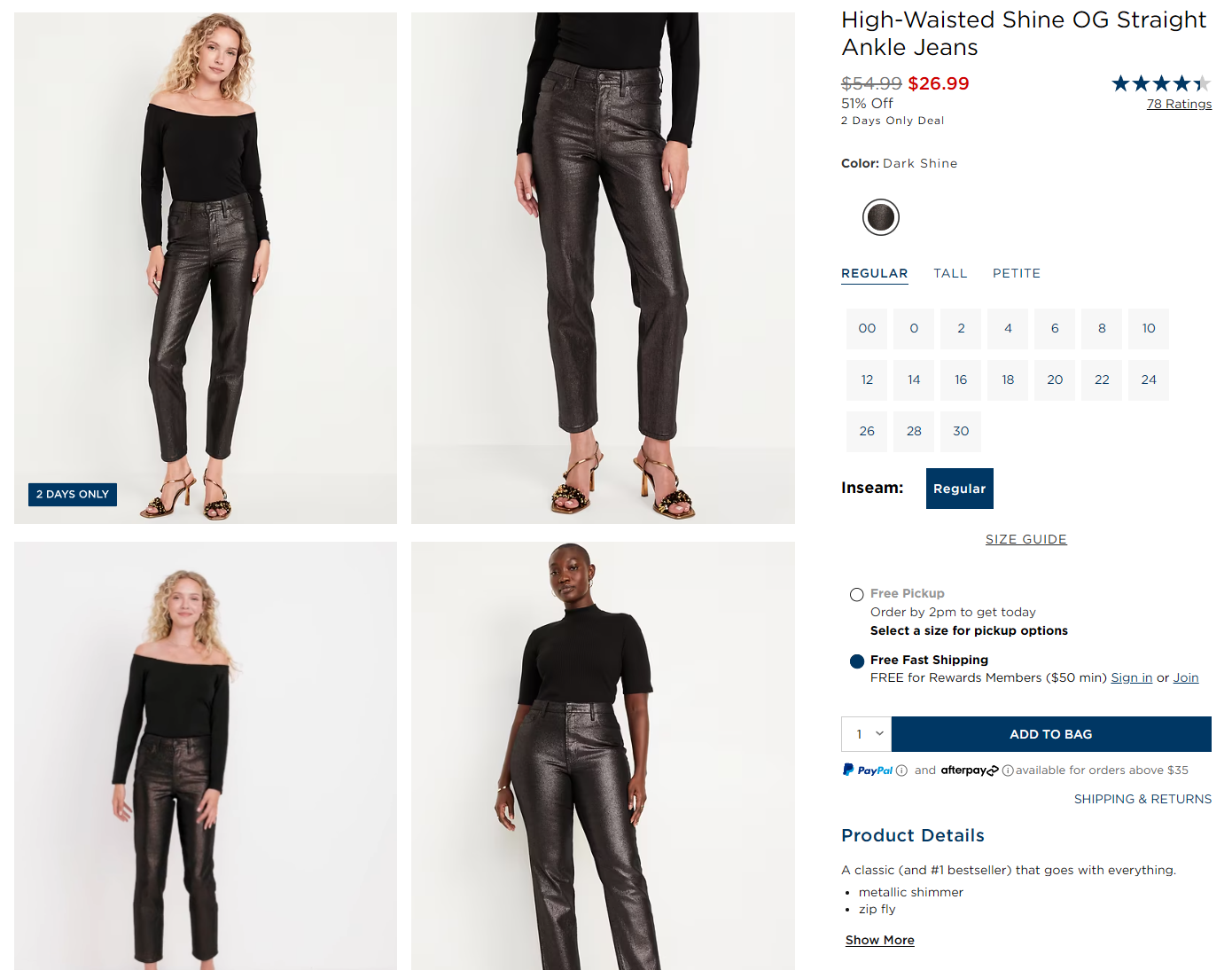
When Old Navy’s products go on sale, they feature a prominent “X Days Only” badge to highlight limited-time sales and promotional offers. This countdown creates a sense of urgency, motivating customers to act quickly before the offer expires.
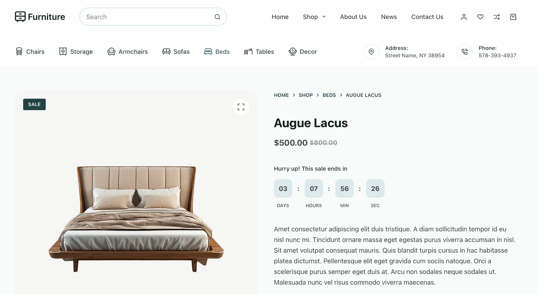
If you want to effectively use a sale countdown to encourage impulse buying, you can set up Blocksy’s Product Sale Countdown element to highlight time-limited offers on your single product pages. All you have to do is schedule the sale start date and end date from the back-end along with the sale price.
#10: Le Creuset – Floating Cart for Seamless Shopping
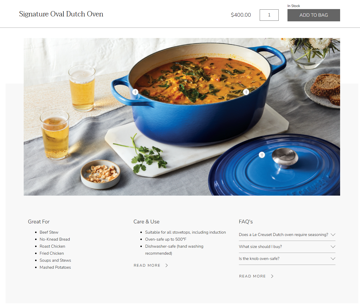
Le Creuset’s eCommerce store has a floating cart feature that allows customers to view and edit their selections without leaving the page. This feature enhances the shopping experience by making it easier for customers to add products to their cart and continue browsing without interruption.
For instance, customers can scroll down the page to learn more about the product, for example, read about what the product is great for and how to care for it properly and add the product to cart without scrolling back up. This keeps potential buyers engaged and less likely to abandon their purchase.
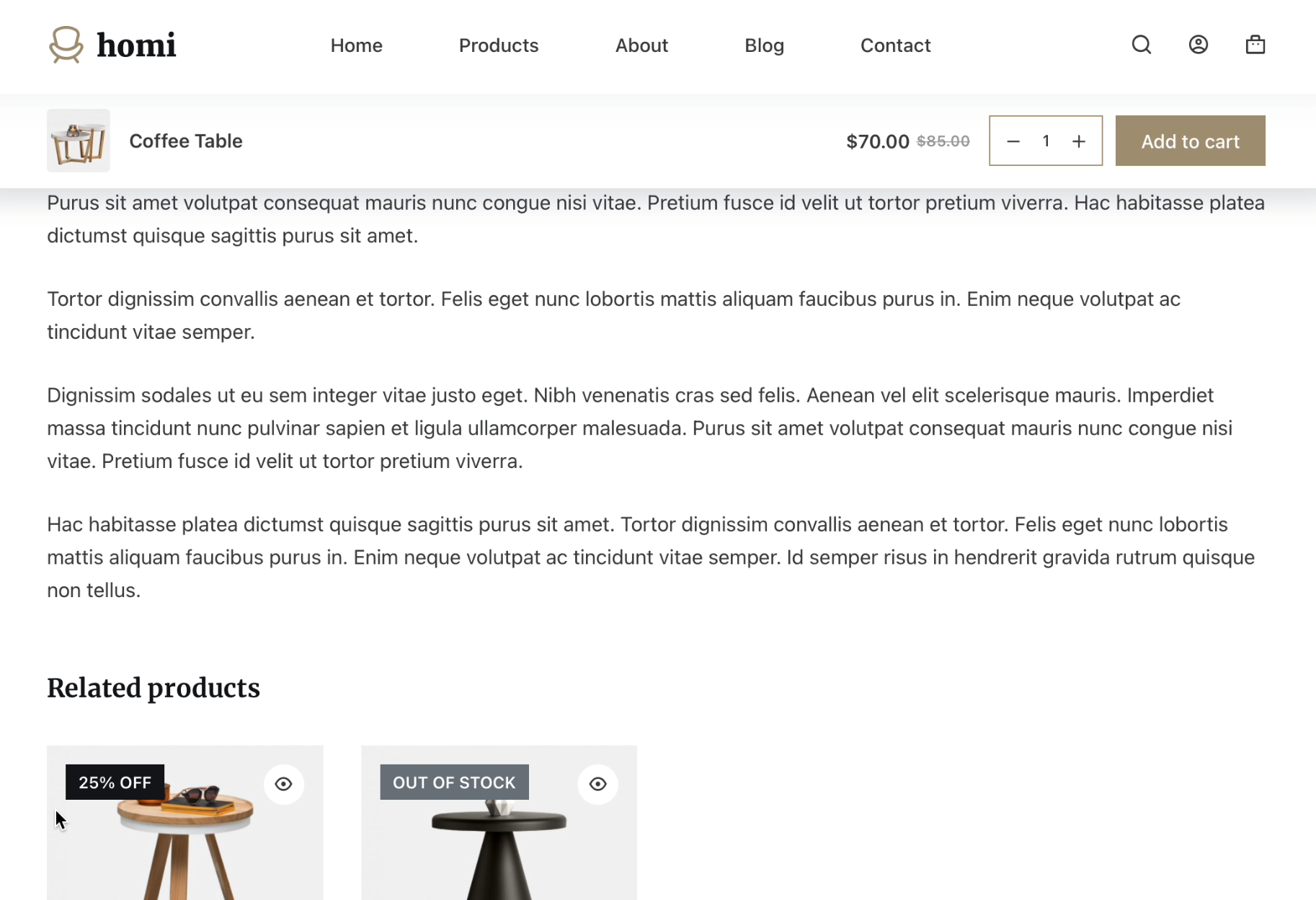
With Blocksy Pro, you can enable a floating cart on your WooCommerce store to keep customers focused on their shopping.
Conclusion: How to Apply These Strategies to Your Store
Your product pages are the make-or-break moments for turning visitors into paying customers. The examples we’ve covered show that there’s no one-size-fits-all formula for success. That said, the best stores know how to leverage unique features that enhance the shopping experience and drive conversions.
A well-designed product page isn’t just a place to showcase products. In fact, it’s an opportunity to guide your customers through the buying process, make them feel confident in their decisions, and grow your bottom line.
Ready to enhance your product pages? Get Blocksy today!

