These days, most WordPress themes make it easy to build a color palette with built-in options and visual pickers. But creating one that’s actually effective, consistent, and accessible across devices? That’s the hard part.
In this tutorial, we’ll look into how to create a highly effective color palette in WordPress that you can reuse anywhere on your site and that works with any type of content you may want to publish. To do so, we’ll use our stellar Blocksy theme, which gives you access to all of its color features in the free version.
Key Takeaways:
- Blocksy’s free version provides reusable, extensible, and fully customizable global color palettes directly from the Customizer.
- You can start with 12 pre-designed palettes or create unlimited custom ones suited to your brand.
- Update and manage colors across headers, buttons, text, and background from one place—no CSS needed.
- Blocksy palettes are accessible in Gutenberg, Elementor, and other major page builders, ensuring design consistency.
- Includes actionable guidance on color contrast, color blindness, and testing your palette across devices and modes.
Table of Contents
What Does a Highly Effective Color Palette in WordPress Look Like?
Your website’s color palette plays a crucial role in achieving a professional appearance. Whether you’re designing for non-profit websites or personal blogs, your theme largely determines the color scheme, with each theme offering its own unique approach to this essential task.
Your theme may:
- give you access to detailed color options in the WordPress Customizer
- include just some basic color options in the Customizer, e.g. let you change the primary colors of your site
- come with its own preset color palette that you can’t change from the settings, so you need to use CSS to modify the colors
The existence and popularity of color plugins prove that users often need more color options and a better manageable color system than what their theme provides them with.
However, the separation of concerns principle*, which WordPress is built around, still suggests that color should be managed by the theme rather than a plugin.
*Separation of concerns (SoC) is a frequently used software design principle that says that different tasks (i.e. concerns) should be separated into architecturally distinct sections within a software program. In WordPress, this means that the theme should be responsible for the presentation while plugins should be responsible for the extra functionality added beyond the core features, and overlaps between the two should be avoided as much as possible.
In an ideal world, your WordPress theme would provide you with detailed but easy-to-use color options that, together, form an integrated color system, which is:
- reusable so you can easily access your color palette anywhere on your site
- inspirational so you get a selection of professionally designed color palettes to work with instead of being left alone with ‘unlimited’** options
- flexible so you can save, modify, and delete your color palettes, but at the same time, you can also easily return to the default options
- comprehensive so you can easily access your palette to change the colors of any element on your site
- extensible so you can enhance your existing palettes with new colors
** In reality, the HTML color picker, also used in WordPress, gives you access to ~16.7 million colors, which is the total number of all colors in the sRGB (standard red-green-blue) color space — precisely 256*256*256 = 16,777,216, which is far from unlimited.
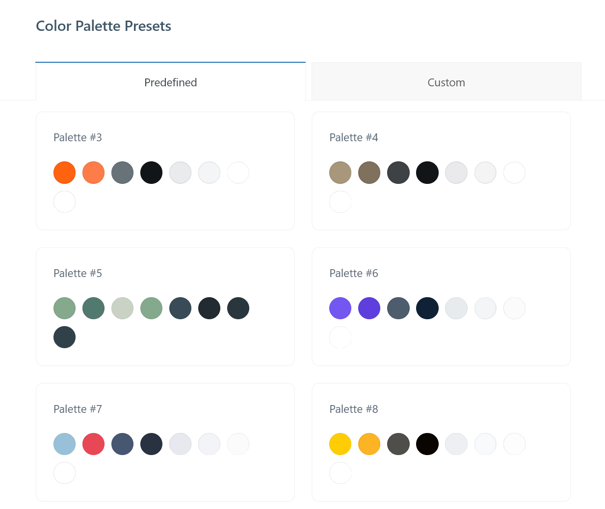
Luckily, this ideal world of color does exist in the universe of WordPress — and it’s called Blocksy. Below, we’ll see how you can use its advanced color system to create a highly effective color palette in WordPress.
Prerequisites
To follow through this tutorial, you need:
- a working WordPress install:
- the free Blocksy theme installed and activated on the WordPress site
- Blocksy’s free Renovation starter site that you can import from the Blocksy dashboard once the theme is activated
Now, let’s see in detail how to create, edit, and manage color palettes in WordPress.
1. Open the Colors Panel in the Customizer
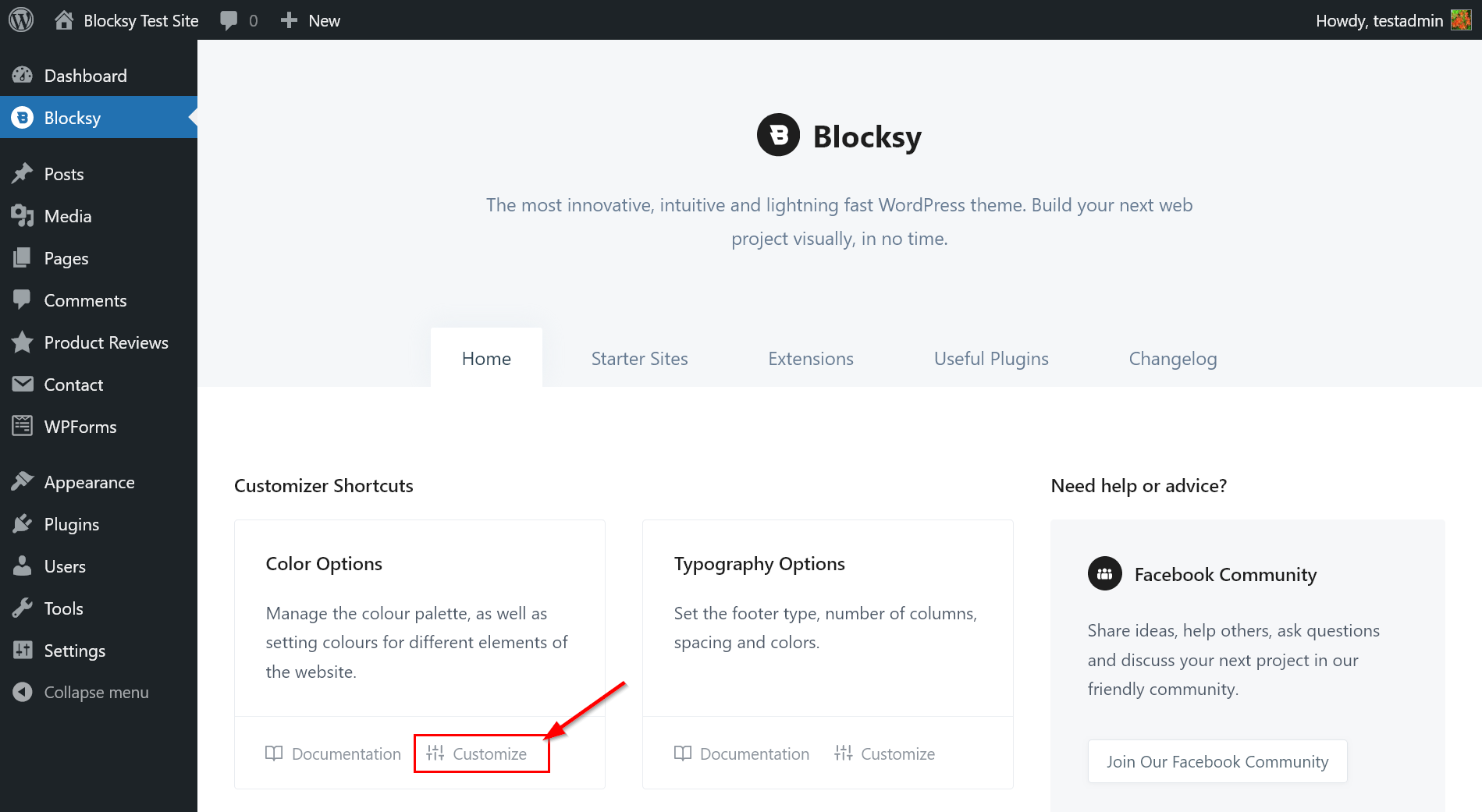
Blocksy’s global color palette options are located in the Colors panel in the WordPress Customizer.
To open it:
- either click the Customize link in the Color Options section of your Blocksy dashboard (see the screenshot below)
- or navigate manually to Appearance > Customize > General Options > Colors
2. Choose a Pre-Designed Blocksy Color Palette
Blocksy provides you with multiple professionally designed color palettes to help you get started. You can use them as-is or customize them to match your brand (see Step 3).
There are two types of pre-designed color palettes in Blocksy:
- each starter site comes with its own color palette (accessible after you import a starter site)
- it comes with 12 pre-defined color palettes that are accessible to every user
i. Use the Color Palette of Your Starter Site
When you import a starter site, it automatically adds its pre-designed color palette to the Global Color Palette option in the Colors panel.
For example, here’s the powerful orange-beige color palette of the Renovation starter site:

If you’re happy with the colors, click the three dots icon to open the utility menu, then select the Save Palette option to save the palette as is:

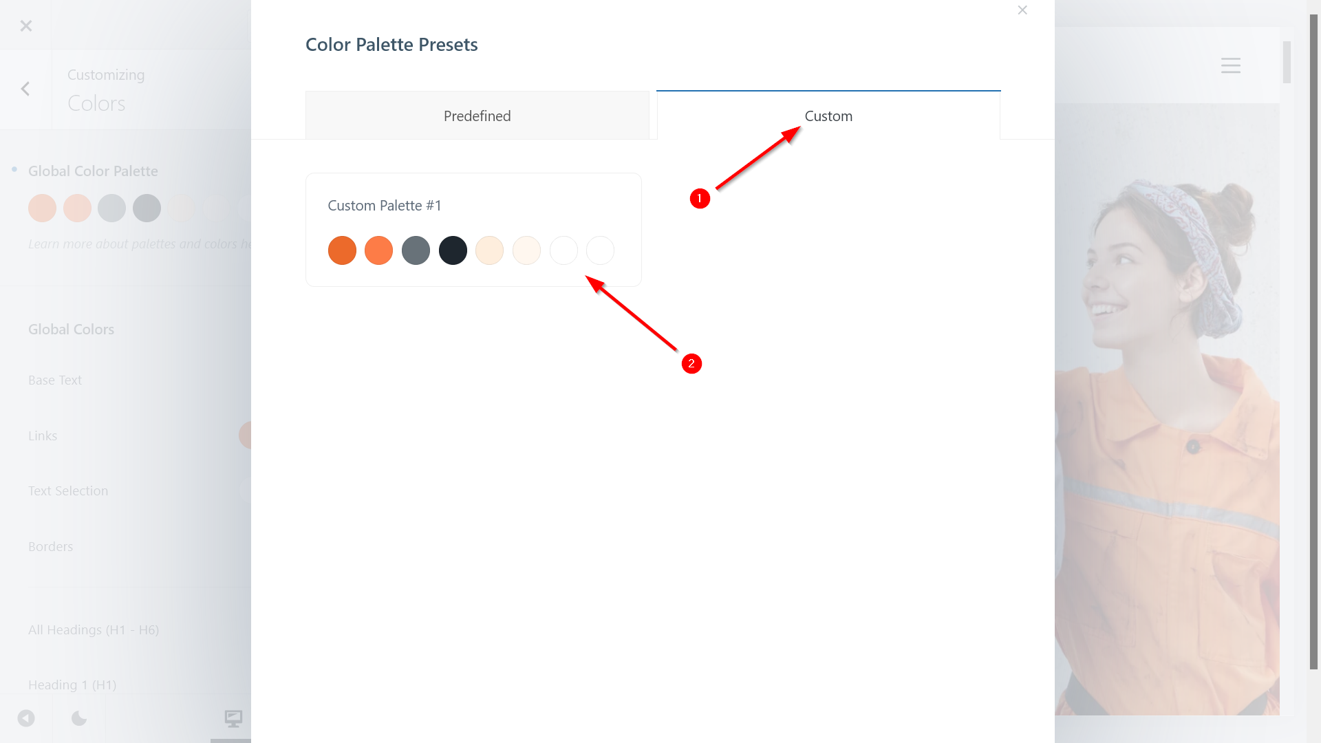
Now, if you click the Color Palettes option in the utility menu, you’ll see the color palette under the Custom tab of the Color Palette Presets modal.
You can always find the original color palette of your starter site here in case you later change the palette or colors:
ii. Enable One of the Pre-Defined Color Palettes
Blocksy comes with 12 pre-defined color palettes that you can access from the Color Palette Presets modal under the Predefined tab.
The pre-defined palettes mostly cover the primary/secondary/tertiary colors, including blue, green, orange, brown, purple, red, yellow, and more:
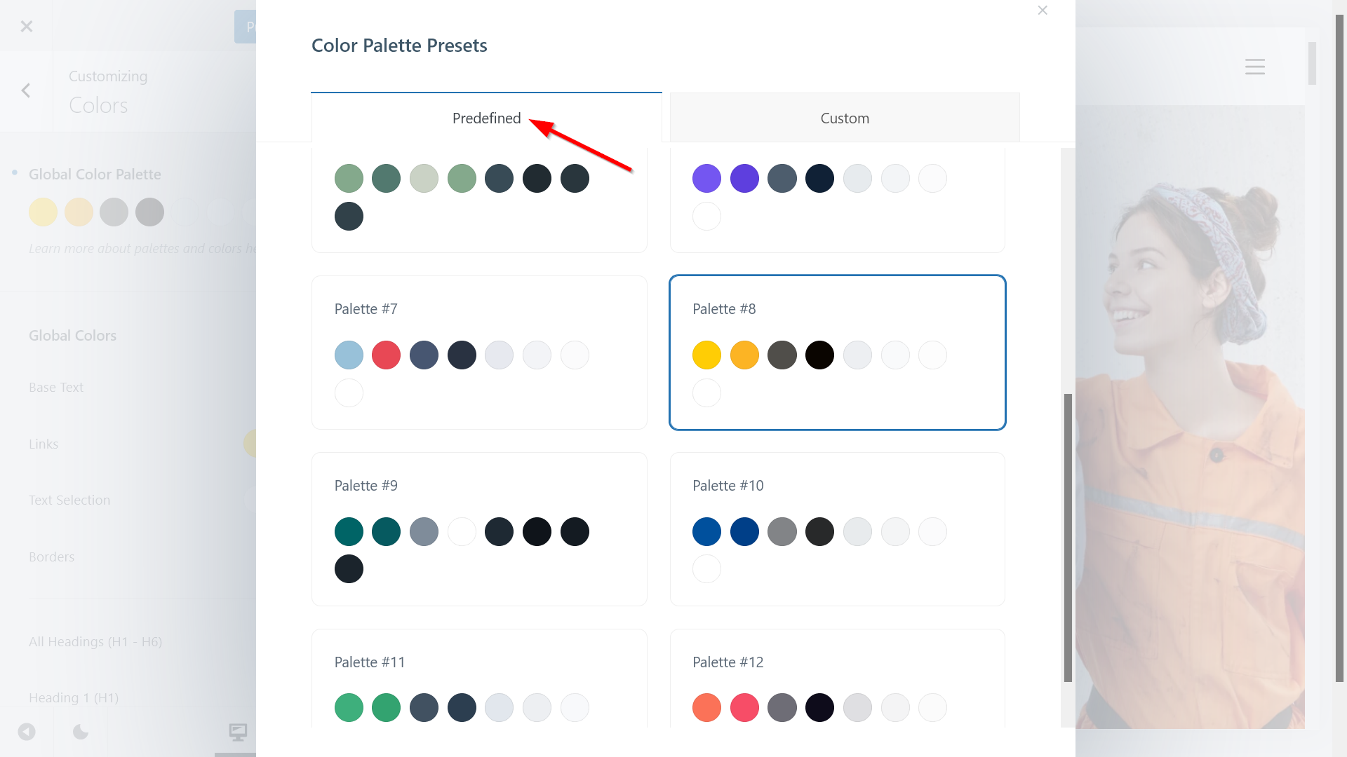
If you select any of the pre-defined palettes, the new colors will instantly appear in the live view of the Customizer.
In case you’re happy with the colors, you can leave the palette as is. If you think there’s still room for improvement, move on to the next step.
3. Add New Colors to Your Palette
There are two ways to add new colors to your active palette in Blocksy. You can:
- enhance the palette with new color swatches (in this way, you can keep the original colors)
- update the default swatches with new colors
You can also combine the two techniques above.
i. Enhance Your Color Palette with New Colors
To add extra colors to your palette, click the three dots icon and select the Add New Color option:

A new color swatch will appear under the default ones. Click into it, and a color picker will show up on the screen.
Pick the color you want to add, and Blocksy will automatically fill in the new swatch with the new color:

You can add as many extra colors as you want. If you’re not sure about how to enhance your existing color palette, you can use a color tool such as ColorHexa, which shows various color schemes for each color (you only need to copy over the hex code of the color).
For example, below, I added the complementary and split complementary colors of the primary orange color:

When you’ve added all the extra colors you wanted to your palette, click the Save Palette option.
As you can see below, now we have two custom color palettes in the Color Palette Presets modal:
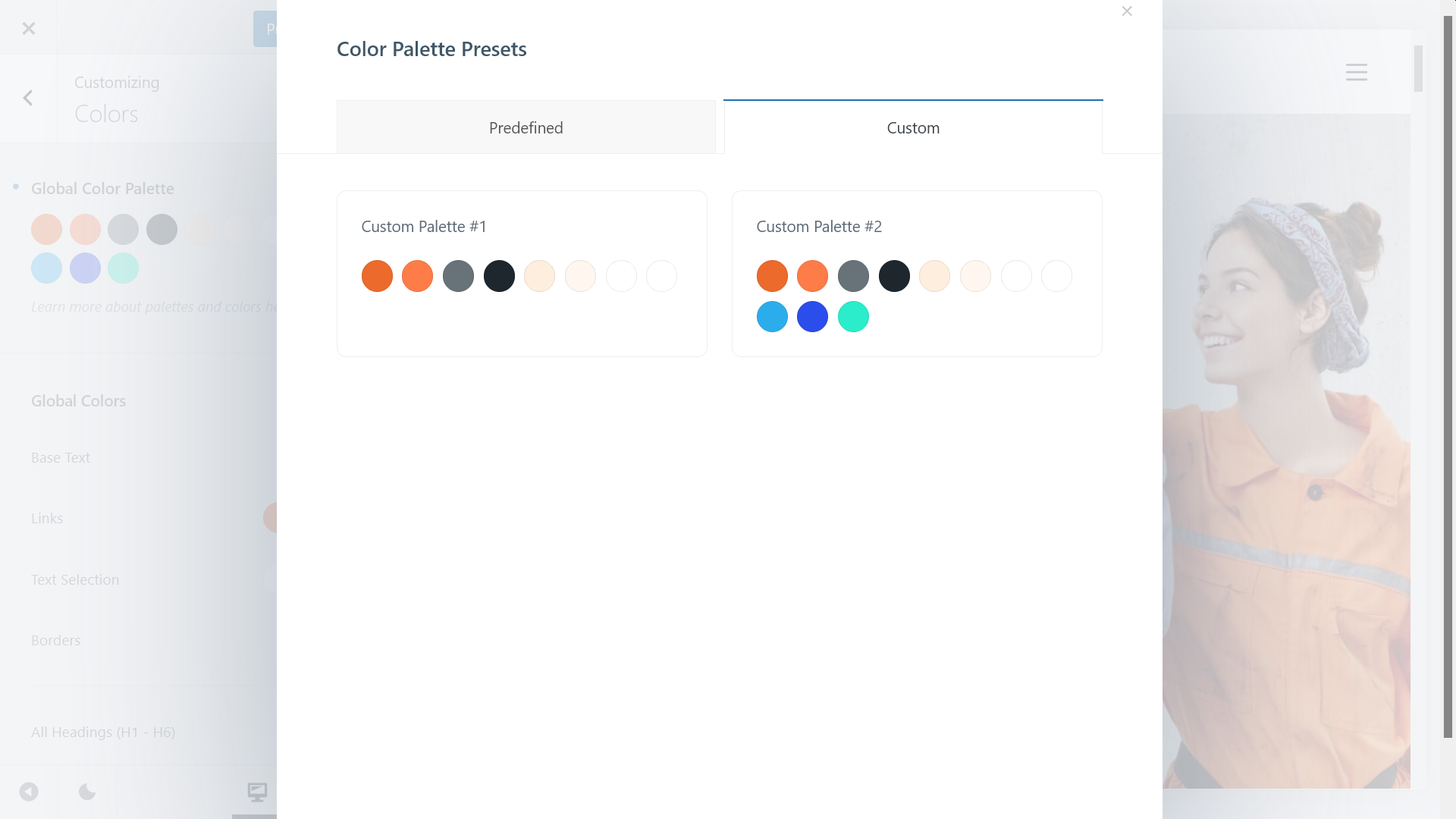
With Blocksy, you can save as many custom color palettes as you want. You can delete a custom palette by hovering your cursor over the top-right corner of the palette and clicking the little bin icon that appears on hover.
ii. Update the Default Swatches with New Colors
If you don’t want to enhance your palettes with new swatches but would rather update the default ones, simply click into the swatch you want to change and add the new color using the color picker:

As you can see in the screenshot above, the new color has been automatically added to the Links and Text Selection fields. This is because Blocksy assigns a color from your palette to each global element by default — however, you can change the default color assignments if you want to (we’ll see how to do so in Step 4).
Another thing that you may have noticed is that the text color of the ‘Making your vision become a reality’ headline in the hero section has changed too. This is because the belonging heading block assigns the first color of the palette to the highlighted text. As soon as you update a color in the palette, Blocksy recolors all the elements assigned to it (we’ll see how to use the color palette in the block editor in Step 6).
When you’re done updating your color palette, click the Save Palette option. As you can see below, now we have three custom color palettes:
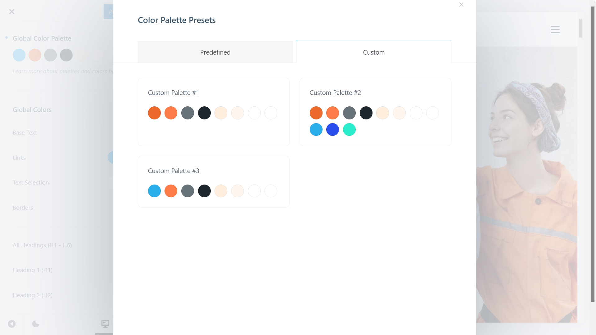
Useful Tip: Return to the Default Color Palette
Any time you get stuck with your color configuration and want to return to the default palette, click the little blue dot icon shown left to the Global Color Palette option.
This is, in fact, an Undo button that lets you undo all the changes (Blocksy shows this handy Undo icon next to each of its Customizer settings):
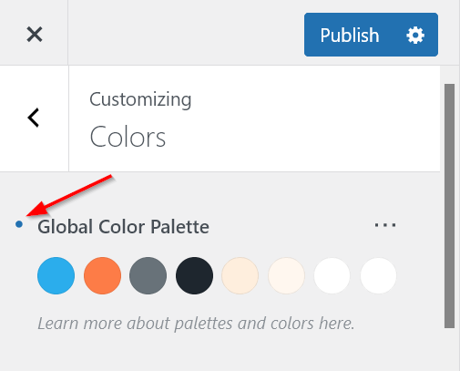
The default palette is Palette #1 from the Predefined tab of the Color Palette Presets modal. The global color palette is updated as soon as you click the Undo icon:
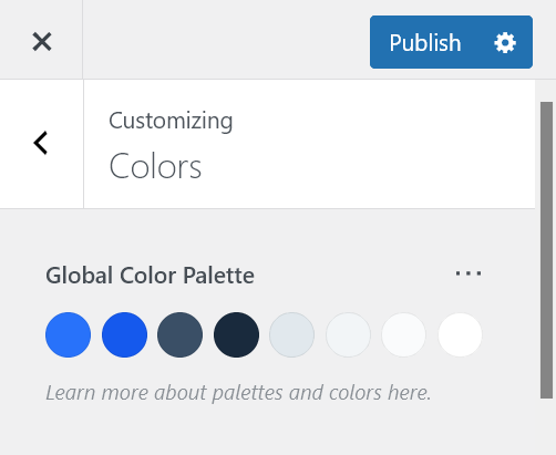
4. Define the Colors of Your Global Elements
You can find the Global Colors options below the Global Color Palette section in the Colors panel.
These options cover the most frequently used elements on a typical WordPress site, including the base text, links, text selections, borders, and headings (H1 – H6), as well as the background of the site.
Blocksy automatically assigns a starting color to each element. For example, ‘Color 1’ is used for the background of the Text Selection setting:
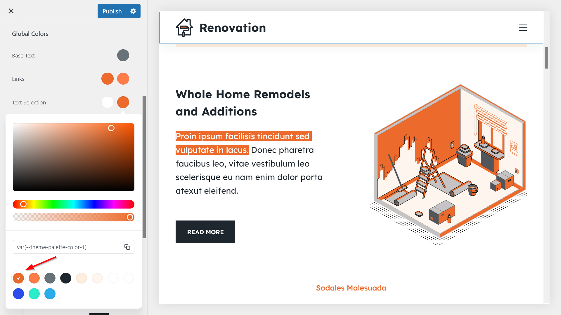
Since your color palette shows up under the color picker, you can replace the initial text selection background color with another one from your palette with a single click.
As soon as you click the color you want to use, the updated text selection background color will appear in the live view of the Customizer (note that you need to highlight some text to see how the text selection changes):
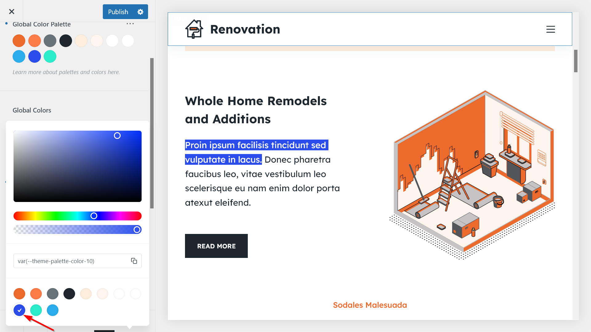
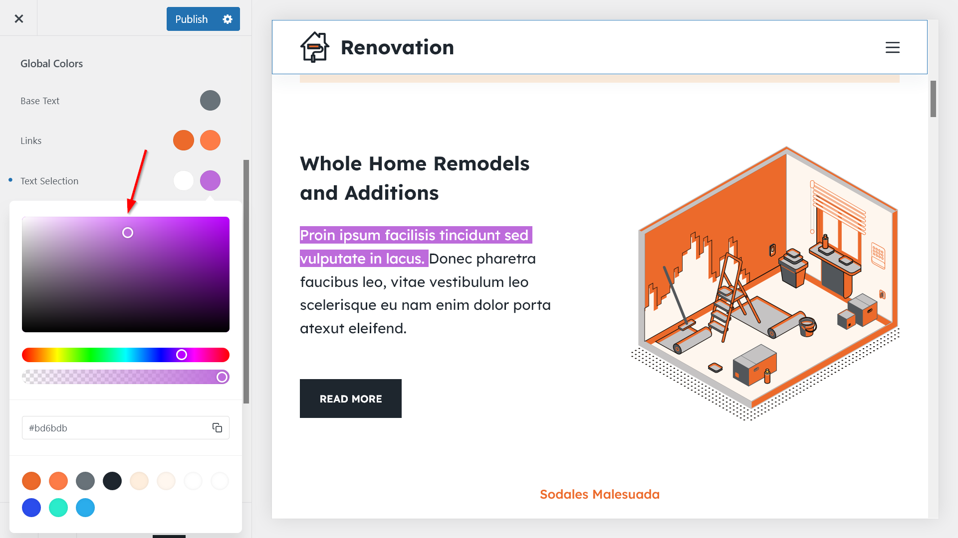
If you don’t want to use a color from your palette, you can also use the color picker to assign another color to the element (however, we do recommend that you save all the colors you use on your site for future access):
5. Access Your Color Palette from Other Parts of the Customizer
You can access your color palette from any color setting of the Customizer, too. In this way, you don’t have to copy-paste hex codes if you want to change the colors of the header, footer, sidebar, blog posts, pages, buttons, and other elements of your WordPress site.
Let’s see a few examples of how the color palette appears in other parts of the Customizer. The workflow is the same as before: you click into the color you want to change, and when the color options appear on the screen, you choose another color from your palette (or use the color picker).
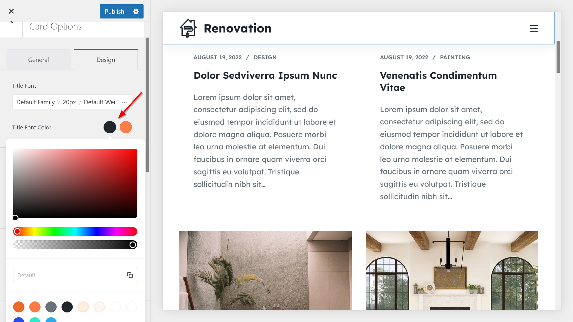
Example 1: Change the Title Font Color of Your Blog Archive Page
If you go to the Post Types > Blog Posts > Card Options > Design panel in the Customizer, you can update the colors of each element that appears on your blog archive page such as the title font:
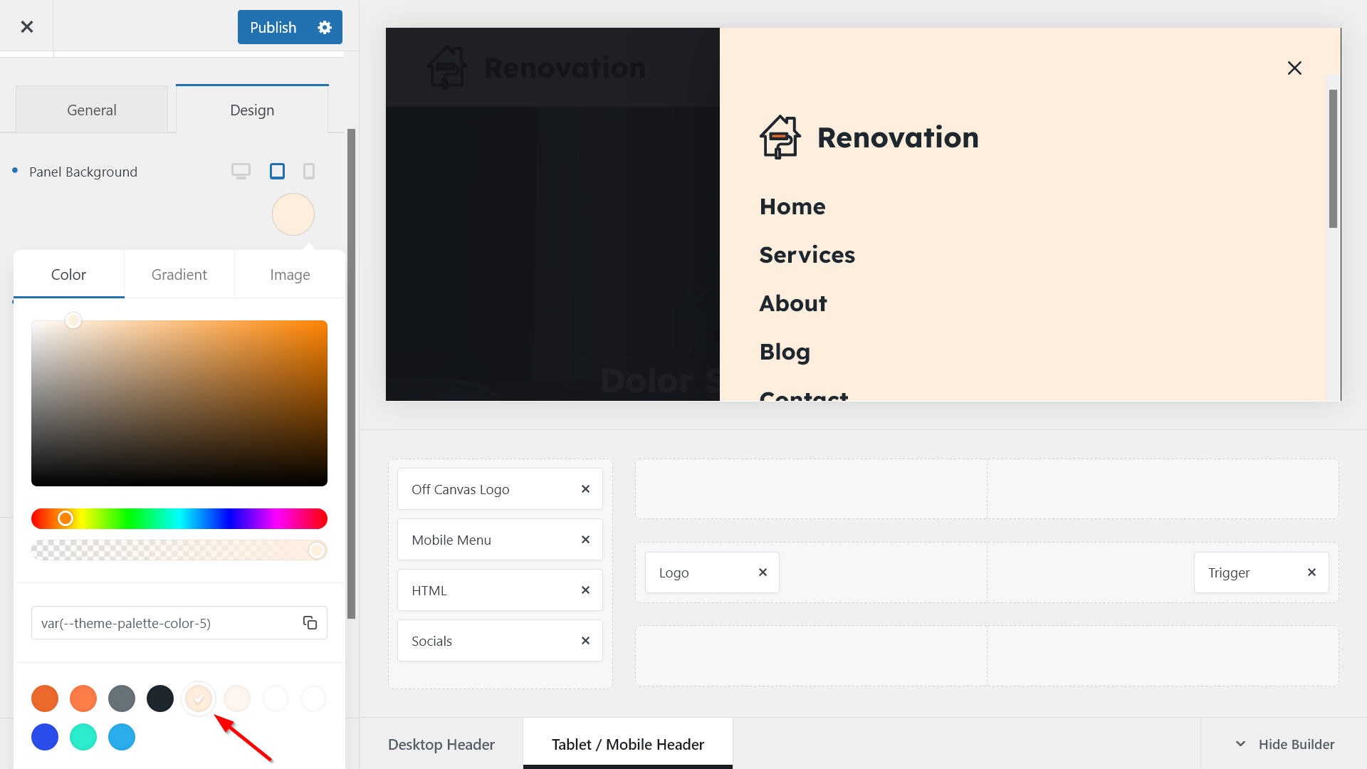
Example 2: Update the Background Color of Your Offcanvas Menu
Your color palette is also available for every element in the header and footer builders.
In the screenshot below, you can see how you can change the background color of your offcanvas menu using your color palette:
Example 3: Recolor Your Buttons
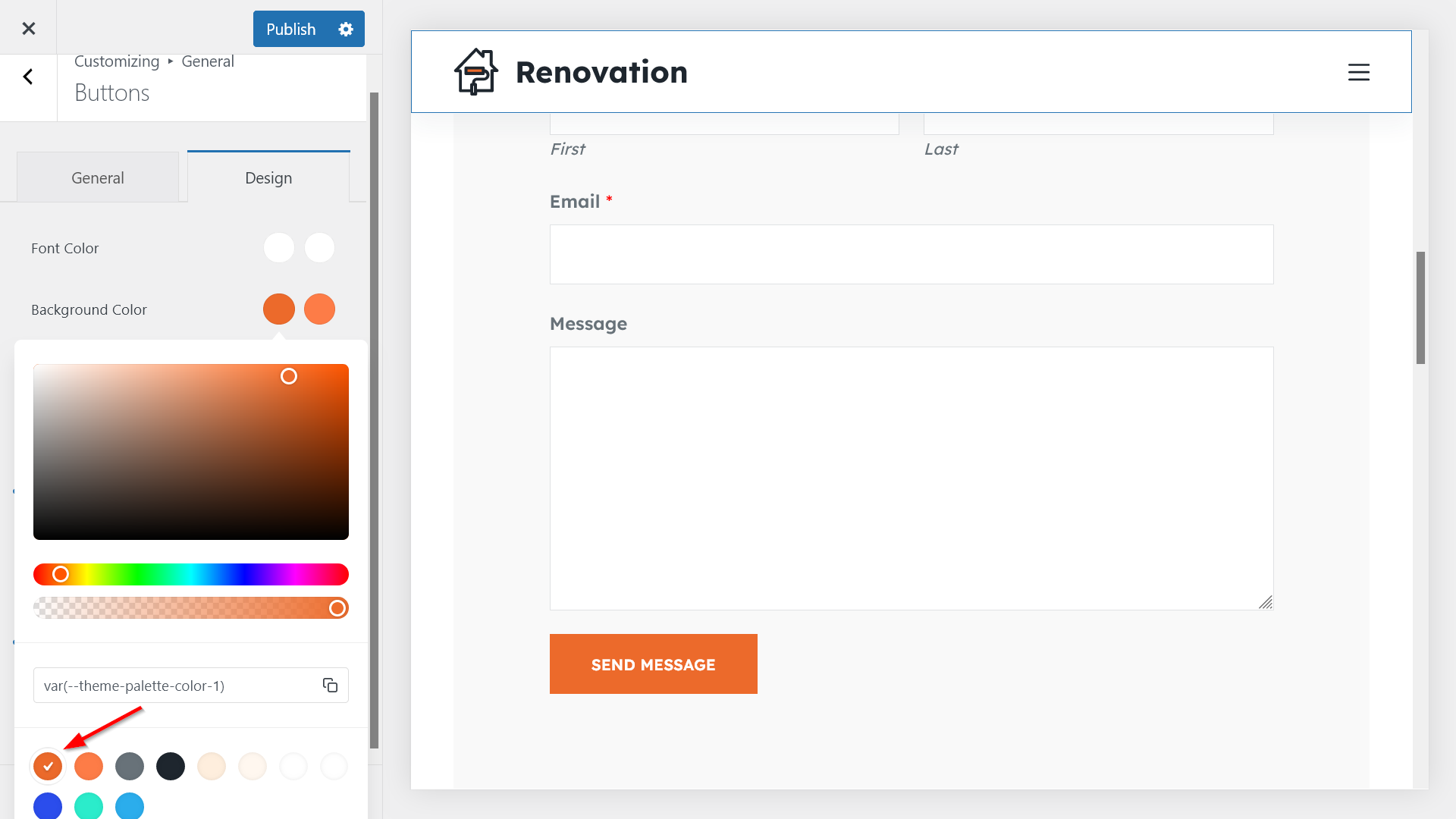
Blocksy assigns the first color of your palette to the background color of your buttons by default.
You can change it by going to General Options > General > Buttons > Design and choosing another color from your palette:
6. Color Your Blocks and Page Elements
Your color palette is also accessible from the block editor and the page builders supported by Blocksy (i.e. Elementor, Beaver Builder, Brizy, and Zion Builder).
i. Use Your Color Palette in the WordPress Block Editor
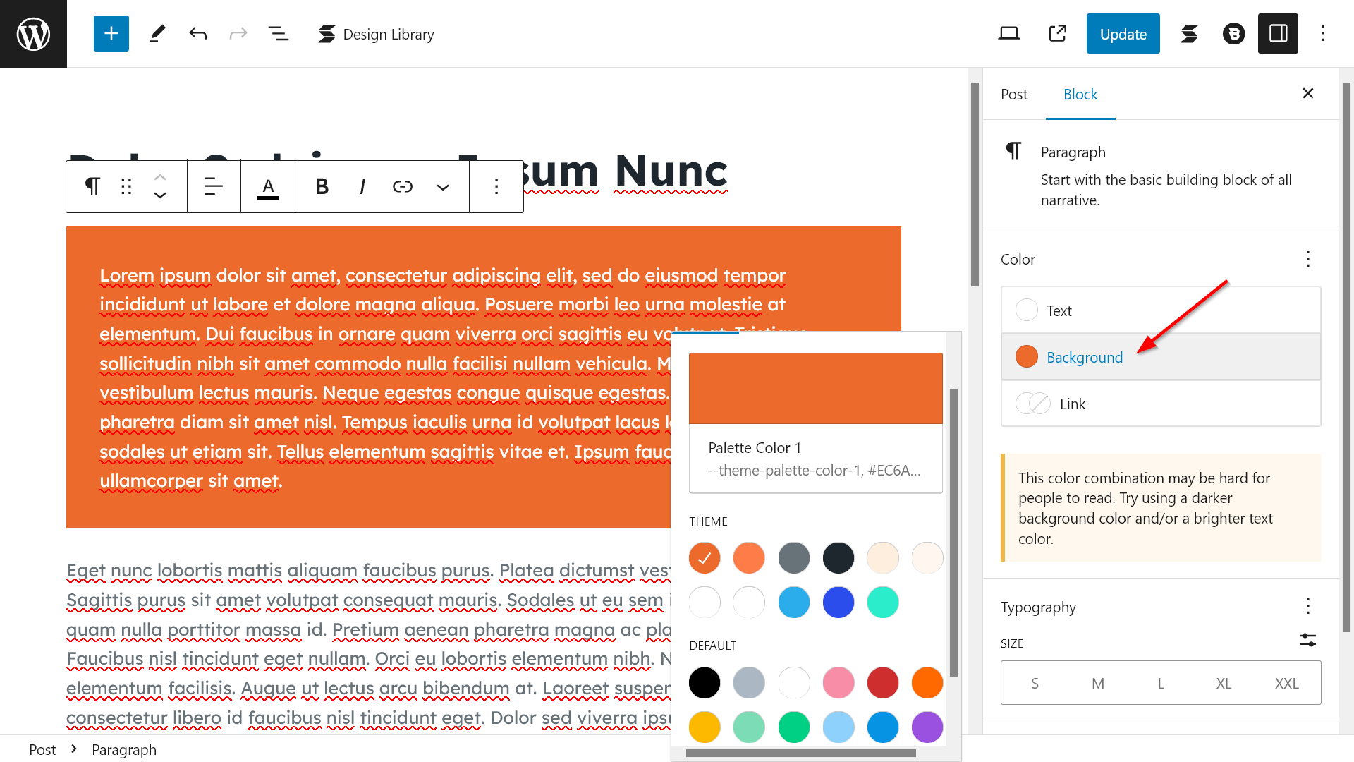
In the block editor, Blocksy shows both your custom color palette (under the THEME heading) and the default colors of the Gutenberg editor (under the DEFAULT heading).
For example, here’s how you can change the colors of the paragraph block (the color palette shows up in every block where it’s applicable):
In addition to the default Gutenberg blocks, Blocksy also supports third-party block plugins such as Stackable.
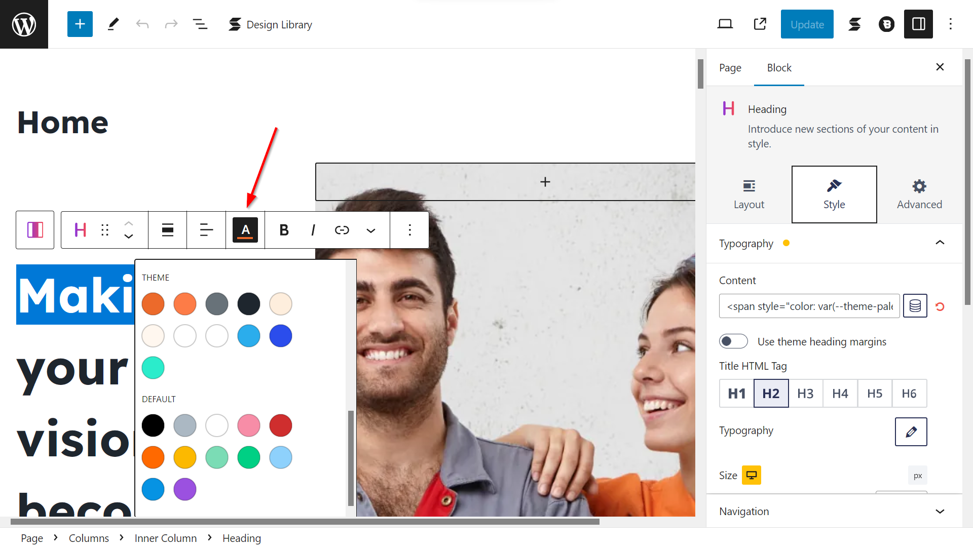
For example, the pages of the Renovation starter site are built with Stackable. If you open the Home page (Pages > All Pages > Home) and click into a Stackable block, you can access both your custom color palette and the default Gutenberg colors:
ii. Access Your WordPress Color Palette from Elementor
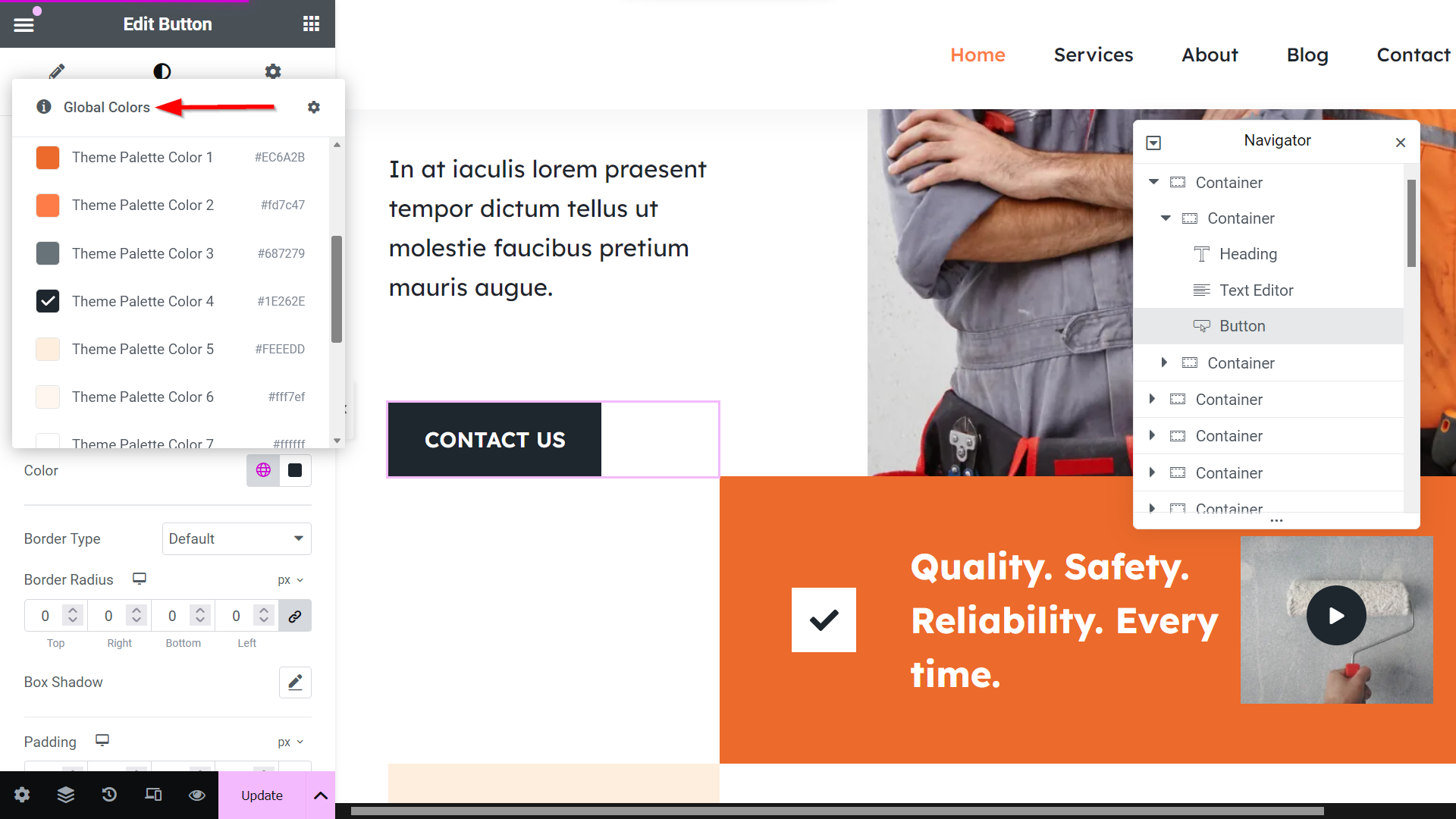
Your global color palettes also show up in the user interfaces of the supported page builder plugins.
For example, here’s how it appears in the design settings of the Button element in Elementor:
Practical Tips for Choosing Effective Colors
- Your color palette should reflect your brand’s personality and values
- Research color psychology to understand how colors influence emotions and decisions. For example:
- Blue conveys trust and professionalism.
- Yellow evokes optimism and creativity.
- Make sure your text and background colors have enough contrast to be easily readable for all users, including those with visual impairments.
- Use tools like the WebAIM Contrast Checker to test contrast ratios and ensure compliance with WCAG (Web Content Accessibility Guidelines).
- Avoid color combinations that may be hard to distinguish for color-blind users, such as red and green.
- Colors can appear different on various screens due to differences in display settings and lighting. Test your palette.
- Consider how colors appear in light mode and dark mode, especially if your site offers both.
- Stick to a core palette of 4-6 colors:
- Primary Colors: Used most frequently (e.g., for buttons and headers).
- Secondary Colors: Used for accents and highlights.
- Neutral Colors: are commonly used for backgrounds and text (e.g., white, gray, black).
- Avoid using too many colors
| Feature | Blocksy Theme | Default WordPress Themes |
|---|---|---|
| Custom Global Color Palettes | Yes – Unlimited palettes with presets | Limited color palette wordpress or none |
| Access to Color Picker | Full access in Customizer and editor | Only basic options or CSS needed |
| Reusable Colors Across Site | Integrated into Gutenberg, Elementor, etc. | Manual application required |
| Predefined Color Schemes | 12 professional palettes + starter palettes | Few, often uneditable |
| Assign Colors to Global Elements | Text, background, links, buttons, etc. | Often only headings or links |
| Dark Mode & Contrast Awareness | Easy to implement with Blocksy tools | Requires custom setup or plugins |
| Extensibility & Custom Colors | Add/delete/update swatches dynamically | Typically not supported |
| User Experience | Intuitive visual control for non-coders | Often requires theme code editing |
FAQ: WordPress Color Palettes
Can I save multiple color palettes in WordPress?
Yes, using themes like Blocksy, you can create and save multiple custom color palettes directly in the Customizer.
How do I apply my global color palette to individual elements?
Once set, your global color palette becomes available in all Customizer sections and supported page builders, allowing you to apply consistent colors to headers, buttons, backgrounds, and text with a few clicks.
What’s the difference between theme color settings and plugin-based color tools?
Theme-based color settings manage visual presentation as part of WordPress best practices, while plugins add extra functionality. Relying on theme settings ensures better performance and design consistency.
Is Blocksy’s color system available in the free version?
Yes, all global color palette features described in the article, including custom palette saving and assignment, are available in Blocksy’s free version.
Can I reset my color palette to default if I make a mistake?
Yes. Blocksy includes a one-click undo icon next to each color setting in the Customizer, allowing you to revert to the default palette easily.
Next Steps
In this tutorial, we looked into how to create a highly effective color palette in WordPress using the reusable, inspirational, flexible, comprehensive, and extensible color system of our free Blocksy theme.
To get started with smart color management in WordPress, install and activate Blocksy, import a starter site, open the color options — then immerse yourself in the world of color.
Learn how to easily create transparent headers with Blocksy in our guide.
In our next tutorial about WordPress and color, we’ll look into how to add dark mode, including a separate dark mode color palette, to your WordPress site. Stay tuned.

