A transparent or overlay header is a modern and stylish design element that allows the underlying content to shine through. Unlike traditional headers that are visually separated from the rest of the page, transparent headers create a seamless blend, enhancing the overall visual appeal and user experience of your website.
In this guide, we’ll explore the concept of a transparent header, its significance in web design, and how you can easily create one using the Blocksy WordPress theme. This time it will be incredibly easy, because we have already prepared everything for you, as usual. 😎
Table of Contents
Key Takeaways
- Transparent headers = modern design – they blend navigation into hero images or videos, creating a seamless, stylish first impression.
- Used by top brands – Netflix, SpaceX, and Zara leverage transparent headers to highlight visual storytelling and product showcases.
- Easy setup in WordPress with Blocksy – Blocksy’s header builder makes enabling, customizing, and managing transparent headers straightforward, even on free plans.
- Optimize for readability & performance – use semi-transparent overlays, minimal menu items, and optimized background images/videos to ensure usability.
- Sticky headers boost navigation – combining transparency with sticky functionality keeps menus accessible while users scroll.
What is a WordPress Transparent Header?
A transparent header is the navigation top section of a website that overlaps the content below instead of being a visually separated section. Transparent headers are often used to create a modern and stylish look for the website.
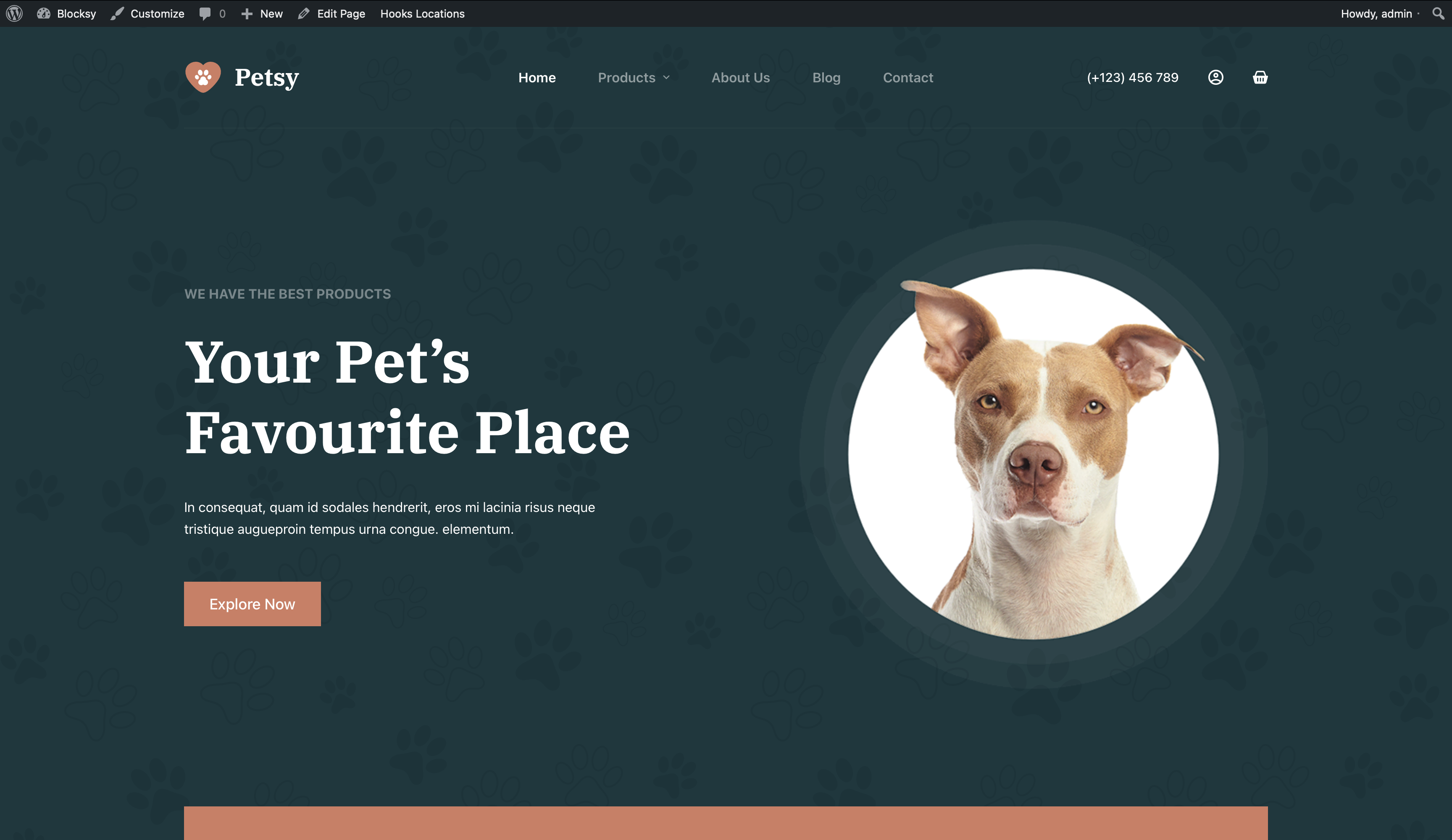
They can also be used to highlight specific content on a page, such as a hero section or a product gallery. This design element has gained immense popularity in recent years, gracing the websites of renowned brands and creating visually stunning effects.
Transparent headers became popular in the early 2010s, as web design trends began to shift towards a more minimalist and modern aesthetic.
One of the earliest examples of a transparent header was on the Airbnb website, which launched in 2008. Airbnb used a transparent header to showcase its beautiful vacation rental listings. Other companies, such as Apple, Netflix, and Google soon followed suit, and transparent headers quickly became a common design element on websites across the web.
Today, transparent headers are widely used by websites of all sizes and industries. They are a popular choice for websites that want to create a modern and stylish look.
Examples of Websites with Transparent Headers
Netflix: Netflix’s homepage features a Transparent Header that showcases its latest and most popular movies and TV shows while maintaining a visually captivating effect.

SpaceX: On the SpaceX homepage, a transparent header blends seamlessly with an image of the night sky captured by a wide-angle camera. This makes the page a little more special.

Zara: Zara’s website greets its users with an elegant and luxurious video that works perfectly with the transparent header navigation.

As you see, this design technique has become increasingly popular.
With Blocksy you can create a transparent header like on these big brands websites in just a few clicks. We’ve already made it work perfectly on all devices and in all modern browsers. And what’s even better is that it’s available in the free version of Blocksy.
When to Use a Transparent Header
Design choices matter here — research shows that 94% of first impressions are design-related, so using transparent headers strategically can directly impact how visitors perceive your brand.
Transparent headers are a good idea to use when you want to –
- Create a modern and stylish look for your website.
- Highlight specific content on a page, such as a hero section or a product gallery.
- Focus on the background image or video.
- Make your website more visually appealing and clear.
Example use cases for transparent headers –
- A page with a large hero image or video that you want to showcase.
- A page with a minimalist design and want to create a more seamless look.
- A page with a parallax scrolling effect.
- A page where you want to highlight a specific section of the content.
- A page where you want to create a sense of depth and perspective.
When using a transparent header, it is important to choose a background image or video that is high-quality and visually appealing. It is also important to use a light colour palette for your header elements so that they are easy to read against the background.
Here are some additional tips for using transparent headers effectively –
- Be mindful of the contrast between your header elements and the background. If the contrast is too low, your header elements may be difficult to read.
- Test your transparent header on different devices to make sure that it looks good and functions properly on all screen sizes.
- Use transparent headers sparingly. Too many transparent headers on your website can make it look cluttered and unprofessional.
- Use a sticky header so that your visitors can always see your navigation menu, even when they scroll down the page.
How to Create a Perfect Transparent Header in Blocksy
To create a transparent header using the Blocksy theme, please follow these steps –
- Go to Appearance > Customise.
- Click on the Header tab.
- Click on the Global Header settings.
- Enable the transparency functionality toggle.
- Add/Edit Display Conditions.
- Click on the Publish button.
In the display conditions, you can choose specific rules for when to leave the transparent functionality enabled, for example: on the home page, certain archive pages, dynamic page categories, specific pages, etc.
In the Pro version of Blocksy, you can create multiple headers and have completely different headers for different products, archives or pages, etc.
Once you have enabled the transparency functionality, it’s time to pay attention to the details to bring your idea to the desired result –
- Use a different colour palette specifically for your header elements’ transparent state so that they are easy to read against the background.
- Make sure that your header elements are spaced evenly and that there is enough contrast between them and the background.
- Double-check the layout and look for different screens like desktop, tablet, and mobile.
- Use a sticky header so that your visitors can always see your navigation menu, even when they scroll down the page.
- Remember that as an option you can choose a semi-transparent background to make elements more easy to read if that complements your design idea.
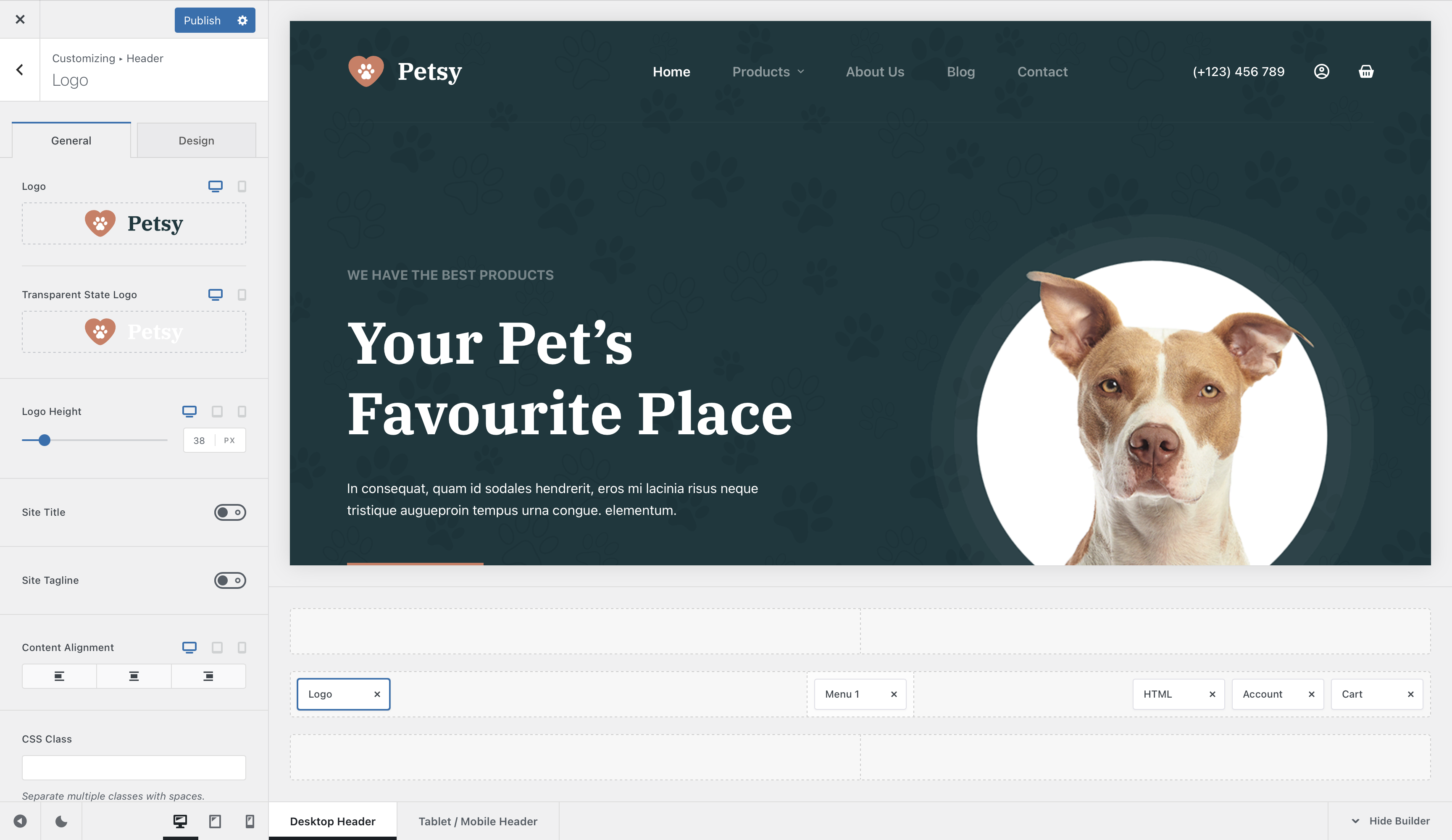
Blocksy’s header builder itself is packed with features, allowing you to customise every element of your header for different screen sizes and states, including –
- Regular, sticky, and transparent header states: logo, menu, mobile off canvas modal trigger, account modal, shopping cart, search modal, social media icons, button, and custom HTML with shortcode support. All with separate colours for each state.
- In Pro version: search box, wish list (favourite products), advanced shopping cart functionality (modal off-canvas cart as in Shopify), language switcher, separator, contact module, desktop off canvas area, multiple menu areas, the ability to choose custom icons, and the ability to duplicate elements.
Customise everything, from colours and borders to shadows and label visibility.
In short, Blocksy’s header builder has everything you need to create a unique and professional header for your website, and even more.
In Blocksy 2, we’ve improved the off-canvas cart, added an advanced dropdown for the account icon, and new elements such as a comparison table, a content block integration element, and more.
Tips for Optimizing Transparent Headers
- Use Semi-Transparent Overlays for Better Contrast. Transparent headers look stunning, but they can compromise readability if the background is too complex. Adding a semi-transparent overlay (a light or dark gradient) to your header helps maintain text visibility and ensures elements like menus and logos stand out. Use CSS or your theme’s built-in settings to apply a 50% opacity overlay to the background of your header.
- Test Across Devices and Resolutions. Transparent headers often behave differently on varying screen sizes. What looks perfect on a desktop might obscure content on a mobile device. Test your transparent header on multiple devices (desktop, tablet, mobile) and screen resolutions to ensure consistent aesthetics and functionality. Use Chrome DevTools or online testing tools like BrowserStack to preview your site on different screen sizes.
- Optimize Images and Videos to Prevent Slow Load Times. Background images and videos are key components of transparent headers but can slow down your site if not optimized. Compress images using tools like TinyPNG or Squoosh and ensure videos are in lightweight formats (e.g., MP4). Lazy-loading techniques can further enhance performance by deferring non-critical content. Use next-gen formats like WebP for images and avoid videos larger than 2MB for headers.
- Maintain Sufficient Padding and Spacing. Transparent headers blend seamlessly into the content below, but this can cause overlapping issues. Add enough padding or spacing between the header and content to maintain visual balance and ensure clickable elements are easily accessible. Adjust the “top margin” or “padding” settings in your theme’s customizer for better separation.
- Choose Minimalistic Header Elements. Since transparent headers emphasize the background, avoid overloading them with excessive elements like large logos or too many menu items. A minimalistic design ensures a clean, modern look and keeps the focus on your content. Limit your navigation menu to 5–7 items and use concise text for links.
- Leverage Sticky Headers for Navigation. Transparent headers can disappear as users scroll, leaving them without navigation options. Implement a sticky header that remains visible at the top of the page as users browse your site. In Blocksy, enable the “Sticky Header” option and customize its design for usability.
The Usability of Transparent Header in WordPress
Transparent headers are a modern and stylish way to enhance the look and feel of your website. They can be used to highlight specific content, create a sense of depth, and improve the overall user experience. It allows the background image or video to shine through, creating a visually stunning effect.
We explored what a transparent header is, when to use it, and how other well-known companies incorporate it into their designs.
If you are considering using a transparent header, be sure to choose a high-quality background image or video, use a light colour palette for your header elements, and consider using a sticky header. Read how to add a sticky header in WordPress with Blocksy. You should also be mindful of the contrast between your header elements and the background, and make sure that your transparent header looks good and functions properly on all devices and screen sizes (which is super easy when you use the Blocksy theme).
Remember that while transparent headers can elevate your site’s appearance, it’s essential to use them on purpose to avoid clutter and maintain a professional look. When done right, a transparent header can captivate your audience and provide a modern and stylish touch to your web design.
