Cumulative Layout Shift (CLS) is a user experience metric that assesses the visual stability of a web page by quantifying all the unexpected layout shifts happening over its lifespan. It’s one of Google’s Core Web Vitals, which means that your Cumulative Layout Shift scores impact your search engine rankings.
Moderate to high CLS scores often frustrate users, causing them to leave your site prematurely. In fact, layout instability has even been exploited for deceptive purposes in the past. That’s why Google treats this metric seriously – and optimizing it can improve your search rankings.
Optimizing Cumulative Layout Shift in WordPress is a fairly straightforward task if you just have a basic blog or content site that doesn’t include (m)any:
- ‘moving’ elements, such as sliders and animations
- third-party JavaScript embeds that are loaded asynchronously, such as ads
- elements that may take longer to render, such as custom fonts
However, optimizing Cumulative Layout Shift becomes harder as the complexity of your website grows.
The good news is that the WordPress core comes with some default features that can help you improve Cumulative Layout Shift.
Beyond that, your CLS results in WordPress mainly depend on your theme and content plugins that add extra elements to your site, such as fonts, ads, animations, etc.
In this article, we’ll look into what is Cumulative Layout Shift and how to improve Cumulative Layout Shift in WordPress.
Key Takeaways:
- CLS affects SEO: Cumulative Layout Shift is a key Google ranking factor and should be minimized for better UX and visibility.
- Define dimensions: Always set width and height for images, videos, and embeds to avoid layout shifts.
- Limit custom fonts: Use no more than two, host them locally, and apply
font-display: swapto reduce shifting during font load. - Use performance-friendly animations: Stick to composited animations via plugins like Greenshift to avoid layout recalculations.
- Test regularly: Monitor CLS using tools like PageSpeed Insights, Lighthouse, and Chrome DevTools to catch and fix layout shift triggers.
Table of Contents
Cumulative Layout Shift vs Other Core Web Vitals
As opposed to the other two Core Web Vitals, Largest Contentful Paint (LCP) and Interaction to Next Paint (INP), which are time values measured in seconds/milliseconds, CLS is a unitless metric.
Your CLS score qualifies as ‘good’ if its value is less than or equal to 0.1 (passing threshold) and qualifies as ‘poor’ if it’s greater than or equal to 0.25 (failing threshold). When optimizing Cumulative Layout Shift, the goal is to make it as close to 0 as possible — the best-case scenario is when there are zero unexpected layout shifts on your site:

Expected vs Unexpected Layout Shifts
As I mentioned above, Cumulative Layout Shift only includes unexpected layout shifts that make content elements suddenly move around in a way that the user didn’t expect. For the majority of users, unexpected layout shifts feel like a bad surprise.
However, not all layout shifts are bad; some are expected and necessary.
Here are some examples of both expected and unexpected layout shifts:
| Expected layout shifts | Unexpected layout shifts |
|---|---|
| Layout changes during the initial page load | Ads or banners added to the top of the page after the main content was loaded |
| Layout changes in response to user actions (as per the web.dev docs, “as long as they happen within 500 milliseconds of that interaction”) | Custom fonts that load in different sizes than the fallback font |
| Composited animations (see below) | Images and videos with unspecified dimensions that shift around the surrounding elements while loading |
| Image gallery thumbnails rearranging | Some shift happens after a button or action is triggered |
| Dropdowns expanding | |
| User-triggered menu actions |
To improve your CLS scores, you need to focus on eliminating all the reasons that may cause unexpected layout shifts on your site.
CLS Optimization Features of the WordPress Core
First, let’s see the built-in features of the WordPress core that can help you optimize Cumulative Layout Shift.
Ensure All Images Have Defined Dimensions
Sizing hints are the width and height attributes of the <img> HTML element that specify the dimensions of an image.
Adding an image without sizing hints increases unexpected layout shifts on a page because the browser won’t know in advance how much space the image will take up on the screen, so it may have to recalculate the layout once the image downloads.
WordPress automatically adds the width and height attributes to every image uploaded via the WordPress Media Library. This includes the images that you upload via the Image block or the featured image field in the block editor:
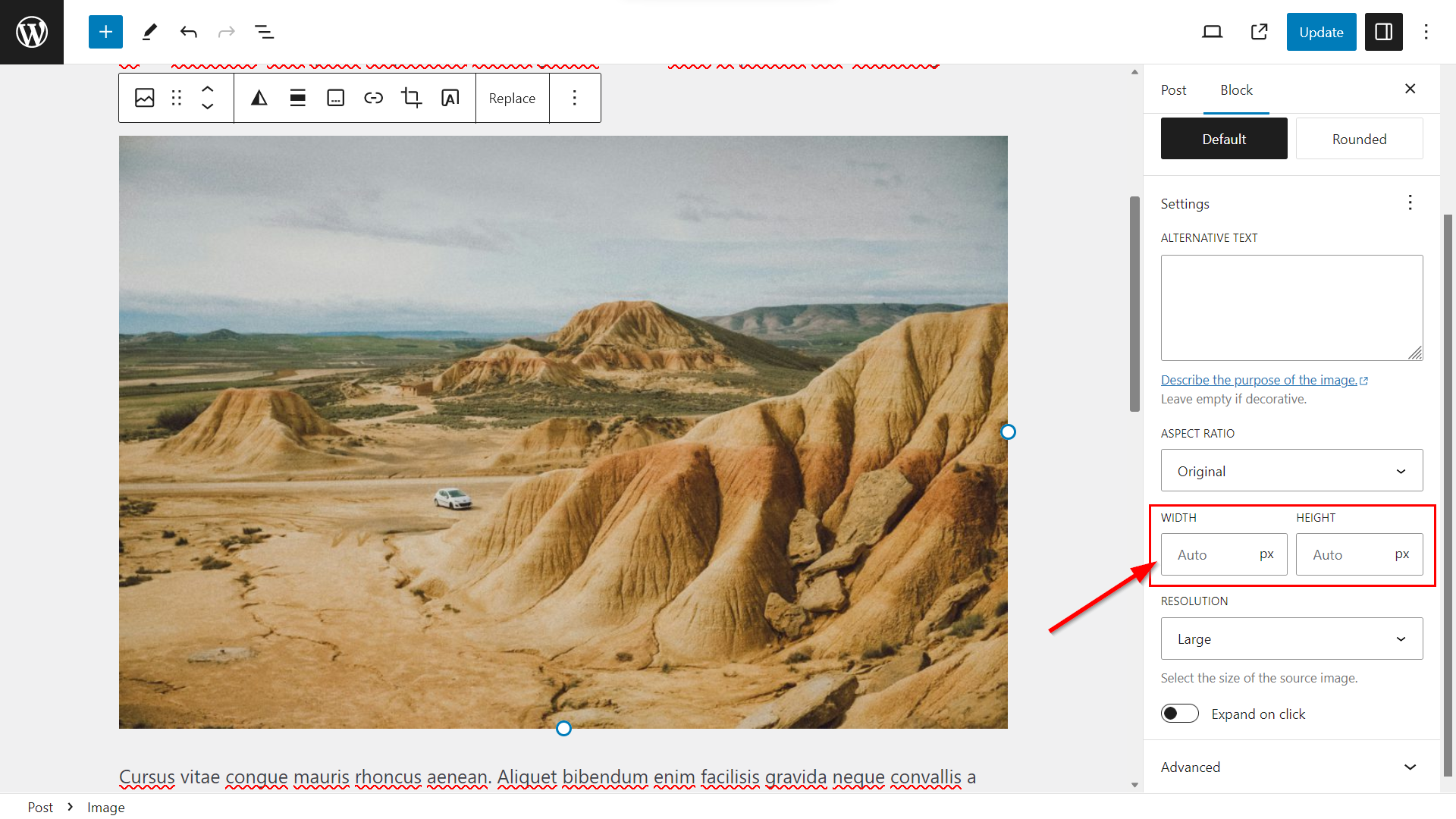
However, note that the dimensions may still be missing if you added the images with a page builder or migrated your site from another website creator platform.
In that case, you’ll need to add them to your images either manually or using an image or speed optimization plugin that lets you automatically add the width and height attributes to multiple images at once, such as WP Rocket or Perfmatters.
oEmbed Blocks Are Available for Many Third-Party Platforms
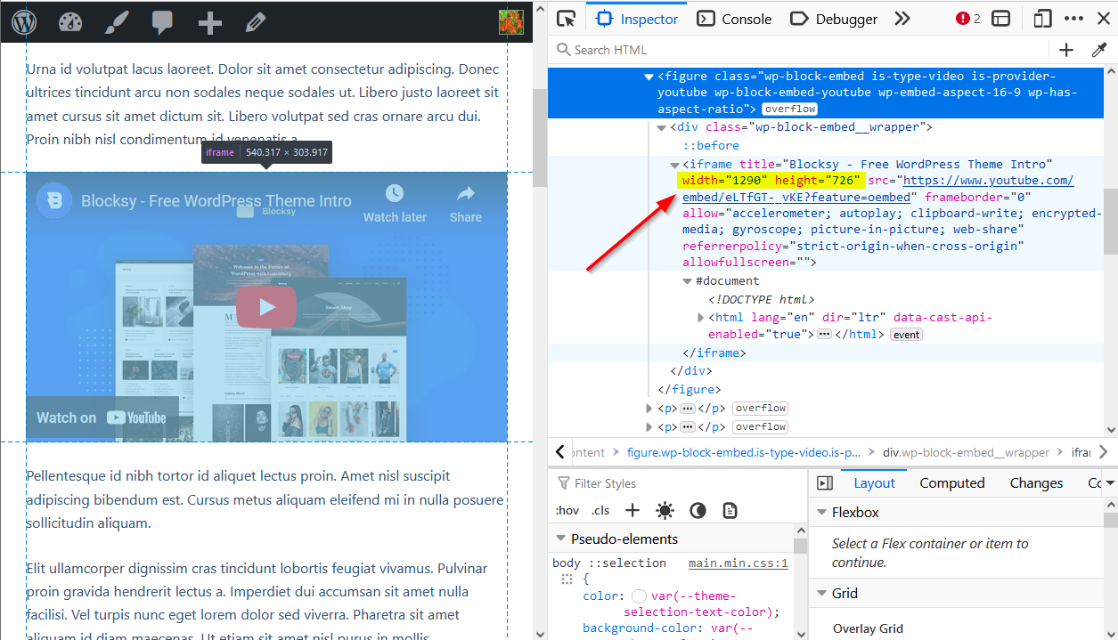
In addition to images, you also need to define the explicit width and height values of your content embeds, such as videos and iframes, to get a good CLS score (meaning that the width and height attributes need to appear in the HTML).
The WordPress block editor has native oEmbed blocks for many third-party media platforms, most of which add the dimensions automatically. For example, the YouTube and Dailymotion blocks embed videos as iframes with explicit width and height attributes in the HTML (while the default Video block doesn’t add the dimensions):
Define the Dimensions of Self-Hosted Videos
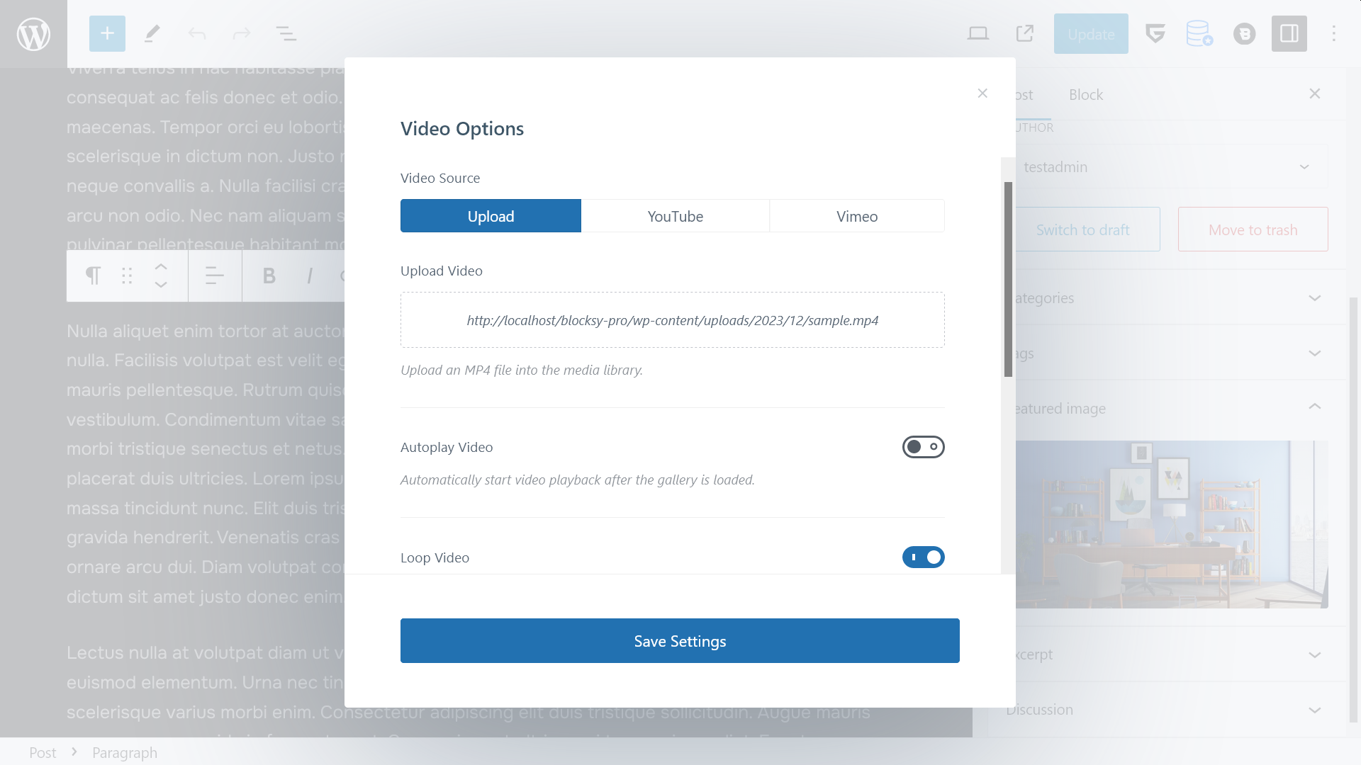
As the default Video block doesn’t include or lets you define the width and height attributes of self-hosted videos that you add from the WordPress Media Library, you’ll need to include the dimensions in a different way.
You can do so by using:
- the Custom HTML block where you can insert the
<video>tag together with thewidth,height, and other attributes - the Embed block which doesn’t require you to write any code and automatically adds the dimensions
- the Shortcode block, in case you use a shortcode plugin that allows you to add videos
- a third-party block plugin, such as PublishPress Blocks, that includes an advanced video block
- Blocksy Pro’s Featured Videos option, which automatically adds the
widthandheightattributes to your featured HTML videos
Replace GIFs with Videos for Better Stability
While animated GIFs have been in vogue for a while now, they can cause unexpected layout shifts (and even worse, they also harm website accessibility).
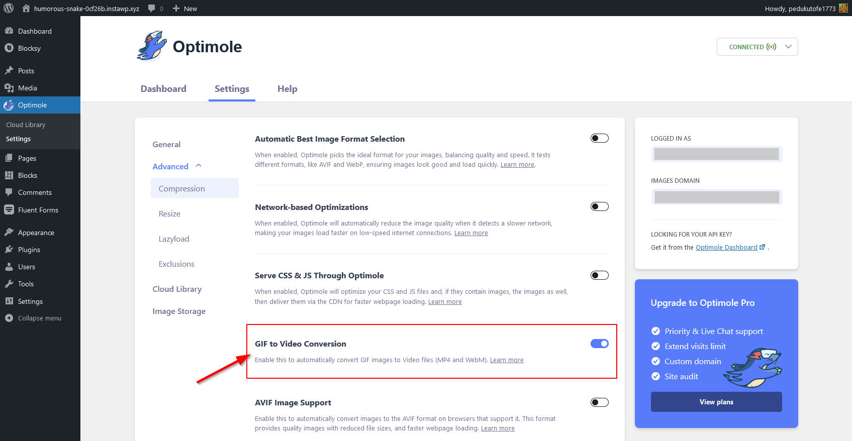
If you want to show animated content on your website, it’s recommended that you use video rather than GiFs, as it loads faster and smoother (especially if its explicit width and height attributes are defined in the HTML, as discussed above) and users can start and stop it whenever they want.
If you already have animated GIFs on your WordPress site, you can convert them to video using an image optimization plugin that provides this functionality, such as Optimole:
Use Composited Animations Only
Non-composited animations start appearing on the page early in the rendering process, so later they may force the browser to recalculate the layout, which can harm your CLS results.
To optimize Cumulative Layout Shift in WordPress, Make sure your theme and plugins use only smooth, composited animations that the browser executes on the compositor thread (instead of the main thread, as in the case of non-composited animations).
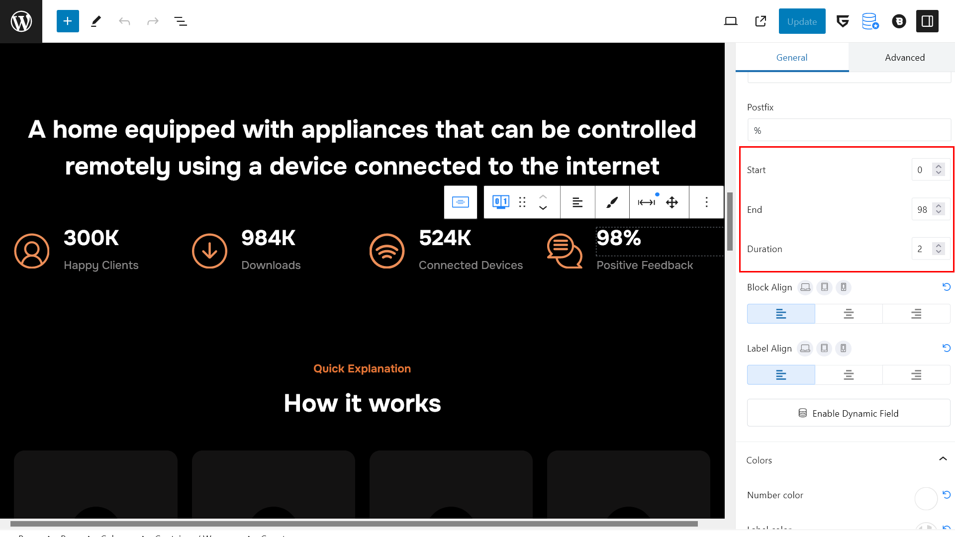
On a WordPress site, you can use a performance-optimized animation plugin that efficiently eliminates non-composited animations. For example, the Greenshift plugin, used by some of Blocksy’s starter sites, is built on top of the popular and widely-tested GSAP (GreenSock Animation Platform) library.
In the screenshot below, you can see the homepage of our Smart Home starter site with Greenshift’s animated counter block that lets you configure the start and end time and the duration of the counter animation:
Don’t Use More Than Two Custom Fonts
Custom fonts can result in unexpected layout shifts because the browser needs to download them, and during that time, it temporarily shows either invisible text or the default system font. When the custom fonts load, the text blocks usually grow or shrink a bit, so the layout suddenly shifts around.
To reduce Cumulative Layout Shift, it’s recommended that you don’t use more than two custom font families on your site.
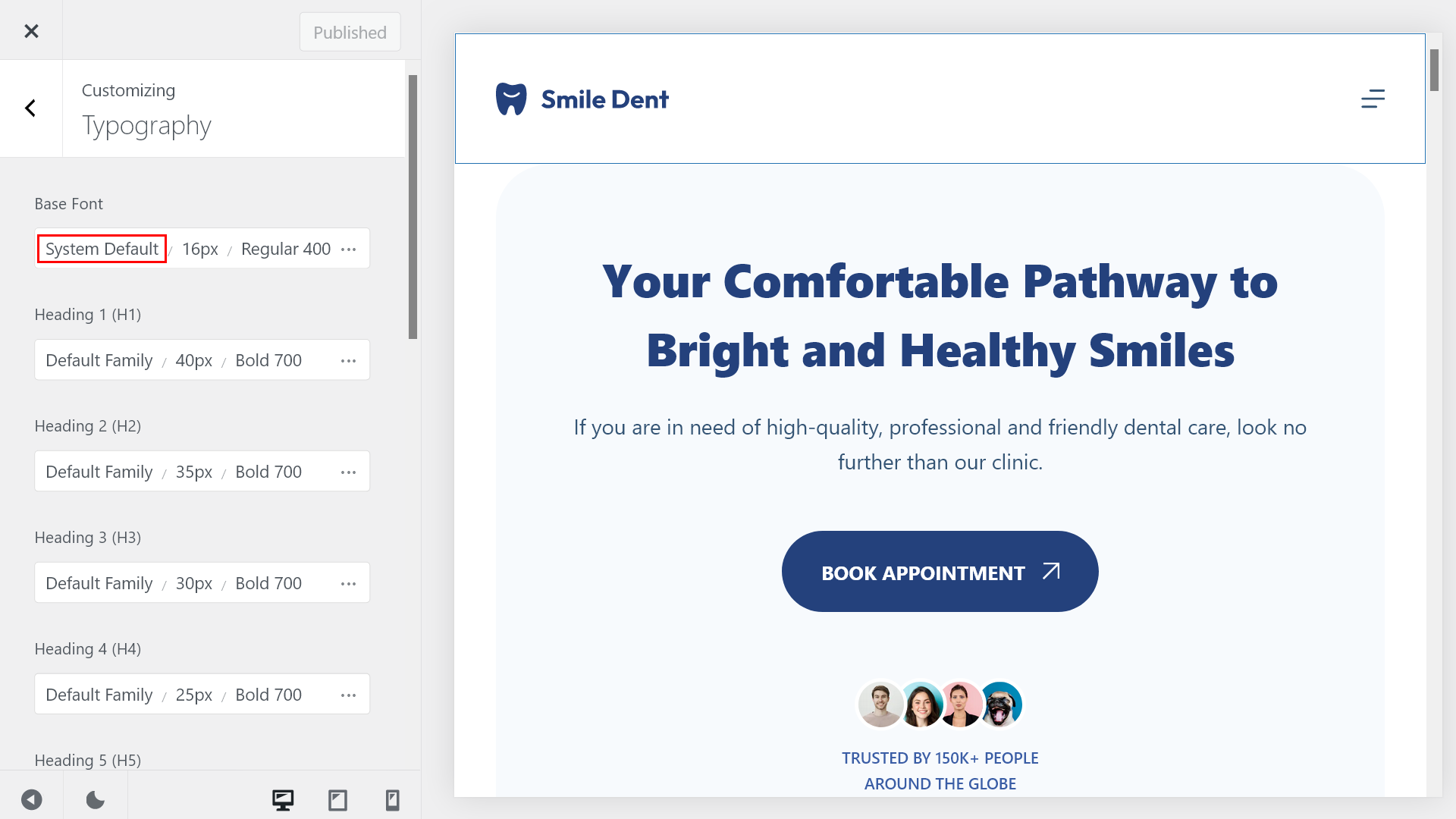
The best WordPress themes, such as Blocksy, also give you the option to load the default system font from the user’s computer rather than using a custom font so that you can completely eliminate unexpected layout shifts caused by font swapping.
Using the default system font also means that different users will see different fonts on your website — however, as system fonts depend on the operating system (e.g. it’s Segoe UI on Windows machines), there will still be just a few font variations.
The font-display: swap; CSS rule ensures that the fallback system font is shown while the custom font is loading. Once the custom font is downloaded, it replaces the fallback font without causing a layout shift.
Preloading fonts tells the browser to fetch the font files as early as possible. Add a tag in your HTML to preload important font files
Loading the default system font can be a good solution to improve Cumulative Layout Shift on a site where it’s not a huge problem if the typography differs a bit across various user groups, such as a dental practice:
Load Custom Fonts Locally
If you still want to use custom fonts on your WordPress site, you can reduce your Cumulative Layout Shift scores by hosting them locally, rather than downloading them from the web.
Locally hosted fonts download faster as they are hosted on the same domain as the rest of your content, so the browser doesn’t have to connect to one or more third-party servers. If your locally hosted fonts load fast enough, the browser won’t show the fallback font at all, so the layout won’t shift around.
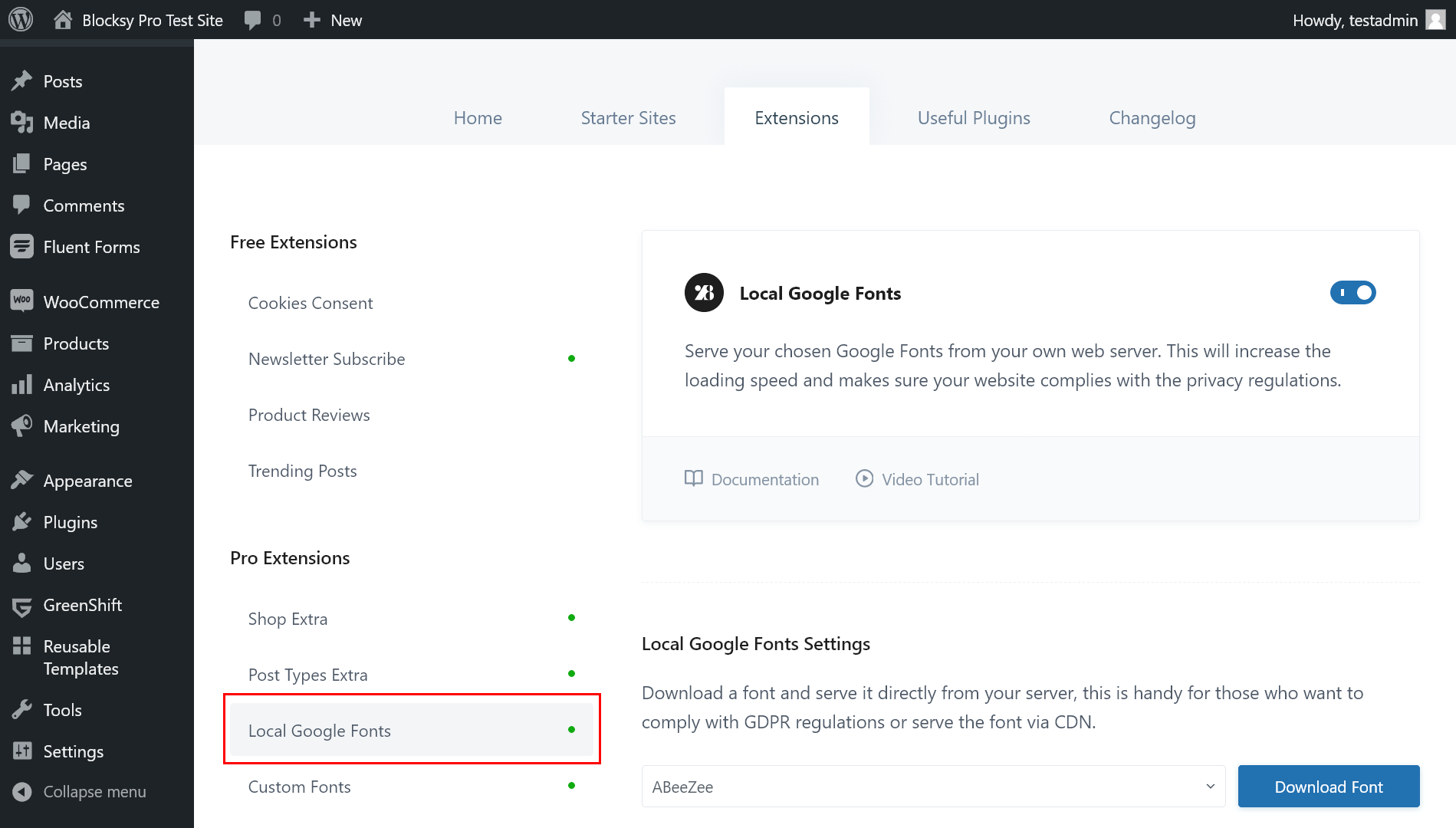
Blocksy’s Local Google Fonts premium extension lets you download any Google Font to your server and then host it from there. It also gives you the option to preload some or all of your locally hosted fonts, which will make them load even faster:
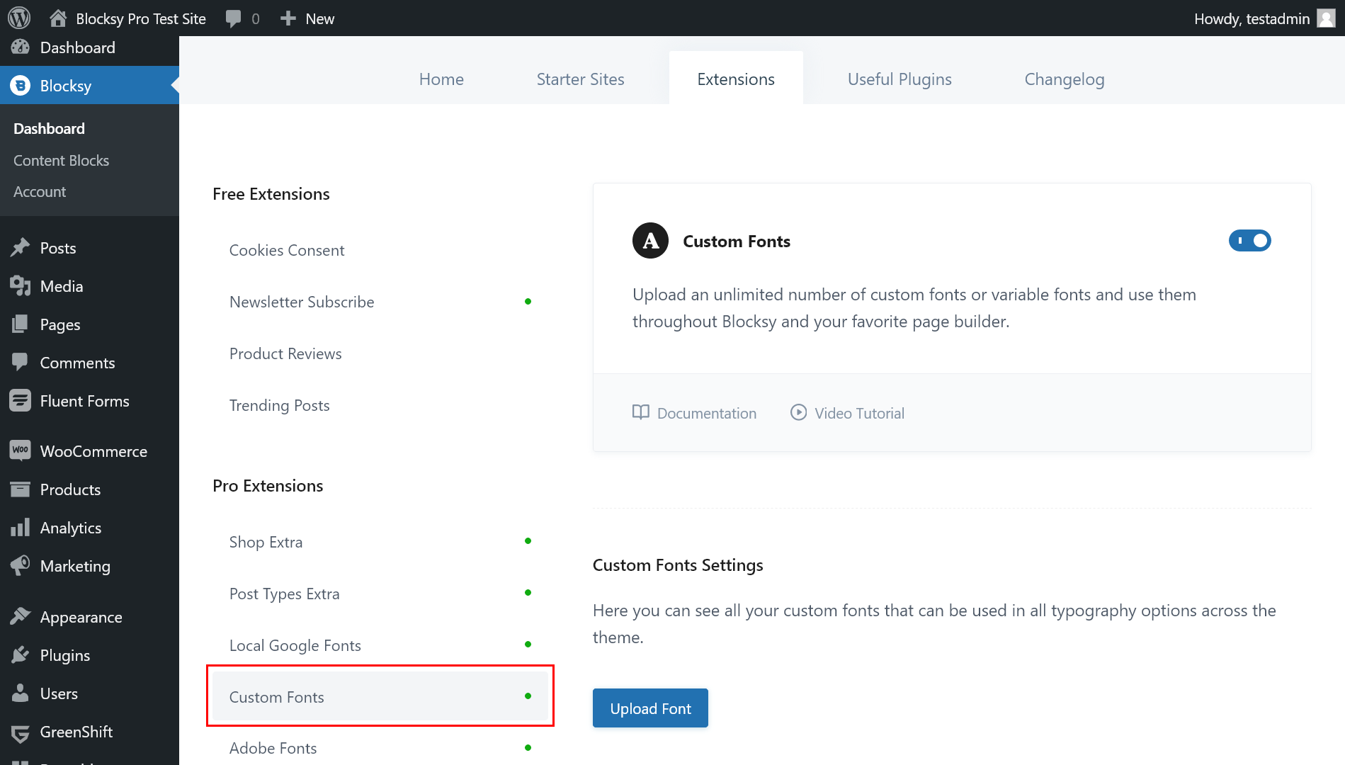
If you have any custom font (including variable fonts) that is not part of Google Fonts, you can also use Blocksy Pro’s Custom Fonts extension to upload it to your server and host it locally:
Detect the Elements That May Cause Unexpected Layout Shifts on Your Site
While the above recommendations can help you optimize Cumulative Layout Shift in WordPress, you still need to test your pages to locate the elements that may result in unexpected layout shifts.
You can use Google’s free web performance auditing tools, i.e. Lighthouse (integrated into Chrome DevTools) and PageSpeed Insights (also uses Lighthouse, but you can run it online), that provide you with a list of the elements that increase your CLS score, together with recommendations on how you can improve them.
On a WordPress site, the most frequent culprits will be slider, ad, and animation plugins. If your performance tests show that one or more of these plugins make Cumulative Layout Shift worse, consider replacing them with an alternative (e.g. your slider plugin should define the dimensions of the slider and preload the images) or, if possible, removing them.
Cumulative Layout Shift How to Improve: Tools and CLS Monitoring Recommendations
Here is the list of the most popular 5 tools to detect and track your CWV and CLS as well.
- Google Lighthouse is built-in Google Chrome browser and we recommend it for fast check. To use it:
- Open Chrome and navigate to your webpage.
- Right-click anywhere on the page and select Inspect.
- Go to the Lighthouse tab and click Generate Report.
- You’ll see an in-depth analysis of your site’s performance, including suggestions on how to improve CLS.
- PageSpeed Insights is the most used tool by our team to track CLS all over our site.
- Visit PageSpeed Insights, enter your website URL, and get a breakdown of your Core Web Vitals, including CLS.
- WebPageTest offers a decent visualization options for you to track resources and layout shifts they occur.
- Go to WebPageTest, run a test, and examine the Content Layout Shift results under the “Web Vitals” tab.
- Chrome DevTools Performance Tab. If you want to dive deep into a specific layout shift event, you can use the Performance tab in Chrome DevTools. It shows a detailed timeline of how the page renders and highlights any layout shifts.
- Open Chrome, right-click, and select Inspect.
- Go to the Performance tab, start a recording, and reload the page to capture any layout shifts.
- GTmetrix is another tool that evaluates page performance based on Core Web Vitals, including CLS. It provides a detailed waterfall chart and recommendations for improving performance.
- Go to GTmetrix, enter your URL, and get a comprehensive report on page performance and layout shifts.
FAQ: How to Fix Cumulative Layout Shift WordPress
What Is Cumulative Layout Shift (CLS)?
CLS is a Core Web Vital that measures how much visible content unexpectedly shifts on a page. A good CLS score is ≤ 0.1; higher values harm UX and SEO.
Why Does CLS Matter for SEO?
Google includes CLS in its Core Web Vitals, which affect page rankings. Poor CLS can lead to a frustrating user experience and lower visibility in search results.
How Can I Fix CLS Issues Caused by Images?
Always set explicit width and height attributes for all images. WordPress handles this automatically via the Media Library, but page builders or migrated content may need manual fixes or optimization plugins like WP Rocket or Perfmatters.
Do Custom Fonts Increase CLS?
Yes. Custom fonts can shift layout during load. To reduce CLS, use no more than two custom fonts, host them locally, and apply the font-display: swap property.
What Tools Can I Use to Measure CLS in WordPress?
Use tools like:
- Google PageSpeed Insights
- Lighthouse in Chrome DevTools
- WebPageTest
- GTmetrix
- Chrome Performance Tab
These tools help identify layout shift triggers and offer actionable recommendations.
Summary: Optimizing Cumulative Layout Shift in WordPress
To optimize Cumulative Layout Shift, you’ll need to reduce (ideally, completely eliminate) unexpected layout shifts on your web pages.
The WordPress block editor comes with some default features that will help you reduce Cumulative Layout Shift even if you don’t implement any other optimization techniques.
Beyond that, you’ll need to focus on your video and embedded content, animations, fonts, and sliders.
The best thing you can do to optimize Cumulative Layout Shift on your WordPress site is to choose a smartly coded, performance-optimized theme, such as Blocksy.
Then, it’s also recommended that you audit your plugins that load extra content to your site and replace or remove them if you find that they increase your CLS results.
Here’s a quick checklist of actionable steps to improve CLS score right away:
- Ensure width and height attributes are specified for all images and videos.
- Use the WordPress Media Library or an optimization plugin (e.g., WP Rocket, Perfmatters) to automatically add these attributes.
- For embeds, use WordPress’s native oEmbed blocks to include defined dimensions.
- Use plugins like Blocksy’s Local Google Fonts or WP Rocket to host custom fonts locally.
- Implement
font-display: swap;to ensure text is visible while fonts load, reducing shifts. - Preload fonts using tools like Font Face Observer for faster loading and fewer layout changes.
- Use composited animations executed on the compositor thread to avoid layout recalculations. Plugins like Greenshift (with GSAP) can help.
- Restrict your site to no more than two custom font families to minimize layout shifts caused by font swapping or loading delays.
- Preload key fonts, images, and scripts to improve load times and visual stability.
To learn more about Core Web Vitals in WordPress, also check out my articles on how to optimize Largest Contentful Paint and Interaction to Next Paint on a WordPress site.


