If you have ever used the Internet, you already know what a pop-up is. A pop-up is a window that appears over the content of a website under certain conditions. For example, when you are scrolling through a page and something annoying appears on top of the screen, preventing you from using the site normally, it’s a pop-up. But not the one we want you to create.
We all have a love-hate relationship with pop-ups because they can be both very annoying and quite useful. The ability to create a beautiful, effective, and clean pop-up is a form of art. And we, for our part, have done everything we can to give you the opportunity to create exactly what you want – as always, in a convenient, unrestricted and stylish out-the-box way.
Blocksy Pro includes a powerful pop-up module that allows you to create custom pop-ups with ease. This article will show you how to create a stunning pop-up with a newsletter subscribe form in WordPress using Blocksy Pro.
Table of Contents
- What is a Pop-Up?
- Real-World Examples of Pop-Ups
- Examples of How Other Companies Use Pop-Ups
- How to Create a Pop-Up That People Will Love
- What is a Newsletter?
- How to Create a Custom Pop-Up with Newsletter in WordPress with Blocksy Pro
- Example of a Simple, High-Converting Pop-Up
- Conclusion
What is a Pop-Up?
Again, pop-up is a window that appears over the content of a website. It appears typically as an overlay, modal, or a separate window. It is designed to capture the user’s attention and encourage specific actions.
The first pop-up was created by Ethan Zuckerman in 1997 and published on Tripod.com. The creation of pop-ups was made possible by the introduction and active development of JS and at the very beginning pop-ups were initially used for clearly advertising purposes. But now they are used for a large variety of other actions. These actions can range from subscribing to newsletters and promotions to guiding users through a certain process or displaying important announcements.
A pop-up can appear when you scroll through a part of the page or scroll to a certain section, when you click over a certain element, when you leave the window, or when you spend a certain amount of time on the site. And of course, you can easily configure all this and more with the Blocksy Pro Pop-up Content Block module.
In the right hands, pop-ups are a great way to capture visitors’ attention and encourage them to take a desired action, such as subscribing to a newsletter or making a purchase. But you have to be very careful and skillful in its use, as it is both the most effective and hated element on the web.
Real-World Examples of Pop-Ups
Marketers all over the world have been actively using pop-ups to engage and interact with users for more than 20 years. If it didn’t work, it wouldn’t be so widespread. But over the years of trying and experimenting, many creative ways have been invented.
Pop-ups can be used for a variety of purposes, such as:
- Capturing Email Addresses to Grow Your Newsletter Mailing Lists: Many e-commerce websites employ pop-ups to encourage visitors to share their email addresses, thereby growing their newsletter subscriber base. These pop-ups often entice users with exclusive discounts or valuable content.
- Promoting Special Offers or Discounts: Pop-ups serve as effective tools for promoting limited-time offers or discounts. They grab the user’s attention and encourage them to take advantage of these special deals.
- Advertising New Products or Services: Websites utilise pop-ups to spotlight new products or services. This dynamic presentation captures the user’s interest and introduces them to the latest offerings.
- Encouraging Visitors to Sign Up for Webinars or Events: Pop-ups can also be leveraged to boost webinar or event attendance. By strategically timing the pop-up’s appearance, websites entice users to register for upcoming webinars or events, ensuring maximum participation.
- Increase conversions: Pop-ups can help you increase the conversion rate of your website by making it easy for visitors to take the next step. For example, you can use a pop-up to offer a discount or free shipping to visitors who are about to abandon their shopping carts
- Retention on exit intent: Pop-ups triggered when users show signs of leaving a site can retain them by offering valuable content, surveys, or special offers.
- Announcements: Websites frequently use pop-ups to communicate crucial information like maintenance notifications, product launches, or relevant promotions.
- Time-Based Prompts: Trigger pop-ups after users spend a set amount of time on a page.
- Content Upgrades: Offer downloadable guides or checklists related to your blog content.
- Cart Abandonment Prevention: Prompt shoppers with discounts before they leave.
- Event Signups: Encourage registrations for webinars, workshops, or events.
Examples of How Other Companies Use Pop-Ups
Many popular companies use pop-ups to increase their email list subscribers and drive sales. Here are a few examples:
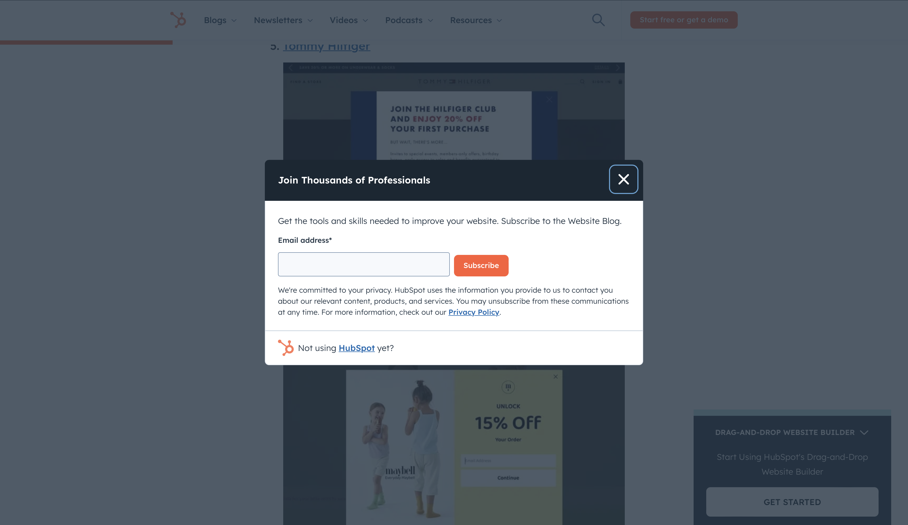
Hubspot: Uses an exit-intent trigger to engage users leaving the site, ensuring they stay connected through the newsletter.
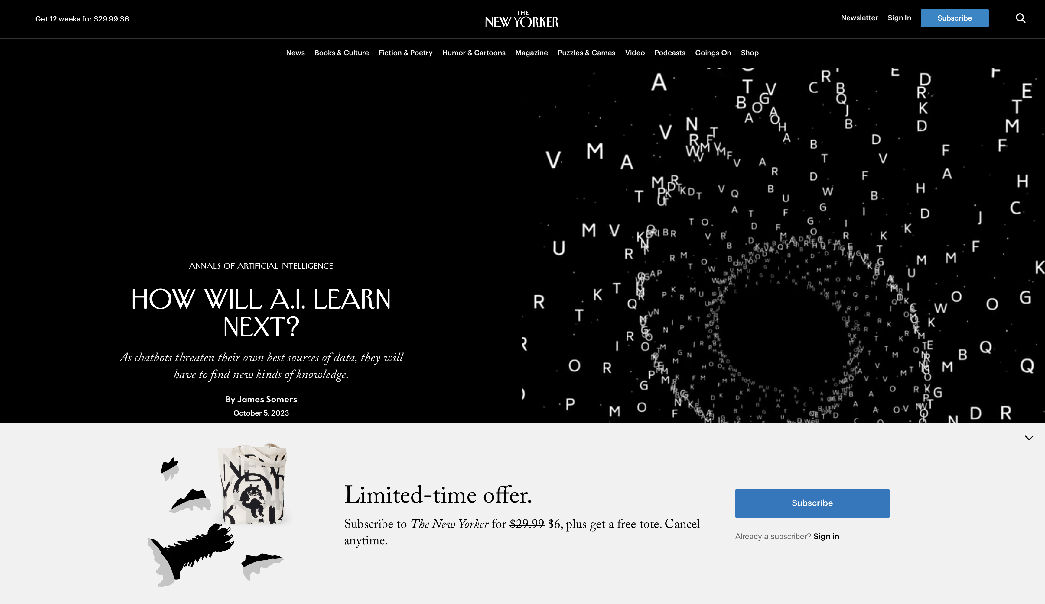
New Yorker: Implements a content-blocking strategy to prompt subscriptions after visitors consume free articles, leveraging curiosity and value.
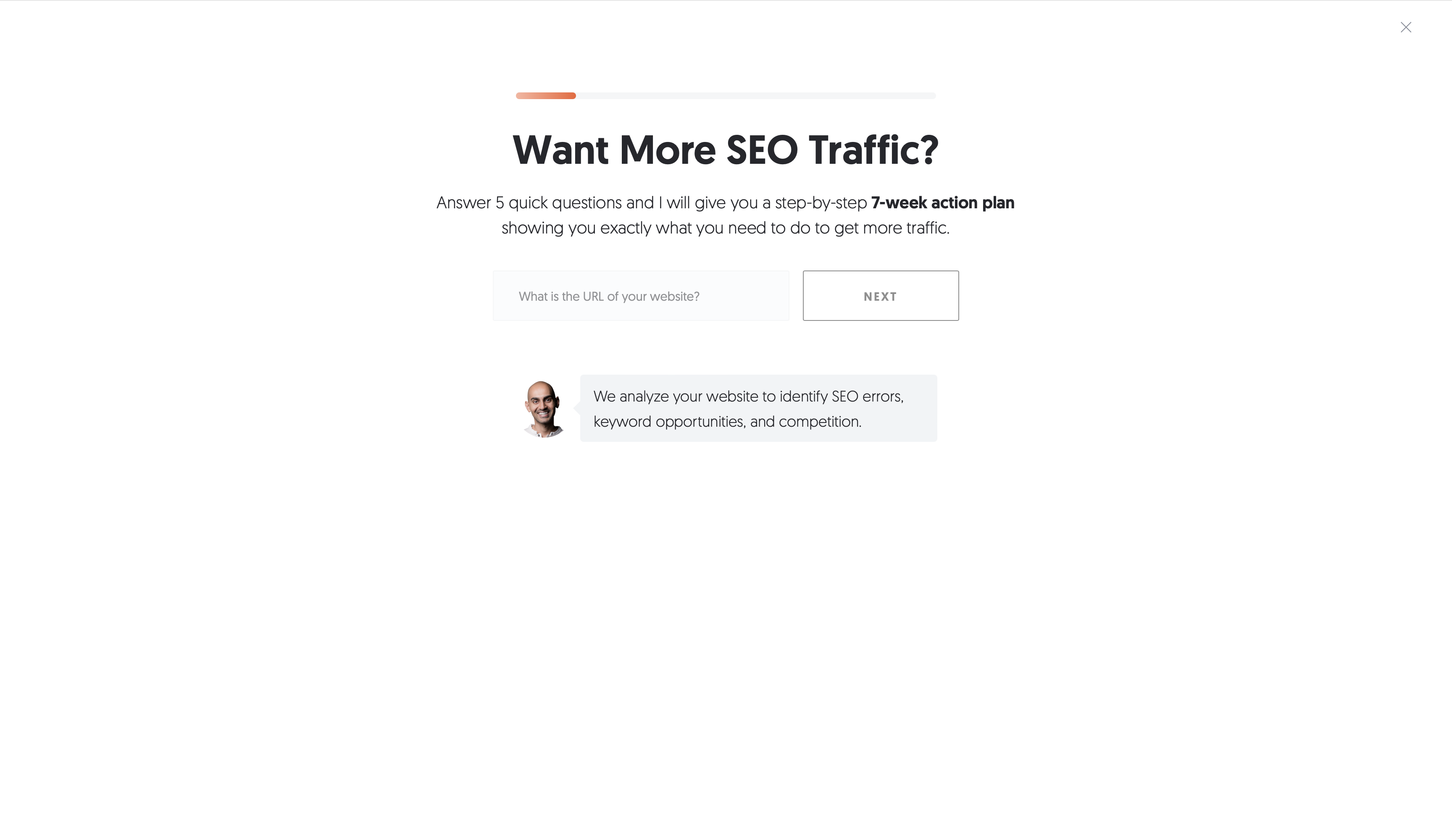
Neil Patel: Engages users with a gamified quiz-style pop-up, making the interaction fun and increasing engagement rates.
How to Create Pop-up That People Will Love
It’s very easy to make people hate you when you pop up with annoying ads in front of their eyes while they’re using the site or reading an article. But how do you make a pop-up that people will love?
To create a pop-up that people will love, you need to make sure that it is relevant, valuable, and easy to close. Here are some tips –
- Make sure your pop-up is relevant to the content of the page it appears on. For example, if you have a blog post about how to make a chocolate cake, you could have a pop-up that offers a free recipe book.
- Offer something of value to your visitors. This could be a discount, exclusive content, or access to a webinar or event.
- Make your pop-up easy to close. There should be a clear and visible “X” button in the top corner.
- Don’t overuse pop-ups. If you have too many pop-ups on your website, it will annoy your visitors.
- Make it tasty. Make your pop-up beautiful, attractive, creative, and original. Play with your imagination, make it so that people would want to talk about it.
Here are some additional tips for creating effective pop-ups –
- Use a clear and concise headline. Your headline should grab the visitor’s attention and tell them what the pop-up is about.
- Use high-quality images and videos. Visuals can make your pop-up more engaging and persuasive.
- Personalise your pop-up. Address the visitor by name and use content that is relevant to their interests.
- Use a strong call to action. Tell the visitor what you want them to do, such as “Sign up for our newsletter” or “Download your free guide.”
- Keep It Simple. Use clean layouts with minimal distractions. Avoid overwhelming users with too much text or visuals.
- Readable Fonts. Choose font sizes of at least 16px for clarity, and maintain high contrast between text and background.
- Responsive Design. Ensure your pop-ups are mobile-friendly, as over half of users browse on mobile devices.
- Strong Call-to-Action (CTA). Use actionable phrases like “Subscribe Now” or “Get My Discount.” Highlight the CTA button with contrasting colors.
You can also use A/B testing to see which types of pop-ups work best for your audience. Try different headlines, images, and calls to action to see what gets the most conversions.
What is a Newsletter?
A newsletter is a regular email that is sent to subscribers. Newsletters are a great way to stay in touch with your customers and promote your products or services. It serves as a direct channel for businesses to communicate with their audience, disseminate information, and promote products or services.
Why do companies use newsletters? –
- Audience Engagement. Newsletters enable direct interaction with your audience by delivering relevant content.
- Lead Generation. Collecting email addresses via newsletters helps build a database of potential customers for future marketing efforts.
- Promotions and Sales. Businesses utilise newsletters to promote products, offer discounts, and drive sales through exclusive deals.
Companies use newsletters for a variety of purposes, such as –
- Promoting new products or services
- Sharing news and updates about the company
- Offering discounts and special offers
- Building relationships and loyalty with customers
No matter what type of website you’re building, the most important thing is the quality of those small points of interaction and connection with your customers. Contact forms are extremely important and companies spend a lot of money to make them attractive because it directly affects engagement and conversion .
Pop-ups are a great area to place a contact form, including a newsletter subscription form. And that’s exactly what we’re going to create today.
How to Create a Custom Email Subscription Popup in WordPress with Blocksy Pro
As always, we have prepared everything you might need and made the process of creating a popup as simple and straightforward as possible. We made sure that everything looks and works well on all screens in all modern browsers.
All you need to do is: Open the dashboard > Create the new popup content block > Add content using Gutenberg > Visually configure the design options > Choose display conditions – and you’re done!
But let’s take a closer look. To create a custom pop-up with a newsletter subscribe form using Blocksy Pro, follow the steps.
Step 1: Install Blocksy Pro
If you’re already on this page, we want to believe that you’ve already installed the Blocksy theme and Blocksy Companion Pro, but if not, you can easily find how to install the Blocksy theme and how to upgrade to Blocksy Pro in our docs.
Step 2: Activate the Free Newsletter Subscribe Extension
After you have installed the theme and companion, open the Blocksy menu > Click on the Extensions tab > open the Newsletter Subscribe extension.
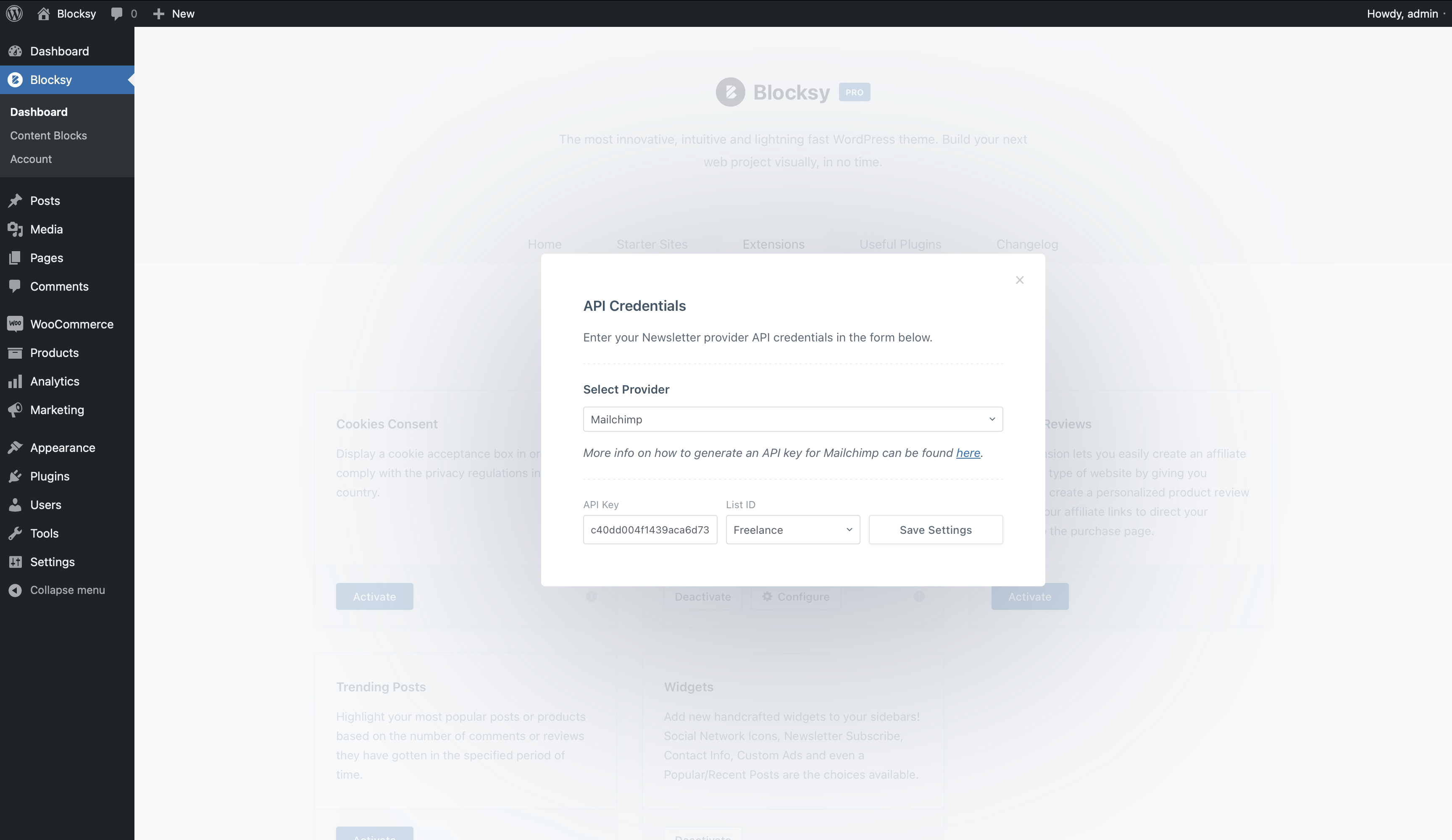
Select your provider and enter your account information. Here we placed links to instructions on how to prepare your account information. After you activate your email, the newsletter subscription form widget will become available on the website. You can also use a pre-configured shortcode. All details about the Newsletter Subscribe extension are available in our docs.
In Blocksy 2, in addition to the usual Mailchimp and Mailerlite providers, you will also have access to Sendinblue, Campaign Monitor, and Convert Kit. Also, Blocksy’s Newsletter extension can be inserted as a native Gutenberg block.
Step 3: Create a New Pop-Up
After we’ve prepared the subscription form, let’s create the popup itself.
In the dashboard, in the Blocksy menu, find Content Block > Add New > In the middle, select Pop-up, enter a name, and click “Create Content Block”
We will name our popup clearly – Newsletter Popup.
After that, the Gutenberg editor will open and basically you’ve just created your first pop-up, because we already ensured that it looks attractive right out of the box. But we still need to add content, to style it, and to make it feel special.
Step 4: Design Your Pop-Up
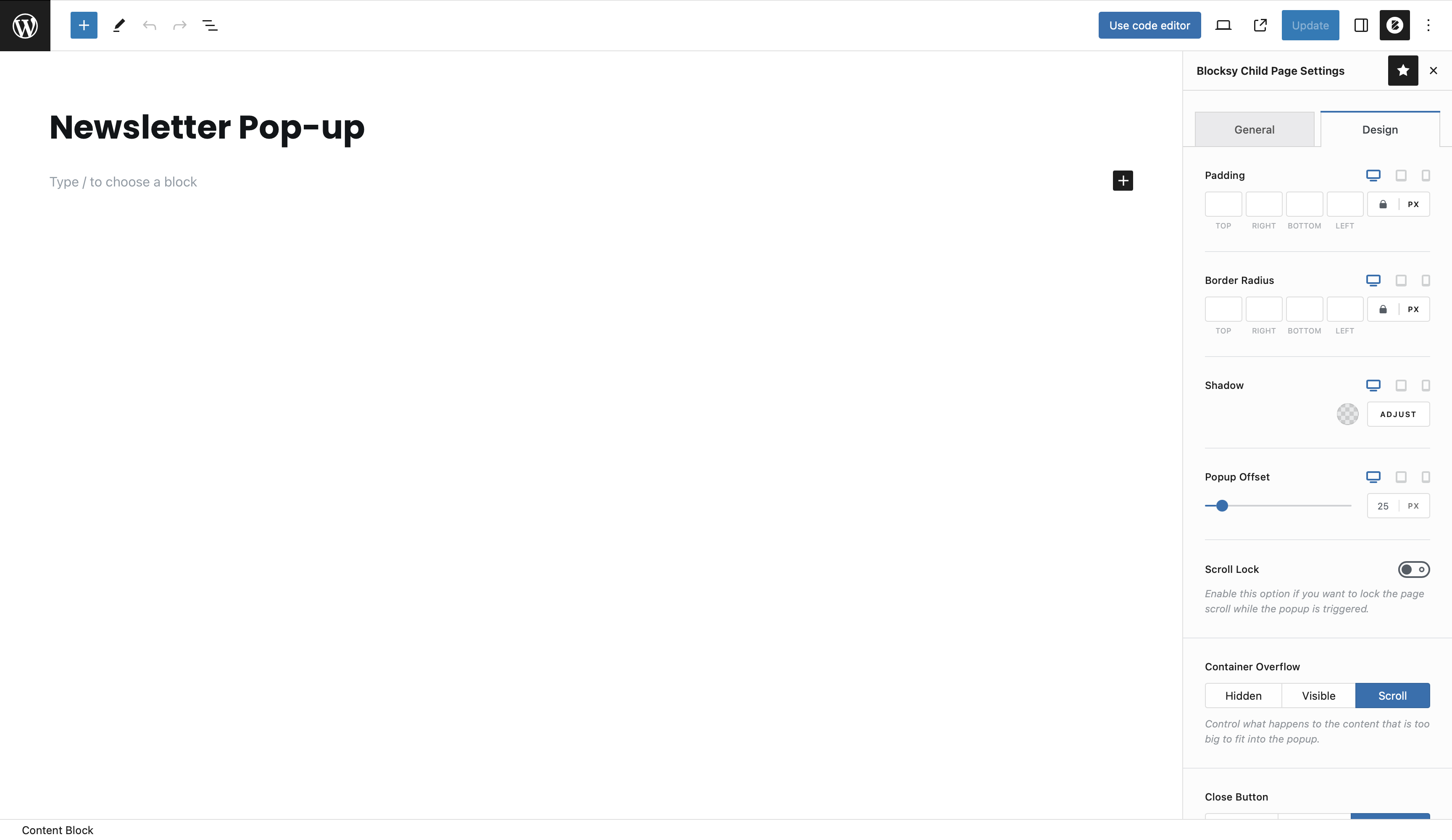
In the upper right corner, click on the Blocksy icon – this is a special Blocksy control menu.
In the general settings, you can choose the position of the pop-up relative to the centre of the screen, a size preset or even a custom pop-up size, and an animation of its appearance. In the design tab, you can set the padding, borders, shadow, scroll lock, container overflow, close button, background (including image and gradient), and backdrop. Basically, everything you may need to style your popup 100%.
Step 5: Add the Newsletter Integration
You can use our widget or shortcode for your newsletter subscription form.
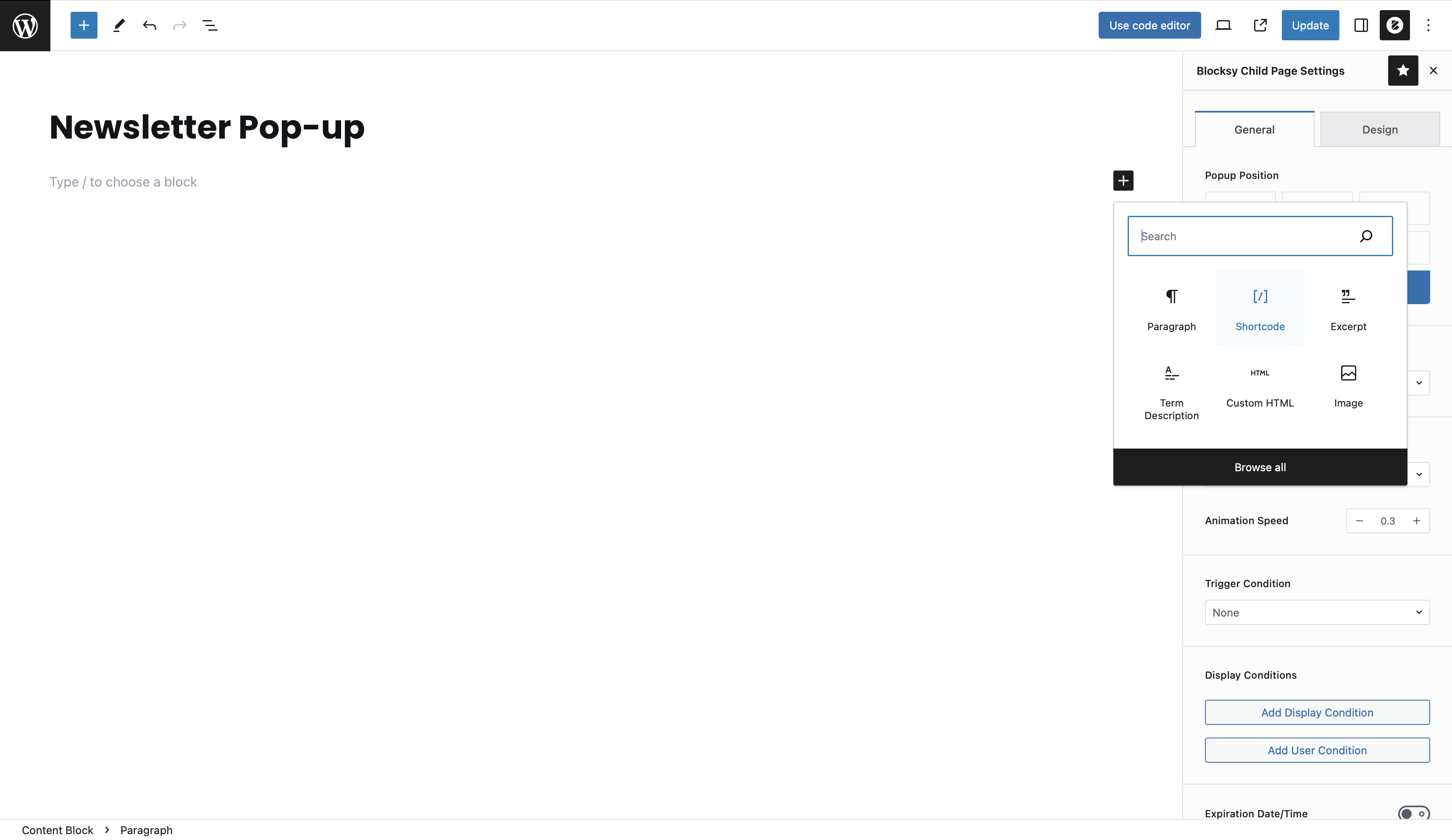
To add a block, click on the Add Block button (+), start typing “shortcode” and the block will be quickly found in the list. Then, in the new field that appears, type the [blocksy_newsletter_subscribe] shortcode.
Remember that you can use absolutely any blocks or shortcodes for your Blocksy pop-up content, including third-party contact forms, A/B testing blocks, etc.
Just make sure that your pop-up’s content is relevant to the content of the page it will appear on, it is easy to close and the title offers something of value to your visitors, such as a possibility to catch the discount or get valuable exclusive content directly into the mailbox.
Step 6: Set Display Rules
Now it’s the most important part – it’s time to choose which pages to display our pop-up with the newsletter on, and when. We’ve already prepared everything, so you can visually select the display conditions and trigger for your pop-up.
Among the display conditions, you can choose specific pages, post types, archive types, specific categories, dynamic templates, and even user roles.
In Blocksy 2, you can visually combine conditions with each other using or/and operators. We have also significantly improved and expanded the module with additional conditions such as time period, recurring days, requested cookie, specific link, or referer.
In the trigger condition box, you can choose – after a certain time, after the number of pages viewed, after the page has loaded, after the inactivity time, after a scroll, on scroll to an element with css class, or on the page exit intent.
As a bonus, you can also copy the unique ID of the content block and add it to any element to trigger the pop-up on click.
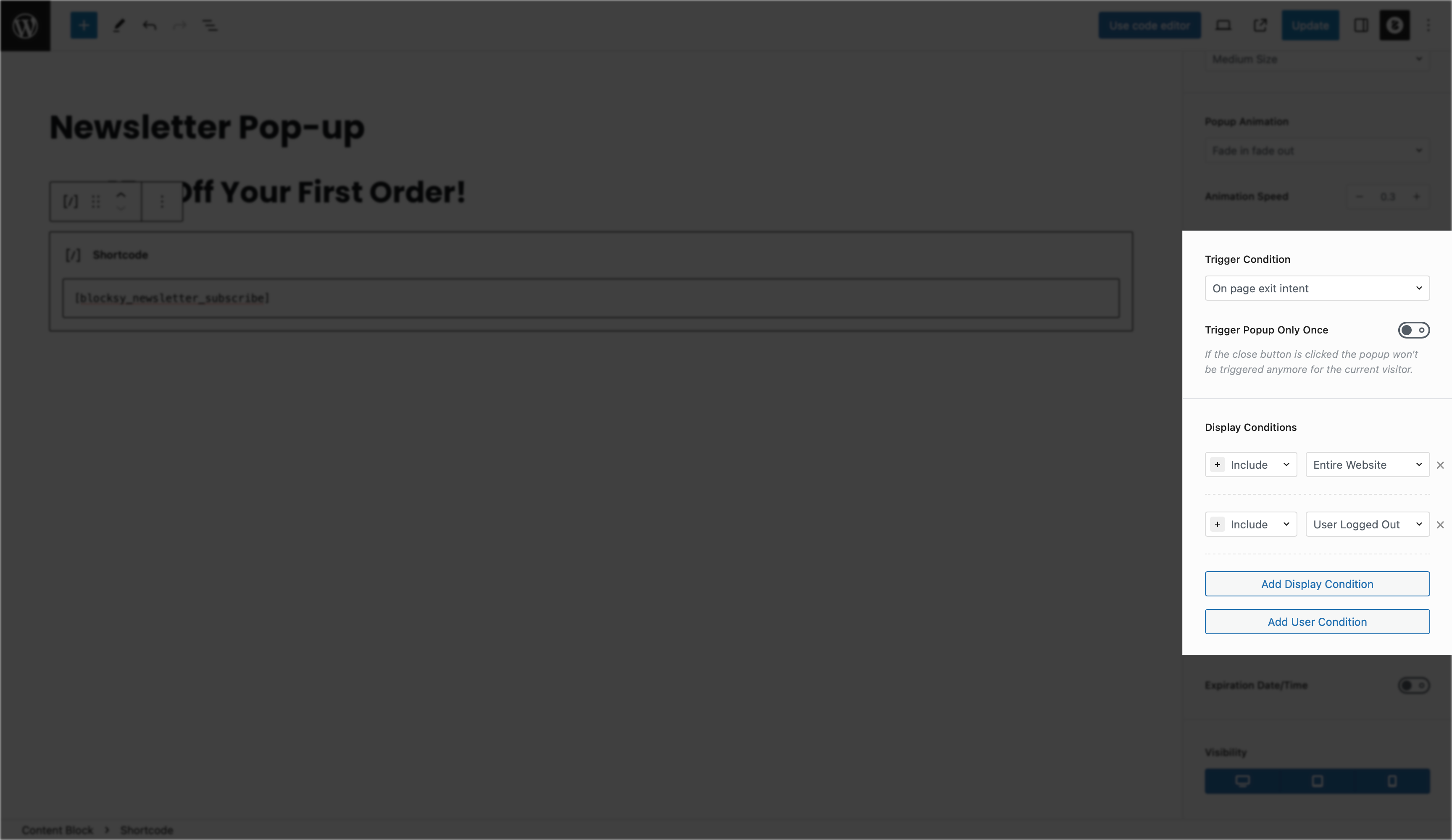
In Blocksy 2, you can now choose a custom element’s class that will open a pop-up when you click on it. We’ve also added the option of AJAX content loading, dynamic content view mode, and the ability to select an additional close trigger as a button class or even enable automatic detection of the “submit” form button.
Step 7: Publish and Test
Once satisfied with your customised pop-up, save and set it to “Published.”
Conduct thorough testing to ensure it displays correctly and integrates seamlessly with your chosen newsletter service.
Practice, be creative, and improve as new ideas come up. And test, test, test. Just like we did when we created this functionality for you with love and attention to detail.
Example of a Simple, High-Converting Pop-Up
Additional reminding tips for creating effective pop-ups –
- Make sure your pop-up is relevant to the content of the page it appears on.
- Offer something of value to your visitors, such as a discount or exclusive content.
- Make your pop-up easy to close.
- Don’t overuse pop-ups, or you will annoy your visitors.
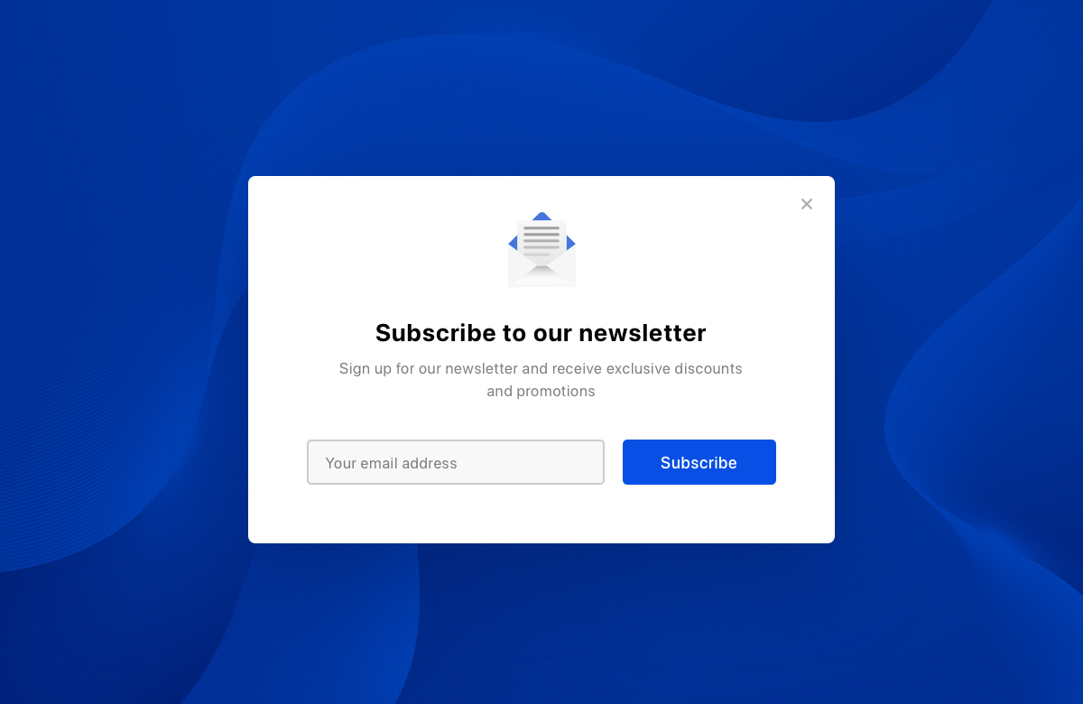
An example of a high-converting pop-up –
- Headline: Get 10% off your first order!
- Body copy: Sign up for our newsletter to receive exclusive discounts and promotions.
- CTA: Subscribe now!
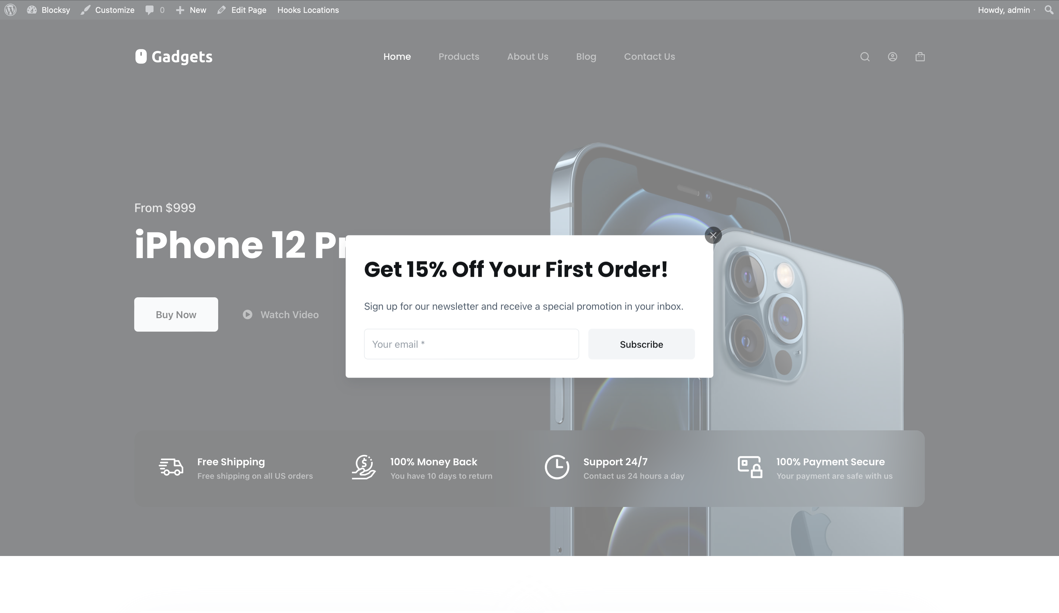
This pop-up is effective because it –
- Is relevant to the content of the page it appears on (an e-commerce website)
- Offers something of value to visitors (a discount)
- Is easy to close (there is a small “X” in the top right corner)
- Is not overused (it only appears once per visitor)
Conclusion
Creating the perfect pop-up boils down to crafting an attractive, straight-forward message that genuinely benefits your visitors, be it with special discounts or exclusive content. Timing is key, so think about using exit-intent triggers or delaying the pop-up’s appearance to make sure it’s user-friendly. Don’t forget to ensure it looks great on mobile devices, respects data privacy rules, and tracks its performance with analytics. Striking that sweet spot between engaging users and avoiding annoyance, combined with ongoing A/B testing, will help you fine-tune your pop-up game.
It will be useful to learn how to configure SMTP in WordPress if you want to work with email marketing.
Blocksy Pro’s pop-up module is a powerful tool that allows you to create mobile and cross-browser optimised, pixel perfect, conversion-ready, and fully custom pop-ups to capture visitors’ attention and encourage them to take a desired action. By following the steps in this article, you can easily create a pop-up with a newsletter signup form to grow your email list.




Too bad Subscribe to Neewsletter widget does not work with Mailster.
I added a task in our to-do list, hope we will be able to add an integration with Mailster 🙂
Many of us don’t want to use a third party service for managing our newsletter.
Mailster is great because it’s saved in our WP databsse.
It would be nice to have full mailster compatibility with blocksy.
So we can use the blocksy newsletter widget and that it adds the email address to mailster.
Hopefully this can be added.
does this work with the newsletter plugin in wordpress?
Hi there, about what newsletter plugin are you exactly referring?