Using a theme rather than a plugin to add dark mode in WordPress comes with two main advantages: it’s better for performance and it’s better for the user experience.
As for performance, if you add dark mode using your theme, you don’t have to install another plugin, and as the dark mode color palette is part of your theme, you won’t slow down your site with extra code additions, workarounds, or hacks.
As for the user experience, with a theme, you can add the color switch to the header menu instead of showing a floating button, which is the modus operandi of most dark mode plugins.
In this tutorial, we’ll look into how to add dark mode in WordPress using the Color Mode Switch module of our Blocksy theme, which complements our advanced color system discussed in depth in our previous tutorial.
To see how dark mode in WordPress works when it’s added by the theme, you can check out the live version of our astounding Daily News starter site:
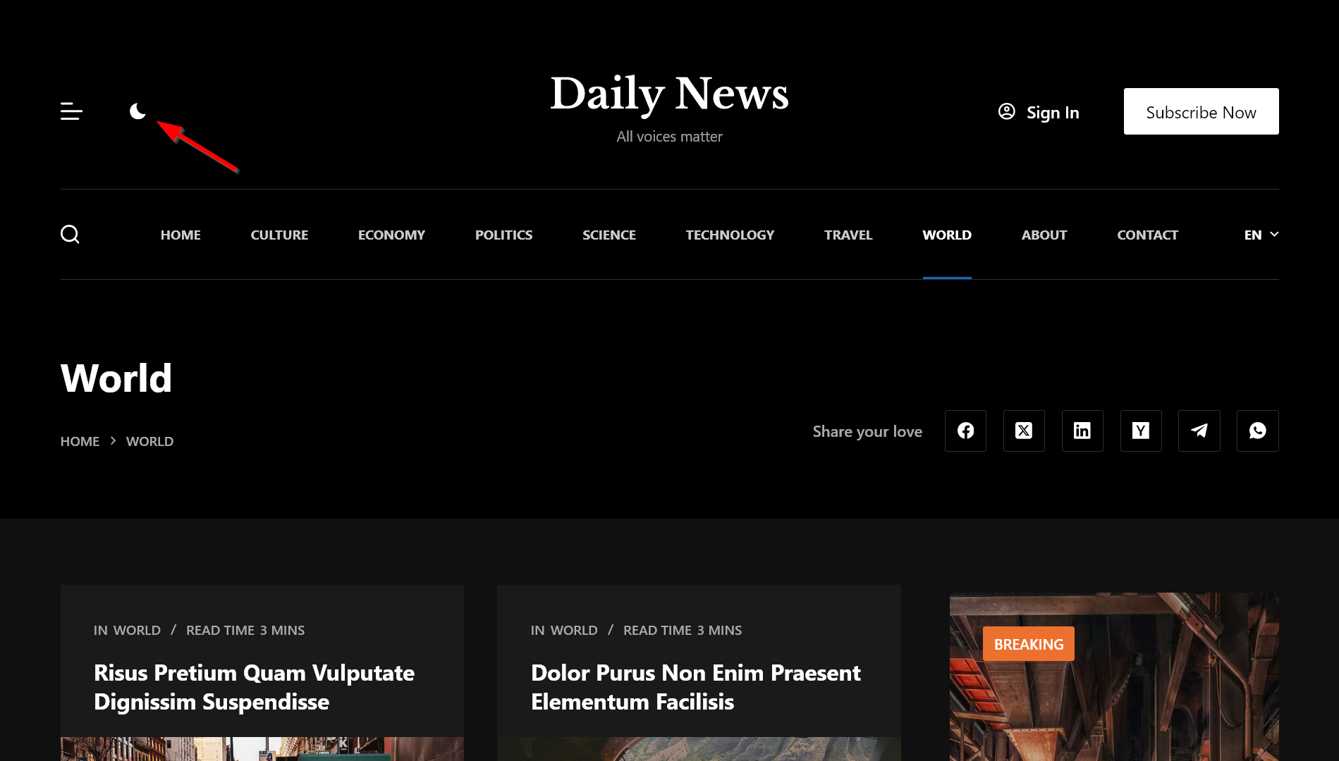
Table of Contents
Why Add Dark Mode to Your WordPress Site?
Dark mode is more than just a design trend—it’s a feature that enhances usability, accessibility, and overall user satisfaction. Here’s why adding dark mode to your WordPress site is worth the effort:
- Dark mode reduces eye strain, especially in low-light conditions, making it easier for users to engage with your content for longer periods.
- For users with light sensitivity or visual impairments, dark mode provides an alternative that improves readability and comfort.
- Dark mode has become a preferred feature for many users across apps, websites, and devices. Offering it shows that you’re in tune with user preferences.
- On devices with OLED or AMOLED screens, dark mode uses less power, extending battery life for users.
- A sleek dark mode design adds a layer of professionalism and modernity to your website, enhancing its overall aesthetic.
Getting Started: What You’ll Need
To follow through this tutorial, we recommend that you:
- Read the previous tutorial which shows how to create a color palette using Blocksy’s advanced color system (available in the free version of the theme). This will be your light mode color palette that we’ll enhance with the dark mode color palette in this tutorial.
- Install and activate Blocksy Pro, as the Color Mode Switch module is a premium extension.
- Import the Renovation starter site, which we also used in the previous tutorial, so you can follow up easily.
The Four Cornerstones of Adding Dark Mode in WordPress: The Theory
Before looking into the practical details of how to add dark mode in WordPress, let’s quickly see the four cornerstones of Blocksy’s dark mode implementation, which will help you make the most out of its Color Mode Switch module:
Step 1: Enable the Color Mode Switch Module
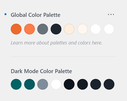
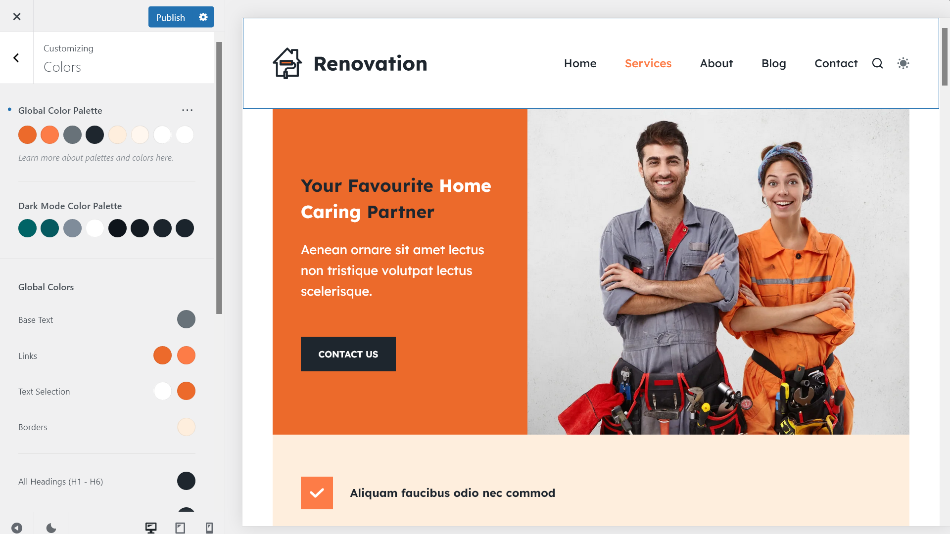
Blocksy adds a default dark mode palette to your WordPress site; this is where you can start from. The default dark mode colors (forest green, gray, yellow, black) work fine for most websites, but most likely, you’ll want to tweak them a bit or more.
Any time you get stuck with creating your custom dark mode palette, you can return to the default colors by clicking the ‘Undo’ icon (i.e. the blue dot icon left to the palette).
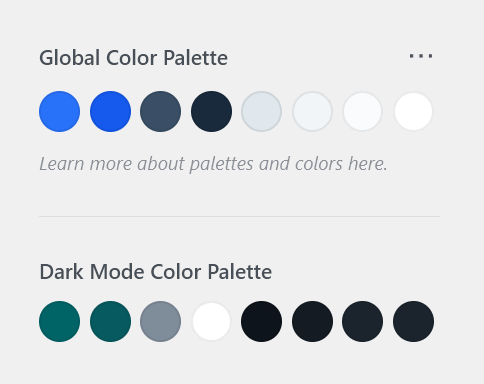
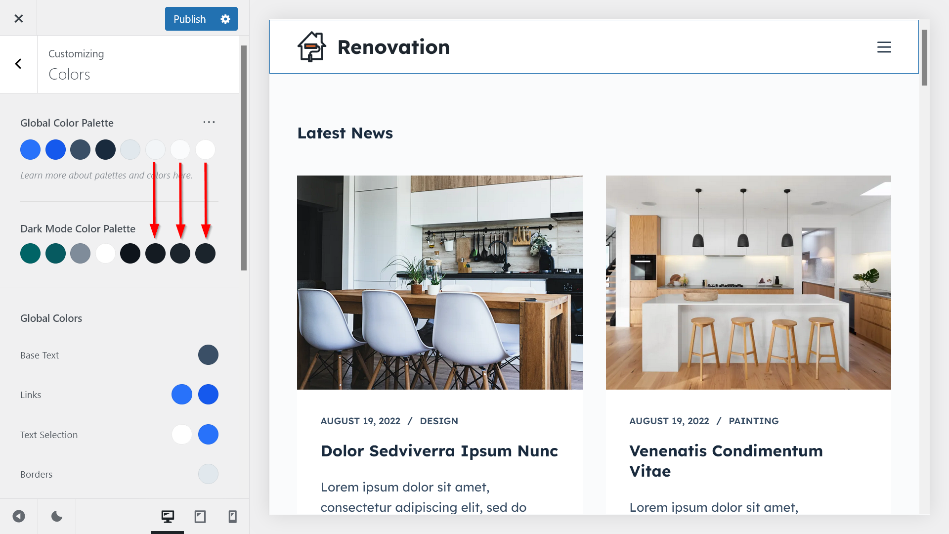
Each of the 12 pre-defined color palettes comes with the same default dark mode color palette so that first you can focus on creating your light mode color palette (referred to as Global Color Palette in the Customizer), which is the basis of your website design (see the previous tutorial), then you can adapt your dark mode color palette to it:
Step 2: Add the Color Switch to Your Header
Blocksy’s color system is based on color variables that enable you to change both the light and dark mode colors of any element on your website with the click of a button.
You can assign a light and dark mode color to each color variable. The light and dark colors belonging to the same color variable form color pairs:
The light and dark mode colors of a color pair are assigned to the same color variable:
Step 3: Customize Your Dark Mode Color Palette
Despite the usage of color pairs, the light and dark mode palettes are still not tied to each other.
For example, in the screenshot below, we updated the light mode colors, but the dark mode colors are still the same:
When we updated the light color palette, the light color values of the color variables were updated automatically, and new color pairs were formed:
Step 4: Adjust Colors for Page Elements and Blocks
Due to the usage of color pairs, you can create two or more dark mode equivalents for a light mode color.
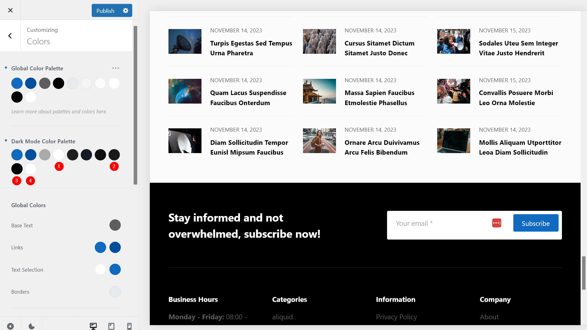
For example, in the screenshot below, you can see the pre-configured light and dark mode color palettes on one of our News starter sites. It has four black-and-white color pairs: (1) black/white, (2) white/black, (3) black/black, and (4) white/white.
This is because sometimes we want to keep the original colors in dark mode. For example, in this design, the footer has a black background and white text in light mode and we want to keep it as is in dark mode as well (i.e. we don’t want to show a footer with a white background in dark mode):
How to Add Dark Mode in WordPress: The Practice
Now let’s see how to add dark mode in WordPress using Blocksy’s Color Mode Switch extension.
First, we’ll add the color switch to the header menu, then, we’ll customize the dark mode color palette, and finally, we’ll apply it to various website elements.
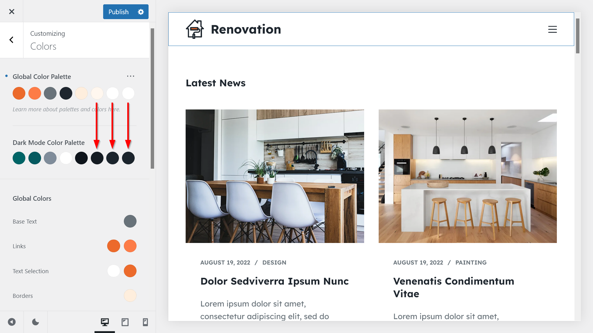
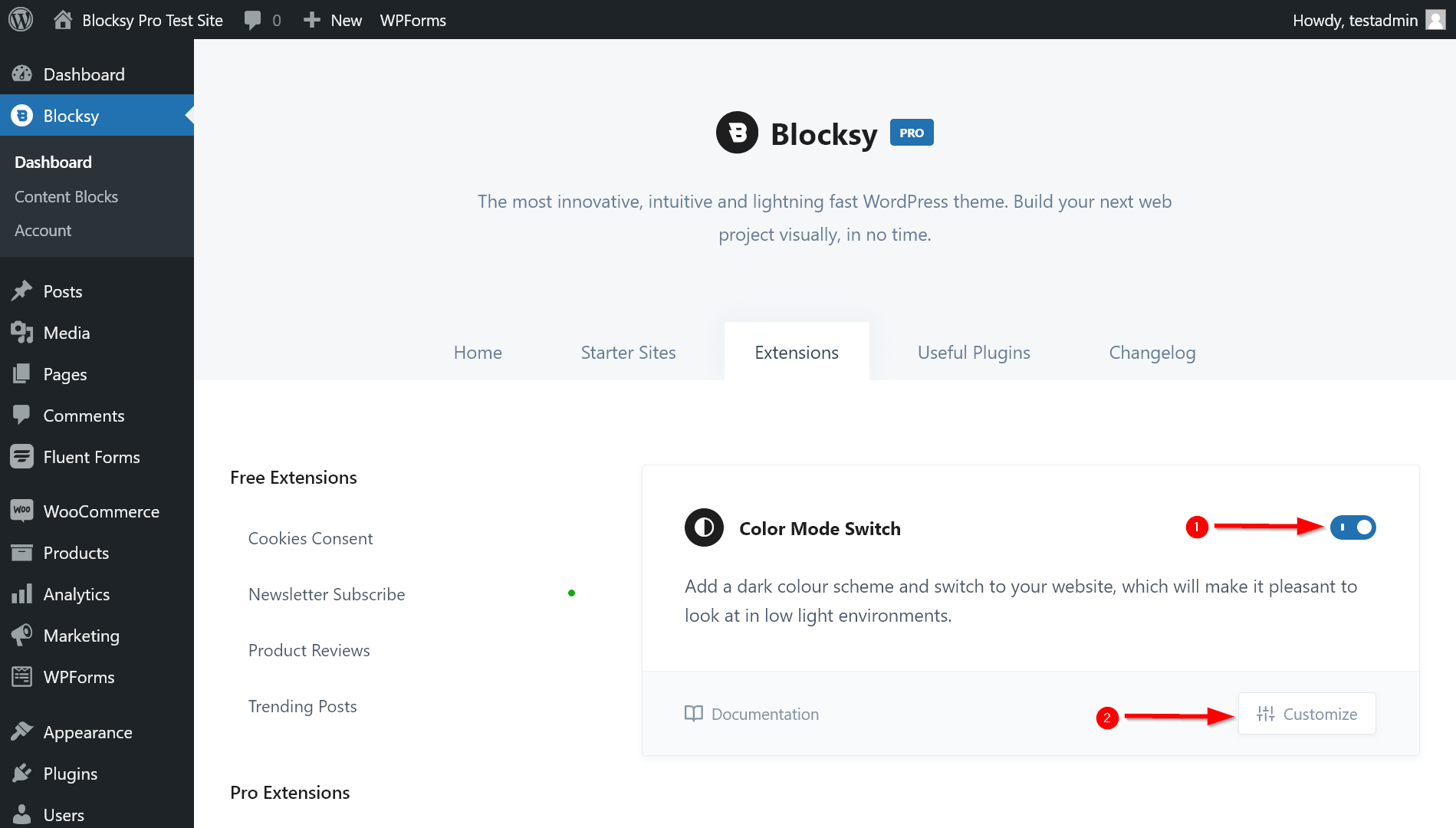
1. Toggle the Color Mode Switch Extension On
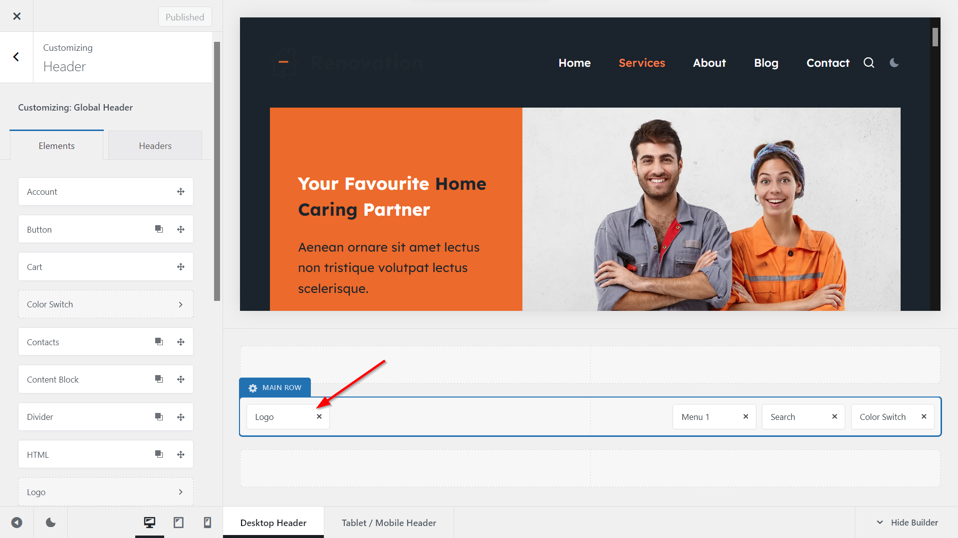
In your WordPress admin area, go to Blocksy > Extensions > Pro Extensions > Color Mode Switch, toggle the extension on, then click the Customize button, which will open Blocksy’s Header Builder in the WordPress Customizer:
2. Add the Color Switch to Your Desktop Header
Once in the Header Builder, find the Color Switch element in the Elements panel…:
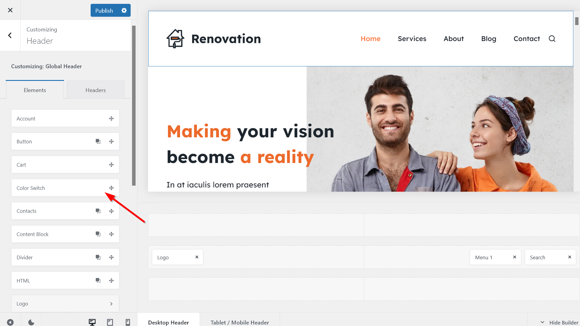
…and drag-and-drop it to the location where you want to display it.
For example, we dropped it right to the Search icon:
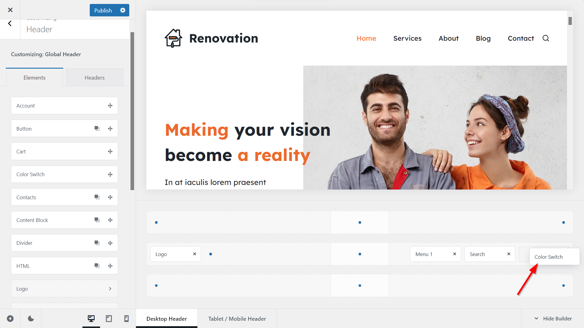
Wait a few seconds until the Customizer updates, and you’ll see the color switch appearing in the header menu at the location where you’ve dropped it:

You can also test the color switch right from the Customizer — just click the little sun icon, and the page will switch to dark mode immediately:
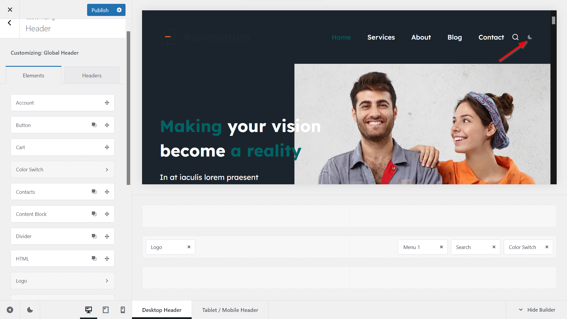
As you can see above, the dark mode colors are not perfect yet (e.g. the highlighted text in the headline is too dark, the logo is invisible, etc.) — we’ll fix the dark mode colors of individual elements in Step 6 (blocks) and Step 7 (logo).
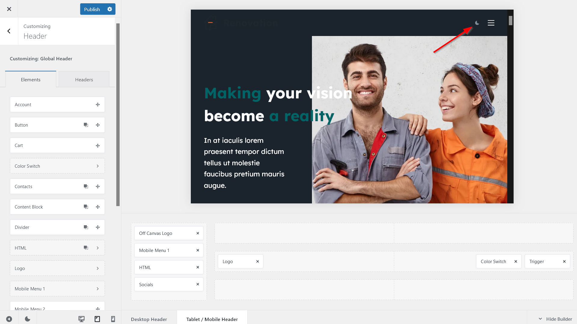
3. Add the Color Switch to Your Tablet / Mobile Header
If you also want to show the color switch on mobile and tablet devices, you’ll need to add it separately.
To do so, click the Tablet / Mobile Header tab in the Elements panel and drag the Color Switch element to the location where you want to show it on small-screen devices:
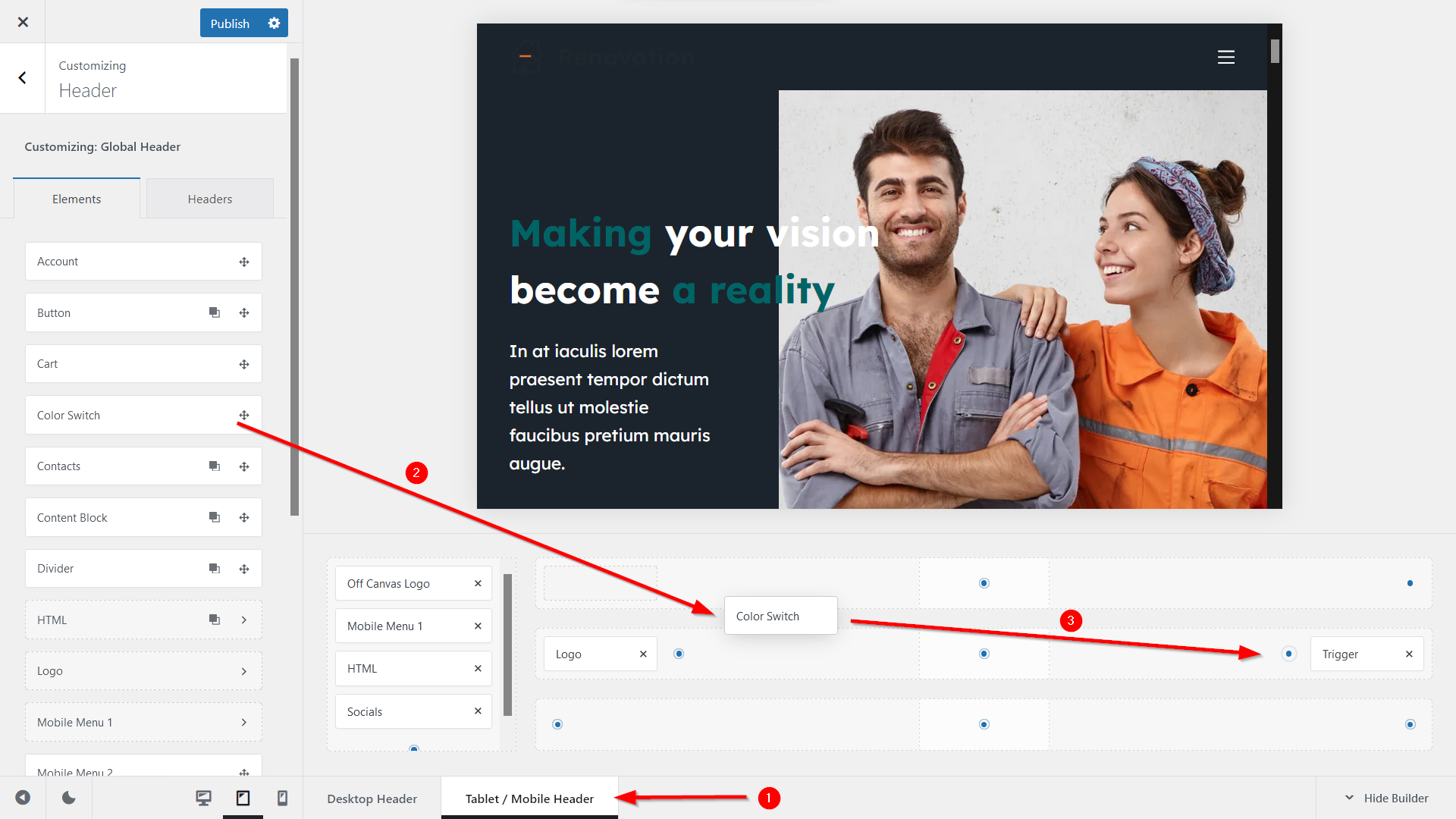
Once you’ve added the color switch to the Tablet / Mobile Header, you’ll see the color switch appearing at the location where you’ve dropped it (in our example, left to the hamburger menu):
(It’s also possible to show the color switch only on mobile and tablet, but not on desktop devices — to do so, only add the element to the Tablet / Mobile Header.)
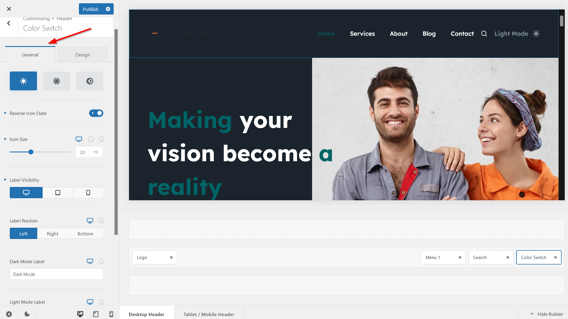
4. Configure the Settings of Your Color Switch
Now click right into the Color Switch element in the Desktop Header tab, which will open its detailed settings:
i. Customize the General Settings
Use the General tab to customize the general settings of your color switch, including the:
- icon (you can choose from three icon styles and reverse the icon state, i.e. you can show the sun icon in dark mode and the moon icon in light mode)
- label visibility, position, and text
- default color mode (to support website accessibility, choose the OS Aware option, which respects the user’s operating system settings):
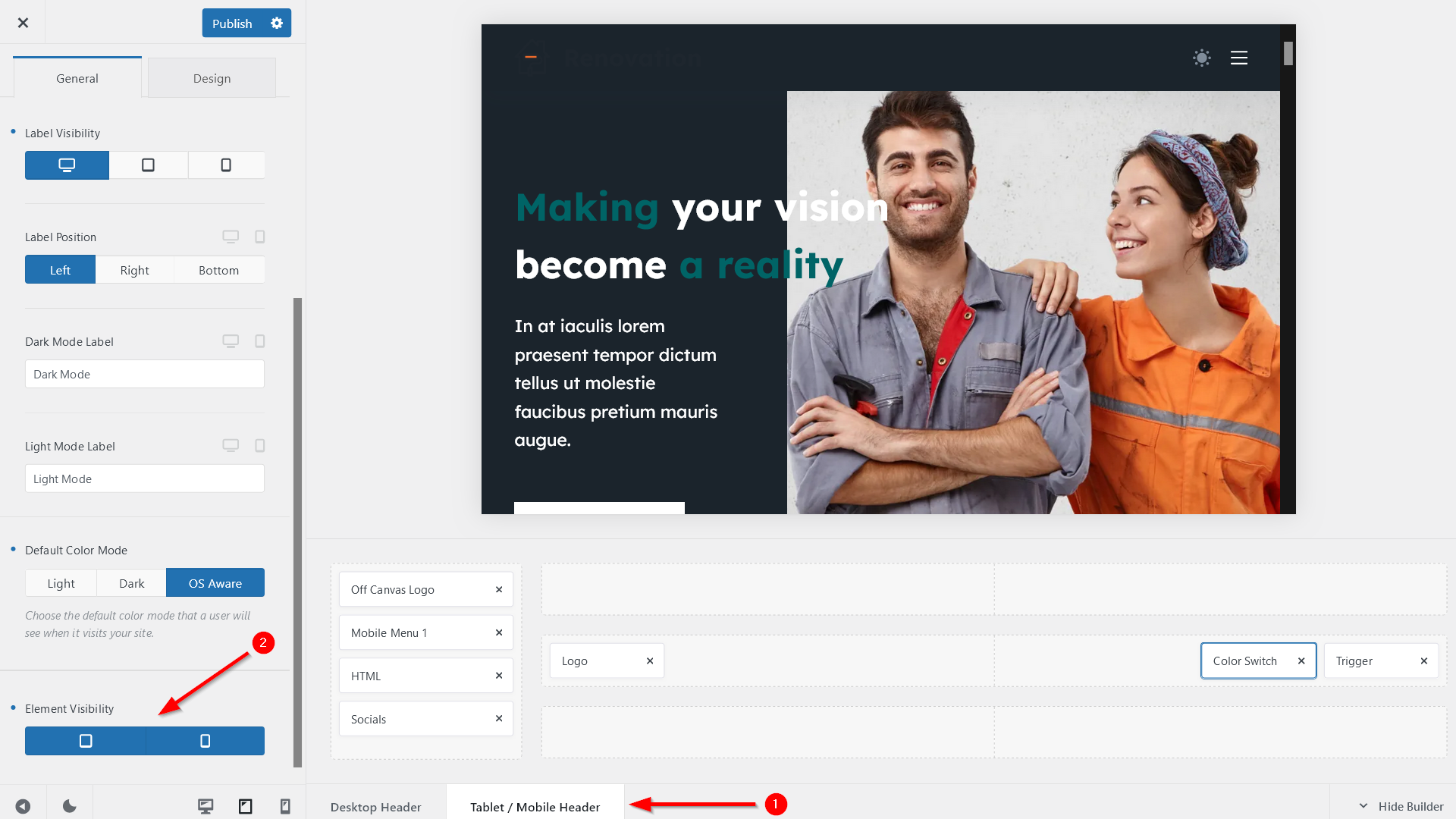
ii. Access the Element Visibility Option for Tablet and Mobile
If you’ve added the color switch for tablet and mobile devices, click the Tablet / Mobile Header tab, which adds an extra Element Visibility setting at the bottom of the General tab.
Here, you can configure whether you want to show the color switch only on tablet, only on mobile, or on both small-screen device types:
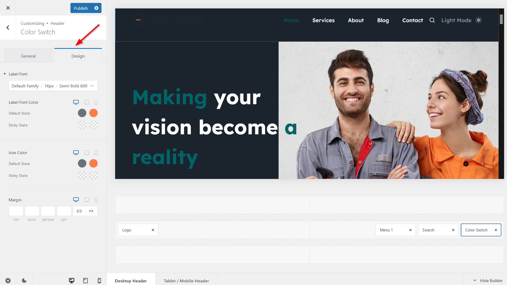
iii. Configure the Font, Color, and Alignment Options of Your Color Switch
Now open the Design tab and configure the:
- label font (this is only relevant if you show a label next to the color switch), including the font family, font size, line height, letter spacing, and capitalization
- colors of the label font and the color switch icon (by default, it pulls the colors from Global Colors; we’ll look into how to use these options in Step 6)
- margin around the color switch (you can set different margins for desktop, tablet, and mobile devices):
5. Customize Your Dark Mode Color Palette
To customize your dark mode color palette, open the General Options > Colors panel in the Customizer where you can see the Dark Mode Color Palette setting populated with the default dark mode colors:
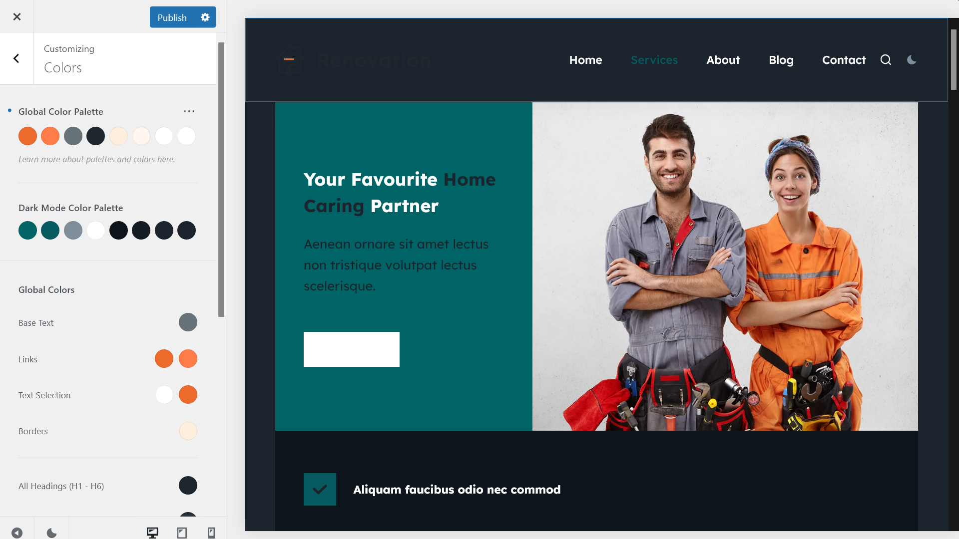
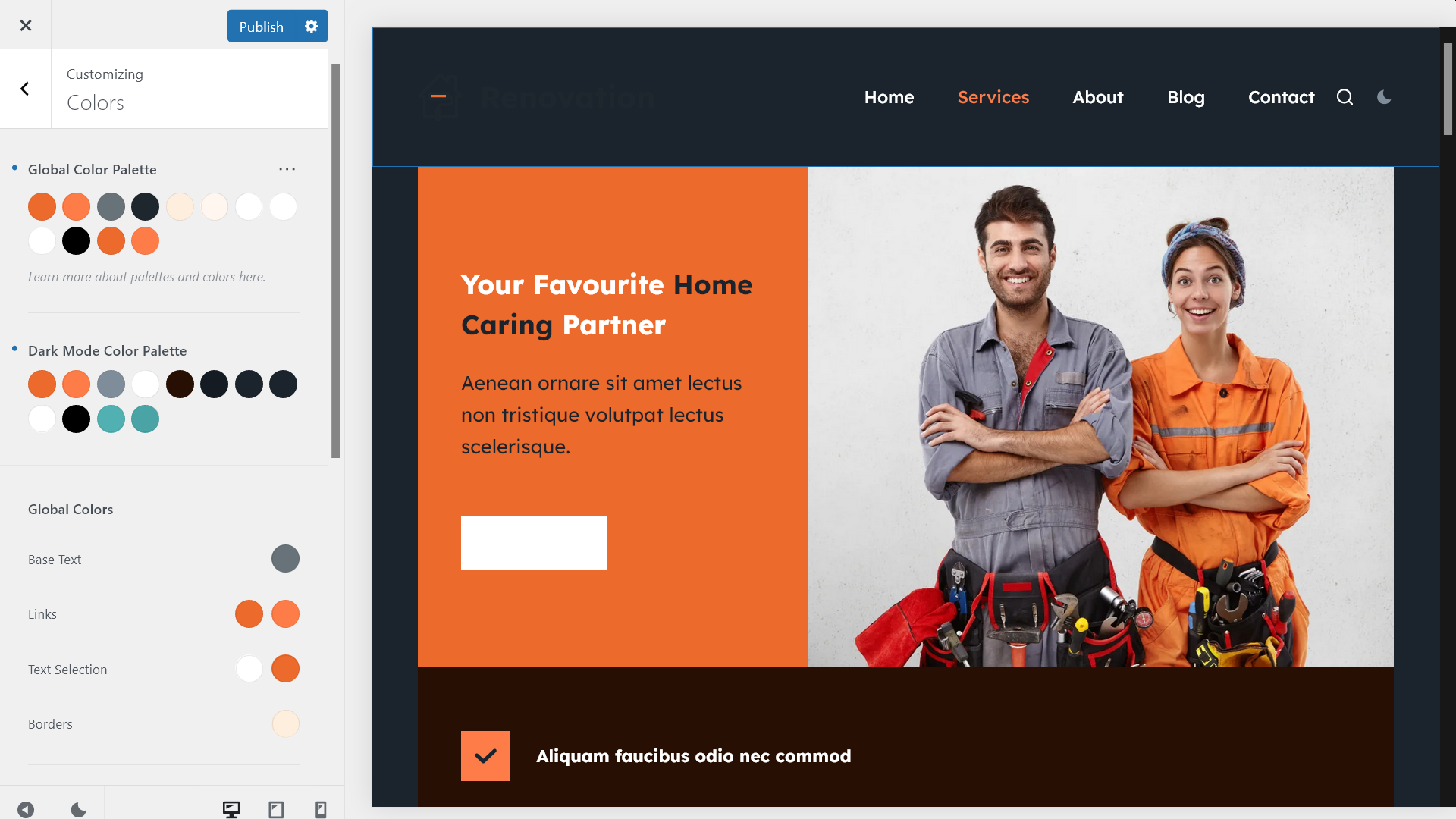
If you switch the site to dark mode, you’ll see that the default dark mode colors don’t look good everywhere.
For example, here’s what the Services page of the Renovation demo looks like in dark mode with the default colors:
With Blocksy, you can customize the default dark mode color palette in two ways:
- by overriding the default colors
- by adding new colors to the palette
Let’s see how to do both.
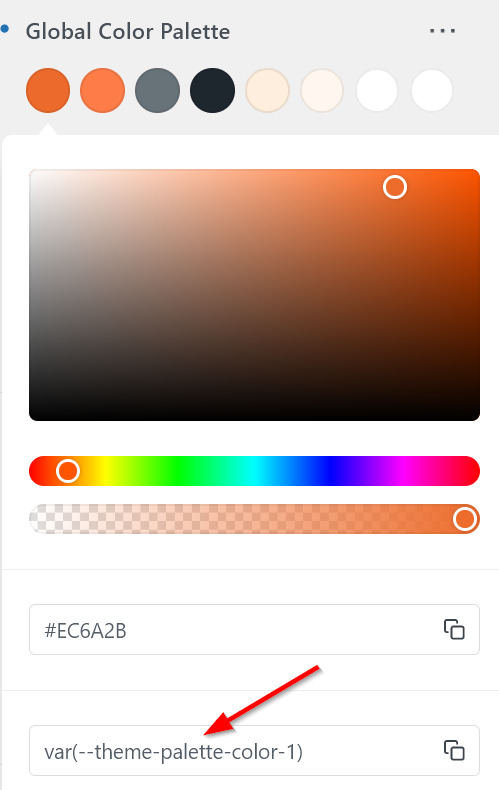
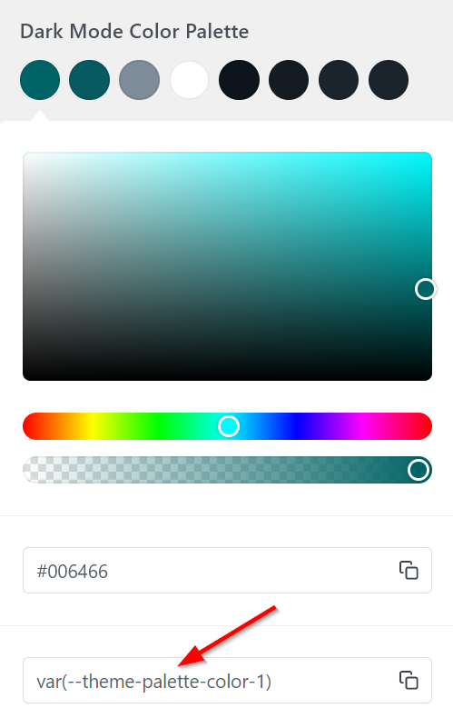
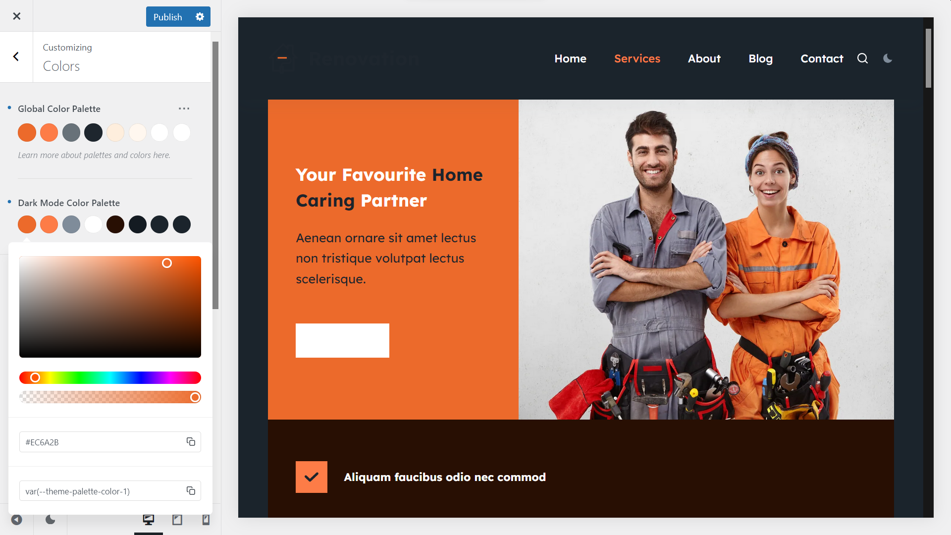
i. Override (Change) the Default Dark Mode Colors
To override the default dark mode colors, click into the color swatch you want to change and add the new color using the color picker.
For example, you can keep the main brand color in dark mode.
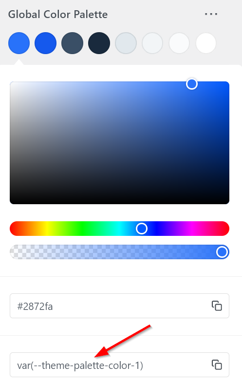
You can do so by copying the hex code (#EC6A2B in the example below) of the first swatch in the Global Color Palette and pasting it into the hex code field of the first swatch in the Dark Mode Color Palette.
As you can see, the background color of the hero section has changed immediately — this is because we overrode the dark mode value of Color 1:
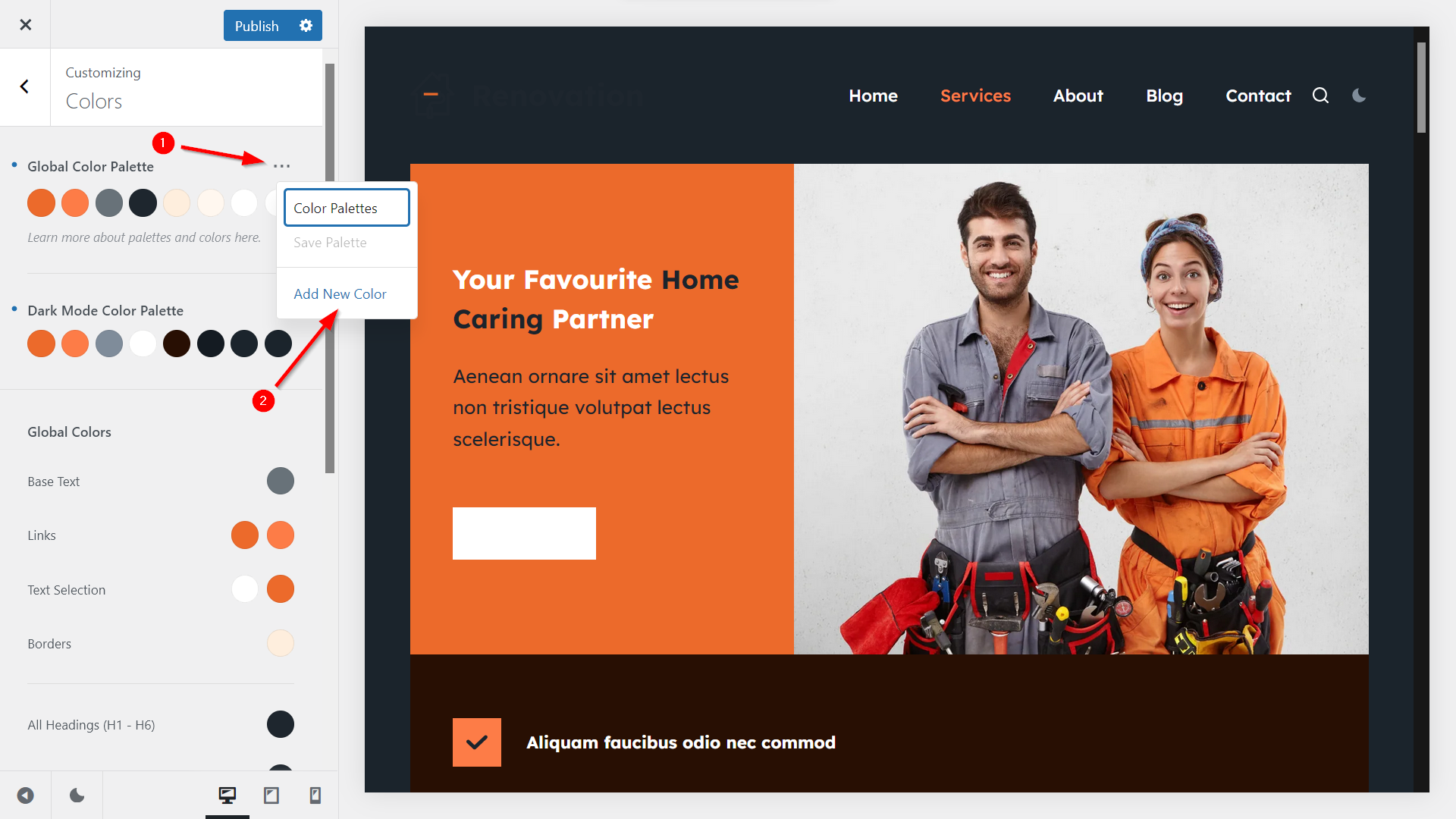
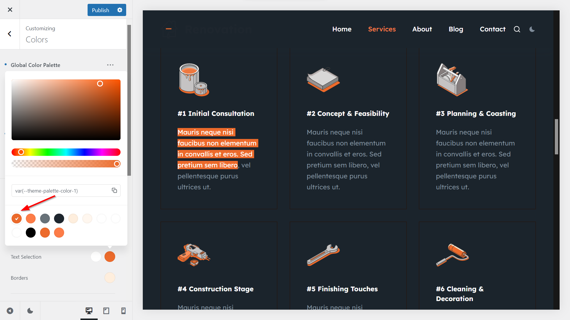
ii. Add New Colors to Your Dark Mode Palette
To enhance your dark mode color palette with new colors, click the three dots icon in the top-right corner of the Colors panel and select the Add New Color option:
When the new color swatches for the new color pair appear on the screen, you can add the extra colors (each color pair will register a new color variable).
For example, in the screenshot below, we enhanced the palettes with four new color pairs:
- the white/white and black/black color pairs will enable us to keep the original black and white colors in dark mode (e.g. we’ll use it to fix the Contact Us button on the Services page)
- the two orange/teal color pairs will allow us to use complementary colors in dark mode (e.g. we’ll use it for the text selection):
6. Configure the Dark Mode Colors of Your Page Elements and Blocks
Once your dark mode color palette is set up, Blocksy immediately applies the first eight color pairs (i.e. the default color variables) to your site.
However, you can assign a new color pair to any of your page elements or blocks. Let’s see how to do so.
i. Change Your Global Colors
The Global Colors options in the Colors panel let you assign color variables to different page elements globally, including the base text, links, borders, headings, the page background, and others.
You can assign a new color variable to your global elements by clicking into the color swatch and choosing a new color.
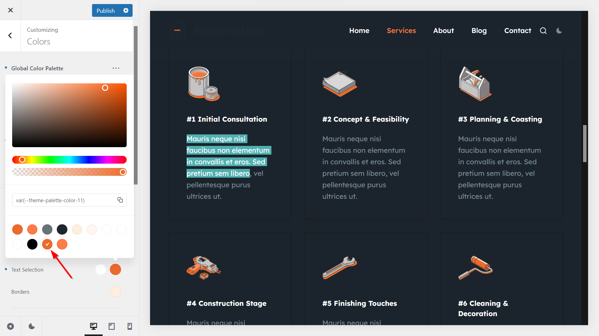
For example, Color 1 is assigned to the background color of the Text Selection option by default. This is the orange/orange color pair, which means that the text selection has an orange background in both light and dark modes:
However, if you choose Color 11, which is the orange/teal color pair we created in Step 5, you can keep the orange background in light mode while showing a teal background in dark mode:
You can use the same method to configure the dark mode color of any of your elements in the Customizer, block editor, and supported page builder plugins (i.e. Elementor, Beaver Builder, Brizy, and Zion Builder).
ii. Use Your Dark Mode Color Palette in the Block Editor
For example, let’s see how to fix the Contact Us button on the Services page, which currently uses white text on a white background in dark mode.
First, open the Services page in the block editor by going to Pages > All Pages > Services > Edit in your WordPress admin area.
As you won’t see the page in dark mode in the block editor, you’ll need to either imagine it or open the frontend preview in another browser tab.
Click the Contact Us button to open its settings (note that this demo is built with the Stackable plugin, so you’ll see the options of the Stackable block, but Blocksy’s color system works the same way with ordinary Gutenberg blocks too).
The dark mode color options won’t show up inside the block’s settings, so you’ll need to use the light mode color swatches.
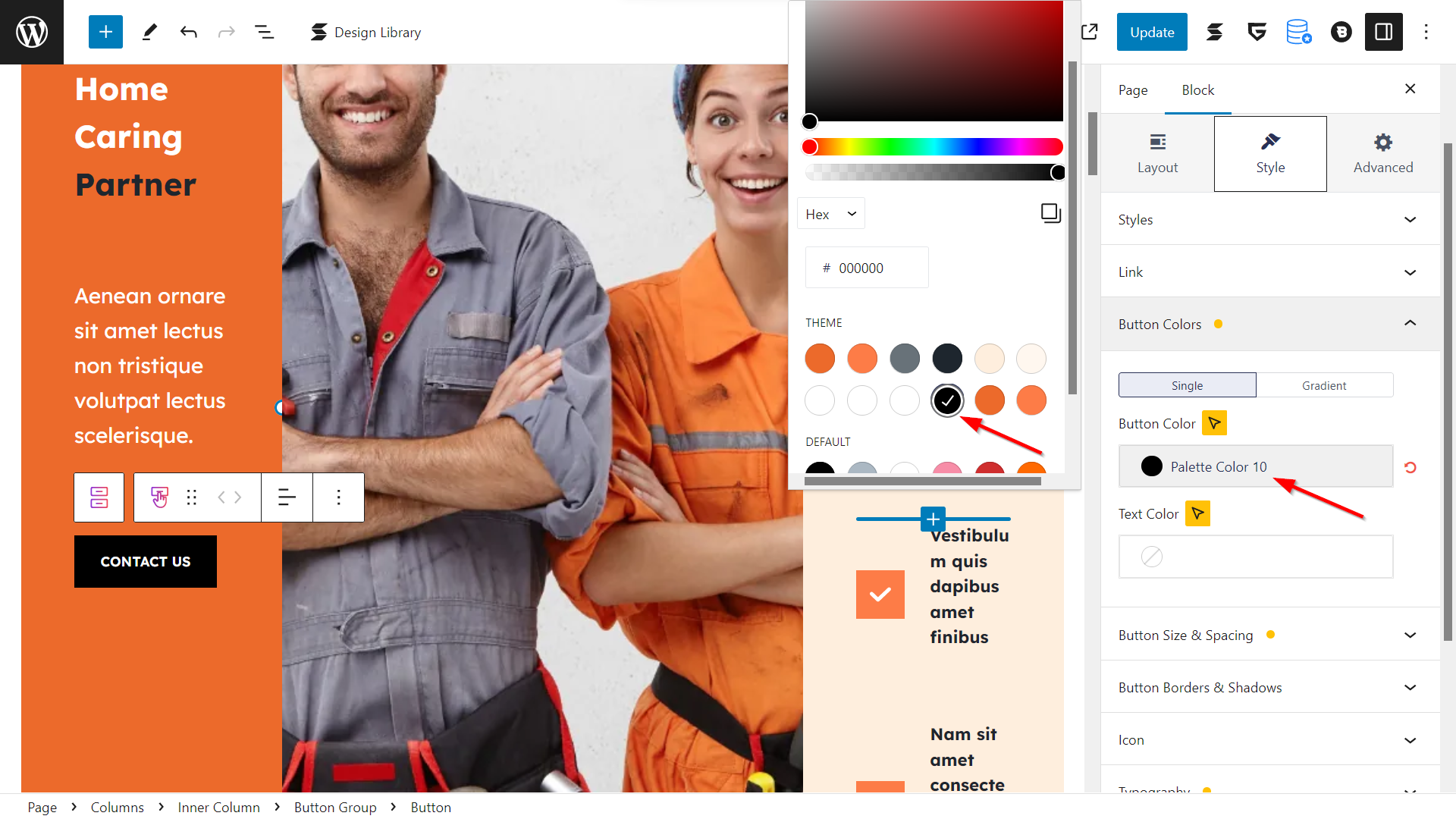
Right now, the block uses Color 4, which is the black/white color pair — this is why the background of the button is white in dark mode:
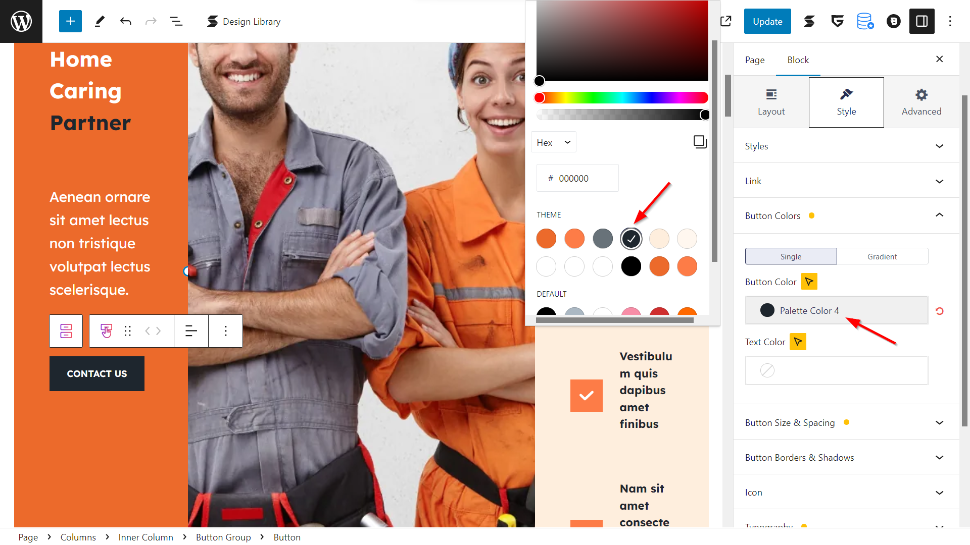
To show a black background in dark mode as well, select Color 10, which is the black/black color pair:
Update the page, then open it on the frontend of your site.
As you can see below, now the Contact Us button has a black background and white text in dark mode too:

7. Add Your Dark Mode Logo
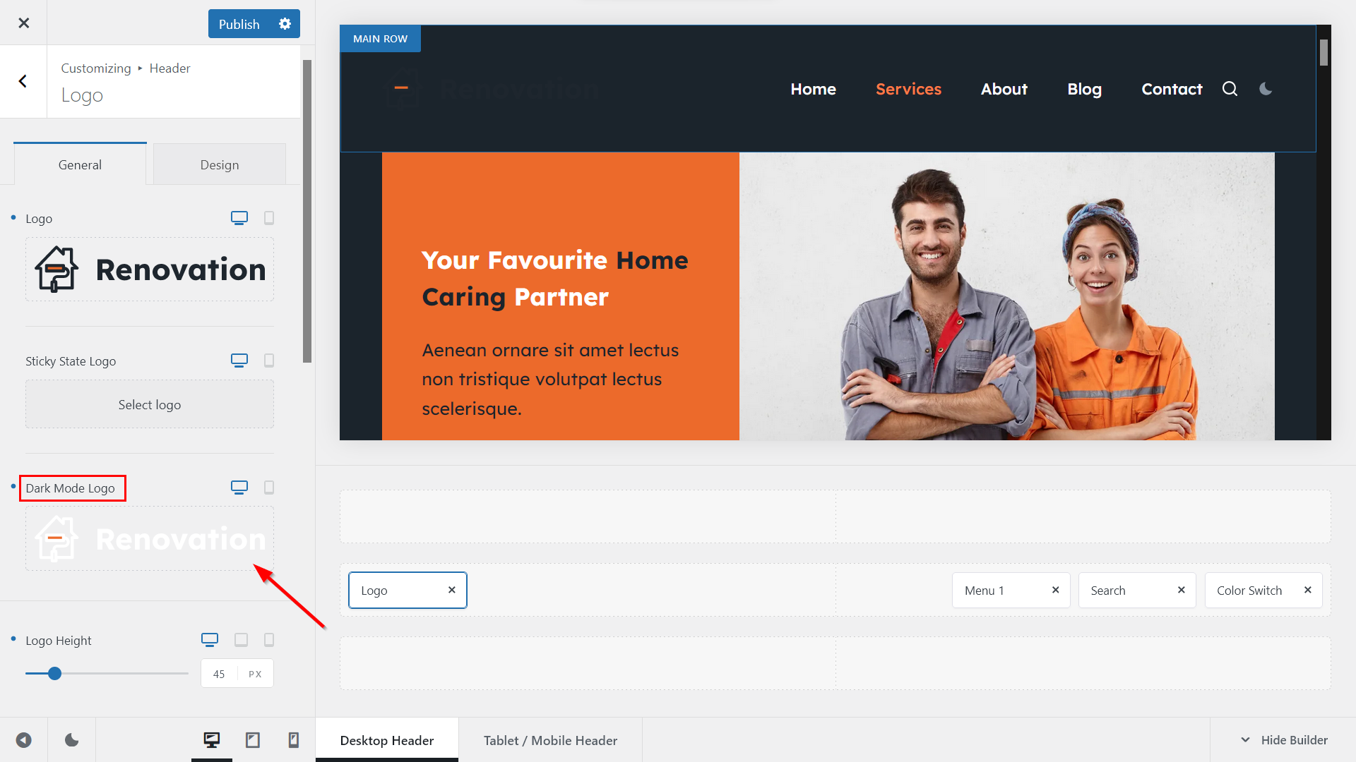
Finally, let’s see how to add a dark mode logo to your WordPress site.
Open the Header Builder by going to General Options > Header in the Customizer and click into the Logo element to open its settings:
When the settings appear in the left panel, click into the Dark Mode Logo field and add the dark mode version of your logo:
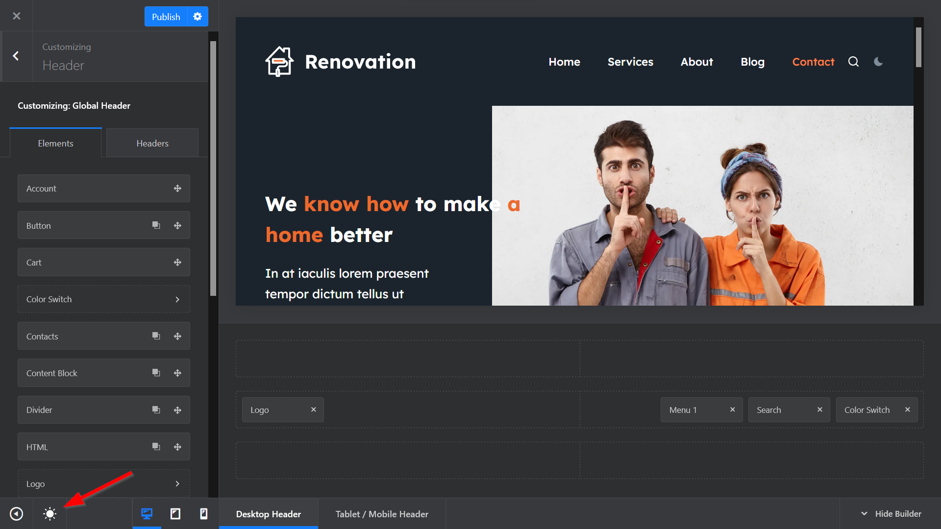
Click the Publish button, close the Customizer, and reload the page to see what your dark mode logo looks like on the frontend of your WordPress site:
Free Bonus: Switch the Customizer to Dark Mode
In this tutorial, we looked into how to add dark mode in WordPress using Blocksy’s premium Color Mode Switch extension.
You can combine the dark mode palette with Blocksy’s other free and Pro features and modules as well, including the transparent header, newsletter subscribe popup, sticky header, and many more.
While we highly recommend that you upgrade your free plan to add premium features to your site — if you’re not ready yet, we also have a free dark mode feature, available to every Blocksy user.
To access it, open the Customizer and click the little moon icon in the bottom-left corner to switch the entire Customizer UI, including the header and footer builders, into dark mode:
Common Challenges When Adding Dark Mode to WordPress (and How to Solve Them)
While dark mode enhances your site’s usability and appeal, you might encounter some issues during implementation. Here’s a guide to common challenges and their solutions to ensure a smooth experience:
1. Logos and Images Not Visible in Dark Mode
- The Problem: Light-colored logos and images may blend into dark backgrounds, making them invisible or hard to see.
- The Solution:
- Upload a dark mode version of your logo with contrasting colors.
- Use Blocksy’s Header Builder to assign a specific logo for dark mode by navigating to Customizer > Header > Logo Settings > Dark Mode Logo.
- For images, add a subtle border or adjust brightness and contrast in your image editor.
2. Text or Buttons Blending into Backgrounds
- The Problem: Inconsistent color palettes may cause text or buttons to become unreadable or invisible against the background.
- The Solution:
- Use Blocksy’s Global Colors to adjust text and button colors specifically for dark mode.
- Test contrast levels for accessibility using tools like WebAIM’s Contrast Checker.
- Apply high-contrast colors for key elements like CTAs to ensure visibility.
3. Poor Color Harmony in Dark Mode
- The Problem: A mismatched dark mode palette may look inconsistent or unprofessional, harming user experience.
- The Solution:
- Customize Blocksy’s default dark mode palette to align with your brand colors.
- Use complementary colors and subtle gradients to add depth and harmony.
- Stick to a limited number of colors to maintain a clean and cohesive design.
4. Performance Issues with Third-Party Plugins
- The Problem: Some dark mode plugins may conflict with your theme or slow down your site.
- The Solution:
- Use Blocksy’s built-in Color Mode Switch module instead of third-party plugins to avoid compatibility and performance issues.
- Regularly update your theme and plugins to minimize conflicts.
5. Inconsistent Dark Mode Behavior Across Devices
- The Problem: Your dark mode design may not look consistent on mobile, tablets, and desktops.
- The Solution:
- Preview your site in dark mode on different devices to identify inconsistencies.
- Use Blocksy’s responsive design settings in the Customizer to adjust margins, fonts, and element placements for mobile and tablet views.
- Test on multiple browsers to ensure compatibility.
6. Users Missing the Dark Mode Switch
- The Problem: If the dark mode toggle is not prominently displayed, users may not notice it.
- The Solution:
- Place the toggle in a highly visible location, such as the header or navigation bar.
- Use a clear icon (e.g., a sun/moon) or text label to make the toggle easy to understand.
- Highlight the dark mode feature in your site’s introduction or promotional materials.
7. Overuse of Pure Black Backgrounds
- The Problem: While pure black may seem intuitive for dark mode, it can cause eye strain and make text appear harsh.
- The Solution:
- Use dark grays (e.g., #121212 or #1E1E1E) instead of pure black for a softer look.
- Balance darker backgrounds with lighter text colors to improve readability and reduce eye strain.