

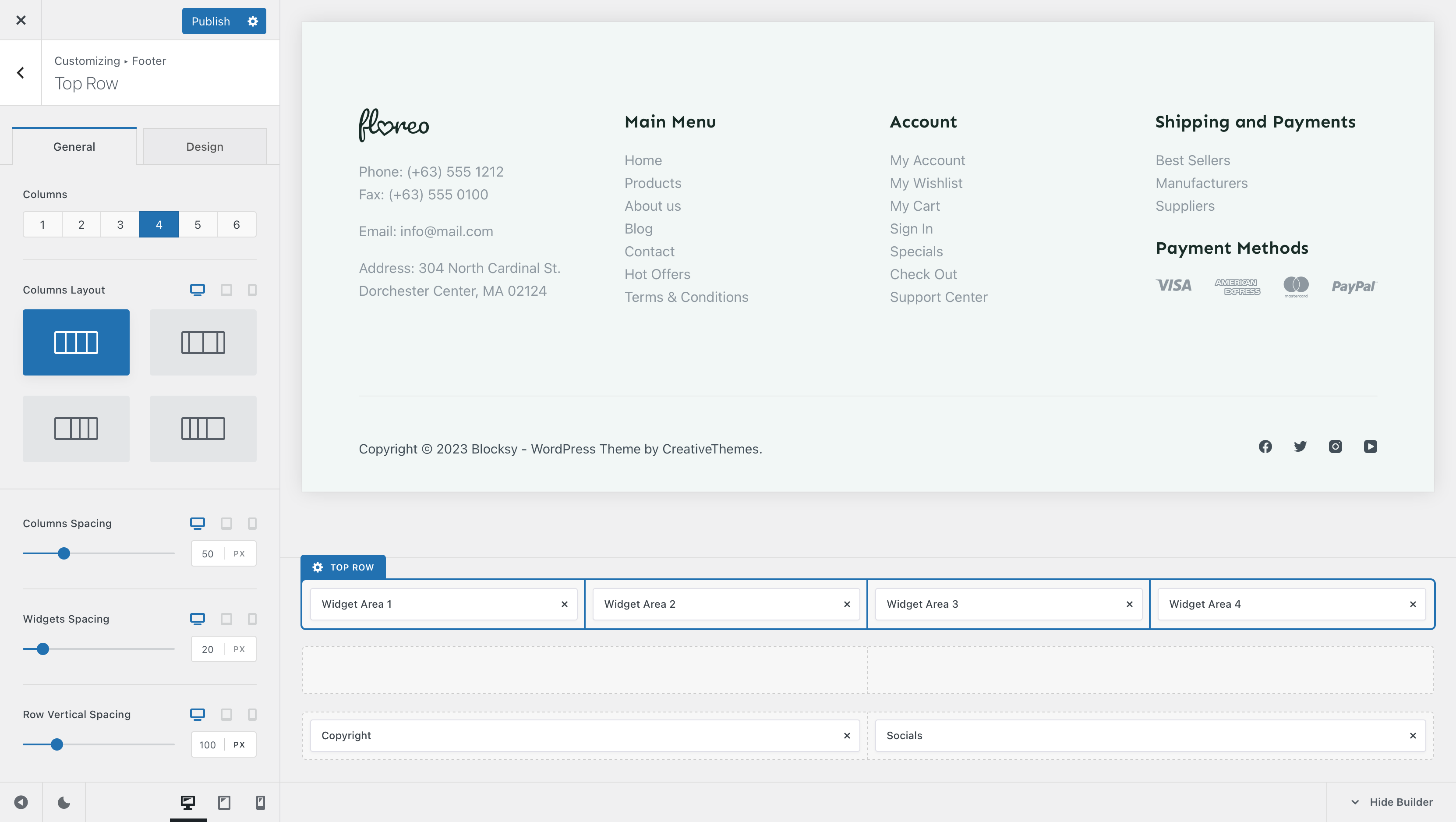
Each footer row has its own set of options which can be further customised to your liking. Options such as the number of columns, the column layout and spacing settings are available at your fingertips.
Granular Controls
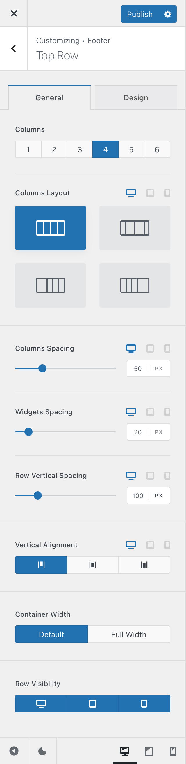
Columns
Each footer row gets split into multiple columns — up to 6 max — to help with aligning various elements inside of it.
Columns Layout
Here, you can select how the columns will be arranged, on a device basis. You can have some columns spread more, as well as toggling between vertical and horizontal columns on mobile devices.
Columns Spacing
This option controls the spacing in between the columns. Simple as that!
Widgets Spacing
Control the spacing between Gutenberg widgets with ease.
Row Vertical Spacing
This option lets you control the padding that the footer row has, on a vertical axis. This means that you will modify the spacing of the top and bottom sections of the footer row.
Vertical Alignment
In case your footer columns are different heights, you can control how they are aligned on a vertical plane.
Container Width
Make one of your footer rows full-width or constrain it into the normal site layout width.
Row Visibility
Option that lets you hide a footer row on a per device basis. Useful in case you wish to present a streamlined footer to your visitors.