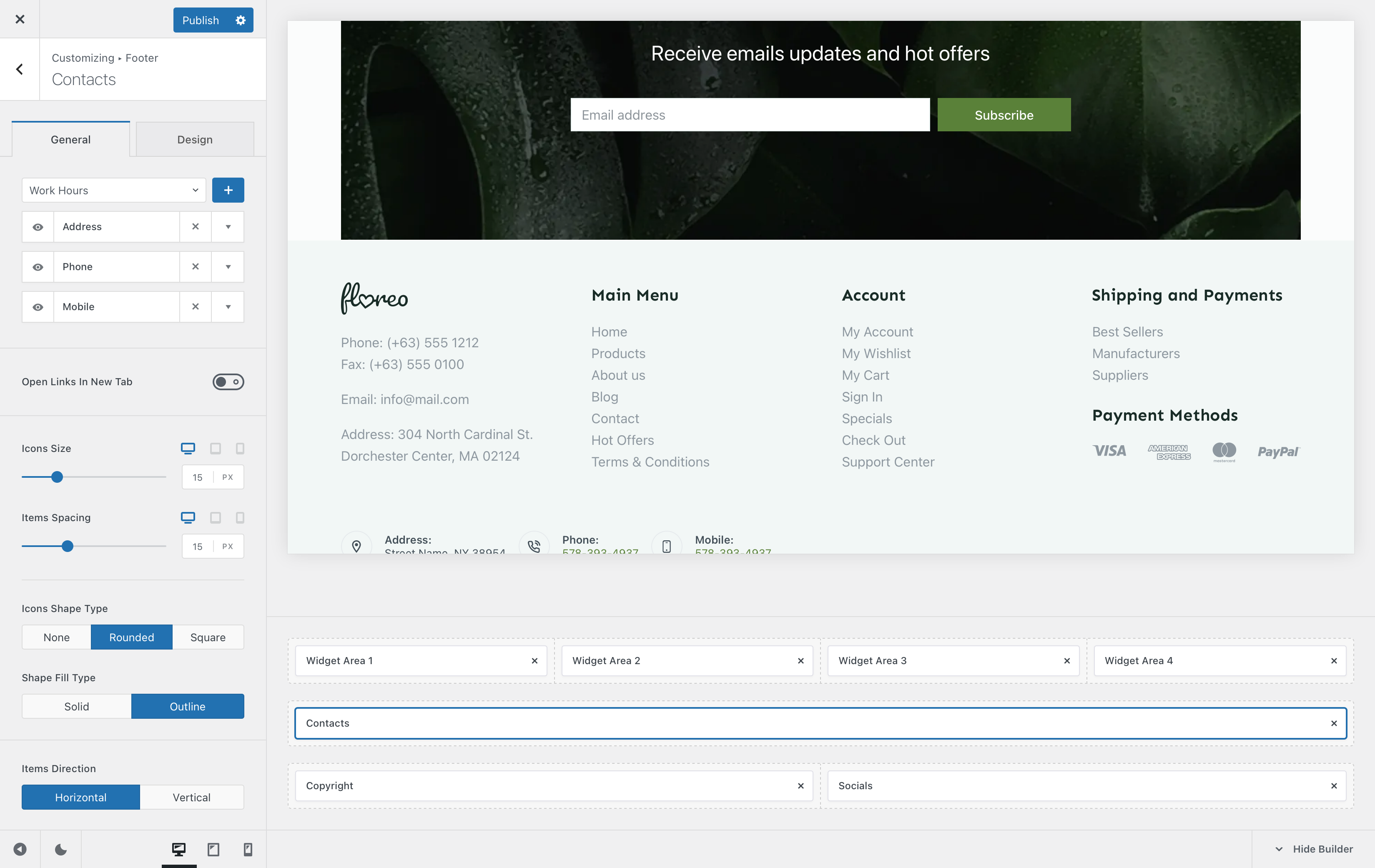
The Contacts element lets you showcase methods of contact that a user might be able to use to get in touch with you or your business. Super simple to configure, with some powerful options such as hot-linking, which lets your users click on the phone icon, for example, and dial out automatically.
Granular Controls

Sub-elements
The first part of the customiser sidebar will let you add, remove or reorder the sub-elements that are present inside the Contacts element. These include —
- Address
- Phone
- Mobile phone
- Work Hours
- Fax
- Website
There’s also a handy option that lets you open links in new tabs, in case of linking another website.
Icon Controls
This section is pretty self explanatory. It lets you control how the icons representing each contact method will look like. Size and spacing controls are available, with a few different design tweaks.
The Icons Shape Type setting will let you highlight each icon with a nice outline, in a round or squared off shape. If you select one of these shapes, you will also have a choice if you want the outline to be filled in or not.
Items Direction
This option lets you decide how you want the contact sub-elements to be spanned. You can have them stacked on top of another, or spanned across a single row in a horizontal fashion.
Element Visibility
This option lets you hide the contacts element on a per-device basis. You can show it on just the desktop view, the tablet view, mobile view or all at the same time.