

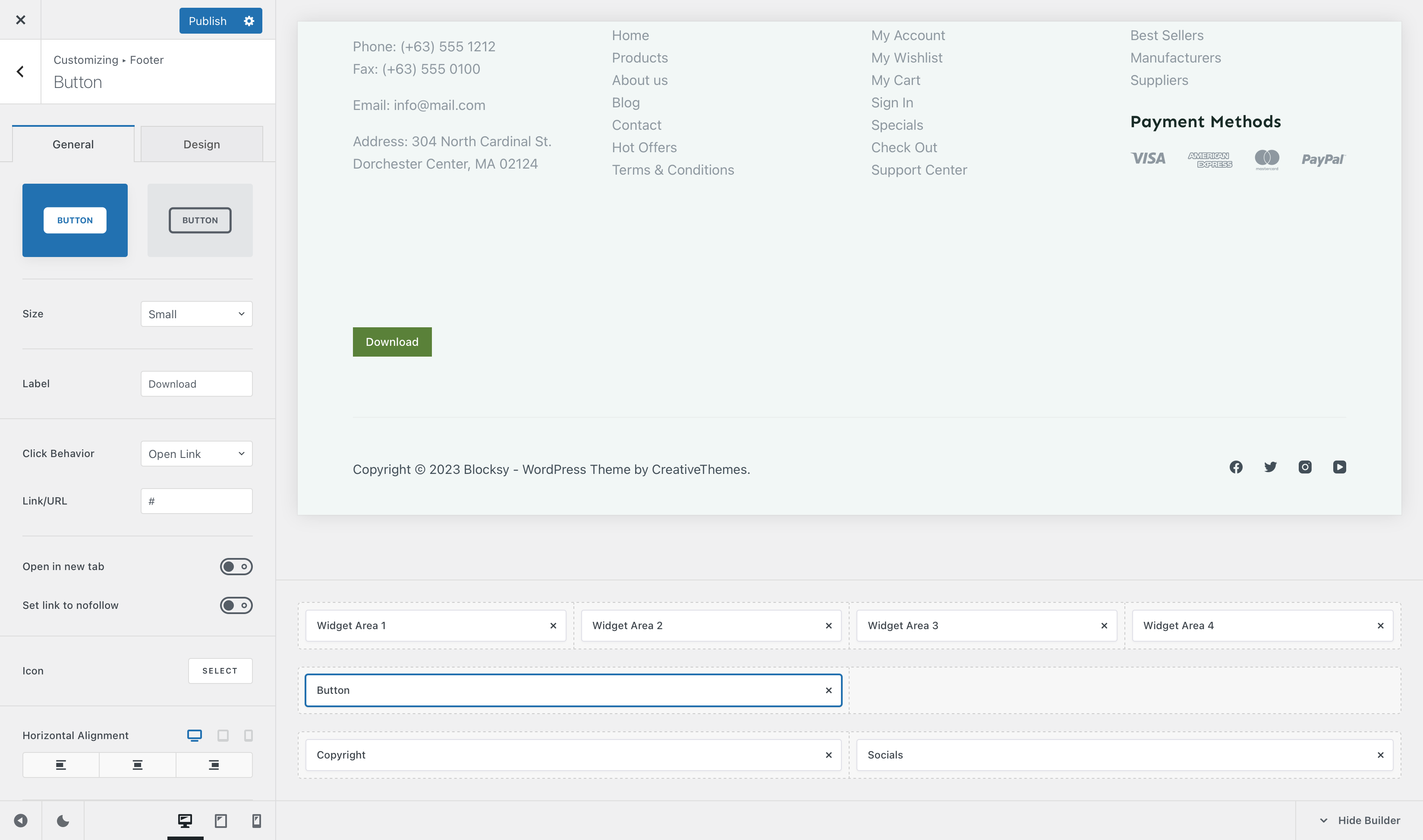
This element is pretty simple. It’s just a Button that lets you do a couple of actions, such as directing users to a specific page, opening a pop-up or just highlighting something.
Granular Controls
Button style
This first option will let you select between two simple styles for the button. One is fully filled and attracts attention instantly, while the secondary one offers an outlined design, which is subtle and blends in nicely with the content.
Size
Pick between four different sizes —
- Default – inherits the size set inside the general button options, under General -> Buttons
- Small
- Medium
- Large
Label
This lets you set the text label that’s displayed inside the button. Simple enough.
Click Behaviour
This lets you select what icon will happen when the user clicks on the button. By default, you can set it to any kind of link you might want, but Blocksy Pro users have the advantage of also opening pop-ups on demand.
The “Open in new tab” option will let you do just that — open the link in a new tab, while the “Set link to nofollow” helps search engines understand how links are sent outbounds from your website.
Icon
This section lets you highlight the button with a nice icon, that represents a call to action for your visitors.
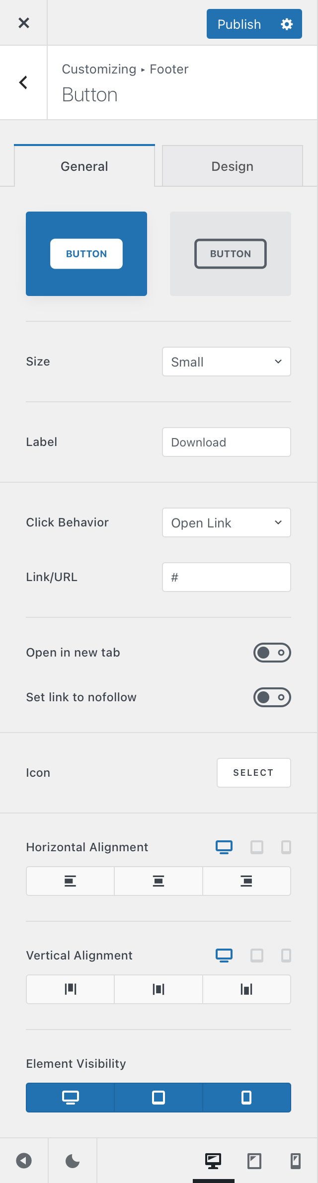
Alignment Options
The horizontal and vertical alignment options let you position the button in the place you want, within its footer row column space.
Element Visibility
This option lets you hide the button element on a per-device basis. You can show it on just the desktop view, the tablet view, mobile view or all at the same time.