

Blocksy’s Pop-up Content Block gives you the tools to display important messages, promotions, or calls to action in a clean, visually appealing box that appears on the screen based on specific conditions. Think of it as a dynamic overlay, perfect for grabbing your visitors’ attention without disrupting their browsing experience.
Just like other Content Blocks, Pop-ups integrate seamlessly with the Conditional Module, giving you precise control over when and where your message appears — whether on specific pages, user roles, or other advanced conditions.
Getting Started
Creating a new Pop-up template is quick and intuitive:
- Open your WordPress Dashboard.
- Go to Blocksy → Content Blocks.
- Click Add New at the top.
- Choose the Pop-up Template option.
Once the template is created, you’ll be taken to a blank Gutenberg canvas, where you can begin building your custom pop-up using blocks, just like any other piece of content.
Granular Controls
Once your pop-up is created, a range of options becomes available to help fine-tune its behaviour and appearance.
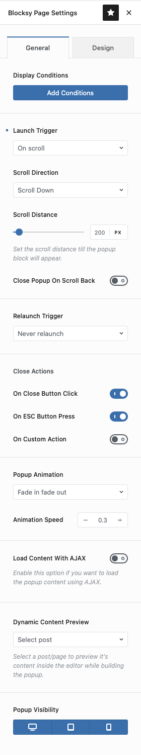
Display Conditions
This section integrates with the Conditional Module, allowing you to decide exactly where and to whom the pop-up should appear — based on factors like specific pages, user roles, device types, and more.
Launch Trigger
Control how and when the pop-up is activated, once the display conditions are met. Multiple trigger types are available:
- On Scroll – Displays the pop-up based on scrolling interaction. Choose between scroll down, scroll up, or scroll to a specific element on the page by targeting a CSS class. You can also set the pixel distance the user must scroll before the pop-up appears.
- On Element Click – Shows the pop-up once a visitor has clicked on an element with a specific CSS class.
- On Page Load – Triggers the pop-up immediately once the page has finished loading.
- After Inactivity – Detects idle users and triggers the pop-up after a set number of seconds without user interaction.
- After X Time – Displays the pop-up after a specific amount of time has passed, regardless of user activity.
- After X Pages – Triggers the pop-up once the user has visited a certain number of pages on your site.
- On Page Exit Intent – Detects when a visitor’s mouse leaves the viewport (desktop only) and displays the pop-up, ideal for encouraging users to stay.
Relaunch Trigger
If you’re using automated triggers, you’ll also find an option to re-trigger the pop-up after a specific time interval, or all the time.
Close Actions
Control how the pop-up can be dismissed:
- On Close Button Click – Closes when the standard “X” button is clicked.
- On ESC Key Press – Closes when the Escape key is pressed.
- On Custom Action – Lets you close the pop-up using specific interactions like:
- Form Submit – Automatically closes the pop-up when a form inside it is submitted.
- Button Click – Assign a custom CSS class to any element inside the pop-up to make it act as a close trigger.
Pop-up Animation
Choose how the pop-up appears on screen. Options include Fade, Zoom, or a Slide effect from any direction for added visual impact.
Load Content with AJAX
Improve performance on pages with many pop-ups by enabling AJAX loading. This feature loads pop-up content on demand instead of embedding it into the page by default.
Dynamic Content Preview
If your pop-up uses dynamic data, this feature lets you preview its content directly inside the Gutenberg editor, ensuring everything looks just right.
Pop-up Visibility
Quickly control which device types the pop-up appears on – desktop, tablet, or mobile.
Design Controls
Once the functionality is set, Blocksy also gives you complete control over the pop-up’s visual styling.
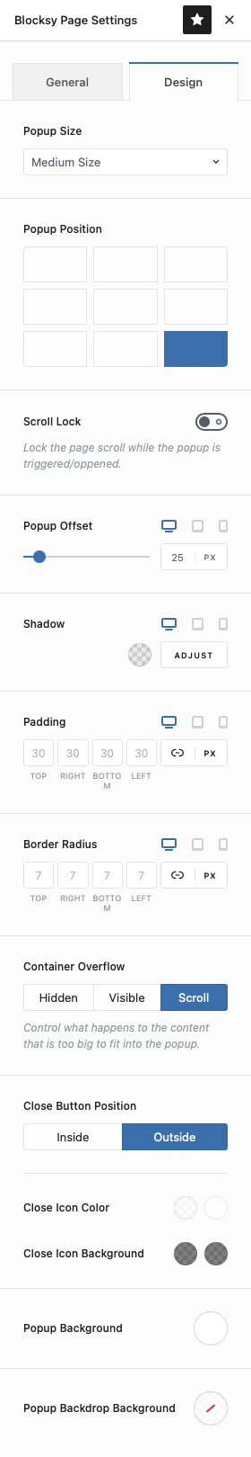
Pop-up Size
Choose from three predefined sizes or define your own custom dimensions, including specific settings for different devices.
Pop-up Position
Pick from nine position options to anchor the pop-up exactly where you want on the screen – top, center, bottom, left, right, and combinations of these.
Scroll Lock
Enable this to prevent users from scrolling the page behind the pop-up while it’s active.
Pop-up Offset
Set how far the pop-up should sit from the viewport edges.
Shadow
Add a subtle or strong shadow to the pop-up for depth and emphasis.
Padding
Define the internal spacing of the pop-up’s content area.
Border Radius
Easily round the corners of the pop-up container to match your site’s design aesthetic.
Container Overflow
Determine how the pop-up should handle content that exceeds its defined size – clip it, scroll, or let it overflow.
Close Button
Customise the appearance of the close button to ensure it blends well with your overall design.
Pop-up Background
Choose a background colour for the content area of the pop-up. If none is set via blocks, this background will apply.
Backdrop Background
Enable this to add a semi-transparent layer behind the pop-up, preventing users from interacting with the rest of the site until the pop-up is dismissed.
Video Resources
Want to see it all in action? Visit our video tutorials page for a closer look at working with pop-ups and exploring example implementations.