

Blocksy gives you comprehensive control over the appearance and layout of your individual blog posts. Through the Single Posts options in the Customiser, you can fine-tune everything from the hero section and post structure to the elements that appear alongside your content — all without touching a line of code.
To access these options, navigate to Customiser → Single Posts. From there, you’ll find a range of controls organised into logical sections, each covering a distinct aspect of your post layout.
Granular Controls
Post Title
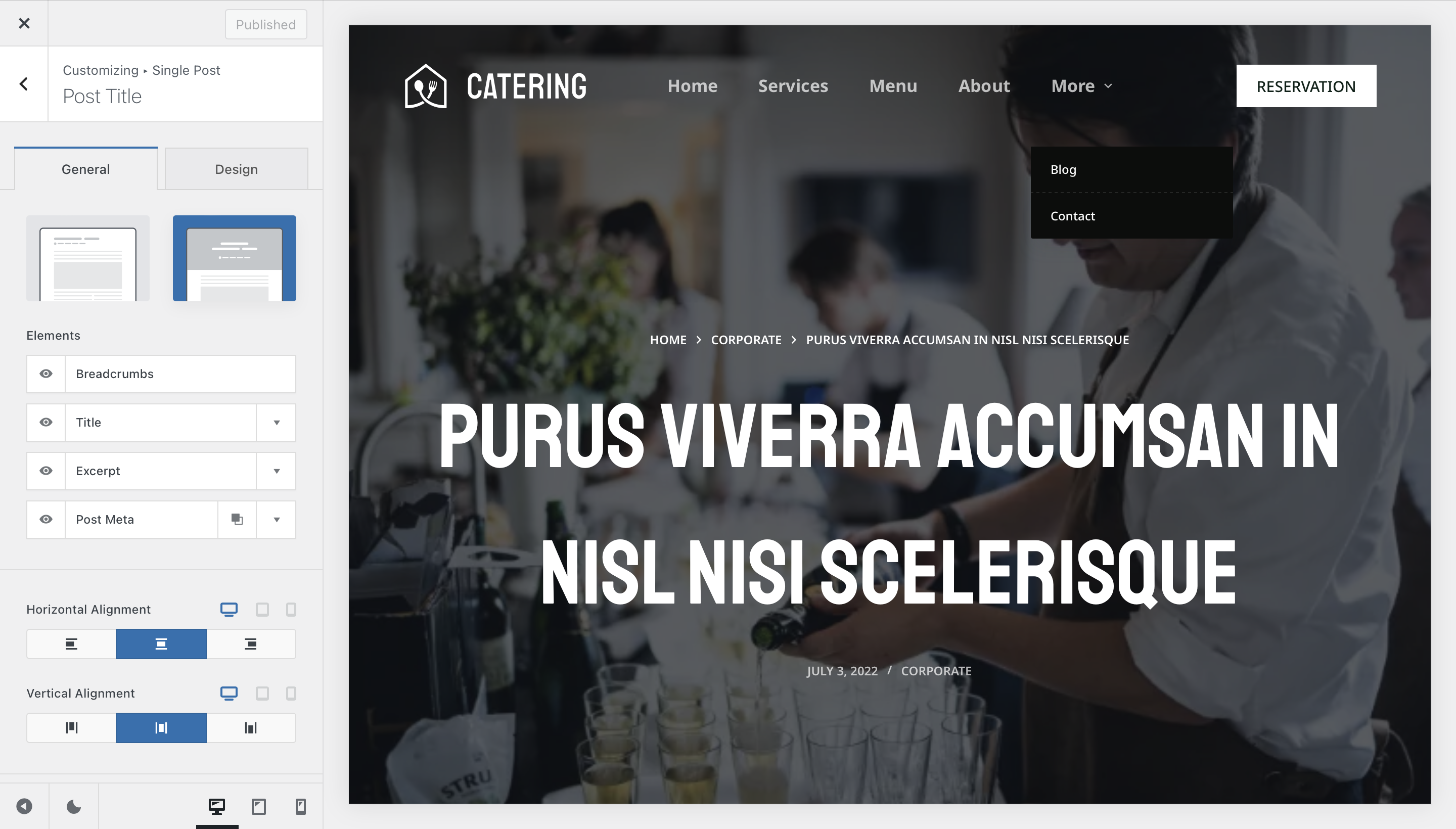
The Post Title section controls the hero area at the top of each singular post page. It offers two distinct design choices to help you achieve the right look and feel.
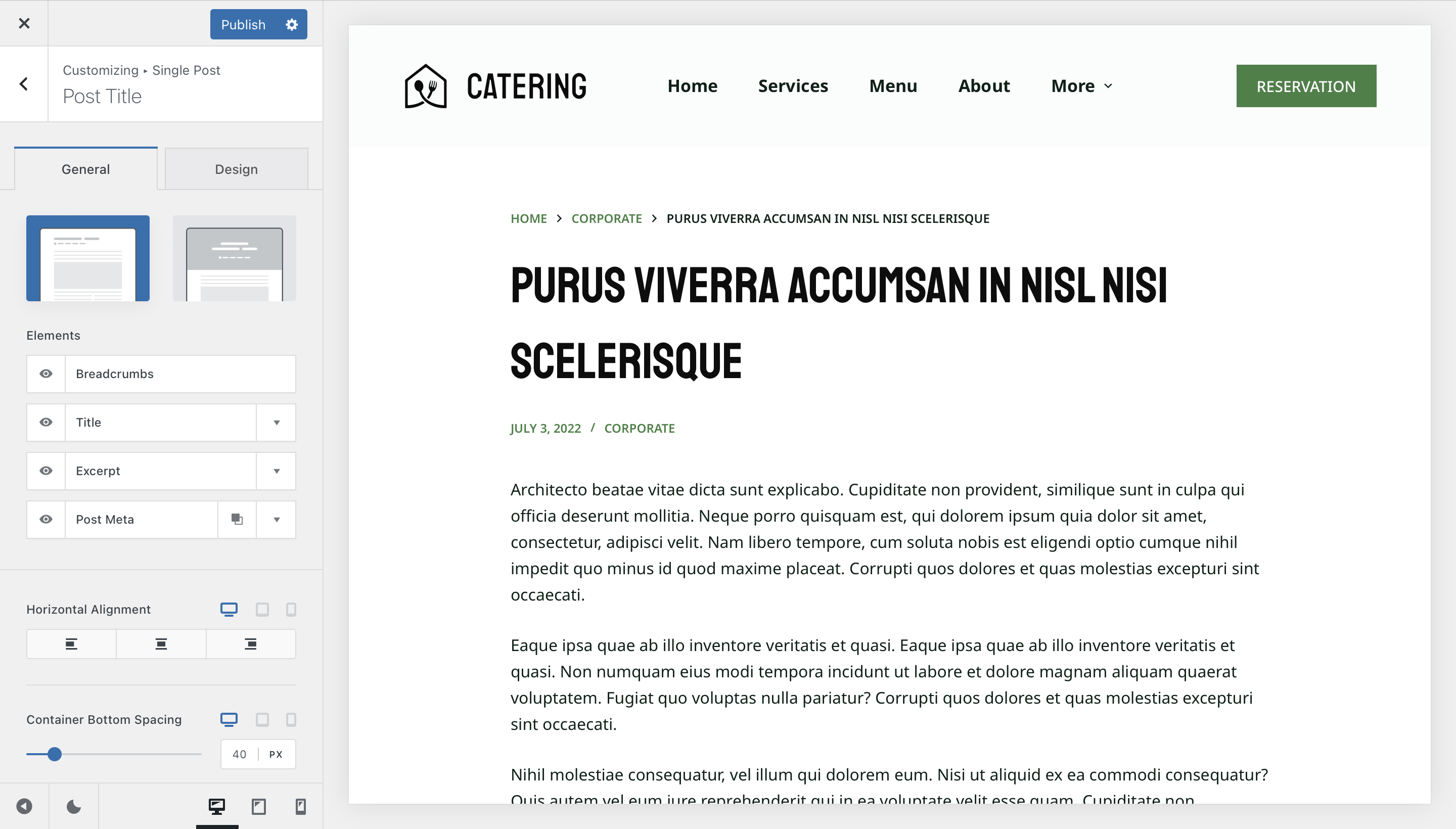
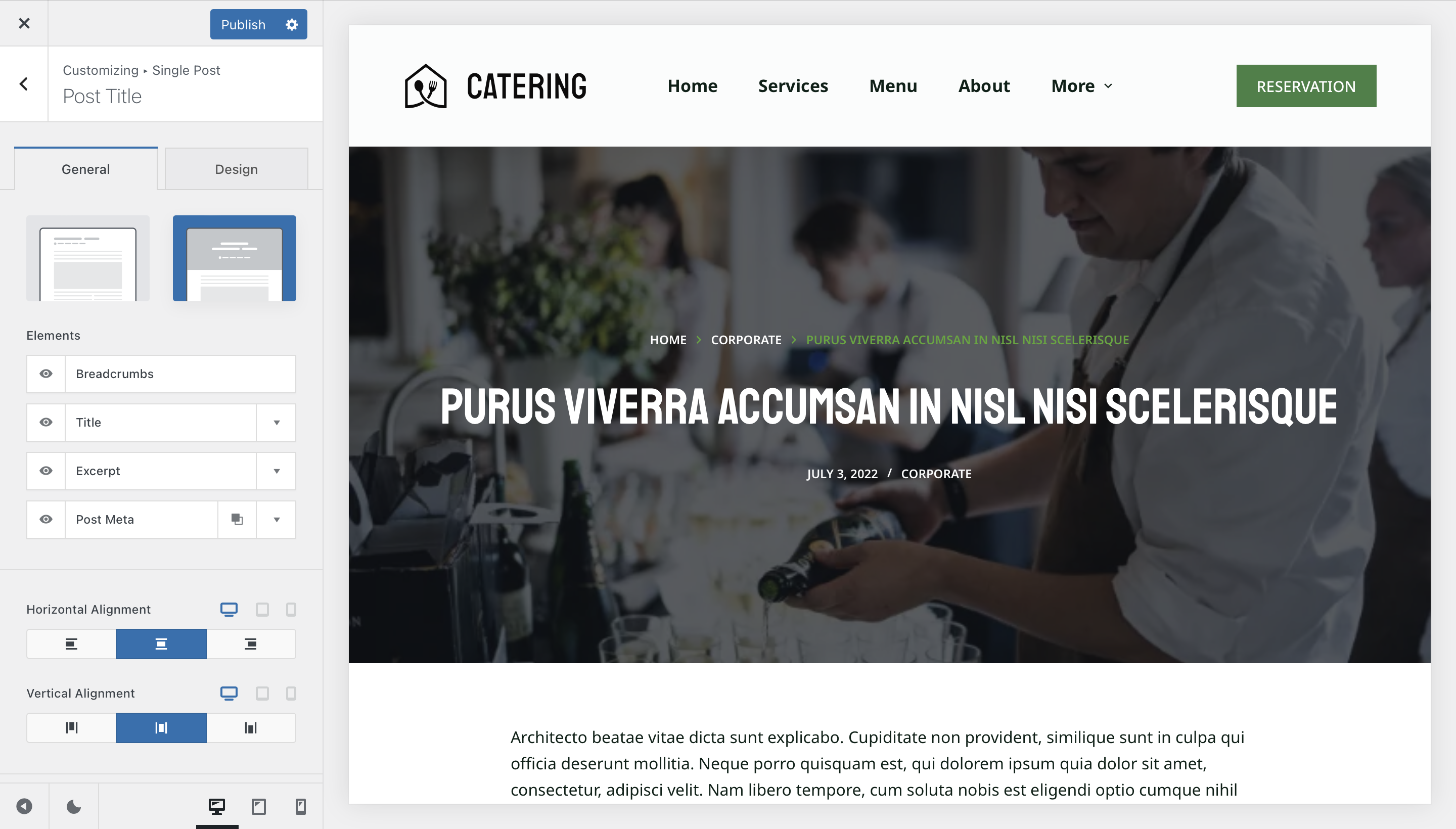
Type 1 is a classic layout, well-suited for displaying structured post information in a clean, familiar format. Type 2 features a full-bleed layout that pairs beautifully with a transparent header.
Each design includes an Elements section where you can control the layers of information displayed:
- Title — Displays the title of the blog post.
- Excerpt — Displays the post’s description excerpt.
- Breadcrumbs — Enables the breadcrumb navigation trail for the post.
- Post Meta — Controls which meta attributes are shown, such as the publication date and author.
Post Structure
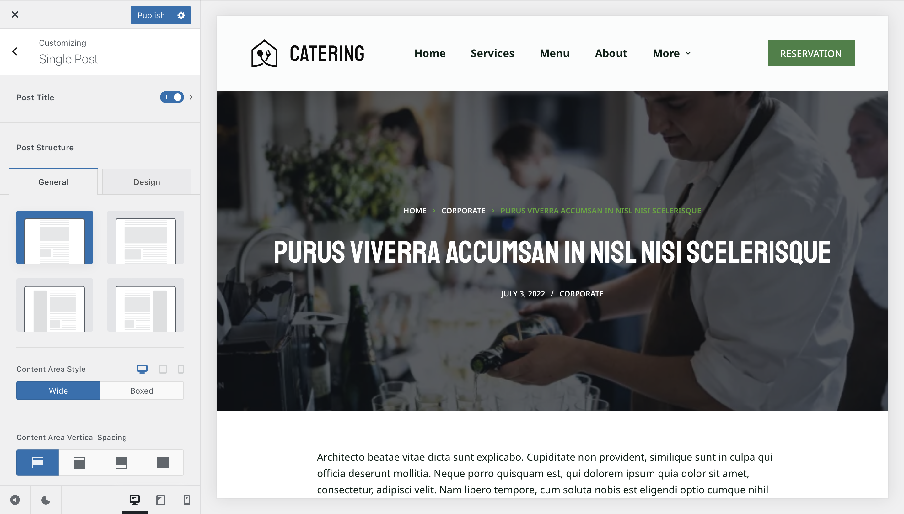
The Post Structure section defines the overall layout of your post content. Four layout options are available, each suited to a different presentation style.
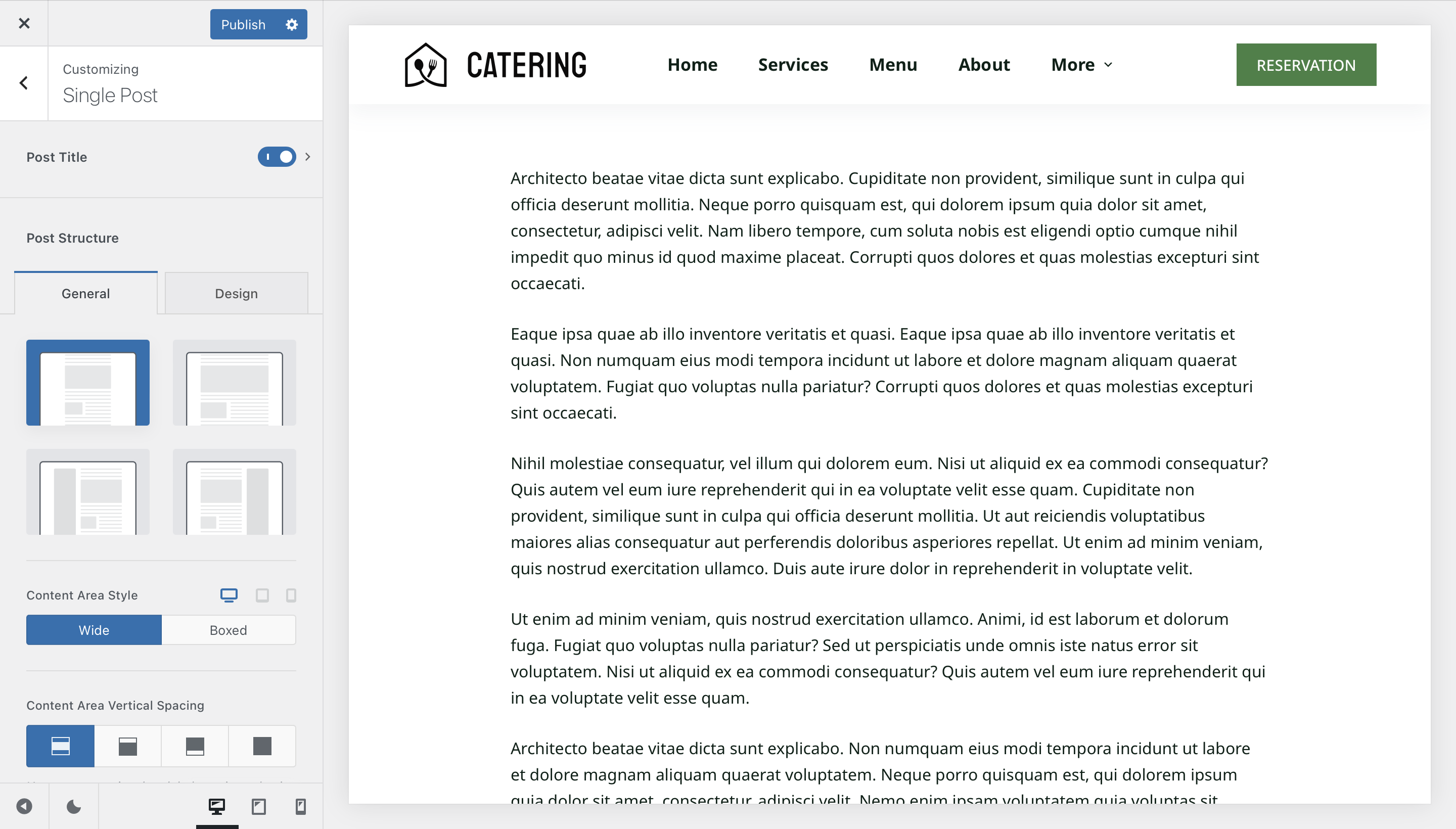
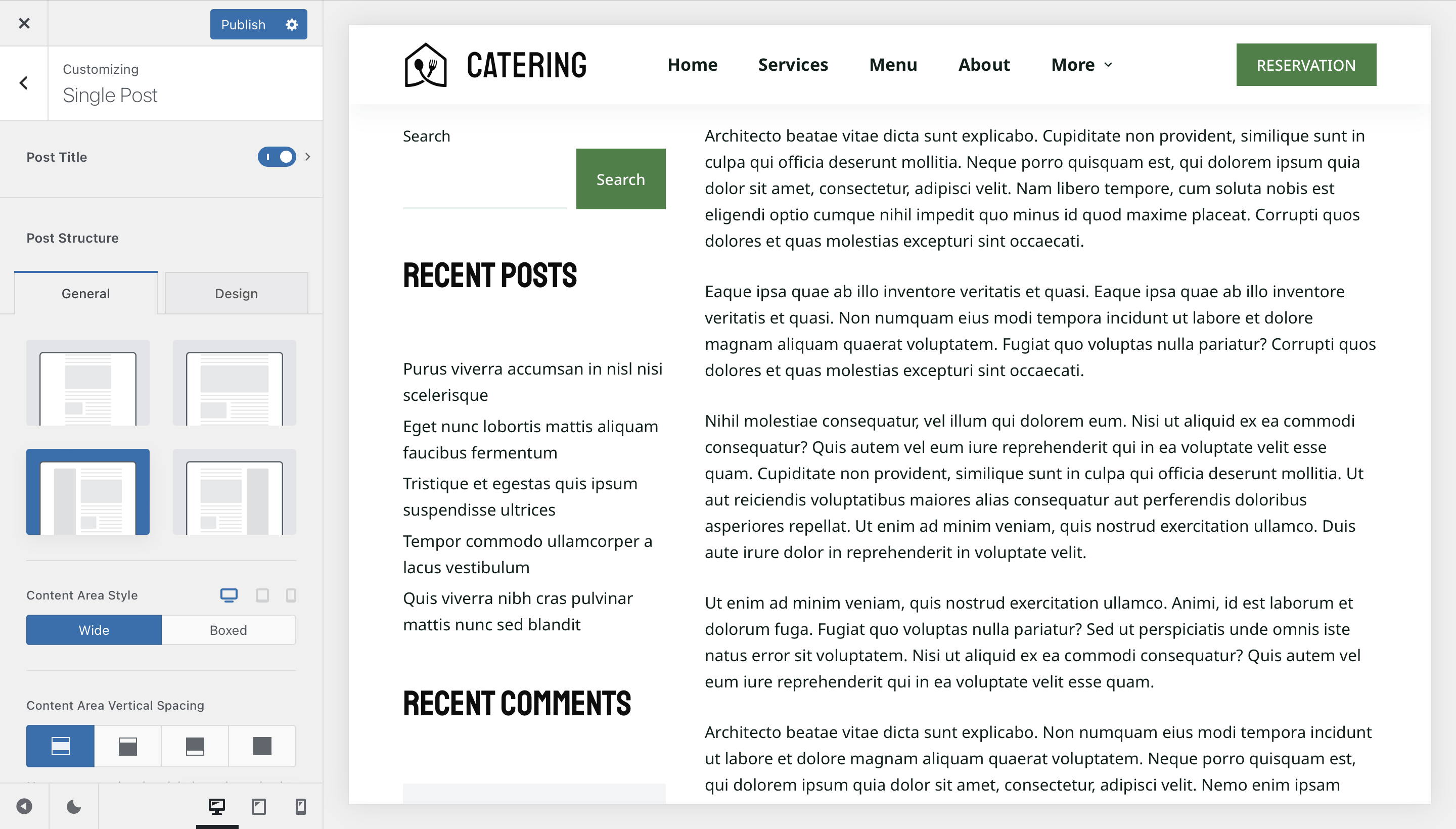
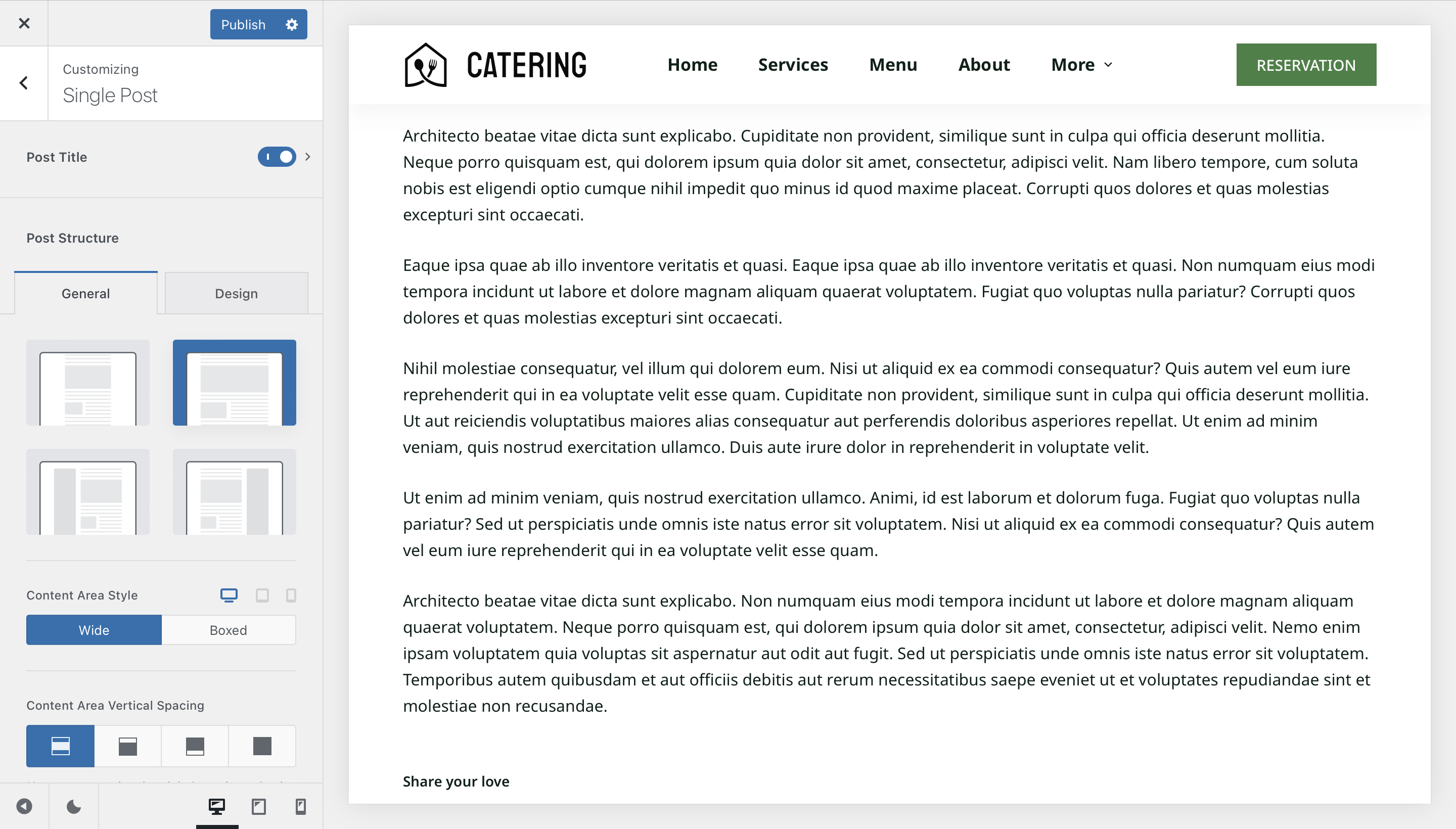
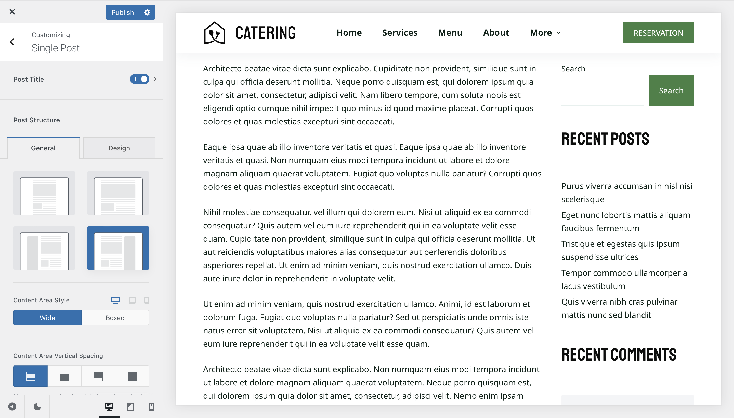
Content Area Style
The Content Area Style option controls how your post content is visually contained on the page. Choose Boxed to encapsulate the content within a defined container, or Wide to allow it to breathe across the full available width.

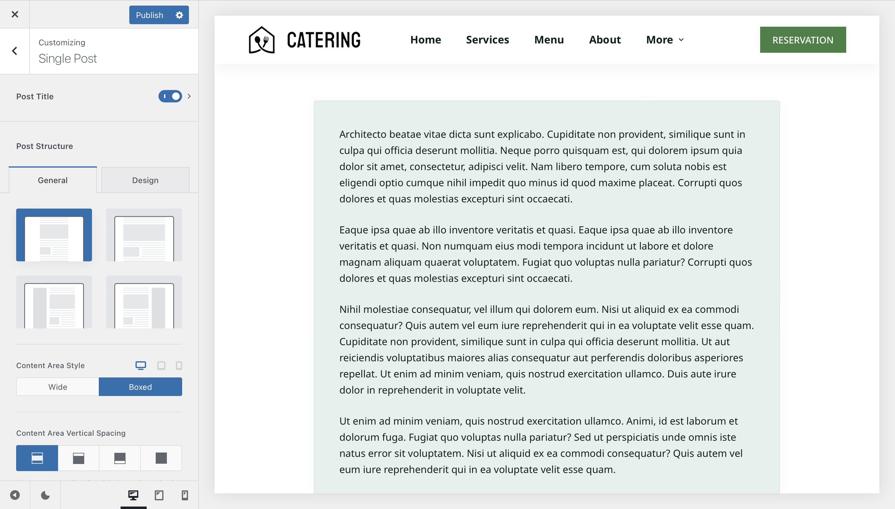
Content Area Vertical Spacing
The Content Area Vertical Spacing option controls the distance between your post content and the header and footer. This is particularly useful when using the transparent header, as it allows you to precisely manage how content sits beneath it.
The spacing value can be adjusted via Customiser → General → Layout → Content Area Spacing.
Post & Page Elements
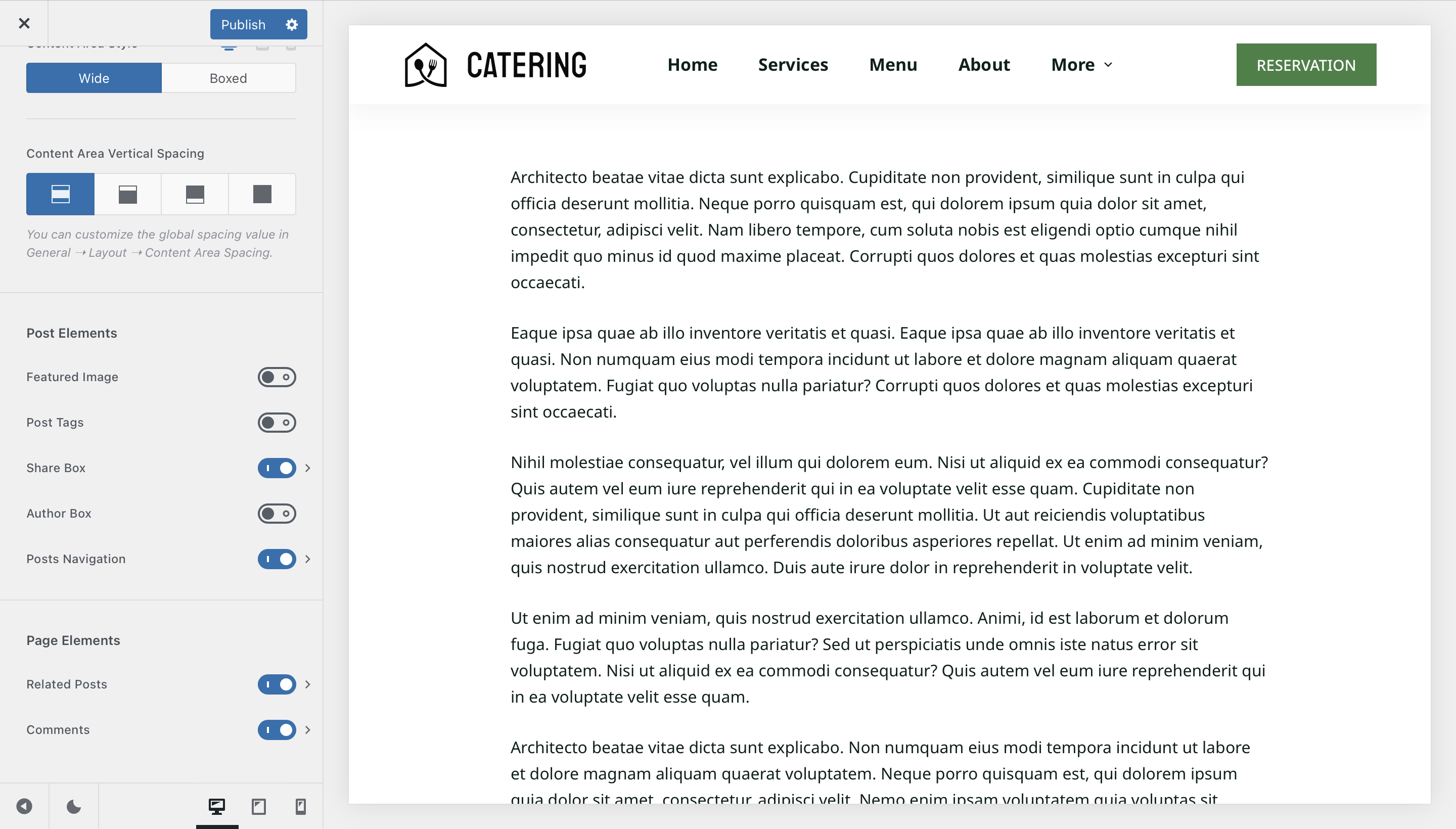
The Post & Page Elements section gives you full control over the individual components that appear on your single post pages. Each element can be toggled and configured independently.
Featured Image
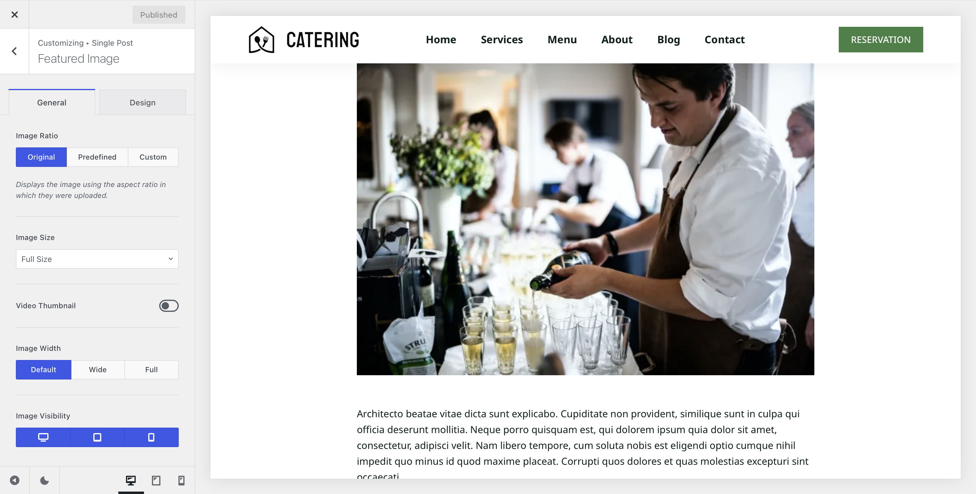
The Featured Image element controls how your post’s featured image is displayed on single post pages. You can configure its ratio, size, and visibility across devices, as well as enable the Video Thumbnail feature available to Blocksy Pro users.
Image Ratio
Select the image aspect ratio. Original displays the image as-is, Predefined lets you choose from a selection of common ratios, and Custom allows you to define a specific ratio.
Image Size
Select which WordPress-generated thumbnail size will be loaded for the featured image. Note that this refers to the image file loaded by WordPress, not the physical display size on screen.
Video Thumbnail
Enables the Featured Videos module, allowing you to replace the static featured image with a video thumbnail on single post pages.
Image Width
Control the width of the featured image — matched to the post width, wider than the post, or full width.
Image Visibility
Choose which devices the featured image will appear on — desktop, tablet, and/or mobile.
Post Tags
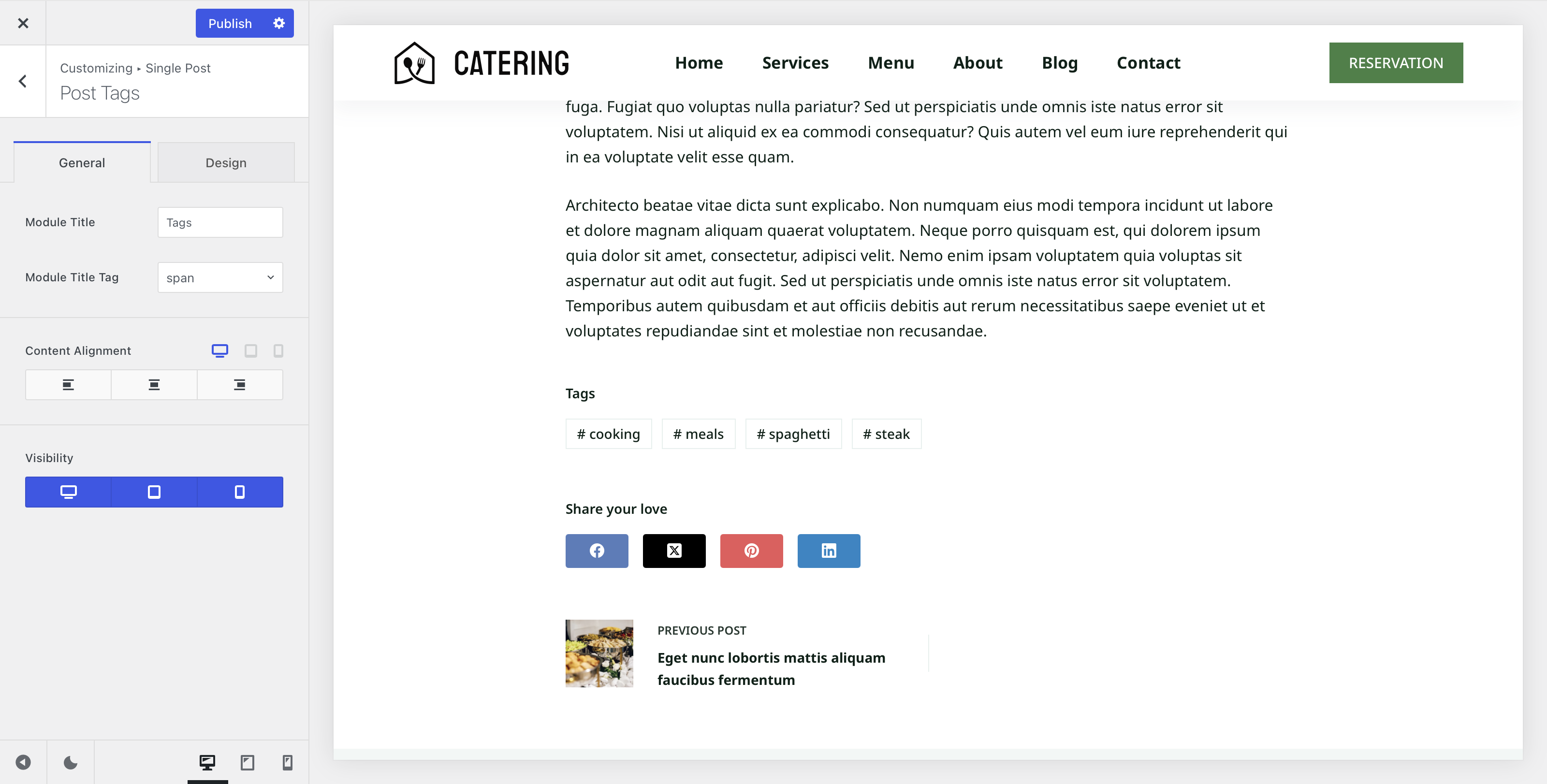
The Post Tags element displays a post’s associated tags at the bottom of the content as clickable buttons, making it easy for readers to discover related posts within the same tag.
Module Title
Define the label displayed above the tag buttons on the front end, and select the HTML tag used to render it.
Content Alignment
Align the Post Tags module to the left, centre, or right.
Visibility
Choose which devices the Post Tags element will appear on — desktop, tablet, and/or mobile.
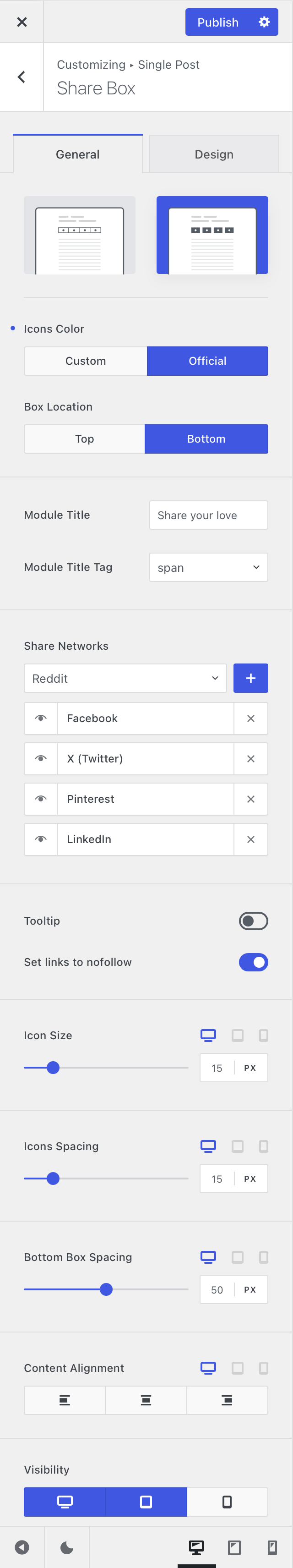
Share Box
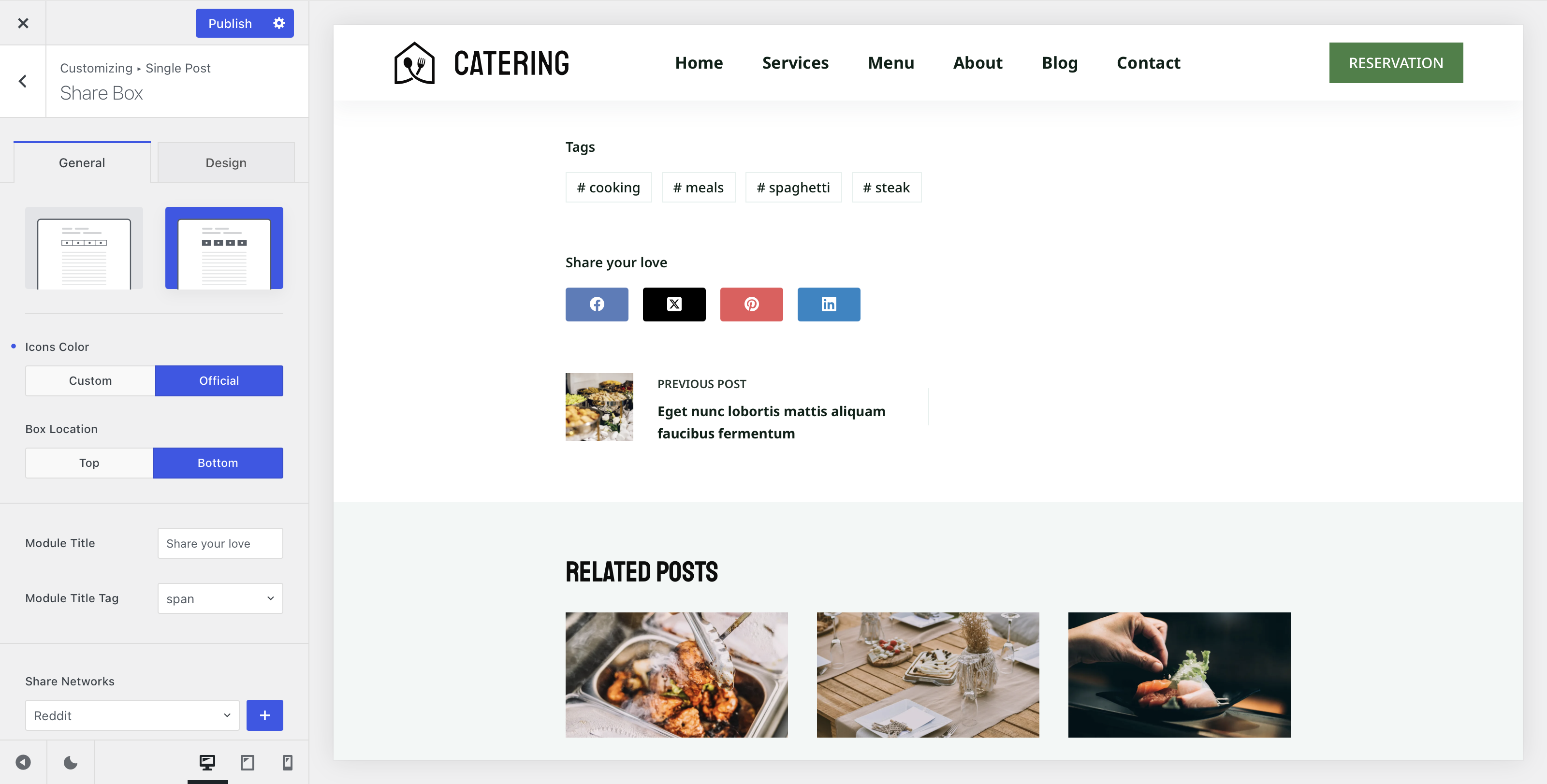
The Share Box element allows visitors to share your posts directly to their preferred social networks, making it easy to extend your content’s reach.
Design
Choose the visual style of the share buttons — Outlined for a minimal look, or Filled for a bolder, colour-rich appearance.
Icon Colours
When using the filled design, choose between a single custom colour for all icons or each network’s official brand colour.
Box Location
Select where the Share Box appears — at the top of the post, the bottom, or both simultaneously.
Module Title
Set a custom label for the Share Box and select the HTML tag used to render it.
Share Networks
Select which social networks will be available as sharing options.
Tooltip
Display a tooltip on hover to help users identify each social network at a glance.
Link Nofollow
Choose whether to add the nofollow attribute to the share links.
Icon Size Controls
Adjust the size and appearance of the Share Box icons.
Alignment Options
Set the alignment of the Share Box module within the post layout.
Visibility
Choose which devices the Share Box will appear on — desktop, tablet, and/or mobile.
Author Box
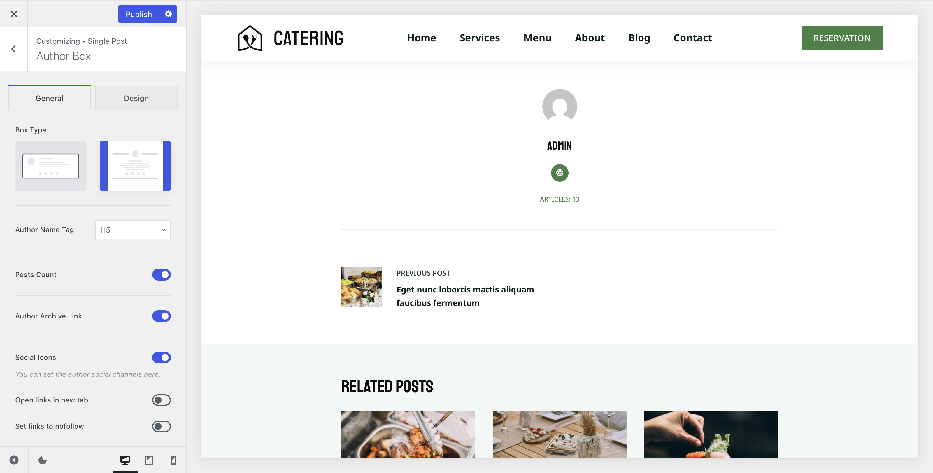
The Author Box element displays a profile card for the post’s author, including their name, a short bio, and social network links — a great way to build credibility and encourage reader connections.
Box Type
Select the visual style of the Author Box — an Enclosed look with a defined container, or a Wide style that blends more naturally into the page layout.
Author Name Tag
Select the HTML tag used to render the author’s name.
Posts Count
Display the total number of posts the author has published on the site.
Author Archive Link
Choose whether the author’s avatar links through to their author archive page.
Social Icons
Display the author’s social network links, with options to open them in a new tab and apply a nofollow attribute.
Spacing
Adjust the spacing around the Author Box module.
Visibility
Choose which devices the Author Box will appear on — desktop, tablet, and/or mobile.
Post Navigation
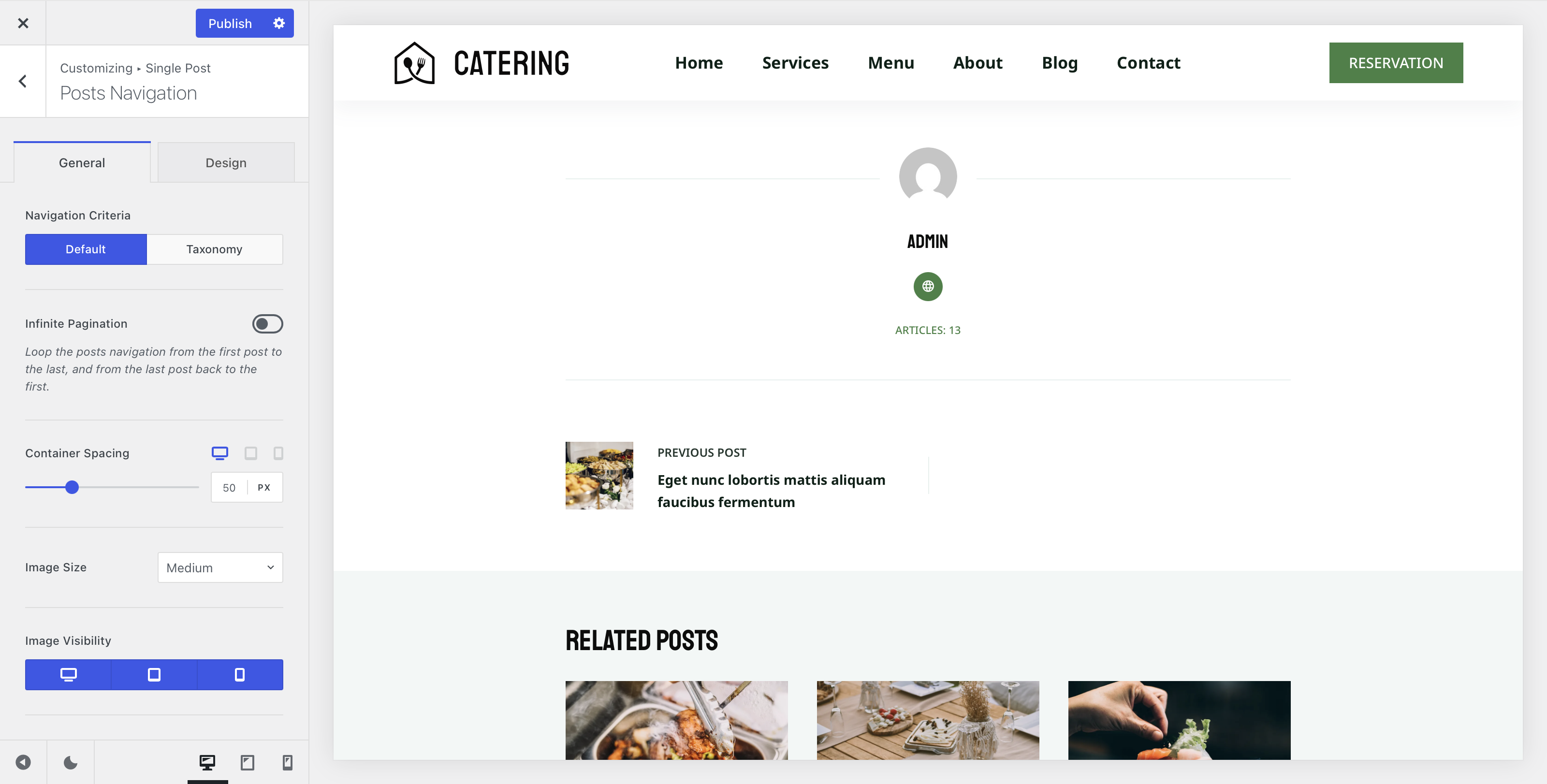
The Post Navigation element adds previous/next navigation links to single posts, making it easy for readers to move through your content sequentially.
Navigation Criteria
Define how posts are navigated. Default cycles through all posts, while Taxonomy restricts navigation to posts within the same category or tag.
Infinite Pagination
When enabled, navigation loops continuously — readers reaching the last post will cycle back to the first, and vice versa.
Container Spacing
Adjust the spacing around the Post Navigation container.
Image Size
Select the WordPress thumbnail size loaded for the navigation thumbnails. Note that this refers to the image file size, not the physical display size on screen.
Image Visibility
Choose which devices the navigation thumbnails will appear on — desktop, tablet, and/or mobile.
Title Visibility
Choose which devices the post title will display on within the navigation — desktop, tablet, and/or mobile.
Module Visibility
Choose which devices the Post Navigation element will appear on — desktop, tablet, and/or mobile.
Related Posts
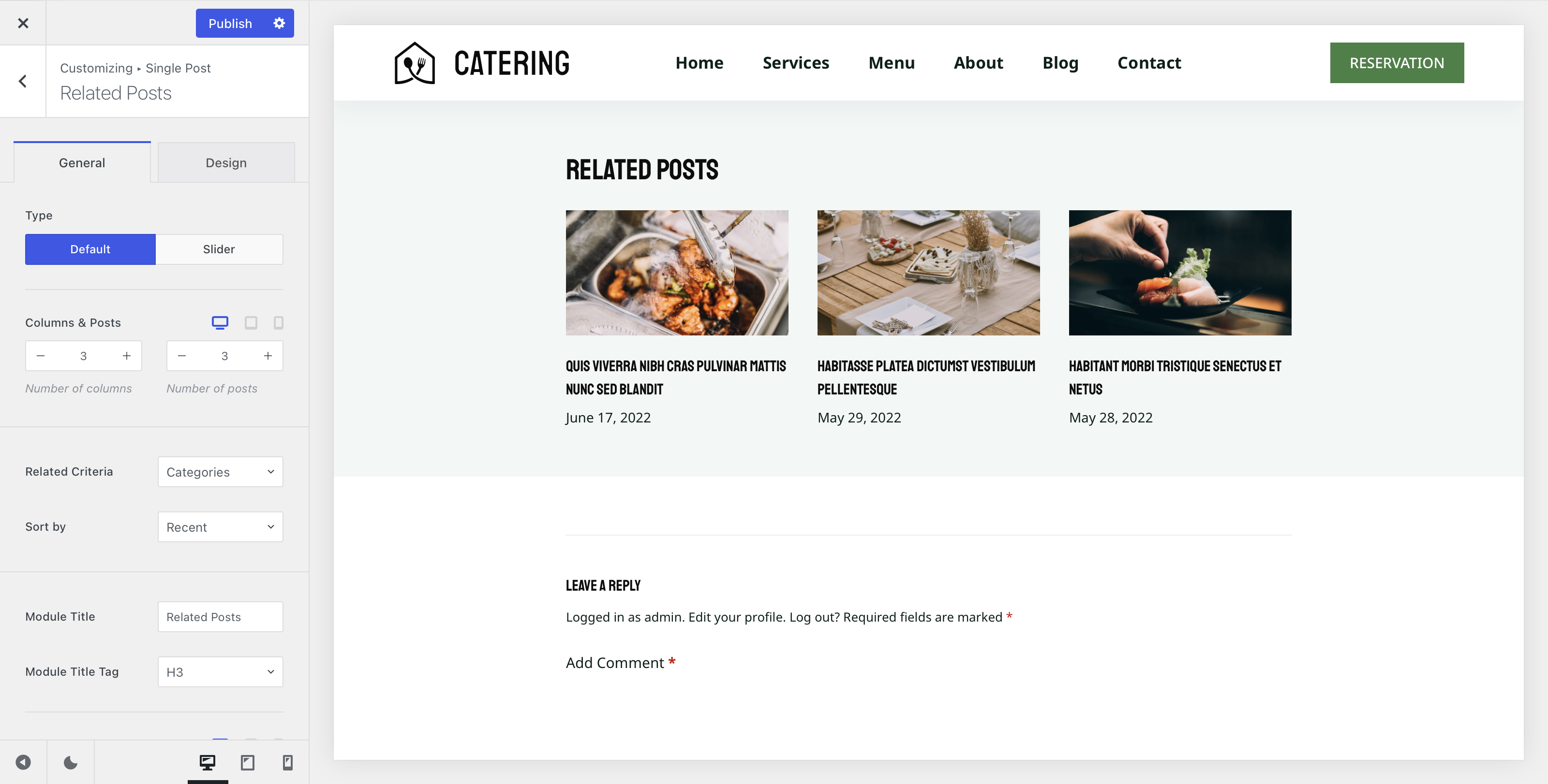
The Related Posts element showcases relevant content to readers at the bottom of each post, encouraging them to explore more of your site. For full configuration details, refer to the dedicated Related Posts article.
Comments
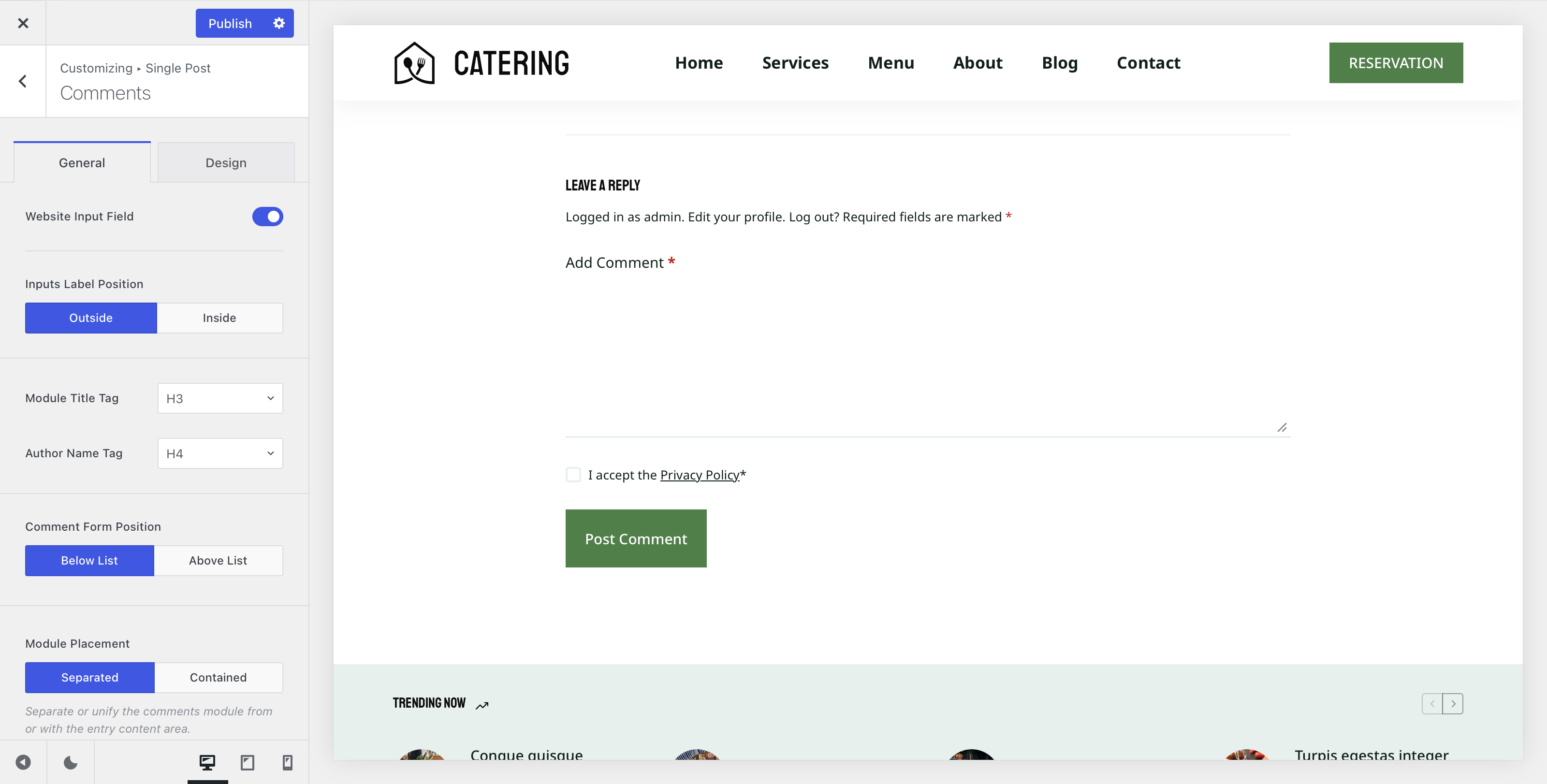
The Comments element enables visitor commenting on your posts, with a range of options to control the form’s layout and behaviour.
Website Input Field
Choose whether visitors can include a website URL when leaving a comment.
Inputs Label Position
Select whether form field labels appear outside the input as standard labels, or inside as placeholder text.
Module Title & Author Name Tags
Select the HTML tags used for the Comments module title and the commenter’s name.
Comment Form Position
Choose whether the comment form appears before the list of existing comments or after.
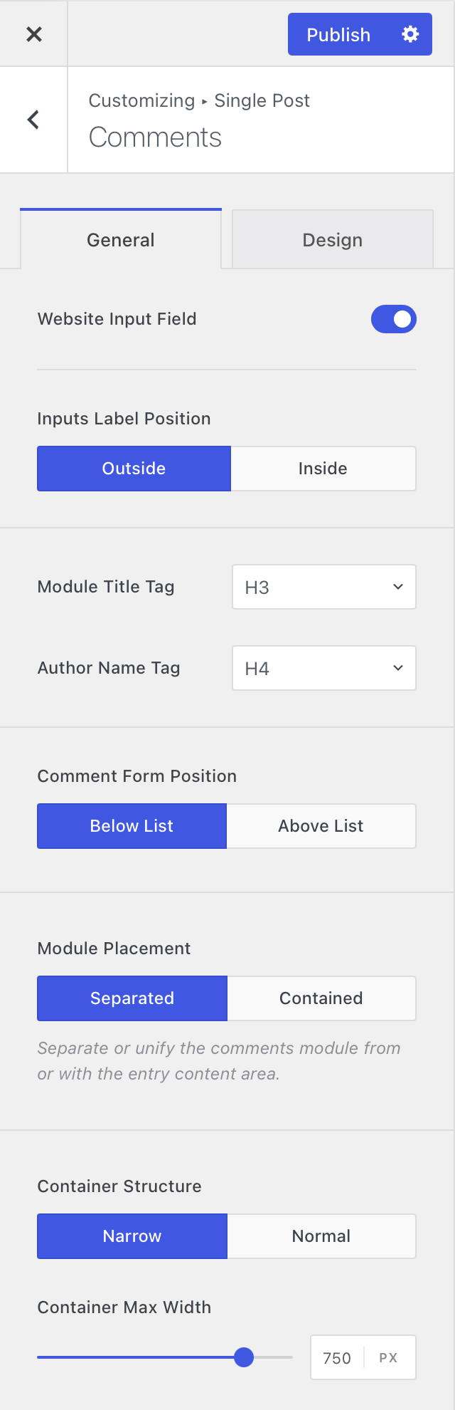
Module Placement
Select how the Comments module is placed on the page — as a standalone element or contained within the page’s base structure.
Container Structure
When using the separated placement, define the width of the Comments container.