

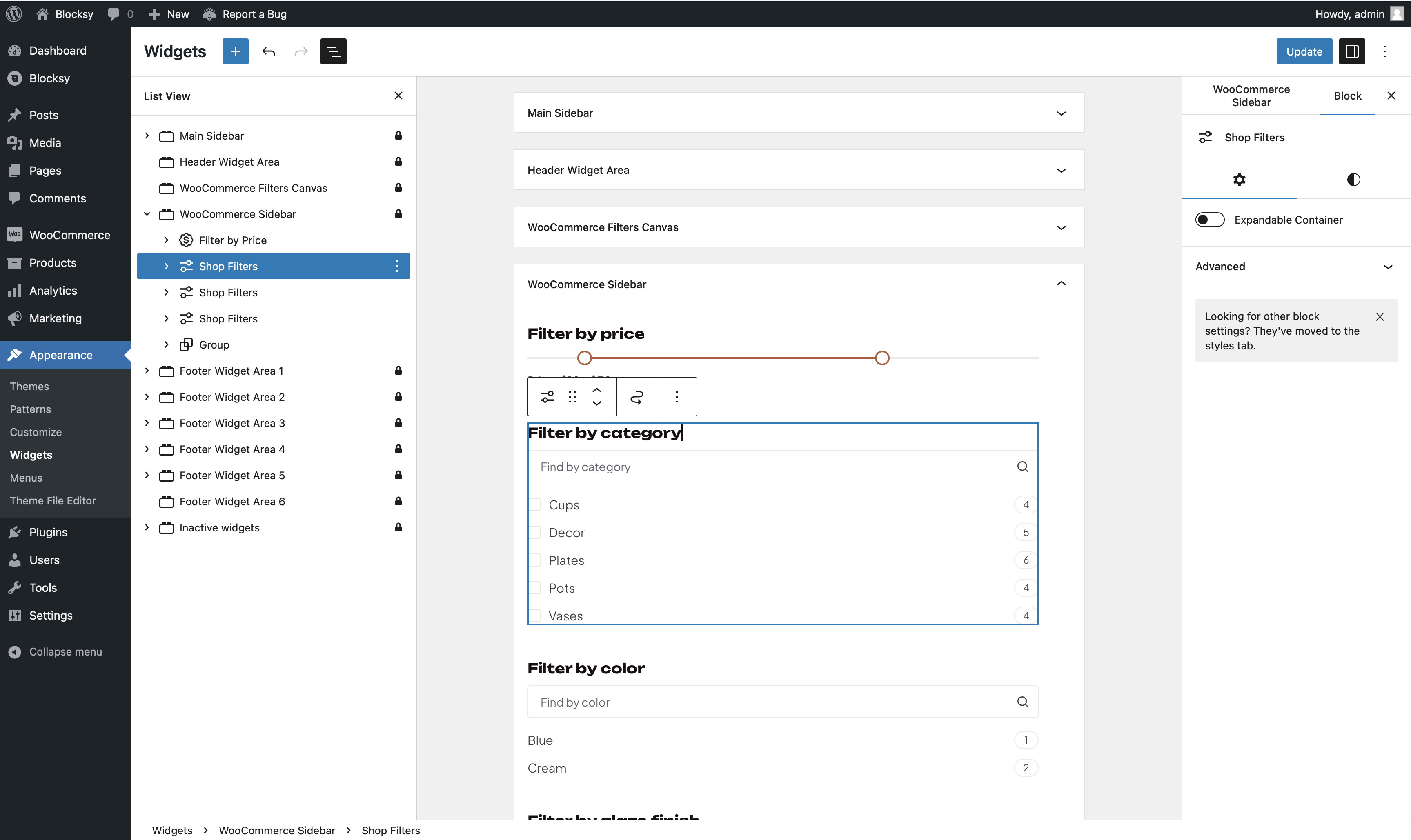
The Shop Filters block provides a simple and effective way for customers to filter products by various taxonomy terms, including categories, tags, brands, or any other attributes available. This enhances their shopping experience by making it easier to find exactly what they’re looking for.
To add this block to your page, open the Gutenberg block library and search for the “Shop Filters” block, which is represented by an icon with two setting sliders.
Granular Controls for Taxonomies
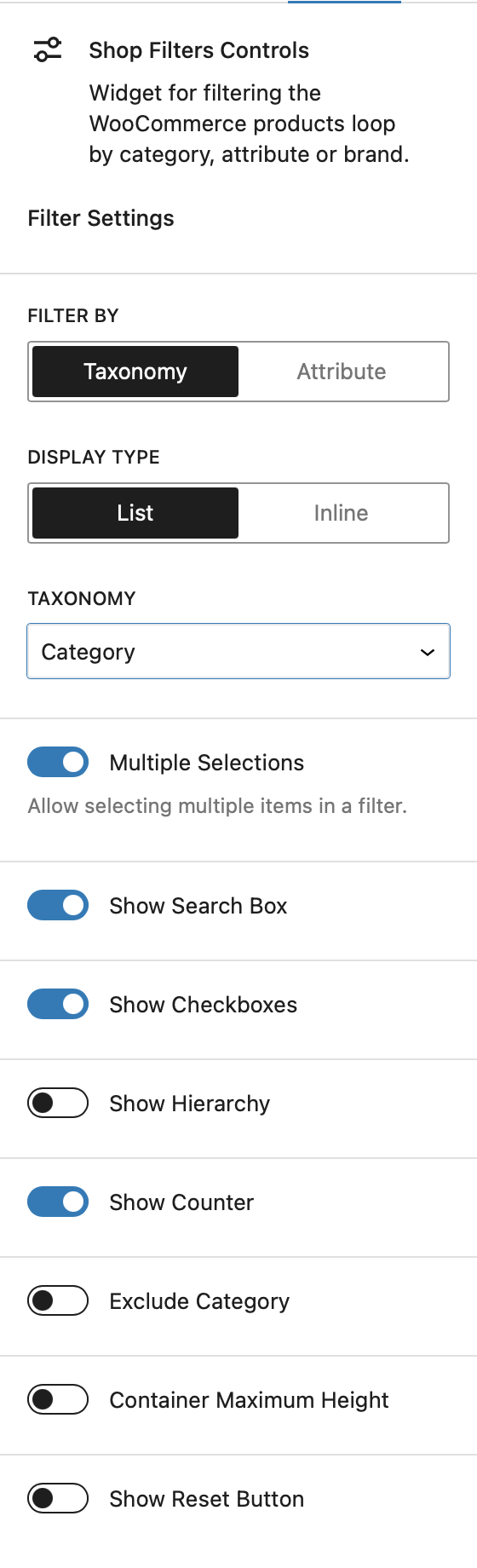
Filter By
This setting allows you to choose what criteria the filters will use. For example, selecting “Category” enables visitors to filter products by categories, while choosing “Attribute” allows filtering by product attributes like color, size, etc.
Display Type
This option determines how the filters appear on the front end. Selecting “List” will display the filters in a vertical list format, while “Inline” arranges them in a single, horizontal line that can wrap into multiple rows if needed.
Multiple Selections
This setting controls whether customers can apply multiple filters simultaneously. When enabled, customers can refine their search using multiple criteria, creating more advanced filtering combinations.
Show Search Box
Enable this option to add a search box above the filters, making it easier for users to search through a large number of filter options.
Show Checkboxes
When the Multiple Selections option is active, this setting allows you to show or hide checkboxes next to each filter option, providing a more visual way to select multiple filters.
Show Hierarchy
If the selected filtering criteria have a parent-child relationship (e.g., categories with subcategories), this option will display the hierarchy to better represent the structure.
Show Counter
Displays a small counter next to each filter option, indicating the number of products available under that filter.
Exclude Category
Use this option to exclude specific categories from appearing in the filter list.
Show Reset Button
Adds a reset button that clears all active filters at once, allowing users to start a new search easily.
Granular Controls for Attributes
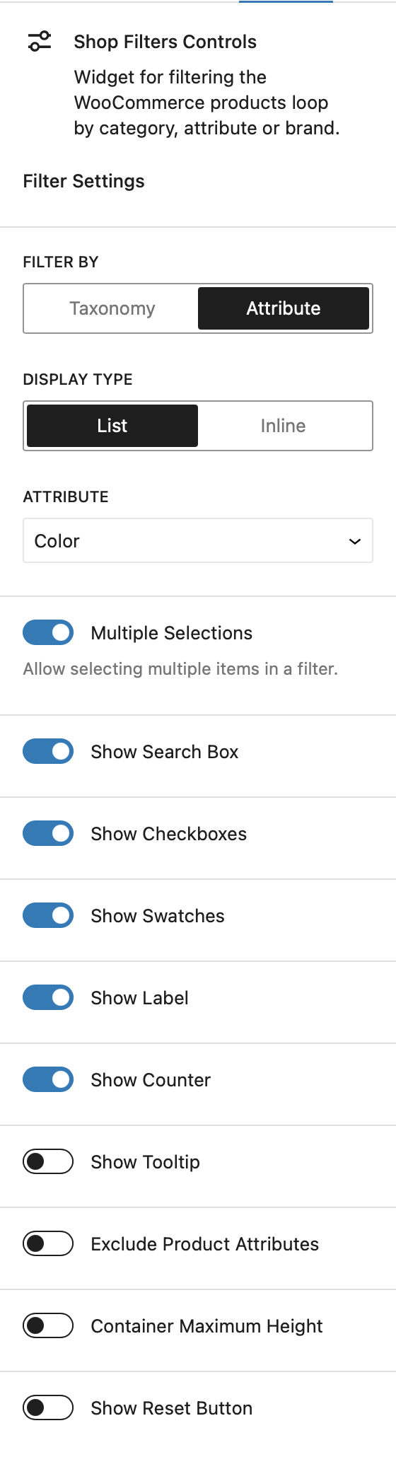
Filter By
This setting allows you to choose what criteria the filters will use. For example, selecting “Category” enables visitors to filter products by categories, while choosing “Attribute” allows filtering by product attributes like color, size, etc.
Display Type
This option determines how the filters appear on the front end. Selecting “List” will display the filters in a vertical list format, while “Inline” arranges them in a single, horizontal line that can wrap into multiple rows if needed.
Multiple Selections
This option determines if customers can apply more than one filter at a time. When enabled, users can combine multiple filtering criteria to refine their product search with greater precision.
Show Search Box
Turn on this option to display a search box above the filters. This is useful when there are many filter options, allowing users to quickly search through them.
Show Checkboxes
When Multiple Selections is enabled, this option lets you display or hide checkboxes next to each filter item, helping users visually select multiple filters at once.
Show Swatches
If you’re using variation swatches for product attributes, this option allows you to display those swatches instead of just the attribute names, offering a more visually engaging filter interface.
Show Label
If you prefer to show only the variation swatches without any text labels, this option lets you hide the attribute labels for a cleaner look.
Show Counter
This option adds a small counter next to each filter choice, showing the number of products available for each attribute.
Show Tooltip
If the attribute labels are disabled and only swatches are shown, enabling this option will display a tooltip that reveals the name of each filter when hovered over.
Exclude Product Attributes
This setting allows you to exclude specific product attributes from being displayed in the filters.
Show Reset Button
Adds a reset button to the filter area, enabling users to quickly remove all selected filters and start a new search.