

Quick Look
Blocksy provides a simple yet powerful way to customize your website’s colors with its Global Color Palette system. This feature allows you to define a set of preset colors and apply them consistently across your entire site. It also extends support to Gutenberg plugins like Stackable and third-party page builders such as Elementor, ensuring a cohesive design experience.
You can access the Global Colors settings by navigating to Customiser → General Options → Colors.
Granular Controls
Managing Colors
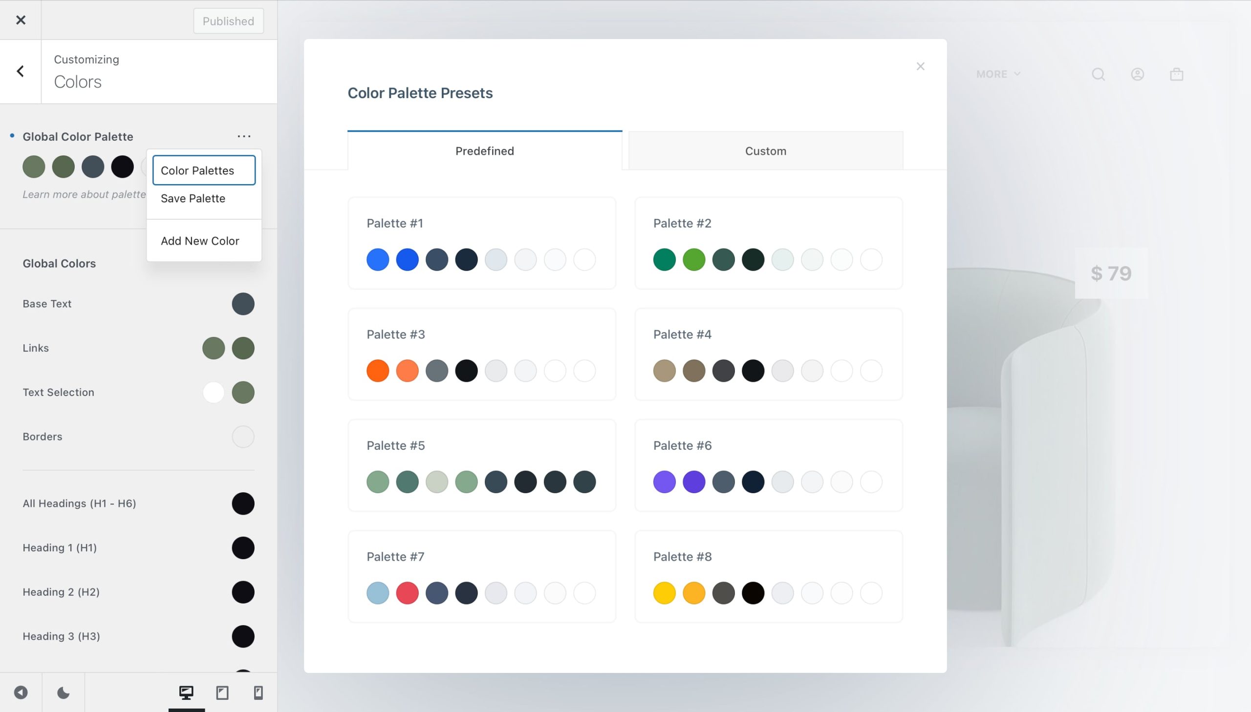
Blocksy comes with 15 pre-defined color palettes ready to use, but you can always create your own or extend an existing palette with additional colors to better match your brand’s identity.
To manage your palettes, click on the three-dot menu and select “Color Palettes”. This will open the palette management screen, where you can explore the preset options or create your own custom palettes.
To save a new palette, first define the colors you want to include. Once you’re satisfied, click on the three-dot menu again and select “Save Palette”. The new palette will then be available under the Custom tab in the palette manager.
Suggested Use
While you’re free to use your colors as you see fit, here’s a suggested structure for better consistency across your website:
- Color 1 – Primary brand color, used for key accents.
- Color 2 – Alternative color, often used for hover effects.
- Color 3 – Main text color for paragraphs.
- Color 4 – Headings, subheadings, and titles.
- Color 5 – Borders and dividing elements.
- Color 6 – Subtle backgrounds, such as page heroes and footers.
- Color 7 – Main site background.
- Color 8 – A lighter alternative, often used for header backgrounds.
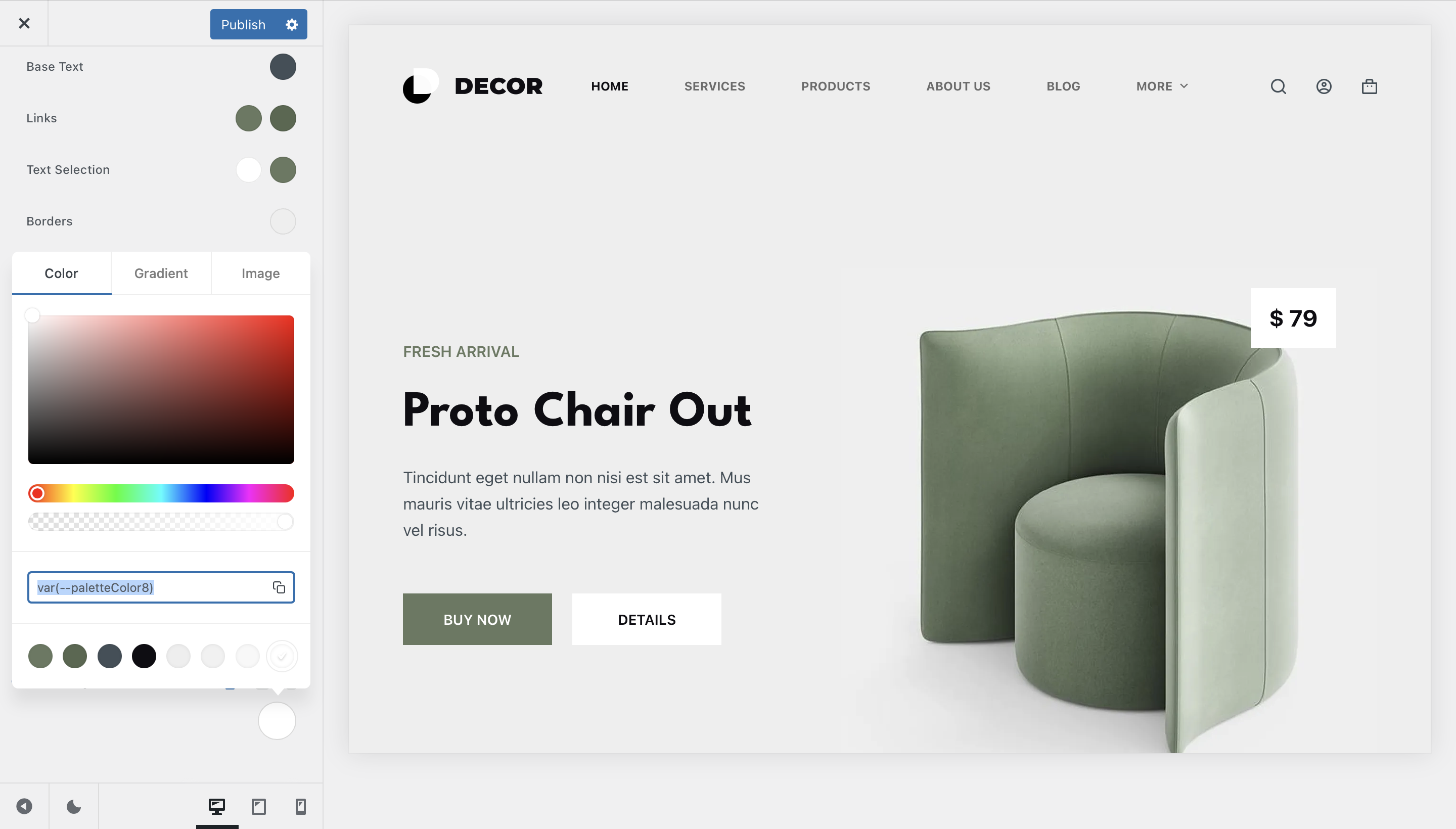
Palette Color Picker
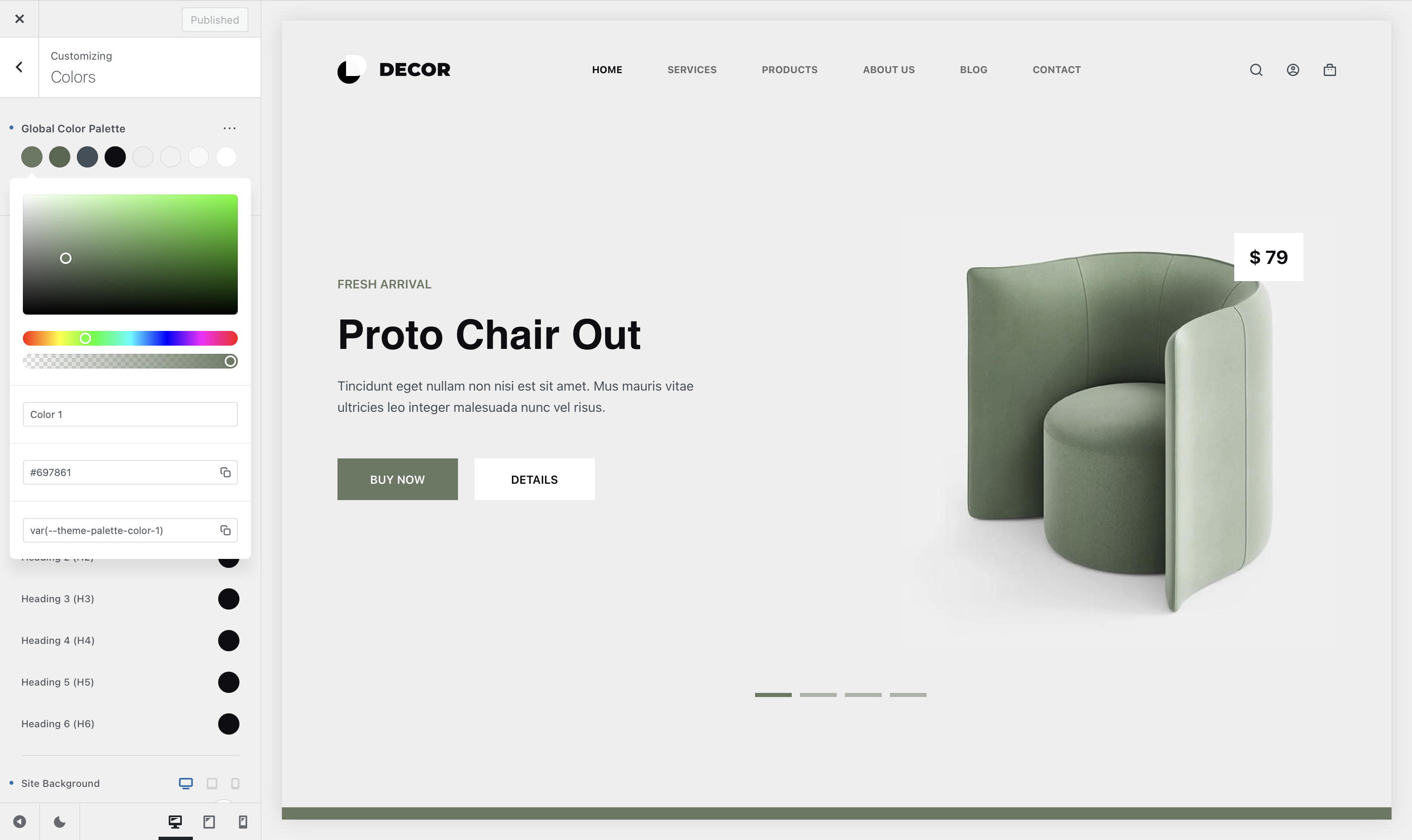
The color picker gives you complete flexibility when selecting your website’s highlights. It includes an HWB cassette for adjusting saturation and brightness, along with a hue slider to fine-tune your chosen accent color.
For better organisation, you can assign custom names to colors in your palette, making them easily identifiable throughout the Customiser and supported page builders like Gutenberg and Elementor.
Additionally, you can quickly copy the HEX value of a color or grab its CSS variable name for more advanced styling scenarios.
Adding a New Color
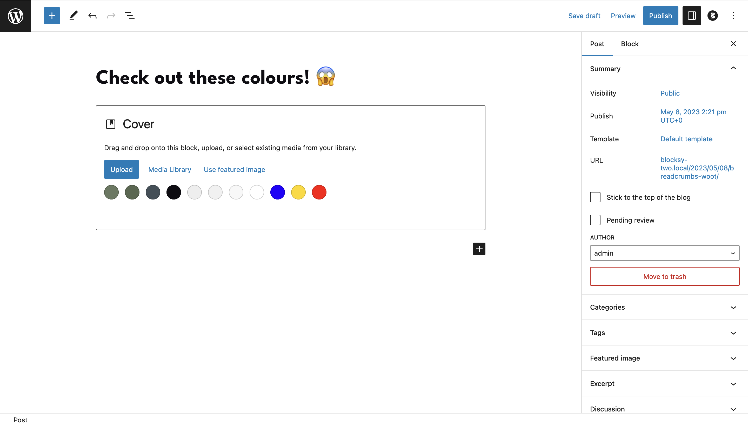
If the default 8 color swatches aren’t enough for your design needs, you can easily add more. Simply open the three-dot menu and select “Add New Color” to expand your palette. The interface makes it seamless to define extra swatches that match your branding and style.
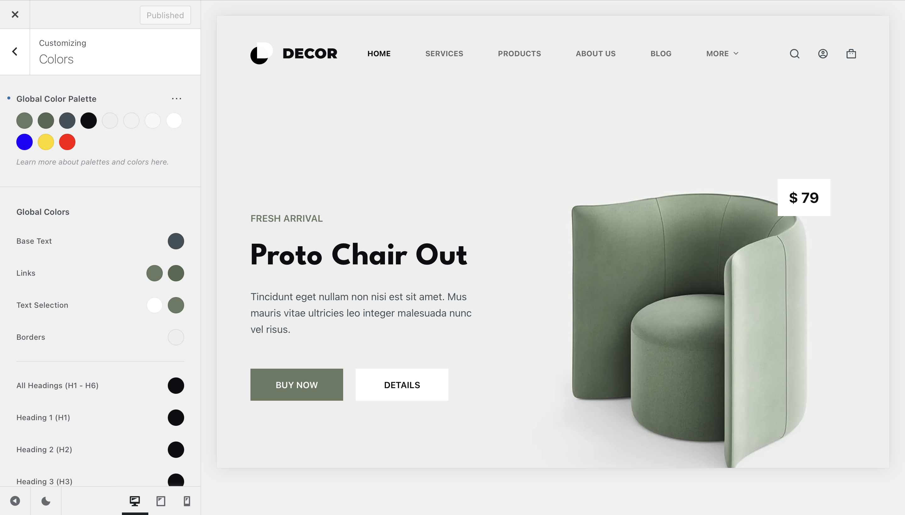
These additional colors are also fully recognised by the Gutenberg editor, ensuring consistency across your content and page builder elements.
Additional Color Controls
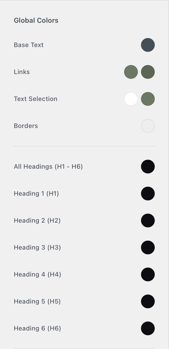
Global Colors
The Global Colors section allows you to define pre-set color categories that are automatically applied across your entire website. This ensures consistency and makes it easy to manage your site’s color scheme.
- Base Text – Controls the default font color for all paragraphs and body text.
- Links – Sets both the initial link color and the hover state color.
- Text Selection – Defines the color styling for text that users highlight (e.g., when clicking and dragging to select text).
- All Headings (H1 – H6) – Applies a unified color to all heading tags at once.
- Heading 1, Heading 2, Heading 3, etc. – Allows you to set individual colors for specific heading levels, overriding the global “All Headings” setting.
- Site Background – Controls the overall background color or image of your website. Any changes here will be reflected across all pages and posts.
Important Notice!
You’re not limited to just the color palette. Every color can be individually adjusted through the Design tab in the Customiser, giving you full control over your site’s appearance.
Developer Resources
All color pickers from the Customiser should now support defining custom CSS variables. This means that you can define your CSS colors in the Additional CSS pane as variables and reuse them throughout the Customiser.