

Quick Look
Granular Controls
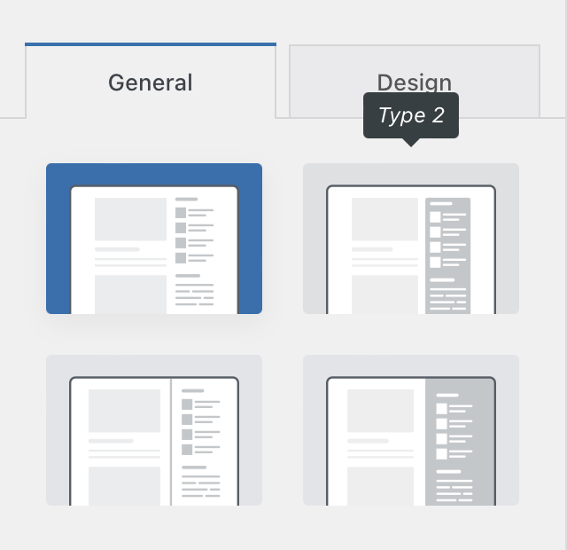
Design type
This option will let you choose between our four design types. Each design has unique characteristics, that can be further controlled via the “Design” tab.
Type 1 – offers you a classic sidebar layout
Type 2 – encloses the sidebar in a nice coloured rectangle
Type 3 – separates the sidebar from the content
Type 4 – colours the whole sidebar area
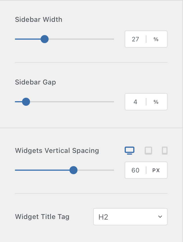
Sidebar spacing controls
These options will let you control things such as the width of the sidebar, the gap between the sidebar and the content of the page, as well as the spacing between the different widgets that you might’ve added to it.
Don’t forget that there are also SEO controls, that will let you change what HTML tag the widgets title will use. Please note however, that this option will be phased out soon, as it is just a compatibility layer for the old, classic widgets. Gutenberg widgets do not inherit this option.
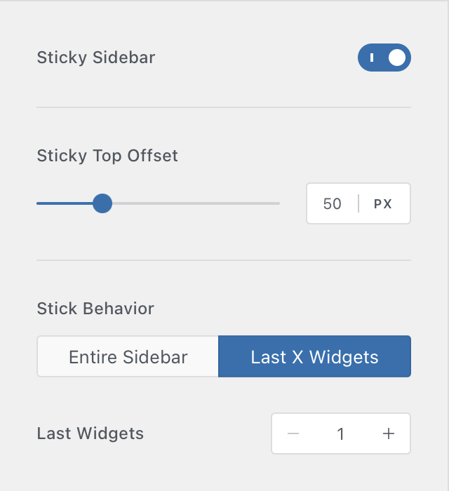
Sidebar sticky widgets options
Want to present important information to your visitors, that’s always on the screen and doesn’t scroll with the content?
These features have been implemented exactly for that reason, letting you keep some widgets always in view, no matter how far the user has scrolled down the page.
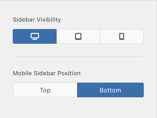
Sidebar device visibility settings
In some cases, the sidebar should only be present on some devices, such as the desktop view where the viewport is much bigger than on a phone screen.
These options will let you do just that. You can only show the sidebar on some device types. And of course, there’s an option for the sidebar position on the mobile view, letting you set it to show up before or after the page content.