

Quick Look
The Form Controls pane will let you change up the look of the forms throughout your website. Contact forms, WooCommerce Checkout forms and other forms are affected by these changes.
You can configure the general look of these forms, with two beautiful design choices — Classic & Modern. There are also granular controls, that go in depth below.
Granular Controls
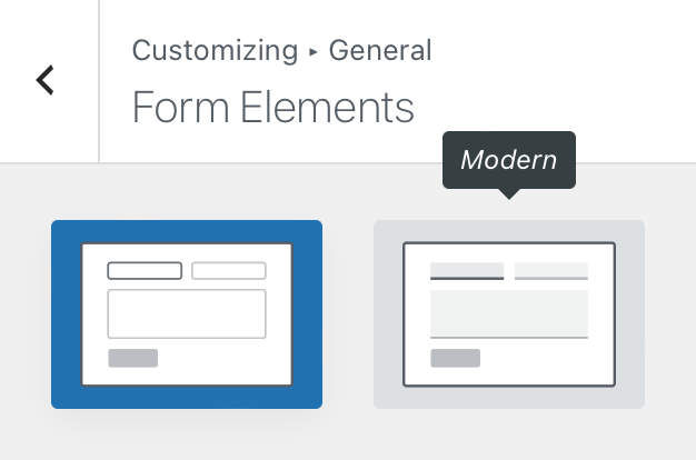
Form type
Lets you adjust the overall look of your form. Classic offers a simple boxed look, while Modern is a flatter design for the minimalist in you.
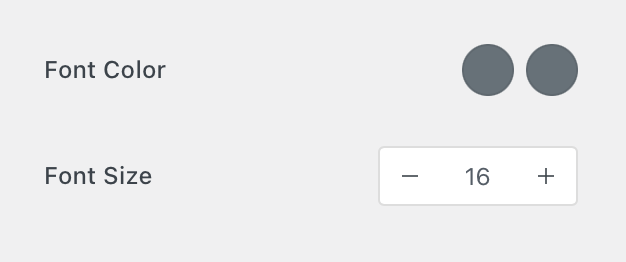
Font controls
These controls will give you the opportunity to adjust the font colours, for both the default and active modifiers, as well as the general font size of the forms.
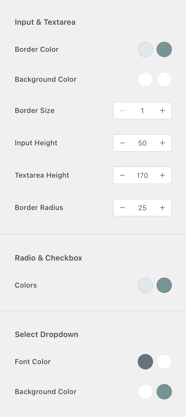
Input controls
There are three sections here. Each will let you control a set of input controls, such as text areas, radios & checkboxes and even selects.
You can choose the border and background colours of the inputs. Border options are also available, as well as radius settings.
For the radio and checkbox buttons, you can select the colours.
And for the select dropdown menus, font and background colours can be chosen.
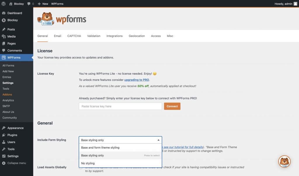
Integrating with third party plugins
Because Blocksy wants to be a citizen, it has to play nicely with others. So we offer full integration with WPForms. There’s only one little thing you have to do, and that is to go to the plugin’s settings and choose Base styling only in the “Include Form Styling” setting. This will make sure that forms generated by the plugin will inherit Blocksy’s customisations.