

The Added to Cart Popup module provides a smooth way to notify customers when a product has been added to their cart. The popup displays key details such as the product image, price, updated cart totals, and even product suggestions that complement the newly added item.
It’s a powerful tool for increasing customer retention, encouraging higher order values, and keeping users engaged throughout the shopping journey.
Activating the Module
To enable the Added to Cart Popup module, follow these steps:
- Open your WordPress Dashboard.
- Click on Blocksy in the left-hand menu.
- Navigate to the Extensions tab.
- Find the Shop Extra extension.
- Locate the Added to Cart Popup module and toggle it on.
Once activated, a new Added to Cart Popup panel will appear under Customiser → WooCommerce General, where you can fine-tune the settings.
Granular Controls

Trigger Conditions
Decide where the popup should appear – on archive pages, single product pages, or both. Please note that the AJAX add to cart option must be enabled for the popup to work.
Image Controls
Customise how the product image is displayed, with options for aspect ratio, image size, and width.
Information Controls
Manage which product details appear inside the popup, including the price, description, and attributes. You can also choose to display cart information such as totals, taxes, and shipping details.
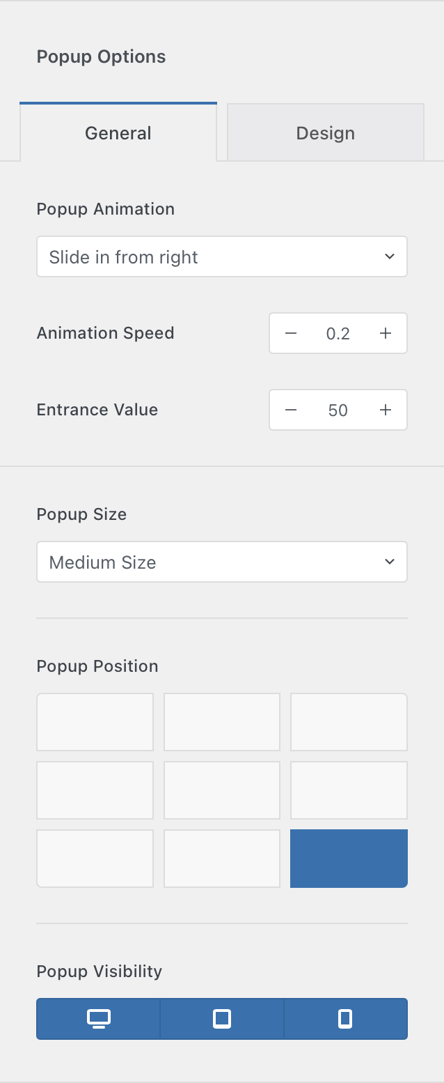
Popup Options
Configure the popup’s overall behaviour, including animation type and speed, popup size, and screen position.
You can also apply Conditional Module rules to control where the popup appears across your site.