

The single product page is the heart of any WooCommerce-powered store. It’s where your visitors make the final decision to purchase, so having full control over its structure and design is crucial. With Blocksy, you aren’t locked into a rigid layout – instead, you get a flexible system where every element can be arranged, styled, or removed to fit your store’s unique needs.
From the product title and image gallery to upsell sections and promotional features, Blocksy gives you granular control over how each part of the page looks and behaves. This ensures your store not only looks professional but also provides a smooth, conversion-optimised experience for your customers.
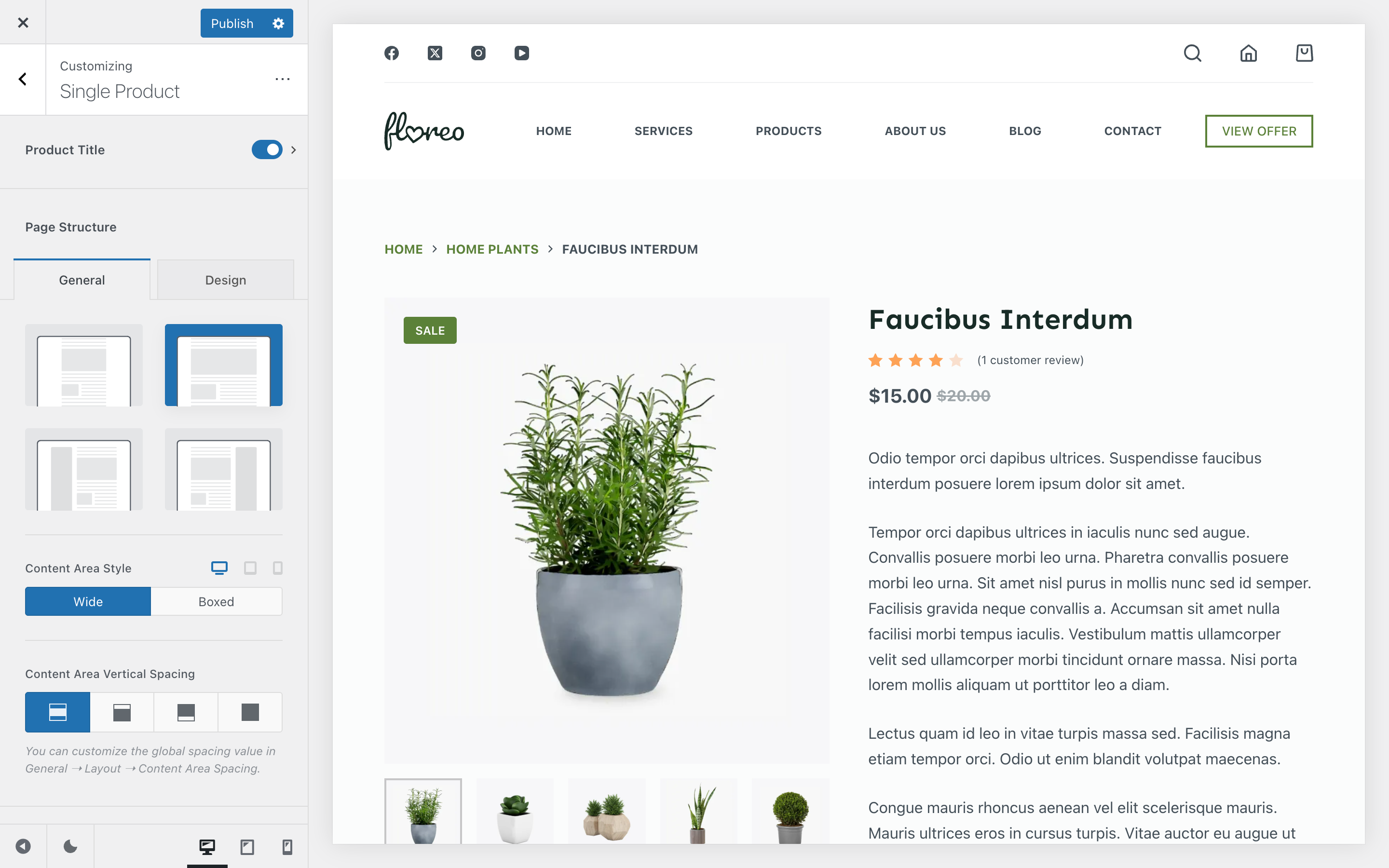
Product Title
The Product Title section gives you full control over the hero area of your single product page. You can choose between two distinct layouts to achieve the look that best fits your store.
- Type 1 – A clean, structured layout that highlights product details in a familiar, straightforward way.
- Type 2 – A more modern look with stylish variations that give your page a fresh, distinctive feel.
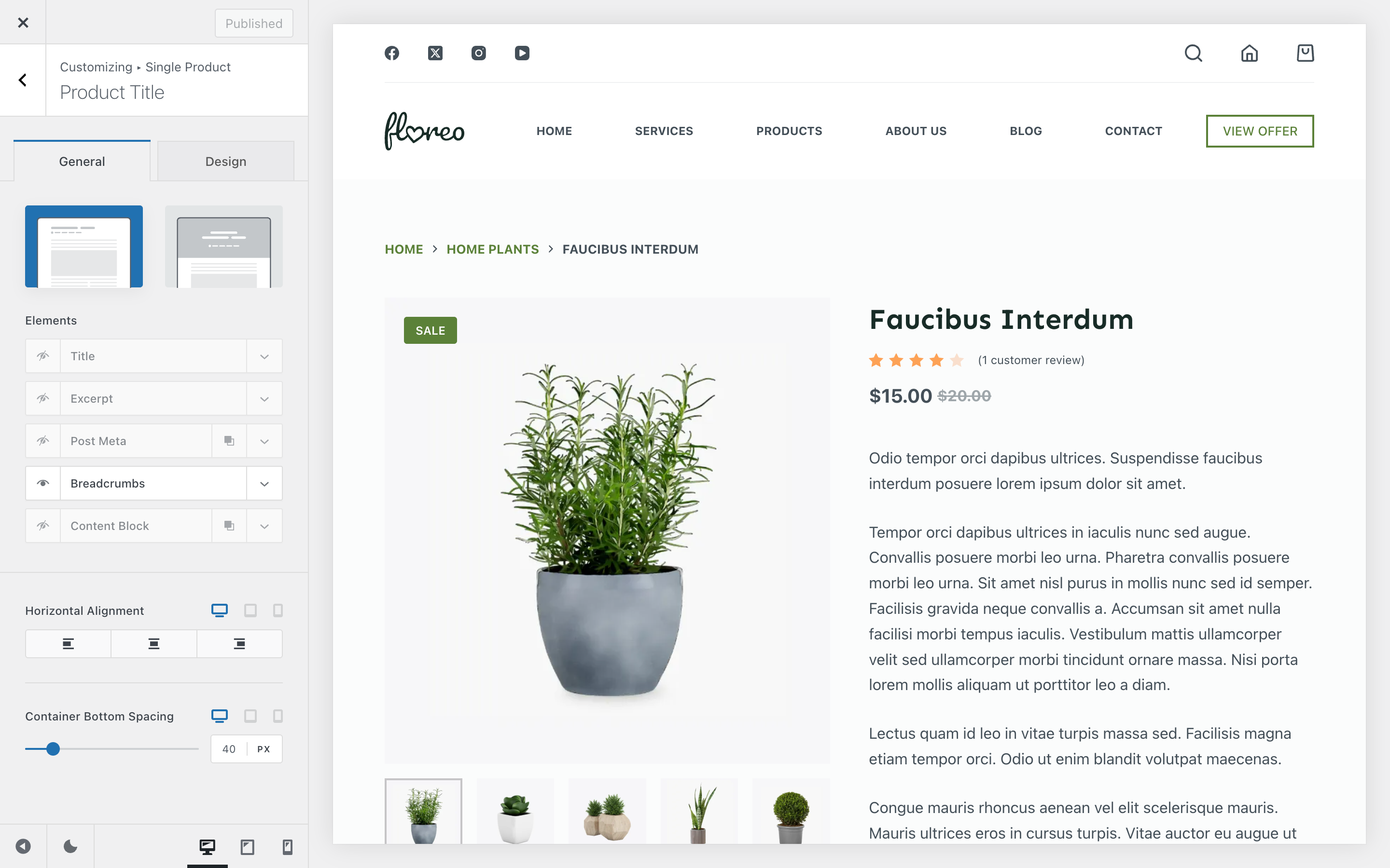
Each layout allows you to toggle and arrange multiple elements, all controlled from the Elements section:
- Title – Displays the product’s title.
- Excerpt – Shows the short description you’ve defined for the product.
- Breadcrumbs – Adds Blocksy’s quick navigation system.
- Post Meta – Lets you display meta information such as publish date, author, or other attributes.
- Content Block – Embeds a Content Block inside the hero section for extra flexibility.
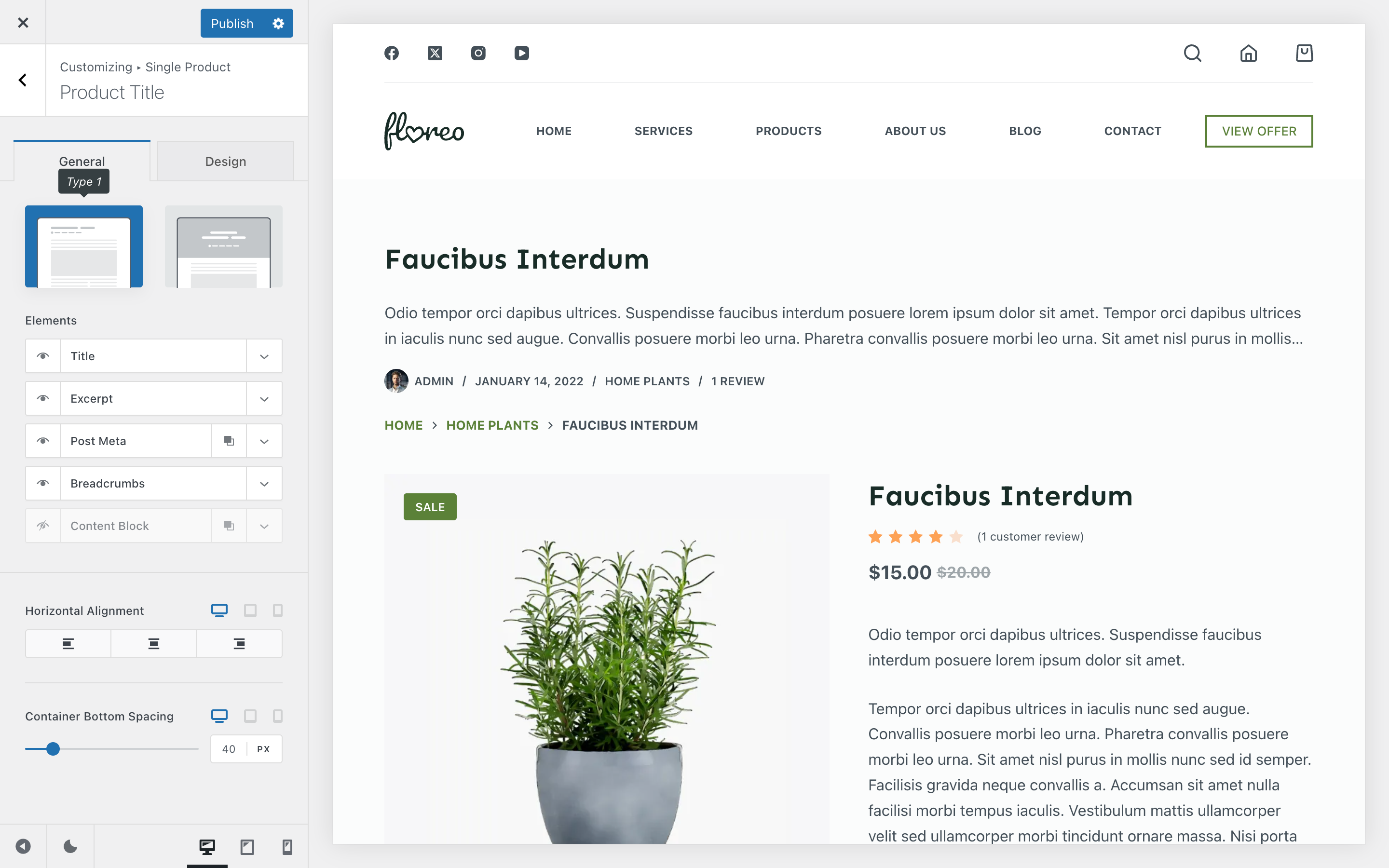
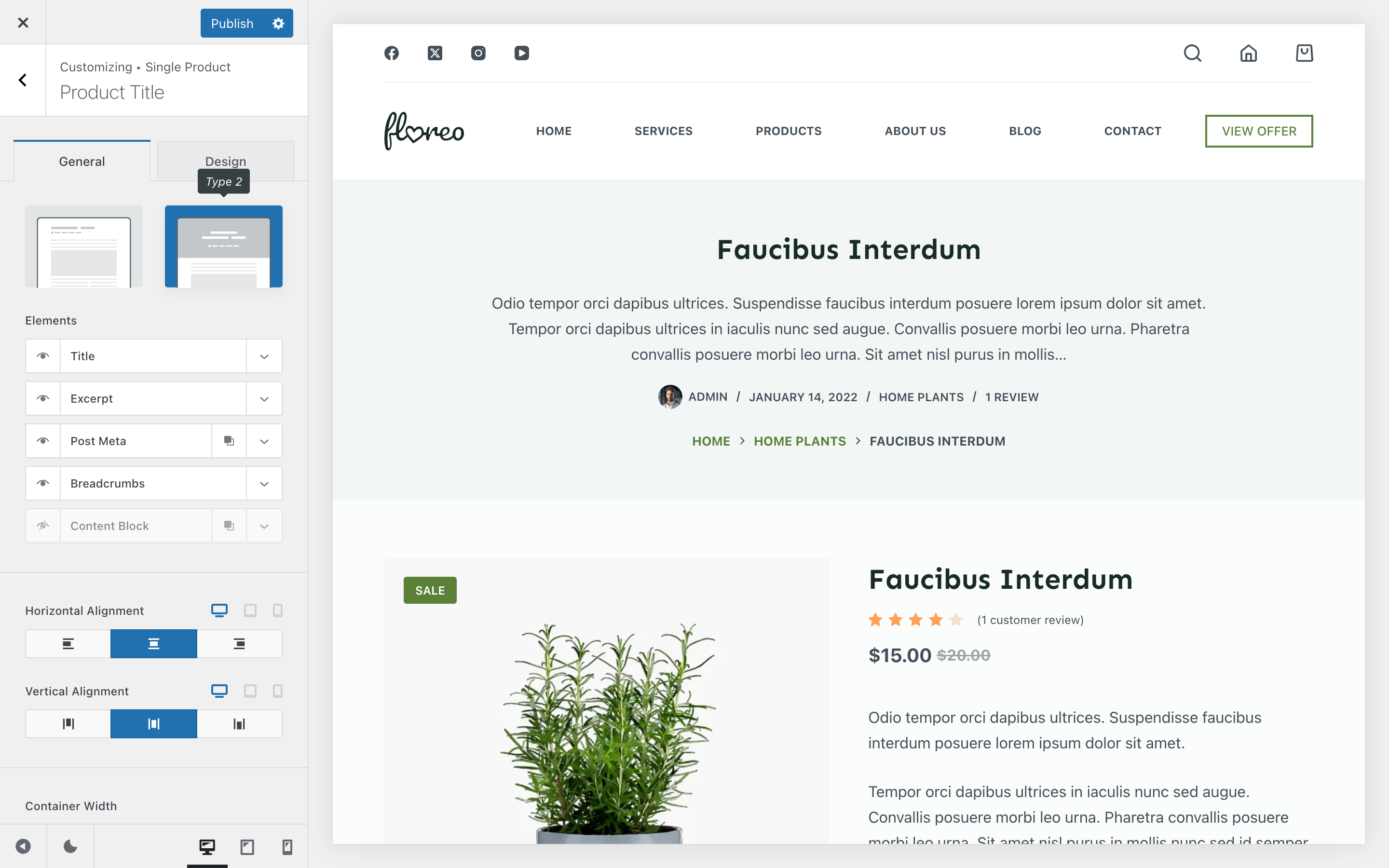
In addition to the basic layout choices, each design type for the page title container unlocks its own set of customisation options. For example:
- Type 1 – Includes controls for horizontal alignment of the content inside the container, along with spacing adjustments to fine-tune how much breathing room the section has.
- Type 2 – Adds more flexibility, such as extra alignment options, the ability to define the container width, and background image settings. For the background, you can either set a custom image, use the featured image of the current page, or disable the background entirely.
These extra controls ensure you can tailor the page title section to match the overall style and mood of your shop or product page.
Granular Controls
Product Gallery
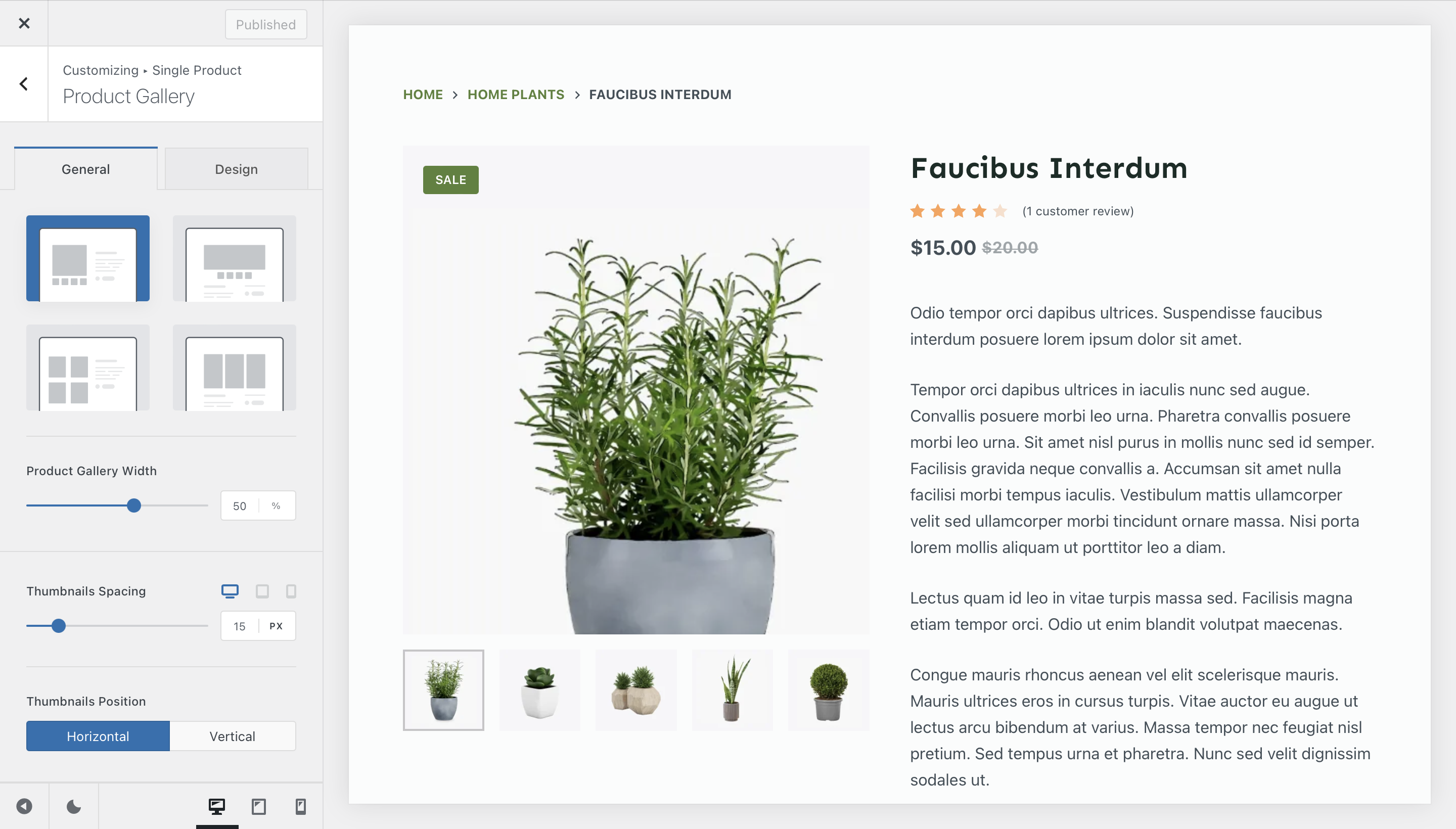
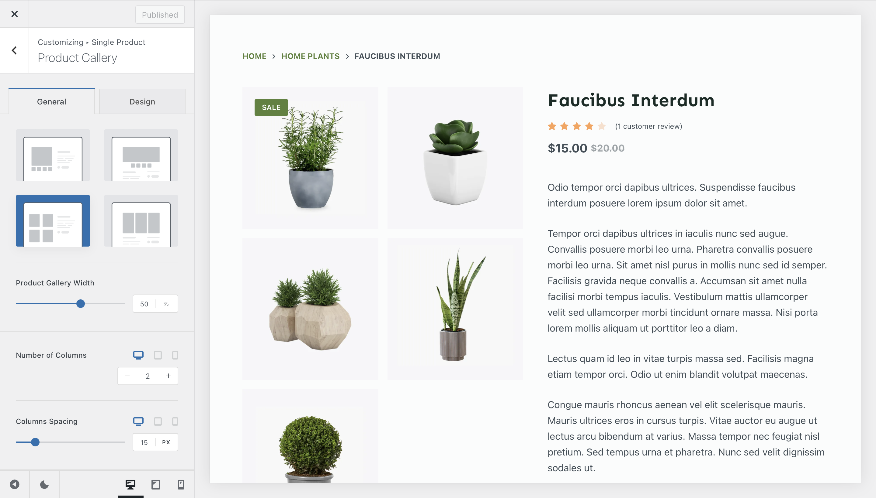
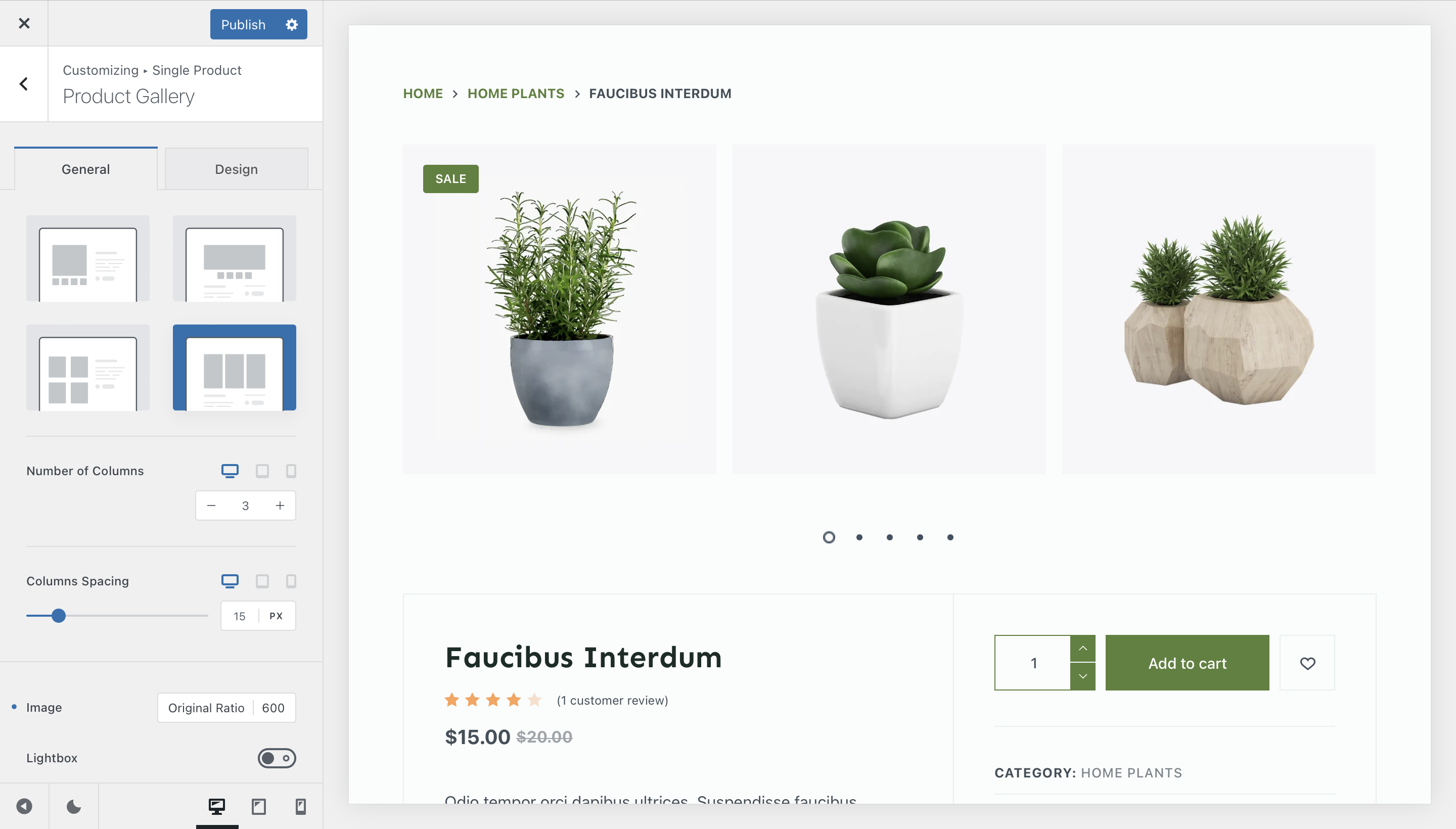
The Product Gallery controls how your product images are presented. By default (Free version), you’ll have access to a classic layout with a featured image on the left and thumbnails below it. With Blocksy Pro, three additional gallery styles become available, each offering a unique way of showcasing your products.
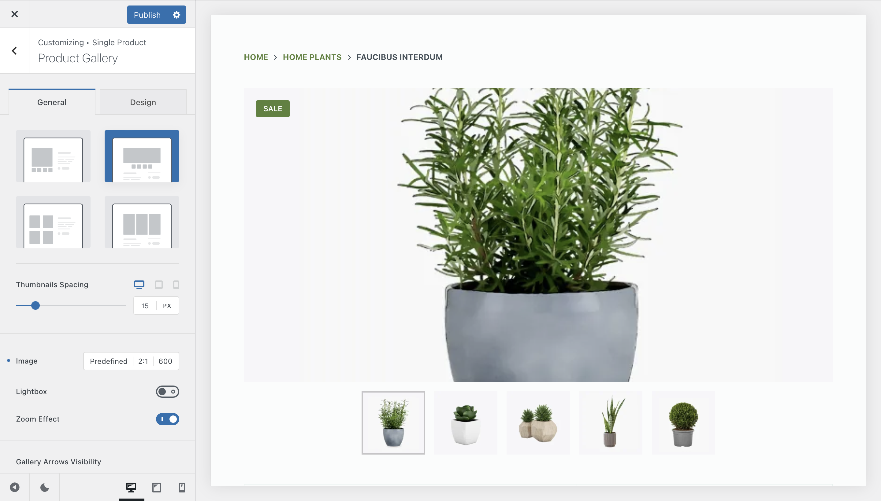
Type 1
The standard layout with a large featured product image on the left and thumbnails underneath. Clean and straightforward, this option works well for most stores.
Type 3
A grid-style gallery that shows multiple product images at once. This is ideal for showcasing items with lots of detail or variations.
Type 2
A carousel view that puts the featured image in the spotlight, with smooth navigation between additional images. Perfect for products where the main image should take centre stage.
Type 4
A grid-style gallery that shows multiple product images at once. This is ideal for showcasing items with lots of detail or variations.
Product Gallery Options
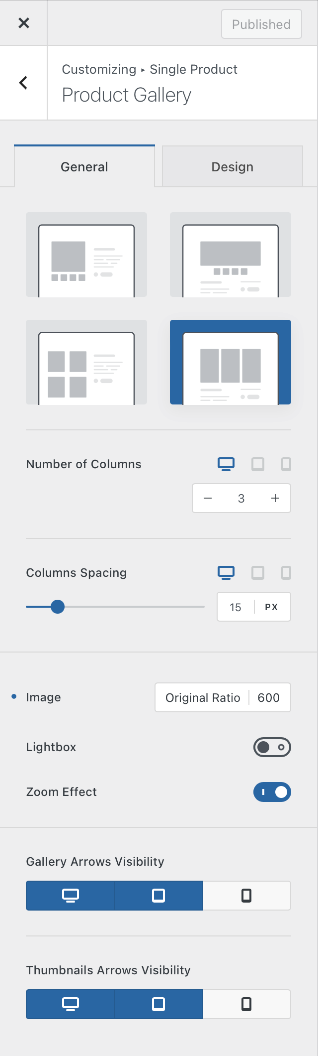
Each gallery type comes with its own set of configuration controls, giving you flexibility to fine-tune the presentation:
- Image Size & Aspect Ratio – Keep your visuals consistent and well-proportioned.
- Lightbox Mode – Let visitors open product images in a full-screen view for closer inspection.
- Zoom Effect – Allow users to zoom in on product images for detailed viewing.
- Sticky Gallery – Keeps the image gallery fixed in view while customers scroll through longer product descriptions on the right-hand side.
Depending on the gallery type, additional options become available, such as:
- Number of columns (for grid-style galleries).
- Thumbnail positioning (for the classic Type 1 gallery).
- Arrow visibility for a cleaner carousel look.
This flexibility means you can adapt the product gallery to match both your brand identity and the expectations of your audience, ensuring your products are always presented in the best possible light.
Product Elements
Beyond the gallery and hero section, Blocksy lets you fully customize the order, visibility, and design of all product page elements. This modular approach means you can craft anything from a minimal, modern layout to a feature-rich page with multiple calls to action.
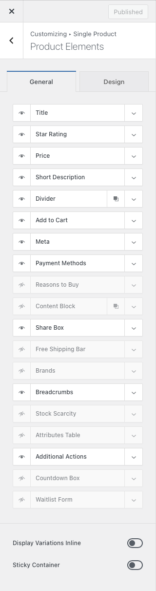
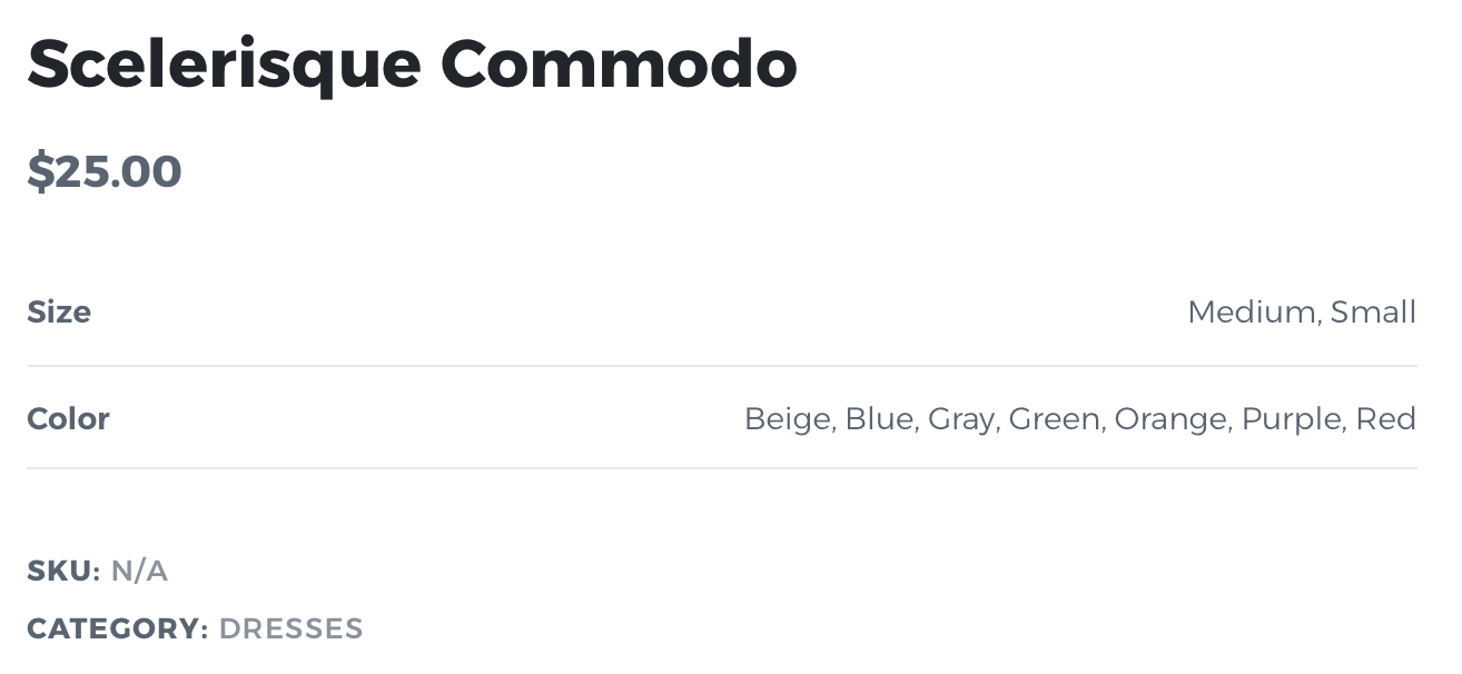
- Title – Show or hide the product title.
- Star Rating – Display average ratings from customer reviews.
- Price – Show or hide the product’s price.
- Short Description – Display the product’s excerpt.
- Divider – Add or remove divider lines (can be multiplied).
- Add to Cart – Configure button visibility, AJAX add-to-cart, and layout.
- Meta – Show SKU, categories, and other product metadata.
- Payment Methods – Display available payment options.
- Reasons to Buy – Add bullet points with extra purchase incentives.
- Content Block – Embed hooks for more custom content.
- Share Box – Configure social sharing buttons, with nofollow option.
- Free Shipping Bar – Integrate progress towards free shipping.
- Brands – Show brand metadata if enabled.
- Breadcrumbs – Add Blocksy’s breadcrumb navigation.
- Stock Scarcity – Display real-time stock levels.
- Attributes Table – List product attributes in a clean table format.
- Additional Actions – Add buttons for Size Guide, Wishlist, Compare View, etc.
- Countdown Box – Show a live timer for promotions.
- Waitlist Form – Allow subscriptions for out-of-stock products.
Display Variations Inline
This option will let you control how the variable products look like. Instead of a drop down of variations, you can get them to show nicely on the page.
Sticky Container
In case you have lots and lots of pictures for your product, this option will let you make the main information container sticky, in order to keep the information present at all times on screen.
Product Tabs
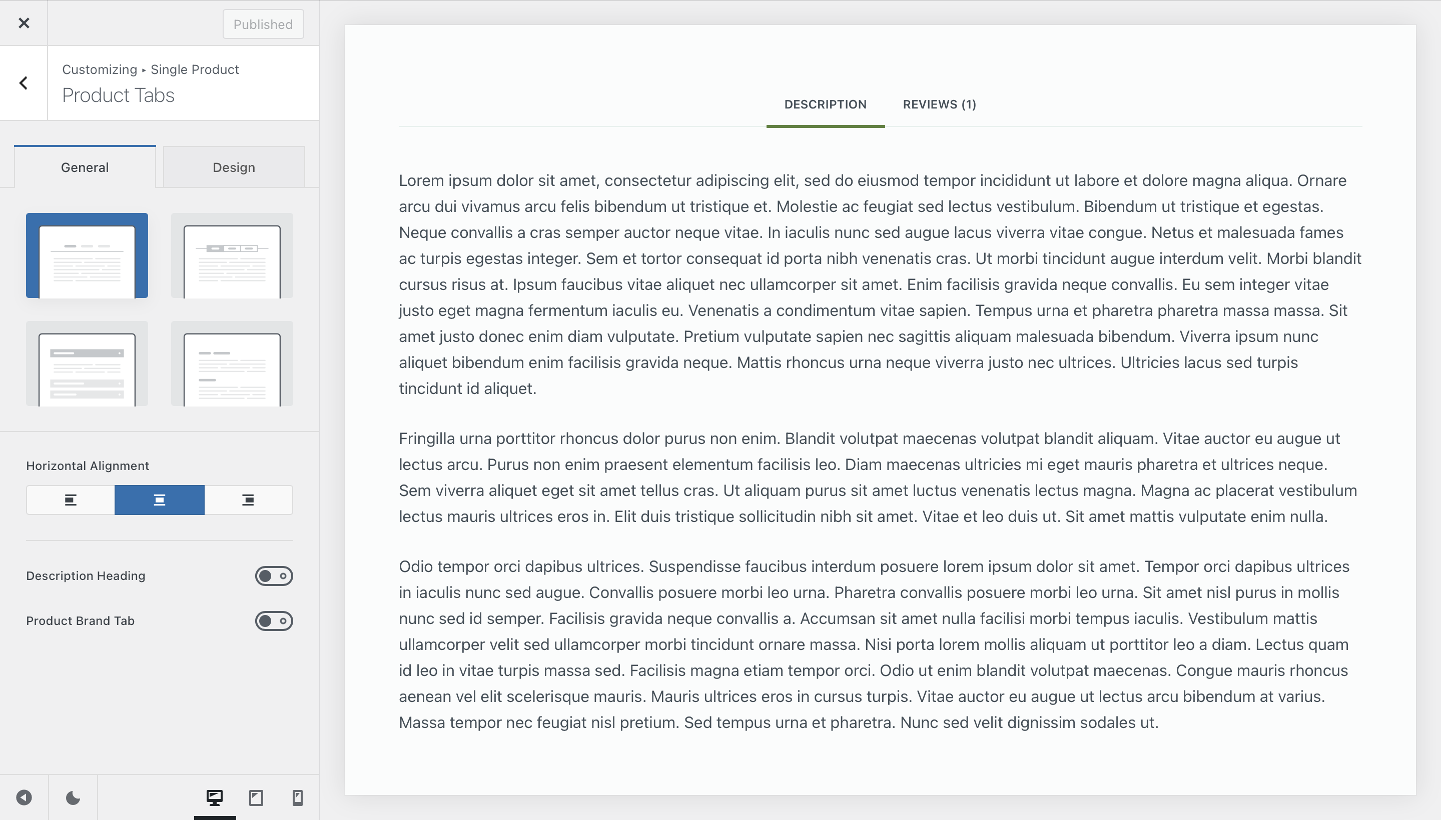
The Product Tabs section organizes additional content such as detailed descriptions, attributes, or customer reviews. Blocksy gives you several display modes so you can present this information in the way that feels most natural:
- Standard view – Classic WooCommerce tab layout.
- Tabbed view – A stylish, space-saving alternative.
- Accordion view – Ideal for mobile or compact layouts.
- Expanded view – Displays all content directly on the page.
Extra controls let you:
- Hide or display the Description heading.
- Add a dedicated Brands tab when the extension is active.
Related & Upsells
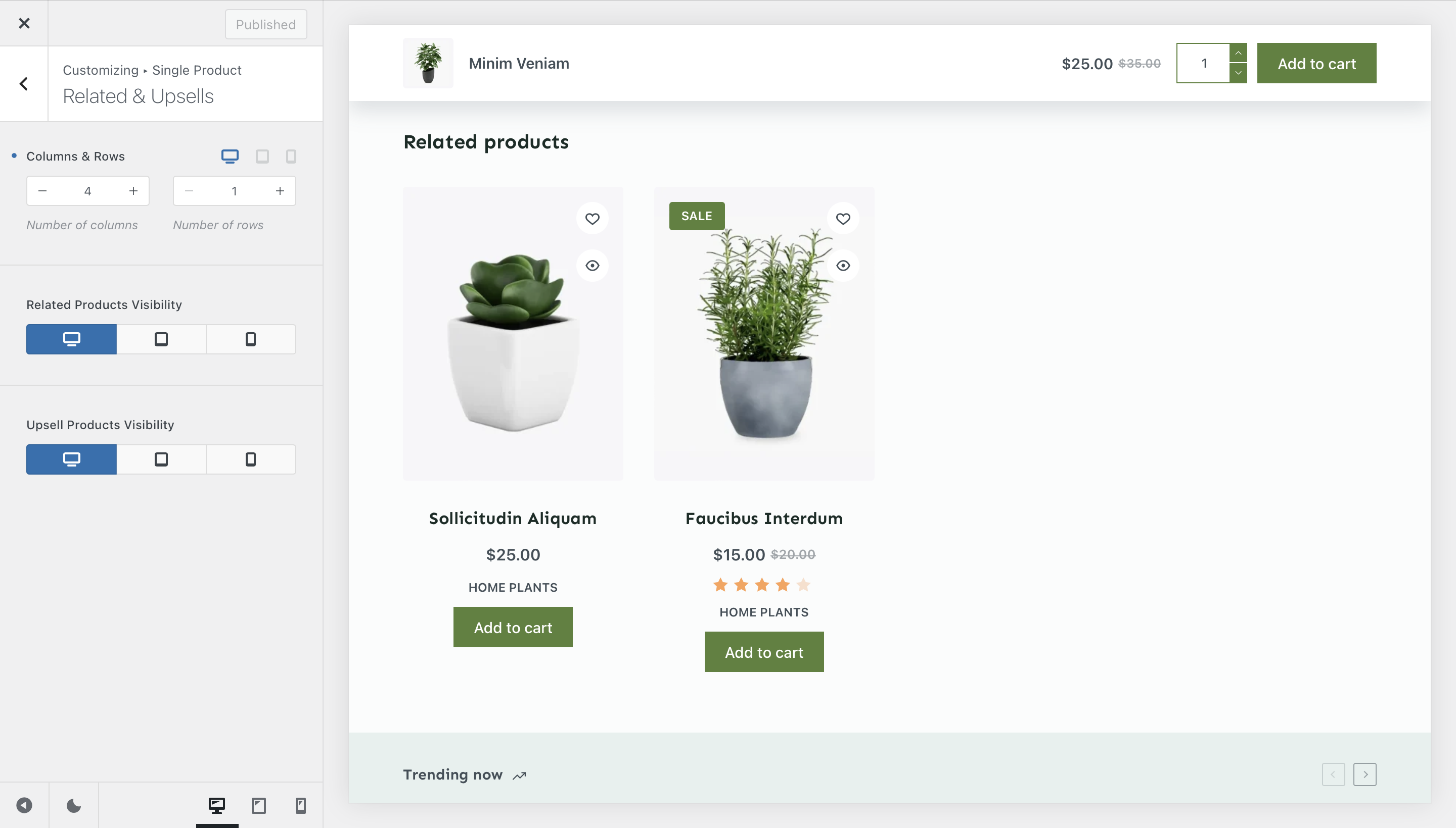
Encouraging customers to explore more products is key to increasing average order value. The Related & Upsells section allows you to control:
- Whether to showcase related items automatically or focus on curated upsells.
- The number of products displayed.
- Per-device visibility to optimise layouts for desktop, tablet, and mobile.