

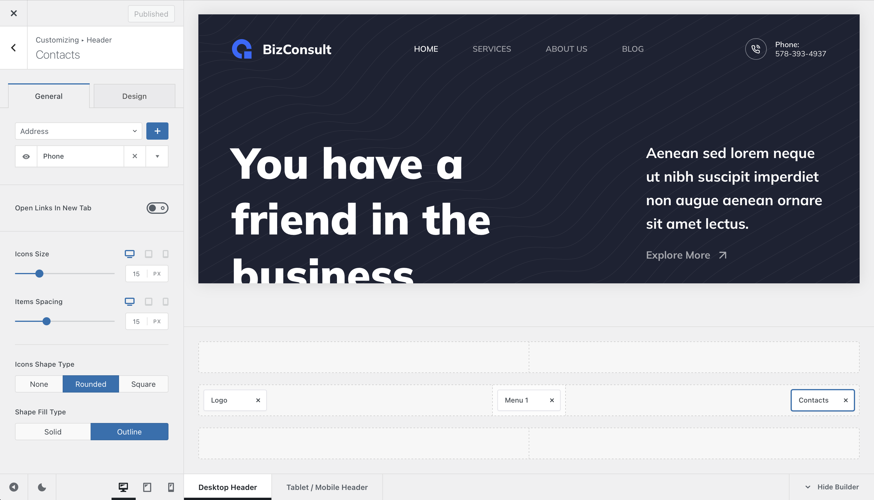
The Contacts element displays useful contact information directly inside your website’s header. It can include details such as an address, phone number, email address, opening hours or website link, making important contact methods readily accessible to visitors.
Supported contact details are automatically linked where appropriate. For example, phone numbers can open the visitor’s calling application, email addresses can start a new message, and website entries can link directly to another page or website.
To use it, open the Customiser → Header, drag the Contacts element into the desired header row or supported area, and select it to configure its content and appearance.
Granular Controls
Contact Items
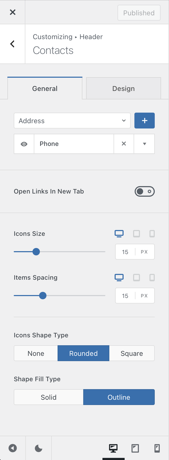
Add, remove and reorder the individual contact items displayed by the element. Available item types include:
- Address
- Phone
- Mobile Phone
- Work Hours
- Fax
- Website
Each item provides fields for entering the information that should be displayed, together with the relevant link configuration where applicable.
You can also choose to open supported links in a new browser tab, which can be useful when directing visitors to an external website.
Individual Item Visibility
Each contact item can be shown or hidden independently. This lets you temporarily remove a particular contact method without deleting its configuration from the element.
Icon Controls
Configure the appearance of the icons displayed alongside the individual contact methods. The available controls include the icon size and spacing between the icon and its associated content.
Icon Shape Type
The Icon Shape Type setting lets you place each contact icon inside an additional shape. Depending on the selected design, you can use a rounded or squared presentation and choose between outlined and filled styling.
You can also customise the Colors used by the icons and their surrounding shapes from the element’s design controls.