

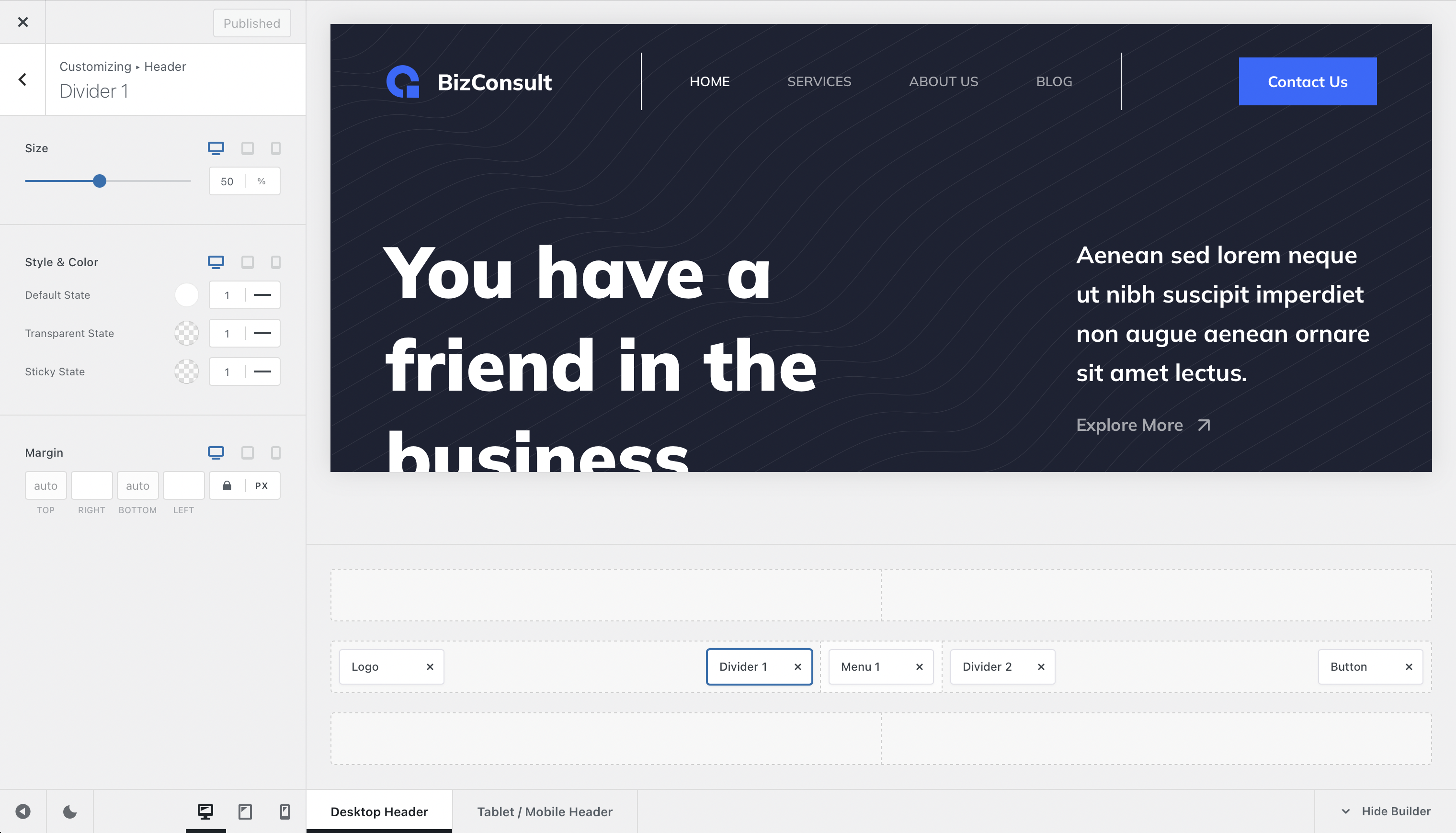
We won’t say much about the divider element in this article, because it is very simple to understand and work with. Simply put, the divider element lets you organise your header into neat little sections, giving a clearer picture to your visitors and letting them navigate with ease.
Granular Controls
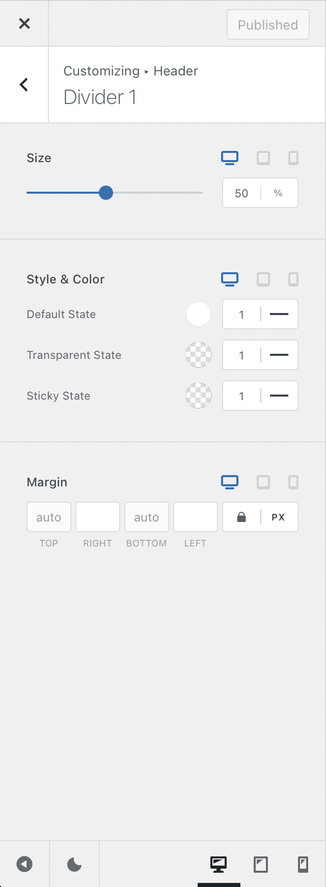
Size
The size control lets you specify how much vertical space the divider element will take of the header row. The change is made in percentage and is very simple to modify.
Style & Colour
These options will let you select the colour and thickness of the divider. Simple enough.
Margin
Simply add a left or right margin to the divider, in case it is too close to other elements.
Bonus!