

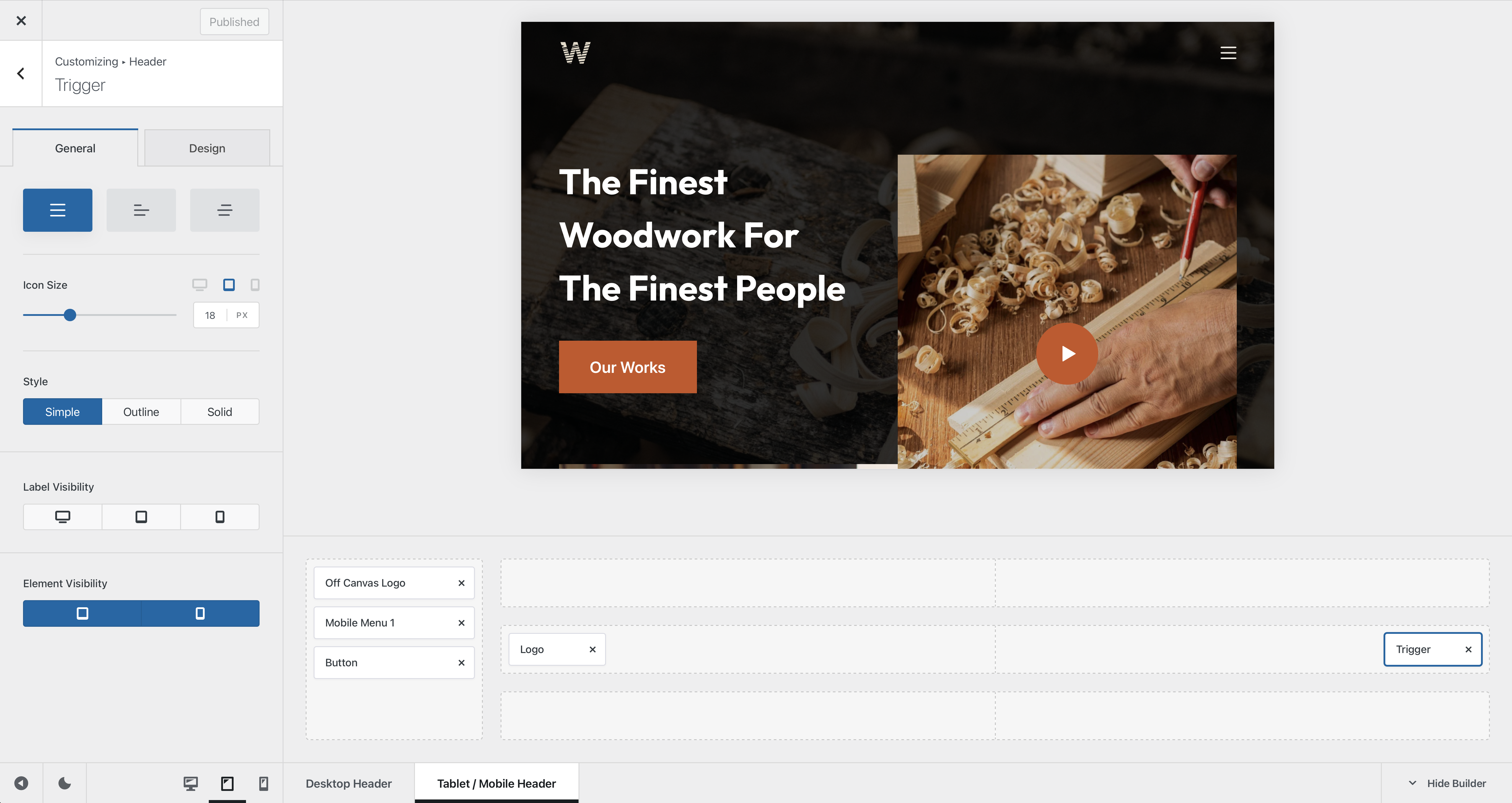
The Trigger element is very simple and has only one function — to trigger the off canvas menu that’s present on mobile devices or in Blocksy Pro’s desktop view. Its configuration settings are very easy to understand and we’ll note them down below.
Granular Controls
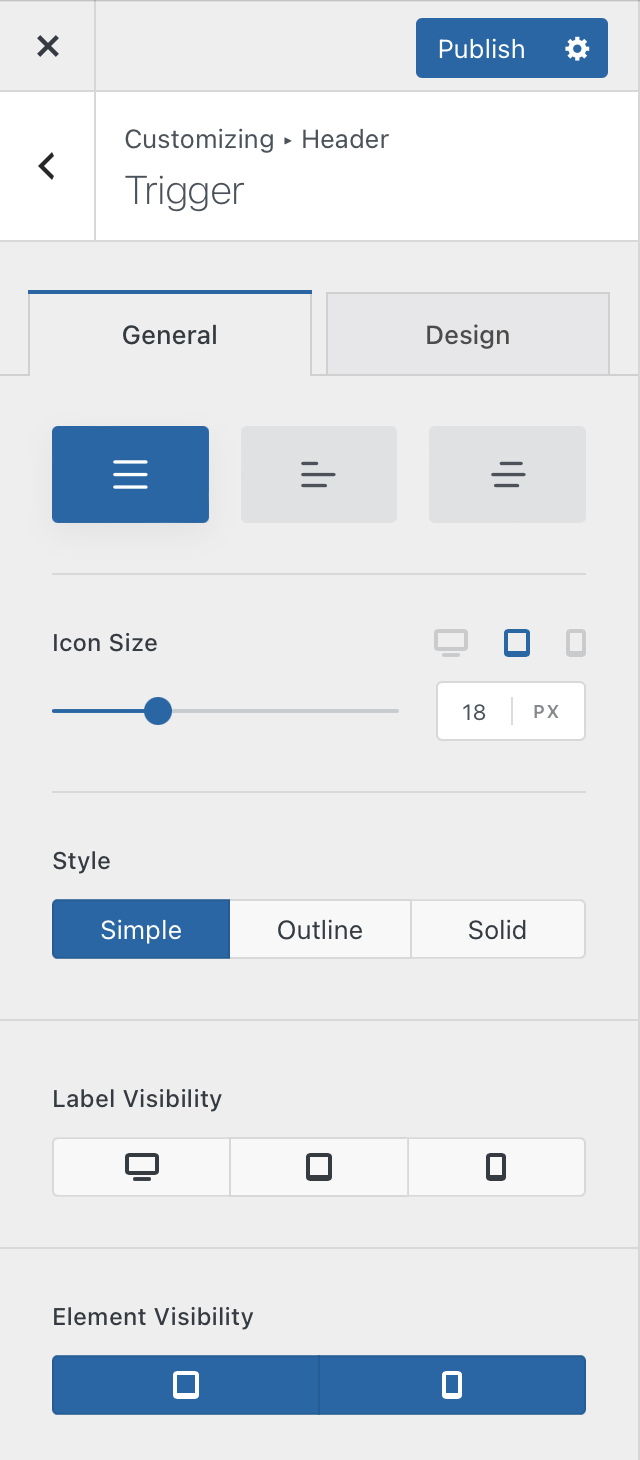
Style Type
The first option lets you select from three predefined styles for the trigger element. The first one is a symmetrical choice, perfect for any kind of setup. The second one takes on an asymmetrical look, that’s perfect for placing the trigger element on the left for creating a pseudo-mobile app. And the third choice offers a sophisticated, titled look. Simple enough.
Icon Controls
The first option simply controls the size of the icon that’s displayed on the front end. There are also per device controls, so you can customise the size independently for each view — desktop, tablet and mobile phones.
The Style section lets you select between three distinct icon decoration styles.
- Simple – just displays the trigger icon
- Outline – adds a nice border around the icon, highlighting it on the page
- Solid – adds a nice solid background colour to the trigger icon
Label Visibility
This option lets you show the text label of the element on a per device basis.
Element Visibility
In case you wish to have a different tablet look, you can easily turn off the trigger element for that view from here, letting you achieve a unique combination for your website.