The Cart element gives WooCommerce customers quick access to their current shopping cart directly from the website header. It can display the number of products in the cart, the current cart total and a mini-cart interface for reviewing or adjusting items without first visiting the Cart page.
To use it, open the Customiser → Header, drag the Cart element into the desired header row, and select it to configure its appearance and behaviour.
WooCommerce required
The Cart element is available when WooCommerce is installed and active on the website.
Granular Controls
Element Appearance
Icon
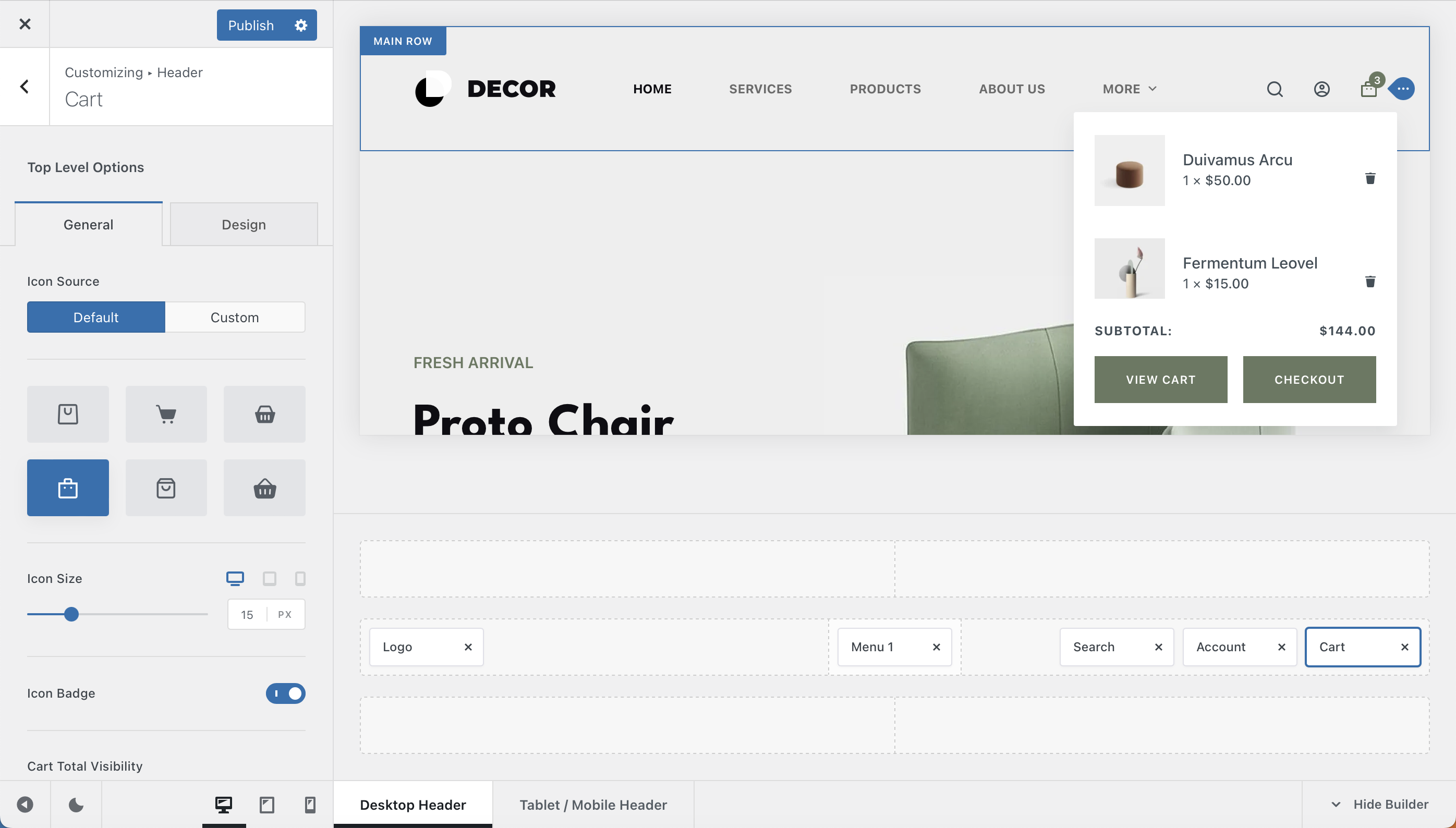
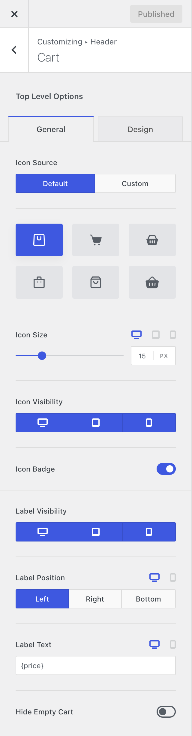
Choose from six built-in cart icons to represent the element in the header. Blocksy Pro also lets you upload your own custom SVG icon.
The icon size can be configured responsively, allowing you to use different values for desktop, tablet and mobile devices.
Icon Badge
Enable the Icon Badge to display the number of products currently added to the customer’s cart.
Cart Total
Choose whether the current cart total is displayed alongside the cart icon, giving customers an immediate overview of the value of their cart.
Label
The Cart element includes several controls for displaying additional text alongside the cart icon:
- Label Visibility – choose whether the label is displayed on desktop, tablet and mobile devices independently.
- Label Position – place the label to the left, right or bottom of the cart icon.
- Custom Label – customise the text displayed by the element. The default
{price}placeholder dynamically outputs the current cart total, and can be combined with additional text if needed.
Hide Cart When Empty
Enable this option if you want the entire Cart element to remain hidden until the customer adds at least one product to their cart.
Cart Drawer
The Cart Drawer controls how customers preview and manage the contents of their cart after interacting with the header element.
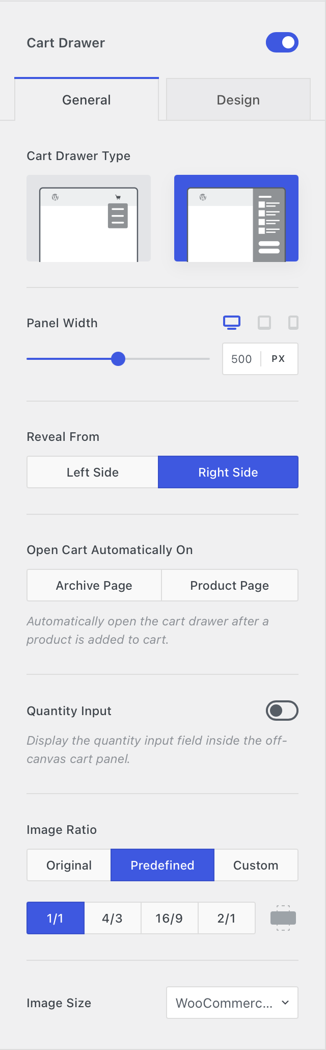
Cart Drawer Type
Choose how the mini-cart is presented when the Cart element is opened:
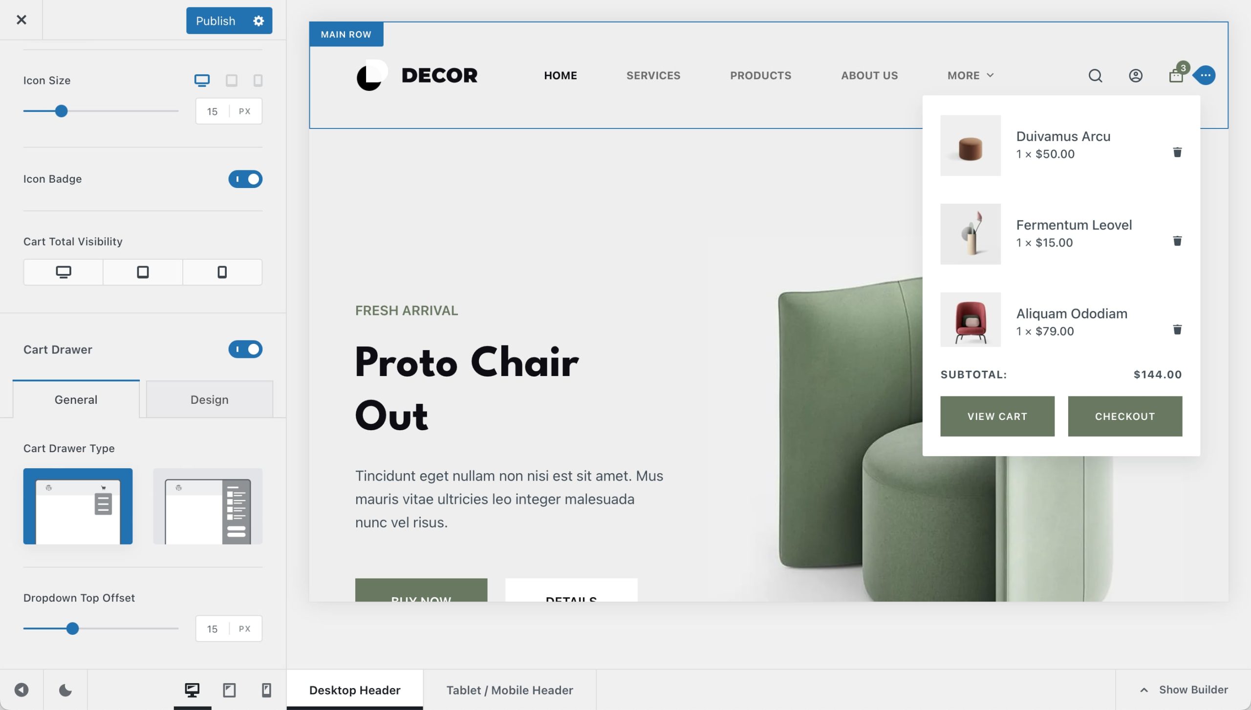
- Flyout – displays the cart in a compact panel attached to the header element.
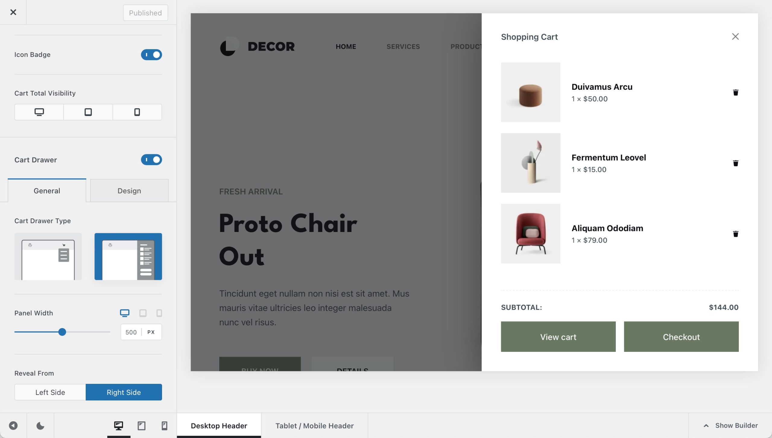
- Off Canvas – opens the cart inside a larger panel that slides in from the side of the browser window. This presentation is available with Blocksy Pro.
Blocksy Pro
The Off Canvas Cart Drawer is a Blocksy Pro feature. The standard Flyout mini-cart remains available without it.
Panel Width
When the Off Canvas drawer is selected, use the Panel Width control to define how much horizontal space the cart occupies when opened.
Reveal From
Choose whether the Off Canvas cart slides into view from the left or right side of the screen.
Open Cart Automatically
Automatically open the cart drawer after a customer successfully adds a product to their cart. This provides immediate confirmation of the action and lets them review the updated cart without opening it manually.
Automatic opening requires the add-to-cart action to be handled through AJAX. If adding a product performs a full page navigation or reload instead, the cart drawer cannot be opened automatically as part of that interaction.
Quantity Input
Enable quantity controls inside the mini-cart so customers can adjust the quantity of products already added to their cart without leaving the drawer.
Product Images
Control how product thumbnails are displayed inside the mini-cart. These settings apply regardless of whether you use the Flyout or Off Canvas Cart Drawer.
You can adjust the image ratio to control the proportions of each thumbnail and select the preferred image size used for the product images. This lets you balance image quality and available space while keeping the mini-cart layout consistent with the rest of your store.
Visual Reference
The examples below show the difference between the standard Flyout mini-cart and Blocksy Pro’s Off Canvas presentation.