

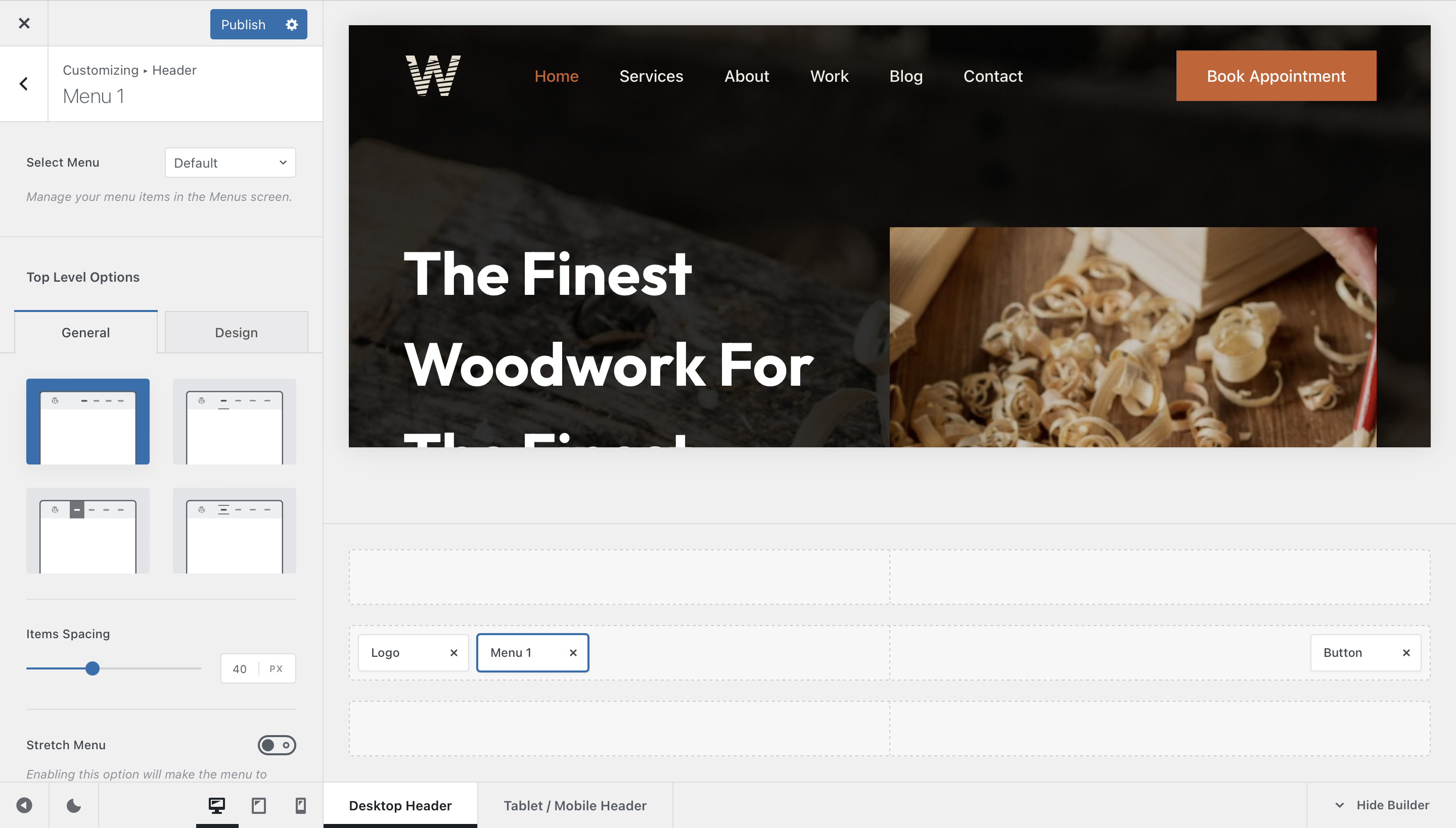
Every website needs some kind of navigation system, right? Then, the menu element comes right in handy for providing an easy to use and configure navigation system for your visitors. The list of options is very long and every single element can be meticulously configured down to a minute detail. Let’s check out everything in detail.
Granular Controls
Select Menu
Remember how WordPress lets you create different menu sets for every occasion, via the Appearance -> Menus pane of your dashboard? This is the place where you assign the menu set to the menu element.
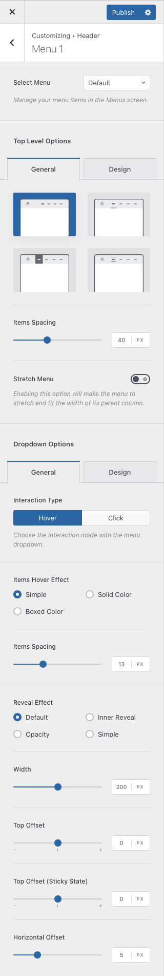
Top Level Options
This section will let you control the very first level of menu items — the one that shows up with no action taken.
Style
The first section here will let you choose a style for how the menu looks like.
- Style 1 – A classic look. No fancy elements here.
- Style 2 – The link gets highlighted with a nice underline.
- Style 3 – A box of colour highlights every link, looking fresh.
- Style 4 – Every link is flanked by a border with a nice animation.
There’s also a quick option that lets you control the spacing between these elements. And the stretch menu option will automatically wrap the menu elements to all the available space.
Dropdown Options
This section will let you control the dropdown that appears when your menu has more sub-menu items.
Interaction Type
This one is very interesting. It lets you select how the dropdown menus behave when they show up. Should they show up when hovering over the parent element, or do you prefer an accessibility-friendly click option?
Items Hover Effect
This lets you select how the dropdown hover effect will look like.
- Simple – just a simple hover effect with no bells and whistles.
- Solid Colour – this highlights the entire element with the colour of your choice.
- Boxed Colour – this is an exquisite design which highlights the element with a nice rounded rectangle.
Reveal Effect
This one lets you choose how the dropdown animation will look like.
- Default – a nice reveal effect from the bottom, using the entire dropdown.
- Inner Reveal – both the dropdown and its contents animate independently, for a playful motion.
- Opacity – a simple fade in/fade out animation.
- Simple – a quick pop in/pop out animation.
Size and Spacing Controls
These last few options will let you control the size and spacing of the dropdown menus. You can control the width, as well as the spacing from the parent element on a vertical and horizontal basis.