

With Blocksy Pro, you can easily streamline the navigation system of your website by offering a consistent experience between the desktop and mobile views. This menu is very similar to the one that’s already present on the mobile view and can be configured using the same options.
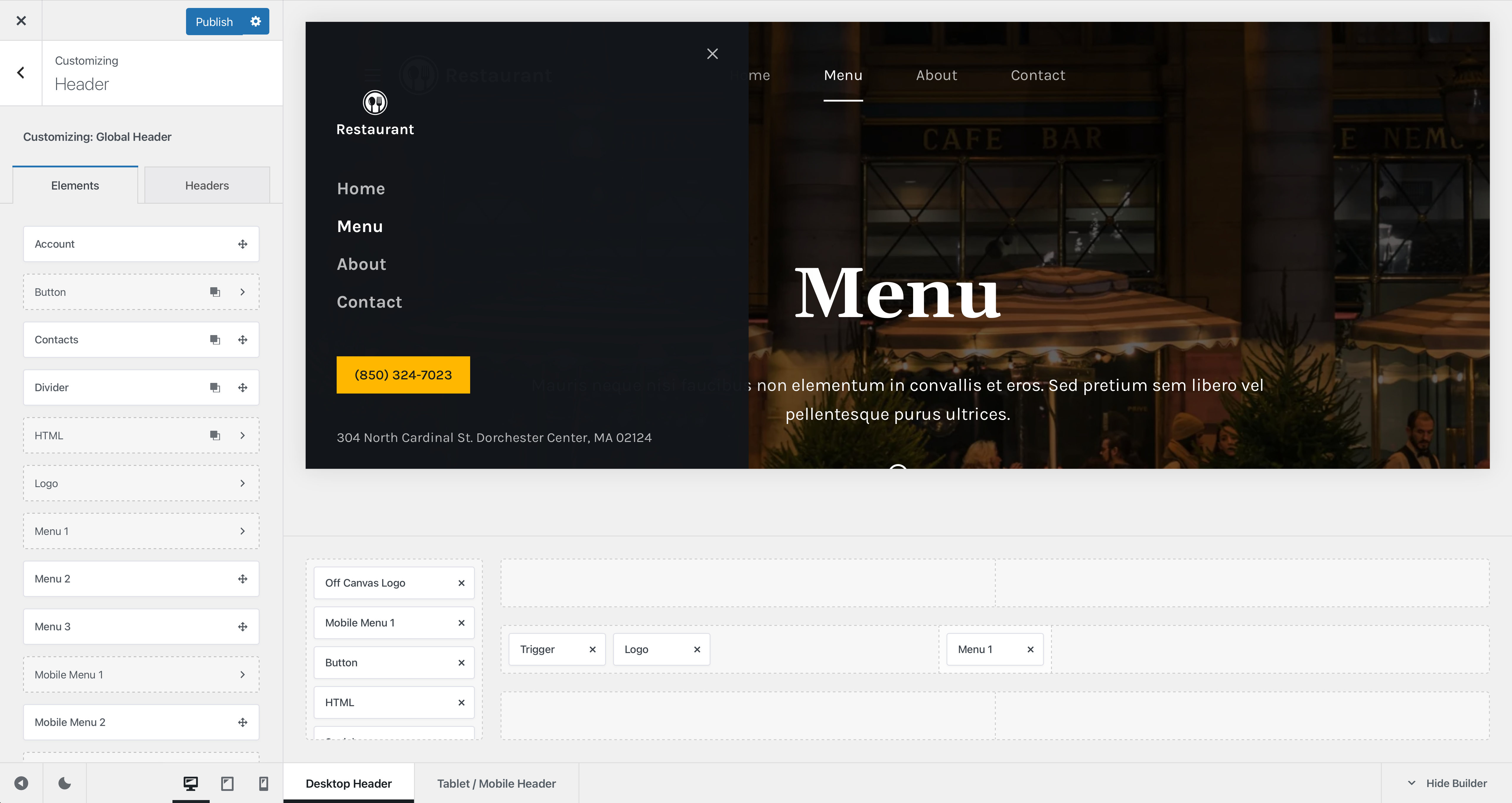
To get started, simply drag the Trigger element on one of the header rows, while in the desktop view.
Now, if you look closely above, you will see the Off Canvas Area, which slides out on the screen when the Trigger element is pressed. This little area is common with the mobile view as well, but does not share the same element configuration between them. The layout created by the elements you put inside the desktop off canvas area are different from the mobile view.
Granular Controls
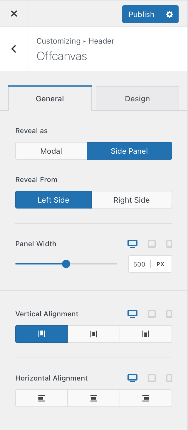
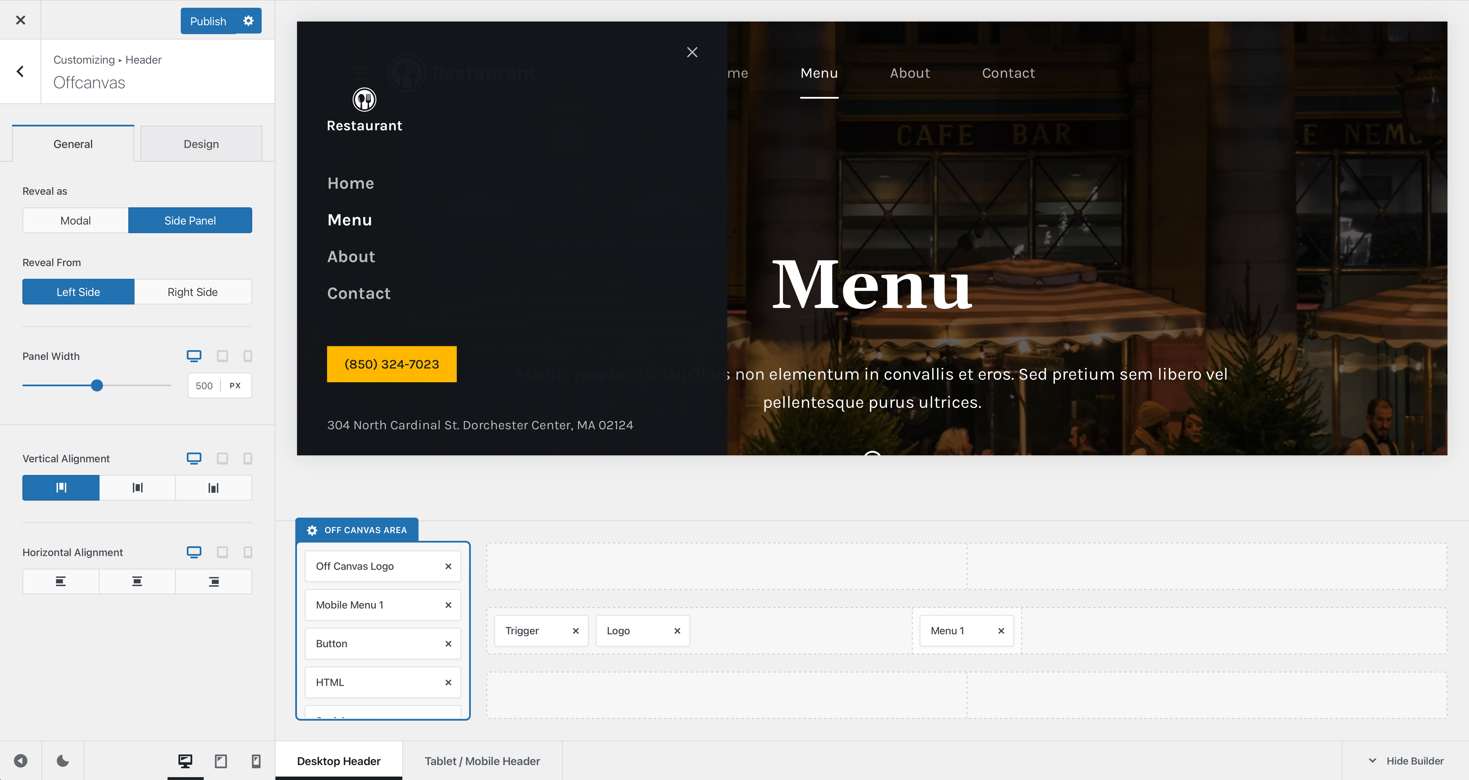
Reveal
This little option lets you select from two different styles for the off canvas area. The Modal option will open the area in full screen, covering the page from behind, while the Side Panel option will let the panel slide in from the left side or the right side.
The Panel Width option is only applicable if you have selected the Side Panel view and lets you define the size of the panel.
Alignment Options
These options will let you select how the contents of the off canvas area are aligned. You can modify those on the vertical axis, as well as on the horizontal axis.