

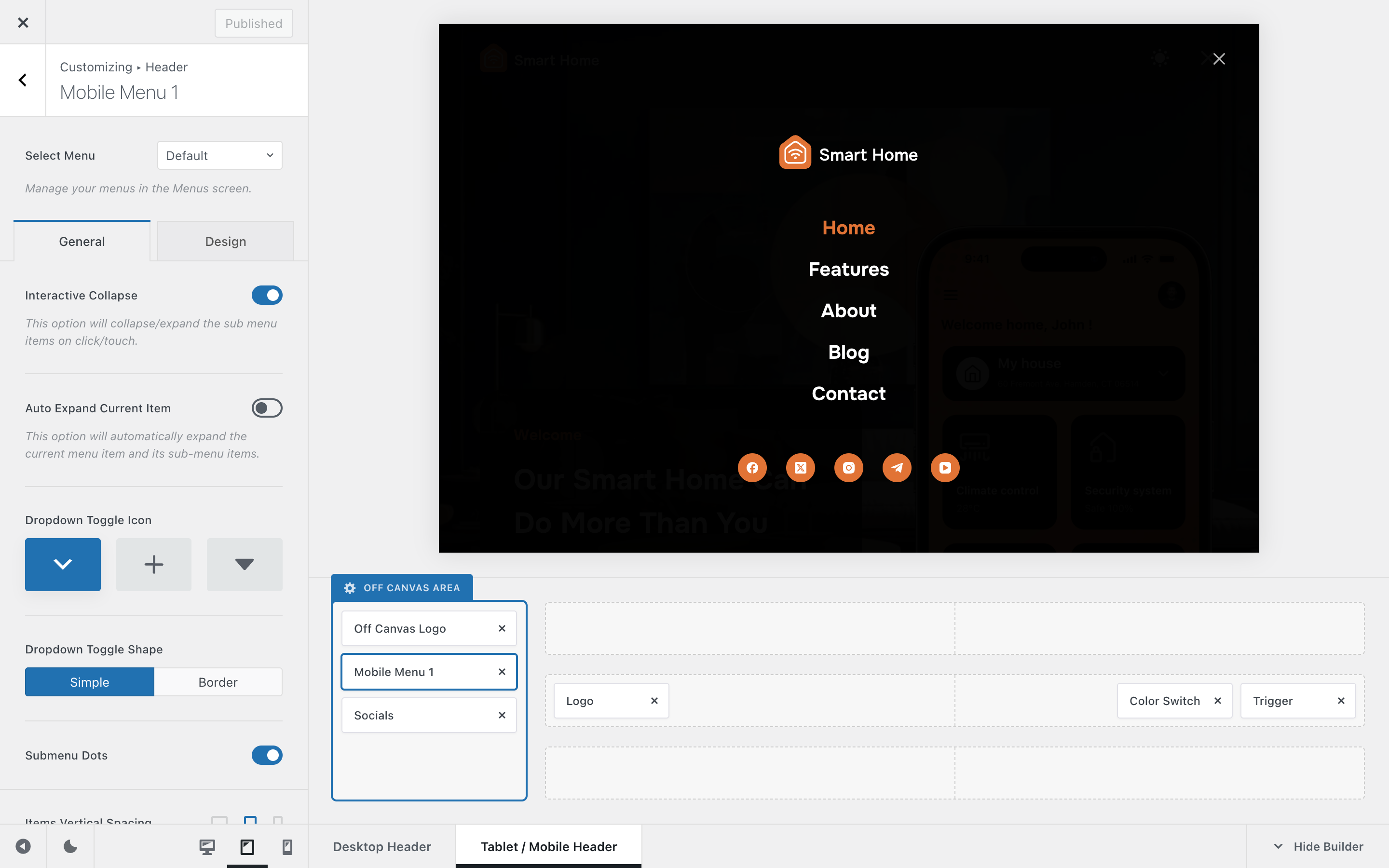
The Mobile Menu header element gives you full control over how navigation menus behave and look on mobile devices. With just a few intuitive options, you can adjust the way submenus expand, icons appear, and spacing feels – ensuring your mobile menu is both functional and visually cohesive with the rest of your website.
Granular Controls
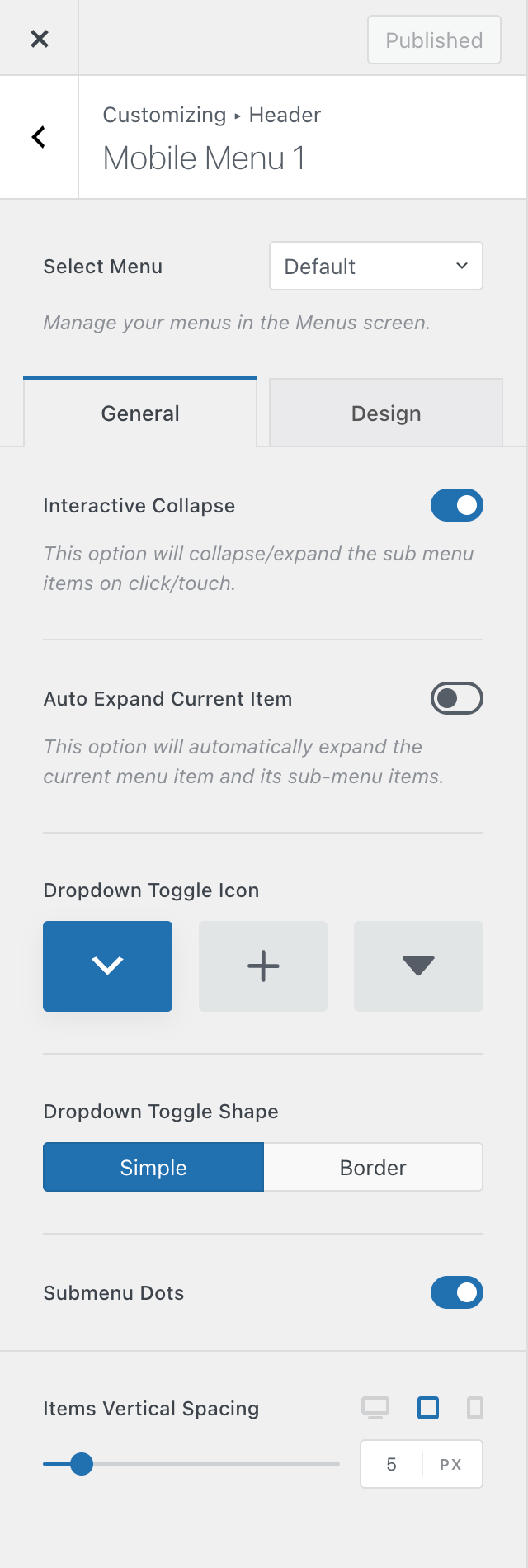
Select Menu
Just like in WordPress’ Appearance → Menus section, where you can create multiple menu sets, this control lets you assign which specific menu will appear inside the mobile menu element.
Interactive Collapse
This option controls how nested menus behave.
- When disabled, all submenus remain expanded at all times, showing the full navigation hierarchy.
- When enabled, visitors can expand and collapse submenus by tapping the toggle icon – perfect for keeping things tidy.
Auto Expand Current Item
Automatically expands the menu path to highlight the page the visitor is currently on. This is especially useful if your navigation has deep submenu levels, ensuring users can always see where they are within the structure.
Dropdown Toggle Icon
Here, you can choose the icon that appears next to menu items containing submenus. A few predefined icon styles are available, allowing you to match your menu’s look to your site’s overall design.
Dropdown Toggle Shape
This setting adds a subtle shape or border around the submenu toggle icon, enhancing visibility and creating a more refined appearance.
Submenu Dots
Disable the indicator icons that highlight the menu’s hierarchy.
Items Vertical Spacing
Controls the vertical spacing between individual menu items. Adjust this value to achieve a comfortable, easy-to-navigate layout on smaller screens.