

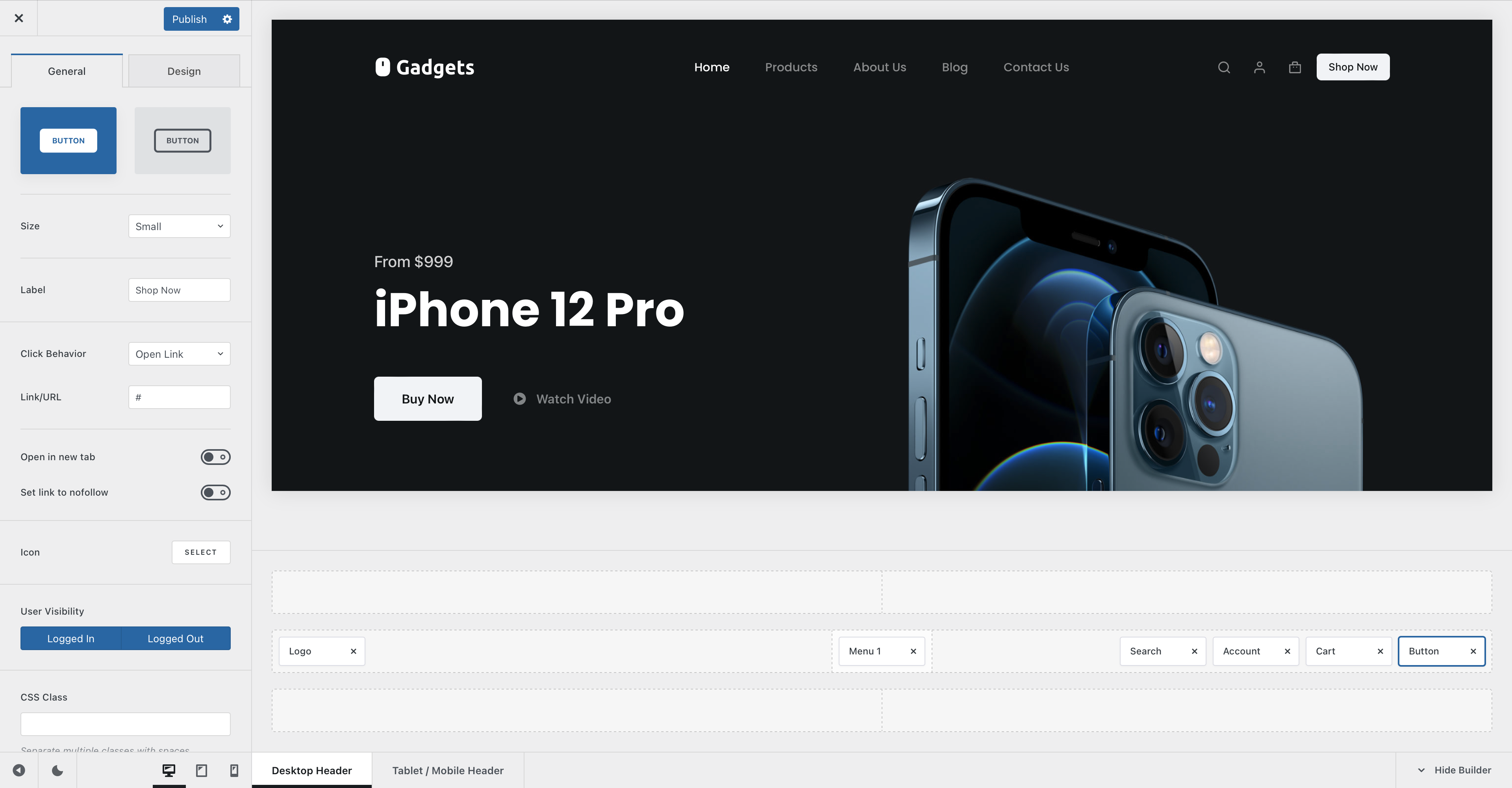
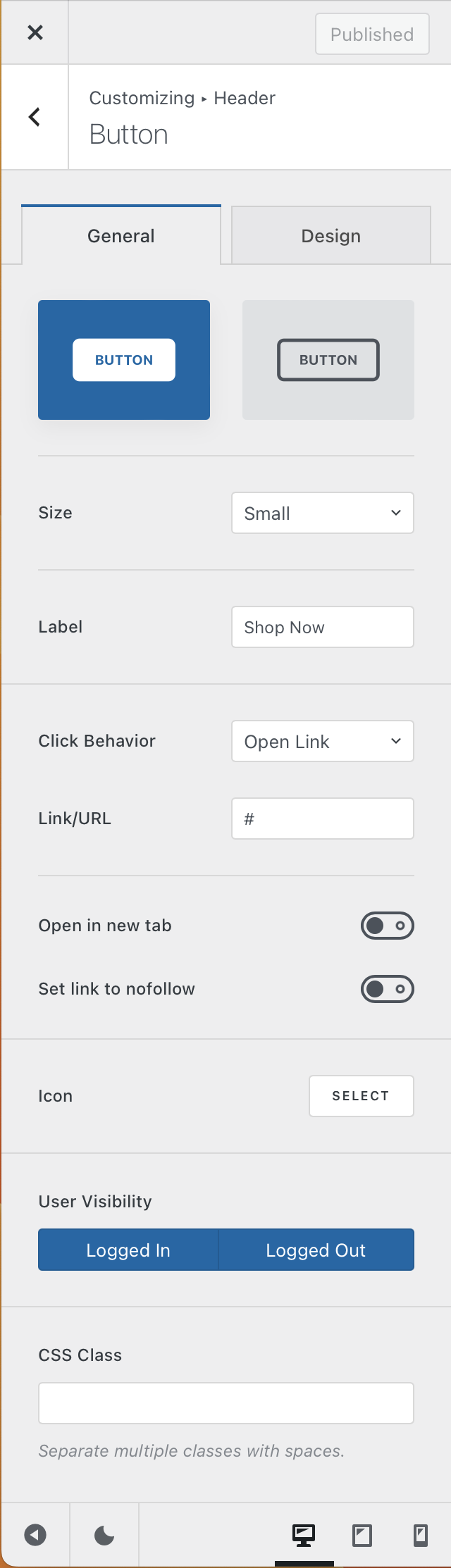
The Button element comes in really handy if you wish to link your visitors to an important part of your website and make things stand out. It has a couple of nice configuration settings, so let’s check them out in detail.
Granular Controls
Button style
This first option will let you select between two simple styles for the button. One is fully filled and attracts attention instantly, while the secondary one offers an outlined design, which is subtle and blends in nicely with the content.
Size
Pick between four different sizes —
- Default – inherits the size set inside the general button options, under General -> Buttons
- Small
- Medium
- Large
Label
This lets you set the text label that’s displayed inside the button. Simple enough.
Click Behaviour
This lets you select what icon will happen when the user clicks on the button. By default, you can set it to any kind of link you might want, but Blocksy Pro users have the advantage of also opening pop-ups on demand.
The “Open in new tab” option will let you do just that — open the link in a new tab, while the “Set link to nofollow” helps search engines understand how links are sent outbounds from your website.
Icon
This section lets you highlight the button with a nice icon, that represents a call to action for your visitors.
User Visibility
This option lets you hide the button element on a user-state basis. For example, you can hide the element if the user is logged in, to streamline the experience.
CSS class
This option is for advanced users and comes in really handy when combined with a third party solution. Many tools rely on a CSS class for triggering their actions, so this field is made just for that!