


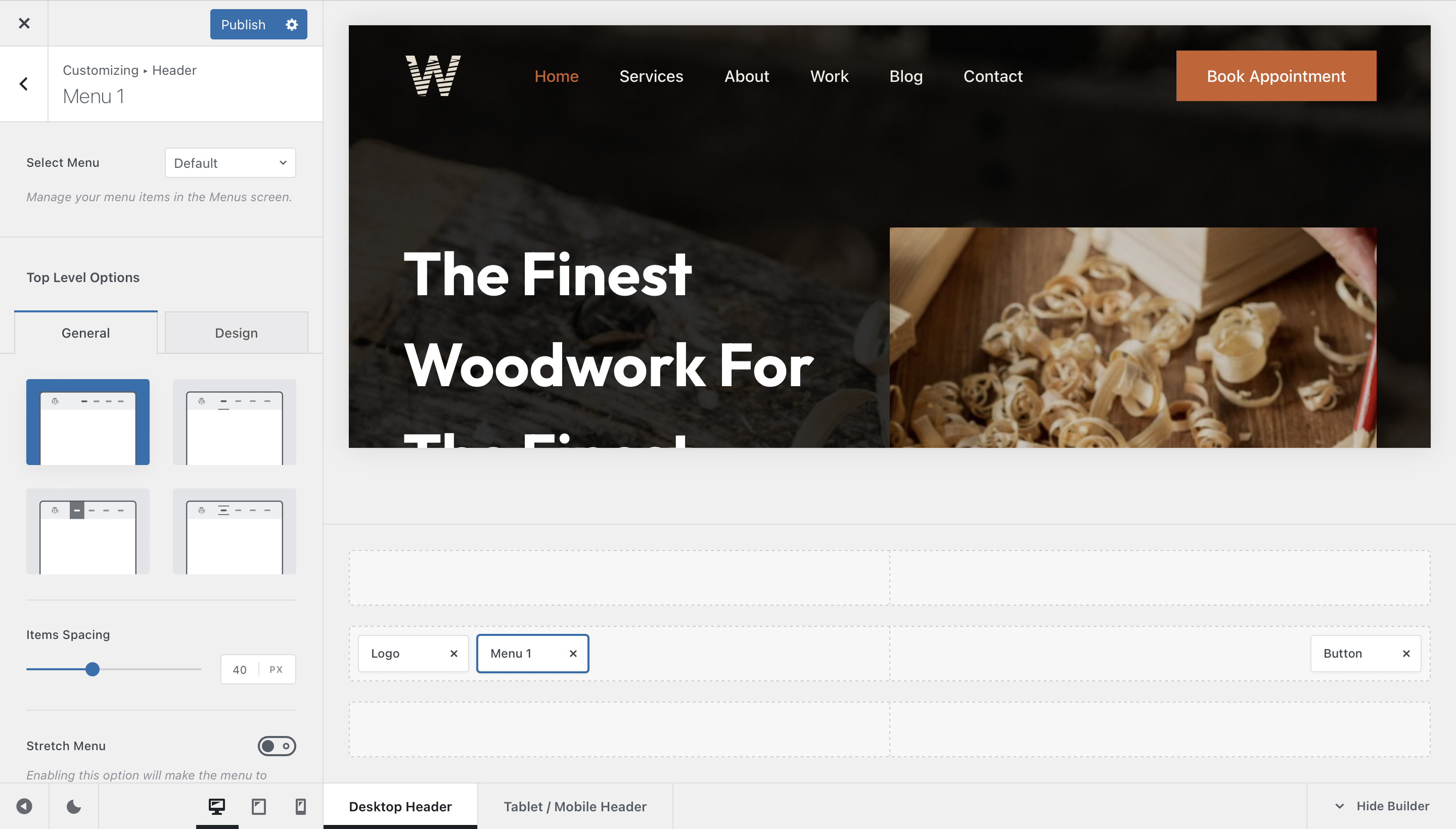
The Menu element adds your website’s primary navigation to the desktop header. It can display any WordPress menu you have created, including nested menu items that open inside configurable dropdowns.
To configure it, open the Customiser → Header, add or select a Menu element in one of the desktop header rows, and choose the menu that should be displayed.
Granular Controls

Select Menu
Choose which WordPress menu should be rendered by the element. Menus can be created and organised from WordPress Dashboard → Appearance → Menus.
When Default is selected, Blocksy uses the menu assigned to the corresponding WordPress menu location. You can also select a specific menu directly when you do not want the element to follow the assigned location.
Top-Level Options
These controls affect the first level of navigation items that remains visible directly inside the header.
Style
Choose from four visual styles for the top-level menu links:
- Style 1 – displays the links without an additional decorative effect.
- Style 2 – adds an animated underline effect to the links.
- Style 3 – highlights links using a background Color.
- Style 4 – uses an animated border effect around the links.
Items Spacing
Adjust the horizontal distance between the individual top-level menu items.
Stretch Menu
Enable Stretch Menu to distribute the menu items across the available horizontal space occupied by the element instead of relying only on the configured item spacing.
Collapse Non Fitting Items
Enable Collapse Non Fitting Items to automatically move top-level menu entries into a More dropdown when there is not enough horizontal space to display the entire menu.
Disable this option if you want all menu entries to remain visible regardless of the available space. In this case, make sure your header layout provides enough room for the complete menu.
Dropdown Options
When your WordPress menu contains child items, these settings control how the resulting dropdown menus behave and appear.
Interaction Type
Choose how visitors open dropdown menus:
- Hover – reveals the dropdown when the pointer moves over its parent menu item.
- Click – requires the visitor to explicitly activate the parent item before its dropdown is opened.
Items Hover Effect
Choose how individual links inside a dropdown react when they are hovered:
- Simple – applies a minimal hover treatment without an additional background shape.
- Solid Color – applies a background Color across the hovered menu item.
- Boxed Color – places the hovered item inside a more compact highlighted shape.
Reveal Effect
Control the animation used when a dropdown becomes visible:
- Default – reveals the dropdown using Blocksy’s standard transition.
- Inner Reveal – animates the dropdown container and its contents independently.
- Opacity – fades the dropdown in and out.
- Simple – displays the dropdown using a minimal transition.
Dropdown Size & Spacing
Fine-tune the dimensions and positioning of the dropdown menus. You can control their width together with the horizontal and vertical spacing relative to the parent menu item.